Enjoying Creativity – How Do You Exercise/Express Your Creative Juices?

Have you ever had a moment or period of time when you longed to create something just for fun? It might be to crochet a blanket or knit a scarf.  It might be to build a model plane or learn how to cast a bronze. What have you longed to create?

It seems that everyone needs a creative outlet even though they might not recognize it as creativity. When speaking to a guy  about his interest in working on cars, he didn’t consider his work “creative.” To work on a car for purposes of enhanced performance, restoration, maintenance or repair all takes a certain amount of creativity. The thought process of problem solving and taking action requires creative thinking.

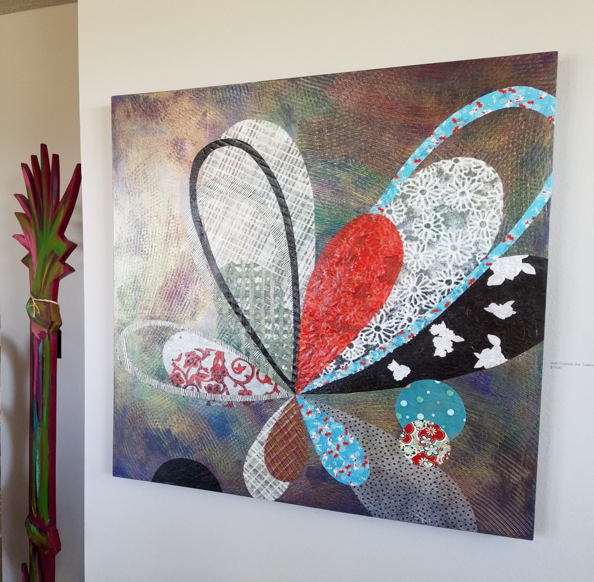
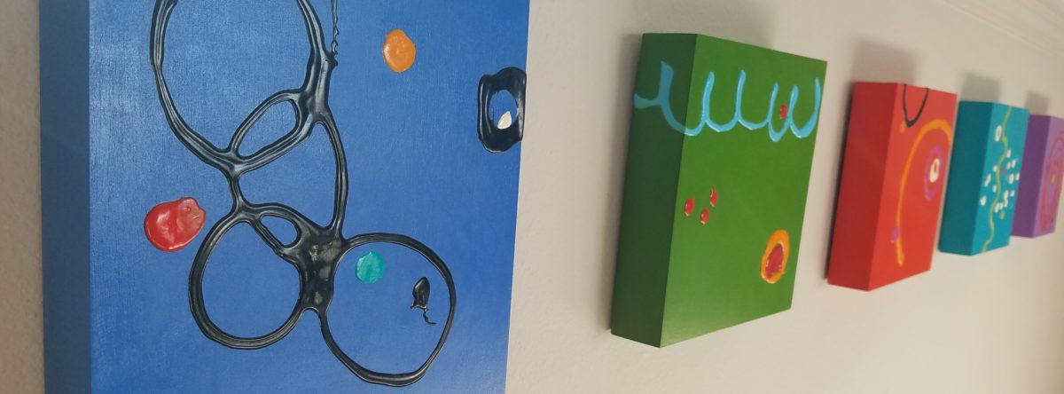
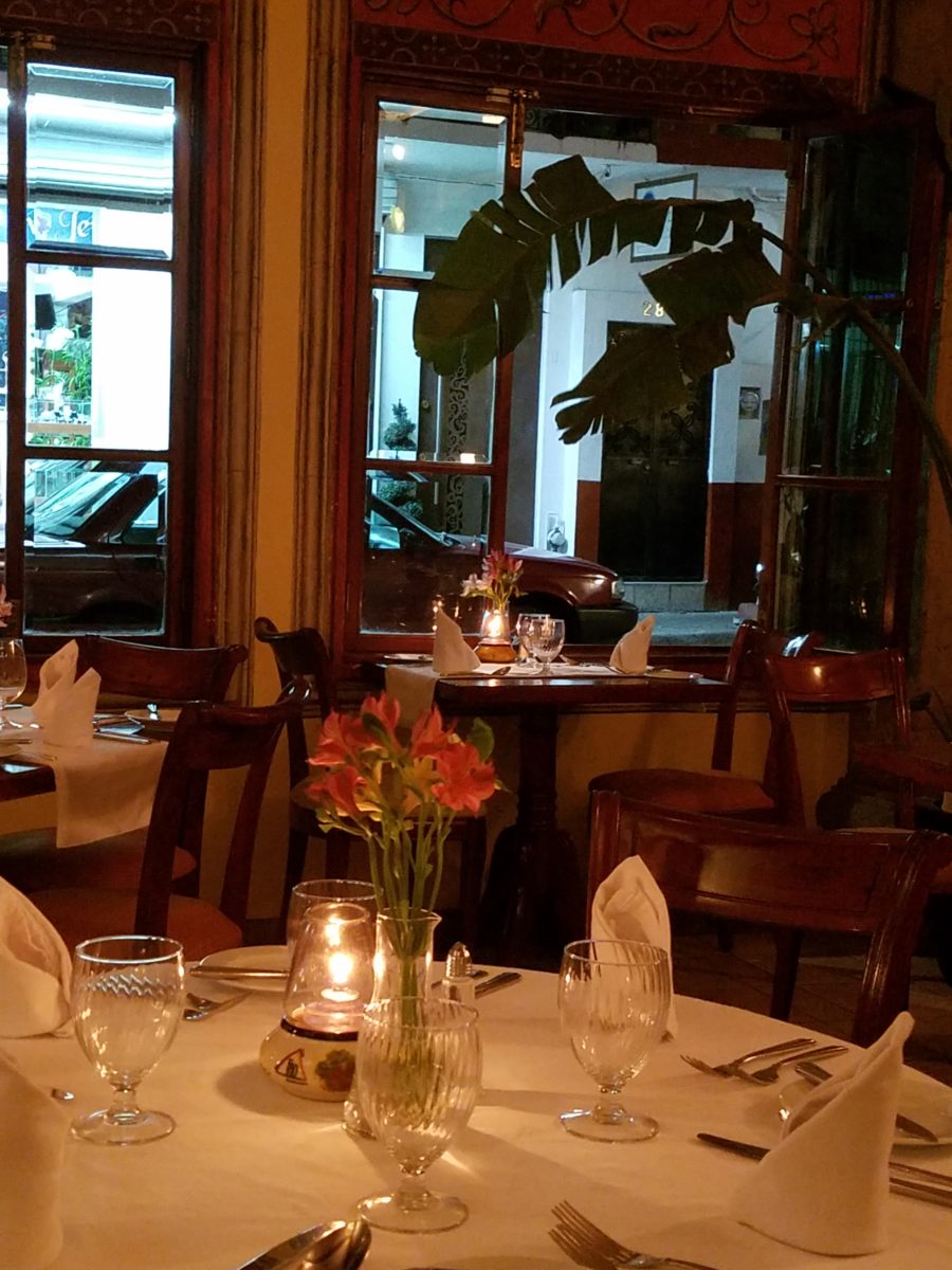
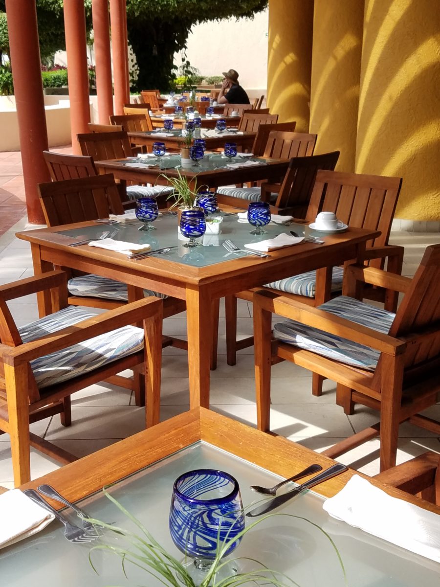
Gardening, painting, sculpting, carving, pottery, collage…there are so many outlets for relaxing creativity. The idea is to not do it under pressure. Lest one defeat the purpose of the relaxing aspect – just for fun – pure joy.

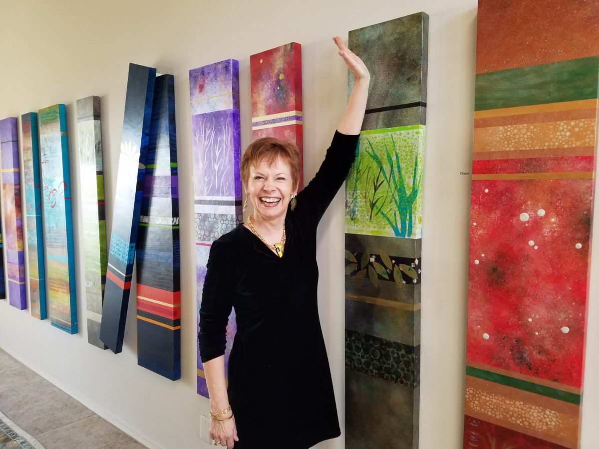
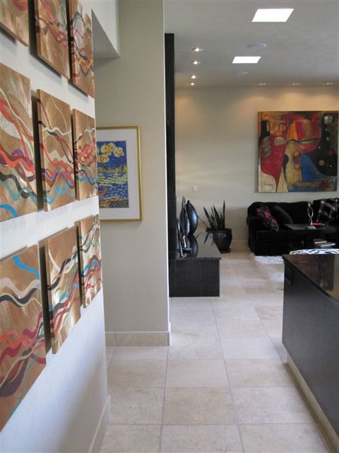
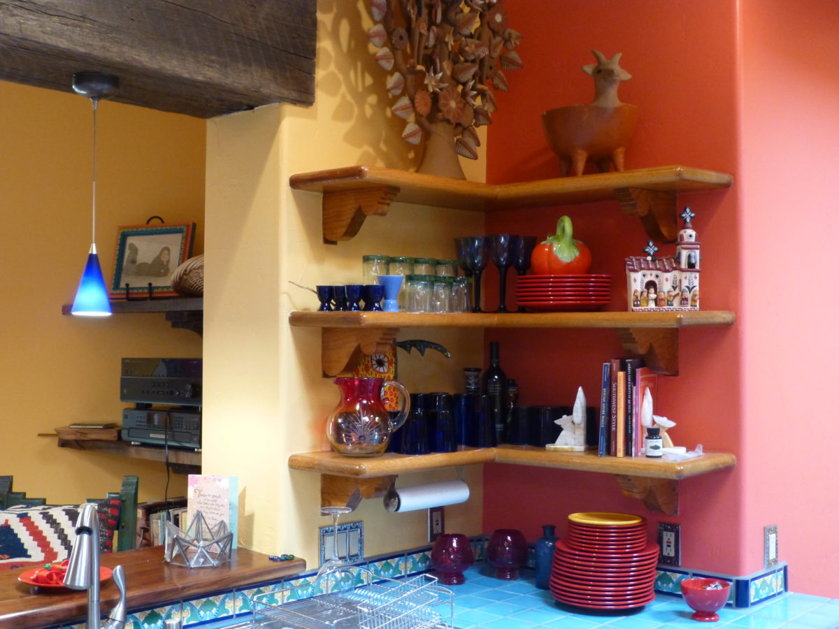
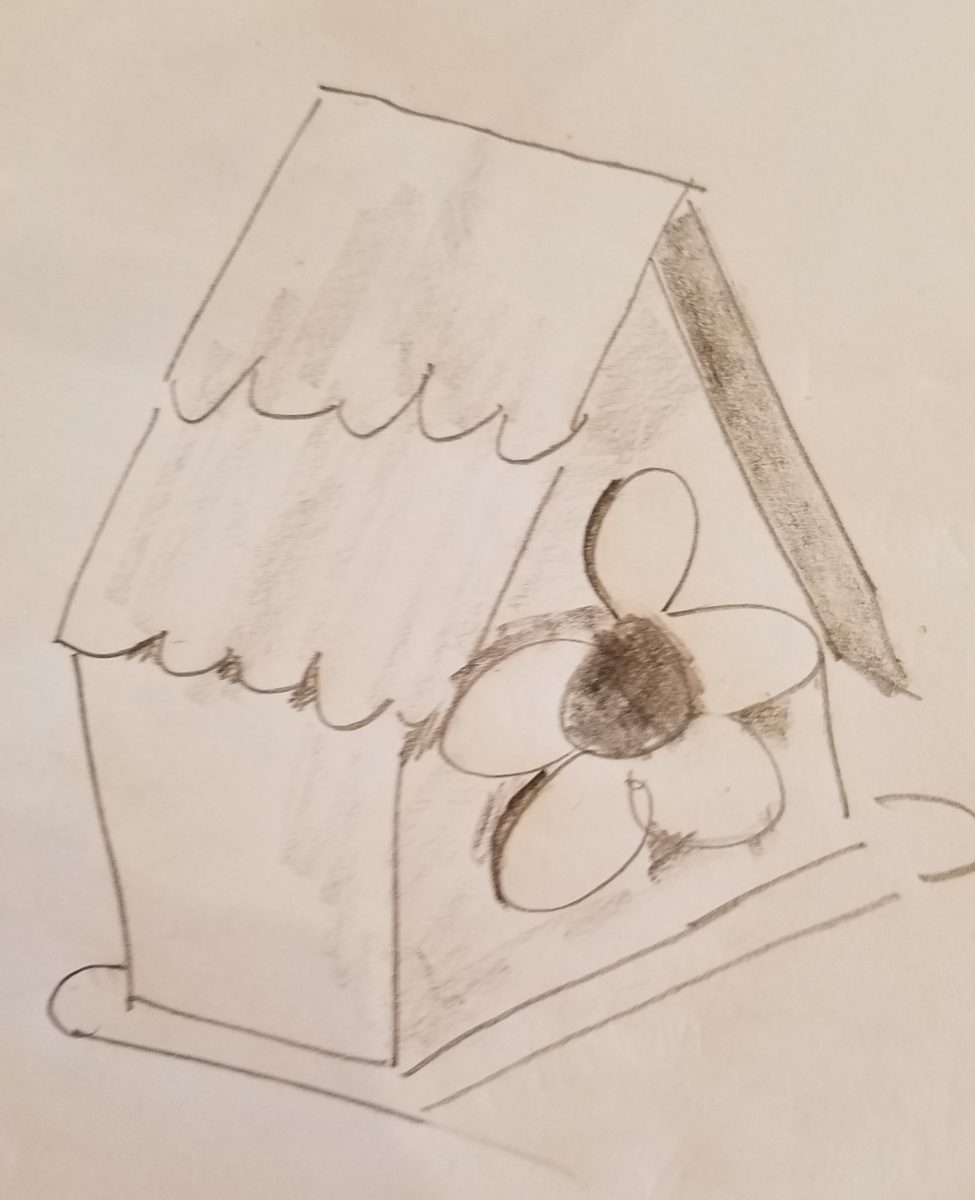
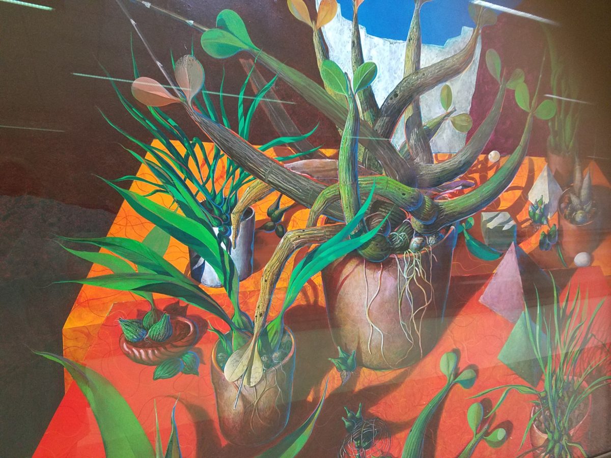
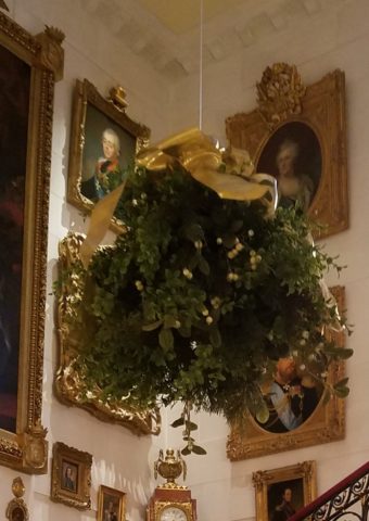
Yesterday I spoke to an architect who said that her creative juices needed exercising. Despite the fact that her daily work required lots of creative thought, it was not pure pleasure. It was not all fun. She wanted/needed another outlet. So she set forth, to do some creative design time, purely for her leisure. She started creating desert floral collages, in a size that could be shared, as greeting cards. She brought them to show me, with a modest timidity, and was most surprised and thrilled when I received her work with great enthusiasm!

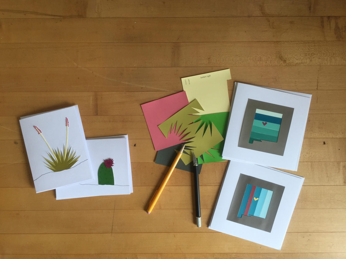
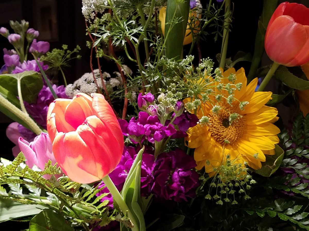
Rebecca has found the medium of paper to be quite satisfying, It is clean and precise, crisp and conveys her intent. She loves flowers, lives in the high desert and communes with cacti and appreciates all flowers – and with that her exciting, yet quiet, introspective, personally satisfying, creative expression has found an outlet.

With positive feedback from several people, she wants to launch a re-sale card line! Now the creative process goes another step. She needs to establish a brand – at least a name for her card line. Will she want a logo? What about her entire experience can she list in words and cull and distill to result in the perfect identity?

There are two parts to this situation and the first is to recognize the need for and find an outlet for the relaxing exercise of expressing creative juices and the second is receiving positive reinforcement for your efforts. Inasmuch as the second might seem  unnecessary, it is a great affirmation and valid “feel good” feeling to create for the fun of it and have your work appreciated!

It need not be commercial  – but “selling” your idea or creative project is even MORE flattering.  Although, it is usually not for compliment much less profit.

Creativity can be relaxing, if it is not in a demanding framework. It’s therapeutic. In pondering this subject, I wanted to know more. Seems that this is a complex topic that deserves more investigation. So,  I did a bit of reading…I found the Handbook of Creativity edited by Robert J. Sternberg from the Cambridge University Press 1999. In the first section – The Concept of Creativity: Prospects and Paradigms by Robert J. Sternberg and Todd I. Lubart it states “If one wanted to select the best novelist, artist, entrepreneur, or even chief executive officer, one would most likely want someone who is creative.”

It is true for those of us doing hiring – looking for that spirit that can see beyond…create…are desirable traits. Yet everyone has a certain creative element in their person. It is the degree to which they have it and in what capacity or direction which might be more applicable or desirable, for consideration  in a certain position over another.

The Concept of Creativity  further states that “Creativity is the ability to produce work that is both novel (i.e., original, unexpected) and appropriate (i.e., useful, adaptive concerning task constraints) (Lubart, 1994: Ochse, 1990; Sternberg, 1988a; Sternberg & Lubart, 1991, 1995, 1996).

The aforementioned seems obvious.

So is creativity a divine gift?  One that makes it difficult to study much less quantify or discern from another? That is not the purpose of his blog…but to not mention that query would be leaving something that one might ask – out.

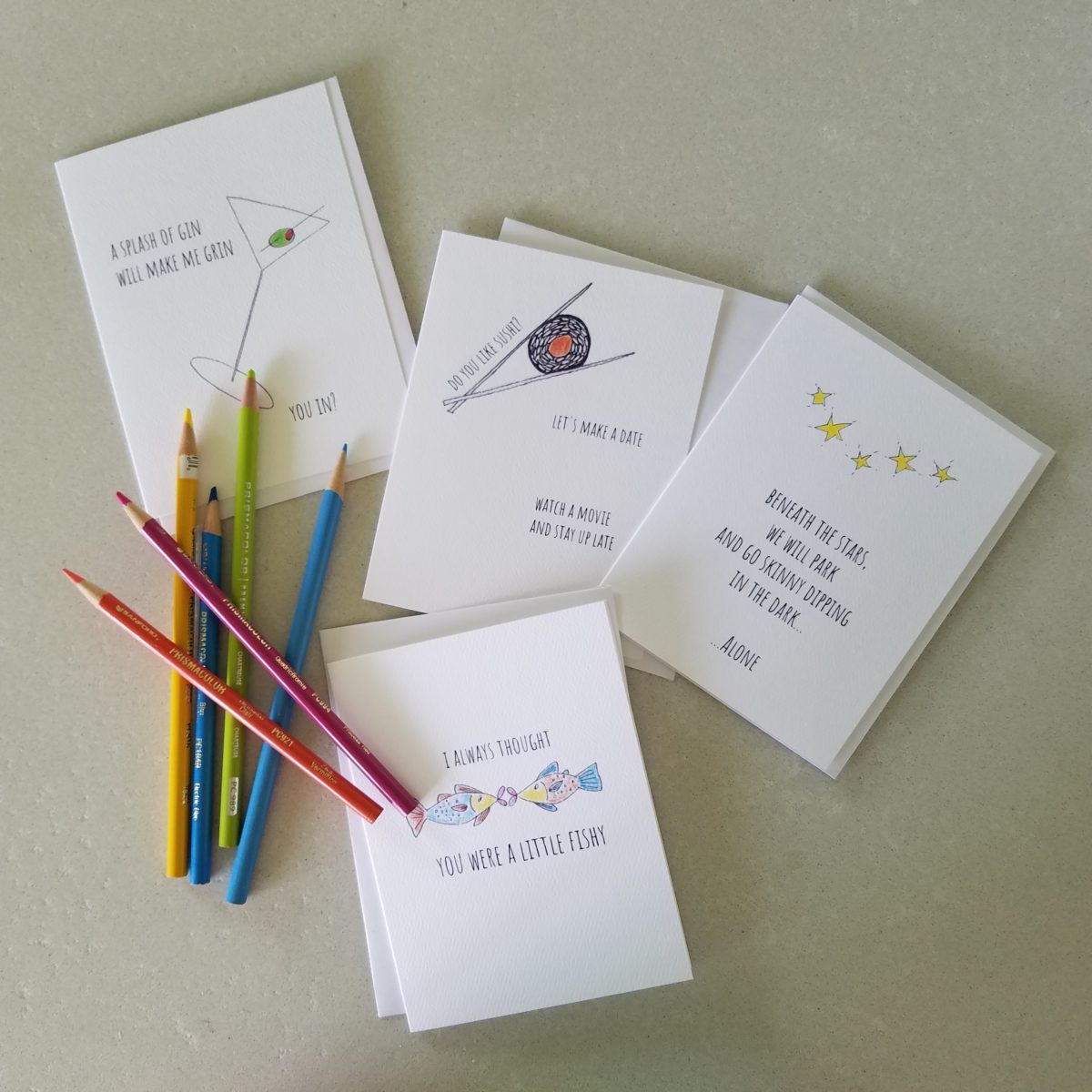
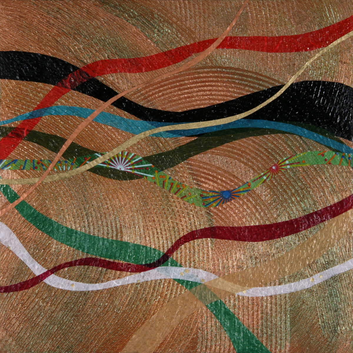
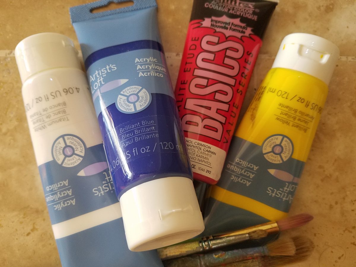
As a professional designer, creativity is part of the daily job description. Yet you will find most designer’s exercise creative outlets that are different from their work. This spring I too launched a greeting card line. It was spawned from hours on the road between San Diego and Albuquerque, with the practice of harnessing myriad ditties that continually race thorough my thoughts. A sudden lightning bolt on one of those trips suggested that I doodle to accompany my ditties. Hence, DATE NITE CARDS were born in March of this year.   Little ditties and doodles to bring a smile, start a conversation, set a date, make new friends, rekindle the spark, celebrate friends, love, anniversaries, romance…

When Extraordinary is an Understatement.

A few years ago, awesome crept into our vernacular and took over. It stole our ability to select options for descriptive excess or exception. Everything from accolades for a job well done, positive reinforcement for anything, to a spectacular sunset, a great new outfit or a startling meteor shower – everything from a tad past the norm…to something truly fantastic – became awesome.   Our language offers so many superlatives, yet we have gotten so lazy.

At the expense of sounding like an advertisement or otherwise paid spokesperson, I write today of a late-night confection experience that is truly like no other. An experience so artful that I could not take enough photos. Artistic delights at a bustling urban eatery where flowers and gold leaf adorn each piece of fanciful frosted awesomeness. Ha -there it is! Had to add more to the mere “awesome,” though!

Extra ordinary – extraordinary – beyond the norm – beyond ordinary, yes, that is an understatement for what I am about to reveal. Yet, that is the moniker of this extraordinary establishment – Extraordinary Desserts!

Several years ago we were treated to a late night surprise. Not knowing our intended destination, we were taken winding through the streets and came upon this little structure the read like an Asian garden. Twinkling lights peeking through wooden slats softened by lush tropical vegetation – the scene was magic. Once we realized the focus of this cozy pocket, we were enchanted. Patrons stood in line to pass along the “extraordinary” dessert cases displaying all manner of outrageously beautiful desserts. Once they decided and paid for their selection, they gathered in intimate twosomes or small groups to savor the delectable delights they had chosen.

Last night, we decided to rediscover this uniquely sweet spot and Googled our way into downtown San Diego. What we found, by happy accident, was a second location – an urban edifice presented on a crowded sidewalk packed with people waiting eagerly to be seated and begin their indulgences.

After leaving our name with the greeters at the podium, we squeezed through the throngs to get a peek at the cases full of magical wonders. Ok – you think I exaggerate…so now begins the photos…

When extraordinary is an UNDERSTATEMENT, you  know you are in the presence of something quite special.  Maybe that’s why people invent words like splendiferous or supercalifragilisticexpialidocious!

The rich velvety and textured frostings and layers of fabulous flavors awaited us as we scanned the displays.

Floribunda- yes, gilding the lilies (orchids as it were) – nothing was too over-the-top!   The rich velvety and textured frostings and layers of fabulous flavors awaited us as we scanned the displays.

Seeing so many astonishingly spectacular desserts in one place all for the spontaneous taking is almost too much to bear. You mean I can HAVE that right now??? I can have a piece of many of them – RIGHT NOW?????

Emulating fine Cerelene Limoges, the would-be doilies of parchment paper rimmed with gold detailing and lettered with Extraordinary the details were dazzling!  No stone left un-turned, they thought of everything to make this a tantalizing treat and patrician presentation!

The interior offers seating at the bar and tables organized throughout. Two tops or ganged together for a crowd, everyone was so focused on their prizes – beauty set before them – animated chatter wafted through the sugar-spun air!  Some chose to sample several knowing that they would take a goodly portion home. Others savored a single serving of a beautifully flavorful masterpiece.

And yes, there’s a book about the cakes – Karen Krasne – appears to be the brain behind this bounty.   I look forward to meeting her. She has an amazing machine with a well-oiled staff. Everyone was efficient and friendly and shared in the enthusiasm that was being expressed all around.

The shelves are filled with teas and other sweet temptations, interesting vessels and serving pieces.

The lighting is dim and the structure envelopes the interior with white-washed frosting of voluminous space punctuated with dark cylindrical pendant lights and pierced bubble-like panels back-lit for added interest, subtle luminosity and dimension.

Raw, polished concrete floors, steel tables and molded wood chairs give a nice balance of warm and cool, rigid and suave – while clean and almost hygge in feel.

Perhaps, in the world of custom confections and TV foodie competitions, these desserts might be within some semblance of a norm – but only from the finest of creatives, in circles of which we usually do not run.

But having cavorted last night through the cheerful melee of confection connoisseurs – albeit one doesn’t have to be clubbed over the head or knighted by the cooks of the kingdom to appreciate what we experienced –  we are sufficiently spoiled both visually and flavor-wise to be tough to ever satisfy again. Good design. Great design. Extraordinary design is often still an understatement!

Focus on an Artist, Patricia Forbes and the Art of Custom Design.

Collecting art, investing in art, loving art, designing with art…one aspect or all of the above, art in interior design has many facets. I have written previously about and presented a workshop about “I want a piece of art to go with my red sofa,” a kind of raspberry in the face of curators, collectors, critics and appraisers who would never take or condone that approach. But the desire and need exists and as a interior designer it is wonderful to work with artists who can and want to respond to cues, take on commissions and create for specific parameters.

Contrary to opinions from the high-brows, this is not to say that these artists lack artistic integrity or meaningful self-expression. Their value is as any other – determined by what the market will bear. The basis for this writing is that we work with many artists who love their work. And creating it (even under direction) brings them and their patrons joy.

Featured here is the up-lifting, colorful and texturally abstract work of Patricia Forbes. We have enjoyed commissioning her for specific interiors over the years and are never disappointed in the quality and creativity of her pieces.

For scale, diminutive Forbes poses by her Vertical Stick series.

With so many mass-produced art offerings at the trendy home decor stores, it is refreshing to encounter new clients who are at the start of their nesting years, establishing their own domains, selecting things that bring them comfort and identity and who’s appreciation lies in acquiring original art.

Designing an interior is about comfort and personal identity. It is about surrounding oneself with things that work – both functionally and aesthetically. Individual’s requirements, in either of those departments, can vary greatly – but suffice it to say, each person or couple or family unit creates a home environment based upon their likes and needs (and budget).

Enter the interior designer. When calling on the assistance of someone outside the intimacy of the home, the client is hoping for and expecting a successful custom-tailoring of their requests based upon the experience of the professional.

When designing an interior, it is exciting to use existing pieces already owned by the client. It is gratifying to arrange and place those items in ways not yet imagined – thereby justifying the investment in design consultation. After an intense session of rearranging furniture, artwork and decorative accessories the “ta-da” moment is one of near instant gratification and satisfaction.

When an interior needs a little something to pull it together, fill a gap, create an accent or establish a focal point, it is great fun to engage the creativity of an artist to custom design a piece to fit the need. Approaching an artist for the express purpose of acquiring a piece of their work to enhance a space is  an exciting venture. It is a personal connection between artist and patron that creates a communion, a bond.

Here I took inspiration from a single panel that Forbes had constructed and requested a series of 9 panels grouped in a grid to make a larger statement on the wall. The interest created from a grid of images adds movement and dimension to this series already complex with sculpted texture and applied layers.

Color, texture, size, style, subject (or not) all are aspects of art that are to be considered for the personal  interests of both artist and patron. If the patron has selected an artist to approach about a commission it is as a result of experiencing their work and appreciating it. The artist, in response, is to accept the parameters of the request and enjoy the challenge and process of creating the intended/desired finished product.

The intensity of this rich red wall was decided early in the design process. As we built layers of existing elements and introduced new pieces, the desire for a custom installation became apparent. This Urban Elements series was a collaborative effort between Forbes and me to provide a bit of an edgy, industrial vibe to this eclectic urban loft. Note too that the end table and coffee table were locally crafted for the project by Kirt Kirkpatrick

Forbes’ creativity is rooted in pattern, color and texture. Primarily non-objective, her pieces are compositions of movement and dimension. Working with a layering technique, she builds her action with a collage of papers and fibers, paint and stain. Action is key when describing Forbes’ artwork.

She creates for herself, but when called upon to collaborate on a project, her eager curiosity for what might result is enthusiastic and ever-promising. About her style and self-expression she states “When I have created a joyfulness and vibrancy in the work, I know I ahve created an experience I wish to share.”

When asked…

1. How/when/why did you start your abstract technique of layering colors and textures?

Forbes has always been drawn to color as a means of her personal expression, once she “experimented with acrylic materials that would hold a texture and  started playing with those using combs and rubber spatulas and sticks to mark in the materials” she was hooked.  “Metallic and interference paints call to me — so I began to combine the over the textured backgrounds, and  then discovered that with acrylic one could imbed paper.  It was really experimentation and discovery of what these amazing materials could do…”

2. What is the most satisfying aspect of your art  for you personally?

The element of surprise is what gets Forbes excited! “When something comes together almost unexpectedly and I wonder how I did that — it’s always a search for the right combination of elements, colors, textures, feelings.”  When they all come together she experiences great satisfaction.  “It’s like turning over pieces to see what fits. Sometimes I have to turn over a lot of pieces to get the right combination — sometimes wondering whether to continue.  Seems like it is always worth continuing the work to a happy conclusion.”

3. Why do you enjoy commissions to create specific pieces for interiors/patrons?

Forbes expresses genuine gratitude for her patrons. “I feel honored and appreciated when someone likes and appreciates my work and invites me to do something special for their home or office space.”  

4. What pleases/satisfies you about this custom commission process?

The process of working together with  her patrons is positive creative challenge. “I enjoy the collaborative aspect and going through the process with a client or designer and receiving their feedback as the work progresses.”

The satisfaction for a designer in partnering with an artist is designing and realizing a vision to complete a space. Bringing visions to reality.  I often say that my team provides tremendous support in making my dreams come true. From artists and craftspeople to seamstresses and all manner of contractors, it is truly a team effort to achieve great results!

Time to Remodel – Finding a Theme

Time to remodel the kitchen!! This charming little bungalow had already experienced its share of remodeling – well, not so much structural – although, many interior design transformations had occurred over the decades. In the mix, the well-used and enjoyed kitchen was feeling a quite tired and dated.

You might remember I have used this now completed project, in the last few months, during its transformation process to identify certain features and design practices. Here is the as-promised unveiling of the before and after photos for further discussion about the design process, intent and results.

We loved the mottled color and organic character of the existing slate floors and opposing green-grey beams with spanning boards of a caramel stain. These were the two elements that went well together as though intentionally planned. Yet in between, the pale, peachy pickled oak cabinets with their radius detailing and red-rose/black matrix of the tiled granite counter-tops, didn’t seem to speak at all well with the ceiling treatment and slate floor’s greens, rusts and charcoal tones. It was a dark, confused space.  

When observing and “listening to” the house, it was evident that the current kitchen, in addition to being poorly coordinated, had absolutely nothing to do with the original architectural intent. The new owners had brought a few very fine antique pieces into the home. The mid-century circa 1964 age of the house accepted them on its original hardwood floors also adorned with their fine antique rugs…but something was missing. There was no cohesive thread running through the house. Over the years finishes and decorative elements had been selected and installed without any consideration for original materials or an attempt to introduce compatible and harmonious materials for the good of the home’s overall theme.

In all fairness, had the entire interior been gutted and a contemporary interior been uniformly installed into the framework/shell of the structure, I might have considered it a success. However, this multiple decade decor was a mix of disparate trends and preferences that had no commonality.

To begin the process of bringing this home into a cohesive design last year, we had redesigned the living room. There we introduced a classic blue and white color scheme derived from the Persian rug in the adjacent dining room.

To the corner kiva fireplace, we added a sandstone hearth and mantle with just enough blue and white Talavera tile trim at the base of the hearth to subtly coordinate with the new scheme. The Talavera was an appropriate material for this New Mexican bungalow.

The original fireplace had a dark, broken brick quarry tile hearth and no cap on the mantle.
The face-lift replaced the hearth material with broken-edged sandstone slab and matching mantle cap with Talavera detailing at the bottom.

With this living room having been so successfully re-designed, the obvious thought came into the discussion to continue the vernacular of the blue and white Talavera into the kitchen. As a bit of a purist when it comes to application and termination of materials, I was not content for a mere back-splash.  No, if the tile were to be effective and commandeer the stage, it had to be used wall-to-wall as though an entire wall treatment.

Treating the Talavera tile as wall-covering, it continues from the kitchen, into the adjacent pocket-space housing a desk and laundry machines.

But wait! The addition of an earthy aqua handmade tile from Spain offered an appealing and unexpected accent woven intermittently through the Talavera. It created a coordinating thread from the colors found in the mottled slate floors and ceiling beams.  

Pre-grout shot shows the individually cut 1″ pieces inserted as mosaics into the random field of Talavera

The cabinets were in excellent condition, but the doors were sadly dated and in no way spoke to the home’s other cabinets, doors and finish carpentry.

The confused interior finishes we in need of a transformation!

With the white raised panel theme throughout the home’s original appointments, we elected to salvage the cabinet boxes and replace the doors and drawer fronts with a similar raised panel detail. The same red oak was used and, with a glossy white paint applied, the grain “read-through” with a very intentional yet subtle moiré-like pattern. The new raised panel white doors and drawers, with crowning top molding provided a crisp, timeless motif. The random patterned Talavera used as an entire wall-covering was very effective. The kitchen was quite gussied-up!!

The transformation was dramatically successful!

The existing slate floor was beautifully organic and I felt, from a design standpoint, was a must to salvage. Making it look like an intentional selection – part of the new scheme – was imperative. Therefore, selecting a counter-top that communed with the tones in the floor resulted in a selection of concrete-like engineered Italian quartz material – balancing the floor with the next horizontal plane and ultimately with the stained and green-grey boards of the existing ceiling treatment.

The new concrete-like Italian quartz counter-tops coordinate well with the other materials.

Another asset was the connection to the outdoors, however the existing window over the sink was high and small.

The window over the sink was high and small…

By bucking the warranty of the Pella people, we had a new double-hung window made to close down onto the new counter-top that passed through from inside to out. They would not fabricate the window to do what we intended, so we had the contractor remove the bottom of the new window frame, thus rendering the warranty null and void, in order to have a completely open, uninterrupted pass-through when raised.

Amusing and interesting…existing family pieces of blue and white ceramics are being discovered and used as decorative accessories in the new kitchen!

We also captured the opportunity to open the opposing wall into the hallway adding pass-through light and dimension to the space. This exponentially expanded the space and made the encapsulated kitchen feel much less confined.

Before, the kitchen felt small and dark…
Opening the wall into the hallway brought in additional light and dimension.

To add drama to the newly created dimension, we discussed having a painting commissioned to pop an accent of yellow into the blue and white scheme on the far hallway wall. Lemons, a perfect citrus for the kitchen, was decided for the theme.  

A miniature oil painting by Federico Leon de la Vega was used to Photoshop into the scene to inspire and convey the design intent.

The additional POP of yellow is a dramatically effective contribution to the overall composition. After consideration, the owners selected a local artist to paint the full-scale painting.

A local Albuquerque artist, Thomas Tomlinson rendered the lemons in acrylic with blue and white tile details.

In summary…keeping the original slate floor, existing cabinet boxes (replacing door and drawer-fronts only), with a bling of new chrome cabinet pulls, switching out the stained glass pendants, replacing the island’s surface with a handsome solid walnut top and a new coordinating concrete-like counter-tops on the periphery, with the decorative embellishment of the Talavera tile continued from the subtle introduction at the living room’s kiva fireplace, the transformation of the kitchen is stunning – not trendy – and was truly, uniquely designed for the architecture and forward, on-going contextual design conversation of the home.

Uniquely designed…

Look around and listen to the environment for and in which you are designing. What makes the best sense for the design direction considering the function and context of your project?

Color. The Spices and Ingredients of Design

Colors for fashion, interiors or a composing a bouquet are like the many ingredients, spices and herbs selected for great food. Creating dishes with fine flavors and visual appeal, by selecting the right combination, is good culinary design. So we see the spices and ingredients of design everywhere!

Assembling the colors, textures and shapes in a bouquet…

The art is in gathering the right combinations, textures, colors, flavors,…ok – maybe edible bouquets…Well, we’re not tasting the interiors – but some are scrumptious! Ooh – good enough to eat! And the fashion – yes, we’ve seen edible fabrics…generally not attempted in draperies – but who knows? The sky is the limit in design!!!


A few years ago, Kingston University Fashion Student, Emily Crane began pioneering a new strain of edible couture created from gelatin and seaweed! Brilliant and beautiful!!

Inasmuch as edible couture and creating fabrics from edible materials is fascinating, I digress…the actual point of my story is to recognize the common denominators between gathering materials for all forms of art – the assemblages result in the creative finished products. In this instance, interiors and their color schemes which bear likenesses to beautiful foods!

Color is the most apparent ingredient of most artistic design endeavors. It is the most obvious and first to catch your eye. Assembling an interior is usually grounded by a desired color. The foundation of a room begins with deciding a direction with color. This might seem to be contrary to the concept that form follows function – but I believe that the designing for the two are often concurrent events. The vision occurs while the function is simultaneously examined. Most people visualize in color.

I often write about color. It is an ongoing fascination to discover who prefers what color(s) and why. It offers the beginning of the visualization of a concept. As the framework is discussed – such as programming a kitchen. Inevitably, in the early stages, colors and materials are discussed. They might change. They might not end up as first imagined, but color aids in the visualization and process of  design.

Look around your world and consider color. Why did you choose your interior colors? When selecting a color for the surfaces, fabrics and finish materials what would you do differently and why. Taking care not to merely react to trends, what colors will bring you joy? Trends often tempt. They are enticing and new, but they move along…It takes thorough examination to determine if a trend is truly applicable or merely a passing temptation. The validation of design is the approval of the occupants or function for whom/which it serves. Not just the feature of a new trend.

So have a little fun seeing these interiors paired with edible color schemes as dishes are correlated to interior schemes.


The spices and ingredients selected to create the flavor bursts might be hot green jalapenos, serranos, tart limes, dried red chiles balanced by the soft and warm yellow of corn tortillas.

What interior might look like a spicy platter of festivity? Perhaps bold wall colors sprinkled with myriad decorative accessories and functional art.

Spicy colors in this festive kitchen.

Imagine creating a creamy white-sauce mushroom pasta with velvety texture and soft finish. The ingredients you would reach for would be the cream, pasta, white pepper and perhaps a touch a sherry. Sautéing the mushrooms in butter for a luscious golden brown.

Invitingly divine.

An interior that captures a similar feel derived from the same palette of colors…


Mimicking the creamy mushroom palette, rich wood, copper and steel tones contrast against the creamy whites in this interior featuring one of our favorite furniture and fabric lines – Duralee/Robert Allen!
Duralee/Robert Allen has many collections providing the perfect fabrics and furnishings for so many deliciously diverse interior projects!

From creamy, soft and warm to cool and refreshing…


Cool sushi plates featuring the pink and orange tones of tender fresh fish, cilantro sprig greens, and so white rice!

An interior possessing similar colors – the perfect ingredients to create a stunning design!


Durlaee encompasses many fine collections. Here the Clarke & Clarke Oriental Garden fabrics are gathered together to present a fresh scene reminiscent of our colorfully fresh sushi plate!

Ready for reds?


A berry lovely dish with creamy whites…Our delectable raspberry tart presented on a lace-embossed white pottery piece accented with finely sliced toasted almonds sets the stage for the next interior color scheme…

Once again we are featuring Duralee’s Clarke & Clarke statement called Zanzibar a brilliant raspberry and red ethnic statement inspired by the exotic and vibrant world of Tanzania, Africa. Discovering the creativity of colors and fabrics in distant places offers a mélange of ingredients with which to create an exciting interior design!

 Mix it up. Gather the ingredients that will bring you joy and result in a deliciously creative interior!!! Come see and feel these fabulous fabrics and furnishings from Duralee/Robert Allen in our comprehensive design resource library at PATRICIAN DESIGN! Call us and we will send samples!

Animating Interiors – for Fun!

The total sum of an interior…comprised of the shape and volume of a space, the colors and textures, architectural details…then layer the lighting, furnishings and decorative accessories and ta-da! But is that all there is?

The beauty and intrigue of interiors is what keeps us discovering and creating. Yes, finding intimate pockets or grand expanses that please and dazzle.

The romance of this setting caught my eye…the far table by the window – set for two seemed a likely scene for a tete e tete to take place!

While traveling in the tropics these last few weeks, I discovered many interesting places. Oddly, while experiencing all the sights and sounds flavors and colors of this paradise, I immersed myself in the unlikely and completely opposite world of early 20th century Russia with A Gentleman in Moscow.

Just for fun, I sat with Federico Leon de la Vega today as he did 4 – minute sketches of some of my photos…needless to say, proper illustrations would have proved more telling of my romanticizing the talents of artists conveying imaginary activities in interiors…but it was fun to play with this today!

The beautifully and artistically articulate writing style of Amor Towles held me captive. And what a dichotomy to play ping-pong with my brain as I digest the restricted realm of Count Alexander Ilyich Rostov while basking in the warm sunshine with fresh sea air and palms rustling overhead…It seems that the extremes of this pairing suited me well as it was a dual escape – a vacation getaway while taking me further into fantasy with another dimensional experience of this incredibly great read!

Although there were many fascinating observations made by the author, it was this passage regarding the Count encountering a young artist/architect that prompted this subject for this week’s blog. The architect, finding himself in Moscow in the post Czar age of socialistic experimentation and implementation, bemoans the lack of work “The way things stand, I’d be happy to design a birdhouse.”

“The way things stand, I would be happy to design a birdhouse!” Sketch by PH

The mayor of Moscow has made an observation espousing the birth of  “the golden age of the prefabrication, cement-walled, five-story apartment building”  – with the very practical  “four-hundred-square-foot living spaces with ready access to communal bathrooms boasting four-foot tubs (after all. who has time to lie down in a bath when your neighbors are knocking at the door).” The mayor further emphasizes and rationalizes “So let us not get bogged down with elaborate designs or bow to aesthetic vanities. Let us apply ourselves instead to a universal ideal that is  fitting for our times.” A horribly inhuman decree in my opinion, rather than a should-be, truly magnanimous spirit. Humans are designed to design!!

The sentiments of the new regime left the architect with having to find avenues to utilize his talents – specifically sketching as he set forth to illustrate a brochure of the city’s finest hotels as retained by the Intourist department. How sad to possess the talent and passion and be reduced to capturing the grandeur without having the opportunity to design??!!

So three things struck me about this situation…one – that the artist was practicing only a portion of his talents and not the true, complete creativity that beckoned him to pursue his career…two – that renderings not only offer the opportunity to preview the proposed design of a space, but they can use artistic license to animate the space for its intended function and three – that spaces are not truly realized until they are filled with the people that are intended to occupy them.

So much so is a room not really finished until it is occupied by the inhabitants for whom it was intended to function, but Towles observes through the renewed appreciation by his architect, “I suppose a room is the summation of all that has happened inside it.” And that is what I enjoyed being revealed as a result of this simple exchange in this one of many experiences in this remarkable storyline .

Humans are designed to design. Rooms are intended to perform a function. They cannot function until they are animated with whatever they were intended to serve. Sketches allow the preview. Sketches are more spontaneous and artfully creative than computer generated versions of the same. Celebrate beauty, creativity and artists!

WHITE by Design…

With all the New Year buzz about the new color forecasts…I started taking notice of the seeming non-color, white. It is often considered the absence of color when in fact it is a very complex color of many shades and values. Just try to select a white and you will know what I mean.

When you look at white paint samples, you will notice the nuances. There are pink whites and blue white, grey whites and yellow whites. Each white is off-set and contrasting to another. You see the differences by comparison and by context. You think you have just the right white until you place it against another sample and see that it is grey or cream and then second guess yourself again…and again…How do you know which white is right?

Dunn Edwards groups their whites and pastels in a separate section of their fan deck as do other paint companies. What is interesting here is that the background is a sheet of white copy paper. Notice how is reads against the colors in the samples…it seems to be a purple blue color. This shot was taken under a full-spectrum LED lamp. The colors should be true. The range of “white” is amazing.

To intentionally design with white is bold. To have the confidence, to decide that white IS the color and that white IS the scheme, is challenging. To effectively design with white, you not only have to select the right white(s), but you have to know just how much of anything else might be effective yet not detract.

Le Leche in Puerto Vallarta is a fabulous example of designing exclusively with white. Only with minimal punctuation with black lettering on the wall of containers and also by allowing shadows is the white interrupted. But the blacks’ minor interruptions gives depth and fine detail.

White design can be cold or warm. Depending upon the desired effect, mood or function of the space, the whites need to be carefully selected. This is true with lighting as well. Warm whites or cool whites…what gives you the desired result?

Popular white string lights add festivity and a warm glow to an evening scene.
See how many lighting colors you can identify in this scene…Starting on the left, a cool pocket glows through the underbrush. The walkway has a warm pink-ish light. The very cool blues of the pool area give a dramatic read. A bold yellow accent peeks from the far left and also over on the right. The palm trees are wrapped in a warm white tube lights while the far right side illuminates the entry to the dining palapa with a cool white light source. The foam of the surf on the beach is captured with a cool white spotlight that maintains its naturally expected white color.

Knowing when to add color to a white scene to achieve an intentional POP is an art. The color itself, the amount and placement is all part of the success of a good design result. From the fine black detailing in the previous shot of La Leche to this still-life composition of a tropical cocktail that I propped the other day, the minimal punctuation of color is key.

White mosaic shards of tile in the background of this composition featuring a peeled coconut and the POP of a pretty pink party umbrella result in a white-on white scene. Yes, this shot says PARTY with a perky smile!

The bench which served as the backdrop for the coconut cocktail is a dramatic serpentine sculpture of site furniture that plays with the white-on-white of the tile and grout.

Contrasting against the organic wood decking, this white monolithic bench snakes around the periphery of this outdoor lounge area. The sunset is casting a soft pink wash over the all white glazed tile.

Beach settings using white materials compliment the white sand and greenery of the tropical plants. From wood frame platform cabanas to the sprinkling of umbrellas, white is a wonderful, fresh color for a crisp clean scene.

Whites on whites…creamy sand colors to crisp white terrycloth, the white-on-white scheme is soft, inviting and clean.
Greenery compliments the white umbrellas and sunning beds on the lawn by the beach.
Palm trunks and other fruit trees are often painted white to protect against insects and what insects insist on climbing the surface are easily spotted by birds who appreciate the help to capture a snack! In this case, they contribute to the white design theme.

The soft creamy off-white folds of fabric offer a soft, inviting scene.

Shadows in the creases and depths of the folds add the dimension to the luxurious feel of the cotton damask fabric.
White stucco is dappled by shadows and greenery while given a warm, strong base by the brick pavers. White as an architectural finish is only successful if the context compliments it. This is true in all design.

Architectural color and texture of surfaces is a moving target. A recent discussion about a white building with black detailing would not have proved right for this particular use of white. The hard, commercial read would have been too severe for the intended effect. Yet that same project, with a warm white and an ochre accent, will be just the right combination to achieve the desired result. Watch for this project to be featured in a few months.

Architectural surfaces incorporating tones and textures of white provide interesting opportunities

Block and crumbled edge accent bands on the facade of an exterior wall.

White in design is an exciting selection. Knowing how, when and why to use it is a test of your creativity. Picking the right white is the challenge.

The limitless colors of white found in a pile of gravel…..

So the next time you think white, think a lot about it. Study the context and what you are trying to accomplish. Feel freed by the fact that white is a color to express and enjoy.

“COLOR IT FABULOUS” – A Color Game to Play and Learn!

After last week’s Color of the Year observations, I furthered the subject regarding the importance, influence and value of colors.

I don’t know the science behind how individual’s eyes perceive and translate color… rods and cones and the anatomy of the eye as it speaks to the brain…but what I do know is that COLOR and the context of COLOR MATTERS even if it is not perceived exactly the same by everyone. 

My parents were coincidentally both apt to notice, remark about and describe color specifically.  To them, and ultimately to me, colors were something to regard and absorb, for better or for worse, and all colors deserved acknowledgement and specification. 

I distinctly remember their descriptions, “Parrot Green, Sapphire Blue, Lemon Yellow, Fire Engine Red and Brown as a berry” – a compliment which indicated that you had tanned sufficiently! I think it was a result of our island home-away-from-home that prompted many of these titles. We, for sure, had no parrots making their presence known in Virginia! But for some reason, colors in the islands prompted unusual appreciation and scrutiny. This parrot green was like grass green but a bit more intense – saturated – not a dark green and certainly not a spring green – just a brilliant, clear, secondary green! The result of true, primary blue and yellow mated to make GREEN!

Color is a communication tool to convey – color. But what color? What type of color? What specific color? Is your version of a color the same as mine? Do we “read” color the same way? Do we express the description of color the same way? How might you explain a color to a person who is blind?

I’m writing this today from the tropics and it seems worthy to note that colors are abundant here in brilliant evidence through all seasons. Whereas in a decidedly changing seasonal and climate, colors come alive in spring, progress through changes and pretty much crash for the dormant winter months. Contrarily, the topics meld their rainbow of blooming floribunda, bounty of fruits and palette of these brilliant colors year round. 

Maybe it is because we straddled both worlds. The lush, verdant, colorfully blooming and always reliable tropics countered by the decidedly and distinctly changing seasons through dormancy in the northern climes. There must be an appreciation for the change. The lovely, yet possibly monotonous climates that produce blooming color all year round might dull the senses to the seasonal reemergence and staggering beauty of new growth and blooming abundance and mute the verbal expression and appreciation thereof. 

For example, my color antenna is always up and running. As I struggled with my pair of carry-on luggage monstrosities clearly in excess of 75 pounds (good thing there is only a size and not a weight limit!!), I came upon 2 art pieces in the Houston Hobby airport. The colors beckoned me. Although I had noticed them in swift passing, I couldn’t help wanting to see more. So I stopped and dashed back, disassembled my cumbersome haul and quickly took photos of these two paintings on exhibit, in the concourse, in order that I could enjoy them a bit later. Initially attracted by the color, they arrested me allowing and inviting an opportunity for  further examination of their subject matter and detail later, when I had the luxury of time. 


The wildly organic plant life, featuring an animated orchid that tangled and writhed on the painting’s surface in a variety of verdant green’s set against a perfectly selected fiery orange table surface, was brilliantly alluring and seemed to set the stage as a  precursor to my soon-to-be-destination in tropical Mexico.  ARTIST: Lucas Johnson Still Life with Schomburgkia

A bit further down the corridor of the concourse another piece caught my attention. Similarly with its colorful invitation, but with entirely  different subject matter which upon closer inspection was quite intriguing, a patchwork quilt of batik fabrics and collage with applied letters beckoning the viewer to wonder what might be beneath was magic. The woman or child and beloved pet in the center of the action nestled under a cozy and colorful quilt, wrapped in a cloak of starry darkness which might suggest clinging to each other against the foreboding imaginings of the night.


The intense collection of the brilliant colors contrasting against black was dramatic, mystic and inescapable in this powerful piece, It Helps to Think We’re Sleeping Underneath the Same Big Sky by artist Joo Young Choi.

Watercolor artist extraordinaire, Susan Weeks,  captured this crate of mangos at an exotic market somewhere very south of here. Peru? Ecuador? I don’t remember. Susan gets around. And, Susan sees color and detail and renders it with remarkably exacting precision. 

As I greet the day, I’m taking my stash of mangoes out onto the balcony to be seen and photographed in context.  Reminded of how Susan rendered this succulent sweet fruit, with the delightfully “hairy pit” (nods to Tricia), I celebrate this colorful collection of nature in a sensational setting! These gorgeous tones of warm golden yellow, baby iguana green and yes, 2019’s rosy warm coral (Pantone’s “Living Coral”) are nature’s color scheme. The orbs are sensuous and the colors are excitingly bright and luscious. 

Mango colors of rosy coral and warm, golden yellow are paired in this arched interior entry.

Here a similar scheme featuring one of our favorite Company C rugs illustrates the bold, effective power of color selection.

Try this exercise with color. I have no idea what your eyes see and your brain translates, but walk around and look at things in your world. Notice color. Notice individual items…book bindings to fresh fruit. Evaluate each color’s effect. Does it evoke any emotion…good or bad? If you wanted a painter to paint a wall that color and you didn’t have the paint selected, how would you describe that color in an attempt to get it on the wall as you desired?

In a more thorough test, you might be prepared with actual paint – like tubes of acrylic from the craft store. Get a print-out of a color wheel to illustrate the primary, secondary and tertiary colors. https://bit.ly/2SVKUMg Buy red, blue, yellow and white and use them to attempt to create the color being described. This could be a party game – but you would need to also have paint chips from the home improvement store or paint store to use as the prompts that would have to be described and used to match the success or failure of the person attempting to create the color.

Noticing color brings appreciation to the details and nuances of our color-filled world.  The little exercise/game, to try to convey a color to another person based upon similar life experiences and references, is interesting.  Please share your thoughts and experiences, dilemmas and frustrations with this project through the blog’s email.

I hope this encourages you to go forth with a new-found appreciation of color and how it adds layers of depth and interest to all that you see. Examine the natural world, or man-made creations in film, set-design, architecture, graphic advertisements, fashion design or interior design. See why color matters!

Designing is like Cooking…

Designing is like cooking – I guess cooking is a form of design. Yes, it certainly is. Whether it is graphic design, fashion design, architecture, musical composition, poetry, landscape or interior design – artists of all media – the art of creating, designing, composing, it is all about the right ingredients in the right amount to balance the scene. Proportion.

Even though I will be focusing on interior design, the”scene” could be the sheet music, the canvas, the poet’s screen or paper…the “scene” is the window that frames/encompasses the finished product. To compare these artistic endeavors, to the art of cooking, is so obvious to me.

Everyone must cook something. Whether it is merely heating up beanie weenies, with a sliced dill pickle tossed in, chased with a gin on the rocks, it is a composition that must result in a tasty scene – for someone. Having said that, we must also note that “beauty is in the eye of the beholder.”  The more successful compositions appeal to a greater number of aficionados.  

To cook, one must combine the right ingredients, in the right proportions, to combine to result in the best finished product. When I design, as with cooking, it is often “create as you go”…it is important to add an element and taste…re-think…evaluate…

Assembling ingredients and considering the balance of them in the finished product. 

At a glance, the significant distinctions between cooking and interior design is that in cooking, the finished product might be gorgeous, but taste terrible. Interior design is all visual – on the surface…or so you might think…until you evaluate function. A beautiful cake needs to taste as good as it looks. An interior must function as well as it looks.  Both are dependent on the subliminal factors that result in a truly successful finish product.

Successful is also in the eye of the beholder…25+ years ago my mother and I went shopping for a leather sofa. She, at 5′ 3″, was a bit on the “vertically challenged” side of the ergonomic spectrum. Therefore, actually sitting in the contenders was important so that her feet comfortably rested on the floor and her back against the back – no propping up with throw pillows to make the fit. So we searched and sat and searched and sat until one day, like Goldilocks, we found one that was “just right.”  

A few weeks later, having waited anxiously for this perfect sofa to arrive, Mom excitedly called me and said “they’re delivering my sofa today!” I told her I would be by after work to see it. But before I could finish my day and see this long-awaited focal piece, she called again exclaiming “It’s the wrong sofa!” To which I replied “hang on – I’ll be right there.”

Sure enough, I watched her as she sat on her beautiful new leather sofa and looked like Lily Tomlin doing Edith Ann! Her legs shot straight out and even with a scoot forward, her feet dangled in mid-air. We knew something was wrong. It looked like the right sofa, but we didn’t have the intended dimensions of what we ordered. So all we could do was go back to the showroom and hope the sofa that we thought we had ordered was still on the floor and go from there…

With great relief, we found the showroom model…Mom crossed the room and took a seat. A very comfortable seat. Everything fit just right. So what was with the sofa that was delivered earlier today? As it turned out, it was the right sofa, only hers was brand new. The one on the floor had been sat upon for months and by a thousand fannies…the answer was simple prompted by a simple question. Would they exchange the brand new cushion filling for the broken down stuffing that was in the floor model? And with that – voila! Her new sofa was modified to be the perfect fit – old, broken-down cushions and all!!!!! She still sits comfortably on that sofa today.  Function. The outside looked great – the ingredients were a bit off. Ingredients make the difference.

I used this example with a client recently when she had a chair reupholstered. Per her request, the stuffing was not changed – but the upholsterer thought that the collapsed appearance was not good and would reflect a lack of attention on his part. So he plumped and made more firm the stuffing inside his new, tighter envelopes.  She was not pleased and thought all was lost. I assured her that it was an easy fix and asked that it be redone. He is in the process of modifying the fill to accomplish the comfort she remembers. The chair looks great – but the ingredients/details are not creating the function that would make it a truly successful design.

As a designer, we often (especially in bidding environments) are faced with “or equal” substitutions to our design selections. The specifications have to be within a certain tolerance, but the results can radically change the complexion, success, look and effectiveness of the design. Imagine how this could affect a recipe?  Well,sometimes great new recipes come from unintentional substitutions….take these cookies I baked last weekend.


Barbara Bush’s popular Cowboy Cookies – unplanned, I had a wild hair to bake cookies. I can count on one hand how often that has happened in the last 20 years!! So having had these fabulous cookies recently (thanks Feath), I rummaged through the pantry for the ingredients. Well, I had wholewheat flour, not all purpose, I had a few butterscotch morsels and a few more white chocolate chips. I had no chocolate chips nor coconut. I had steel cut oats not rolled oats. Too lazy to run to the store, I thought that the worst that could happen was that my cookies would be terrible and I would have wasted the ingredients and a couple hours of time…However, I am pleased to report that they are wonderful and resulted in a new oatmeal cookie worth sharing. Substitutions can work, but the harmony of ingredients is the key.

Another issue that can challenge a good design is when there are too many chefs in the kitchen. The ingredients can become imbalanced and substitutions can be made that alter if not spoil the intended results. In some projects, the”lead” shifts. The contractor, subs, and owner can all insert changes that alter the design. This usually occurs without regard for the design as a whole. Each person has their field of vision, their focus of expertise or special interest.  Sweet, salty, acidic…each has its place – balance. A disregard for any of the ingredients, poor substitutions or imbalanced quantities – will alter the results.

Yin and Yang – the balance of our known universe – is all at the root of the balance of good design. Balance and the relationships of scale (which are also forms of balance). Rough/Smooth, Shiny/Dull, Dark/Light, Soft/Hard are all ingredients of good design. The balance of these are the equation of successful solutions. And this doesn’t even include the magic of color its balance and compliments.

Many people are good cooks. They have an innate sense of what works. Many people have an innate sense of good design. They often take it for granted. They might not be able to articulate it – but they can create it, they know it when they see it and they employ the rules of balance whether they realize it or not. In both of these cases, theses innately talented people often need reinforcement or encouragement – validation  – affirmation.

From dinner guests to friends coming over to see the new furniture arrangement, talented cooks and decorators can get the job done – as with all professional chefs and designers – with the support and contribution of the talents around them.

DETAILS Found at Hillwood Estate This Christmas

The world is full of detail. From the wonders of nature and the perfection of a flower, to the man-made creations that come from inspiration of all sorts. The combined influences that result, in interesting and good design, are limitless and we now have layers of platforms upon which ideas are presented. The access to creativity is staggering.

Take Etsy and Pinterest. There the ideas abound. Everyone has access to creative ideas unlike ever before in our world. In the past, a keen eye observed and discerned. The clever managed to find inspiration in the most obscure places, analyze observations and interpret them for their own purposes. Creativity was spawned from observation paired with original thought. Yet, that observation was generally first-hand. Therefore, those that got about more, saw more and had greater exposure to more (and there you have it) were creatively stimulated more!

We (perhaps I should say I since it is from my own vantage point and experiences, from whence I speak/write), often are so busy observing that we don’t take the time to dissect and catalog the information we discover. I am so very guilty of that as I am so captivated by design and creativity that I forget to  remember!!! Ha – yes – forget to remember or record!!!!

I constantly find myself regretting to have taken a photo of something (some who know how many photos I take might want to take exception with this point), but it’s true. I regret not taking a photo or studying something which, retrospectively, I recognize as something quite special. In the rush to experience the entire scene, I fail to notice or retain the details. Have you ever felt that you were so caught-up in a new experience that afterward you feel you should have paid closer attention? I forget to remember to store the observations or I forget to take a photo – regretting it afterward.

The breakfast room aat Hillwood Mansion where Marjorie Post rarely entertained, but was always set to do so. Pink poinsettias are the seasonal choice.

This can be from a class lecture to a theatrical production. I wish I had focused more closely rather than getting distracted by my own imagination which  often runs rampant with the encounter. However, the stimulation can be so great that the imagination kicks in and causes diversions, in the attention, resulting in a deficit of detail gathering. Hence a clear case of un-diagnosed ADD!!!

With all of this having been the prelude to my thoughts for the day, I have elected to pick out a few details from a recent tour of the Hillwood Estate and Gardens nestled on magnificent wooded grounds in the heart of northeast Washington, DC. And how wonderful to have had the opportunity this week to stroll through the mansion, now museum, of the late Marjorie Merriweather Post during the Christmas season.

As previously mentioned, I would have, could have, should have taken more photos, but was so enchanted at every turn by the beauty and gracious luxury that unfolded, I was too busy darting from one magnificent scene to the next to capture more than I share here. I apologize.

Her favorite color was pink and this tree greeting visitors upon arrival is a precious jewel among many beautiful Christmas trees and decorations displayed in the mansion.


From the reflection on the polished floors of the little white lights to the shimmering crystal punctuated with pink blossoms bedecking the tree was undeniably elegant.

The railings ascending the staircase at the reception desk were draped with garland and strung with simple gold painted discs which were repeated in the coordinating tree which also featured a collection of blue reproduction Faberge eggs.


Marjorie Post was a discerning collector of all manner of artistic beauty including exceptional Russian decorative art. The actual exhibit of Faberge currently available for view on the property is nearing its end. Many dazzlingly detailed pieces from her own collection and others on loan for the exhibit are being shown.

If you are in Washington this month, please treat yourself. This exhibit of Faberge pieces is outstanding.

The gold leaves on this magnificent tree in the dining room would be fun to replicate. Could have easily been dipped in gold leaf. Like lime leaves – or from your garden perhaps photinia or laurel even rhododendron – maybe go faux with silk from the craft store – spray ’em gold!!! Paint magic!

And if you have ever installed a dangle of mistletoe…check this out! This elegant bundle suspended, from the towering heights of the entry hall, puts all other sprigs to shame!!! In the opulent foyer, this grand ball of gilded ribbon-clad mistletoe invites those to tempt the fates of love and superstition, with but a kiss!

Whether it is a theme of gold or a snowy season of white, find details and enjoy the creative opportunities that present themselves to you in passing or from the depths of your imagination and create your own holiday magic!!!

Creating fantasy, festivity or seasonal celebration, gather the details every day from observing all the particulars around you.  It is amazing from where you can collect ideas and be inspired to create your own festive fantasy!!!!!! Then be sure to take some photos!!!!!!!