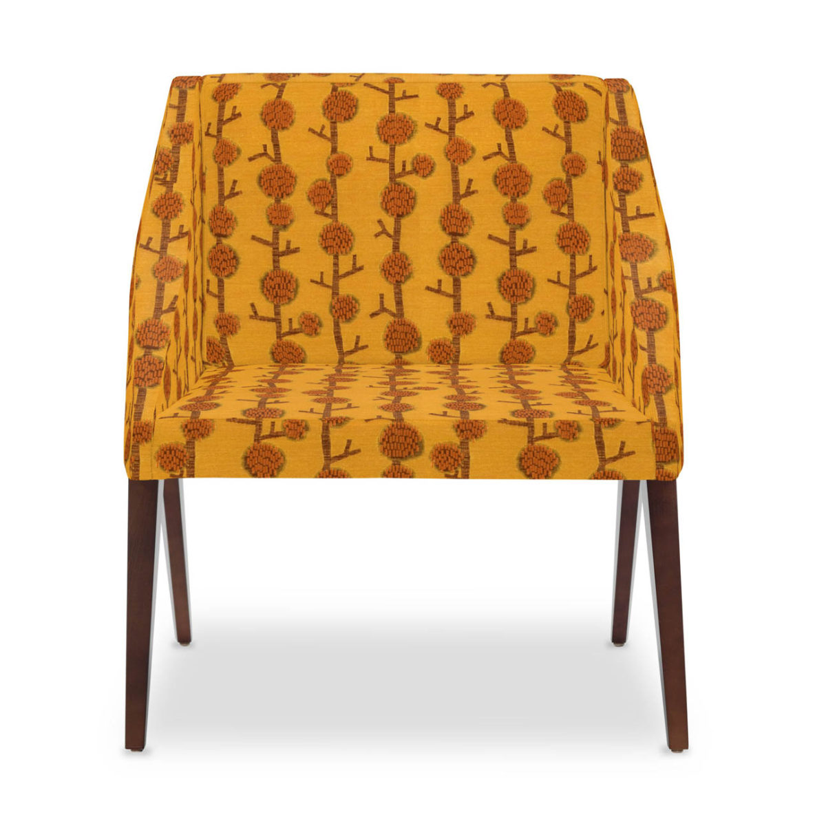
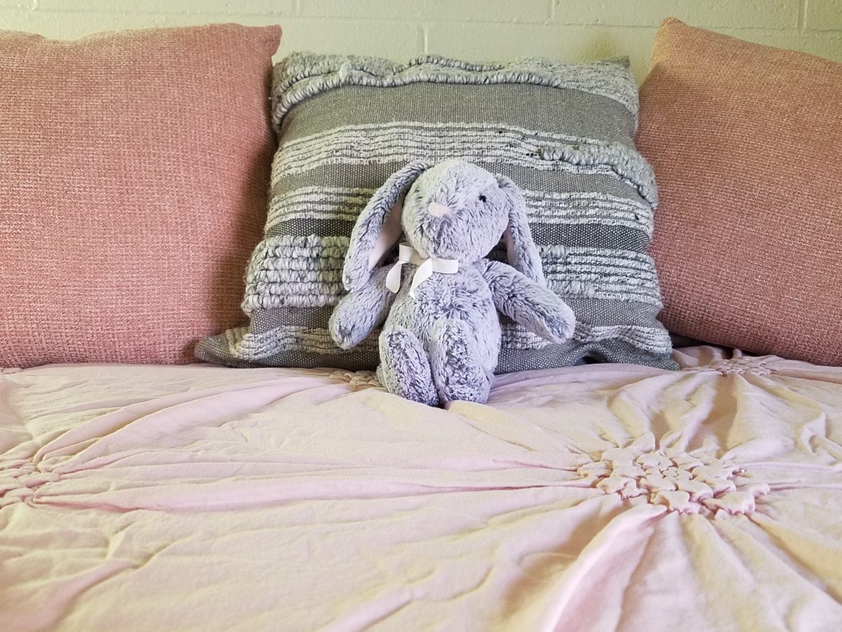
This is the story of a very lucky cat. Her name is Bijou –
French for Jewel. Once the pet, of a
let’s say, “not-ready-for-this-responsibility” somewhat transient
young man living on his own between high school and the next move, she was
along for the ride with kids coming and going, parties and nothing in the way
of consistent comfort and security. Perhaps loved, in a way, but without the
tools or experience to properly care for her, she was collected by a close
friend and given a new home.
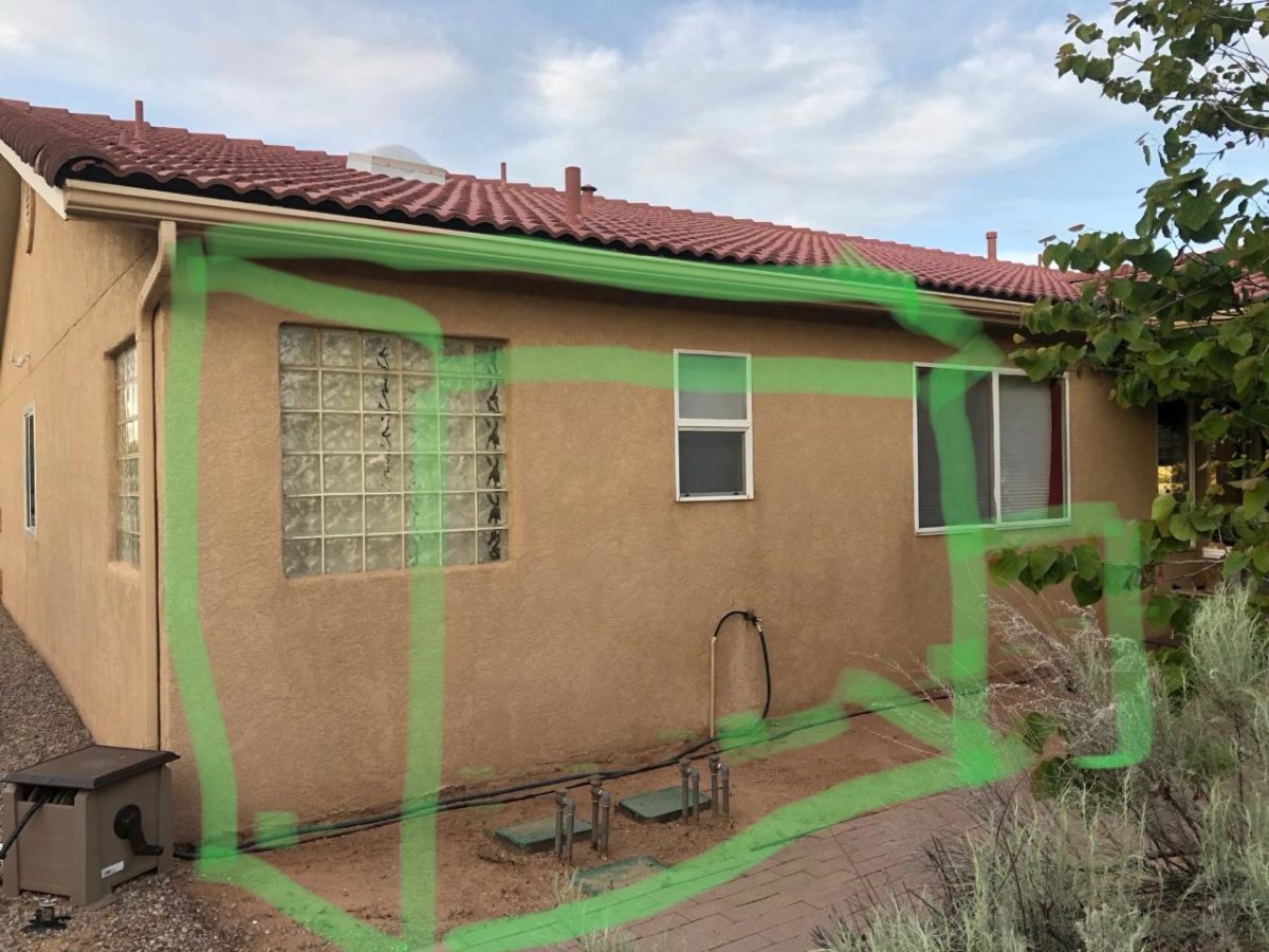
This what the new owner saw.
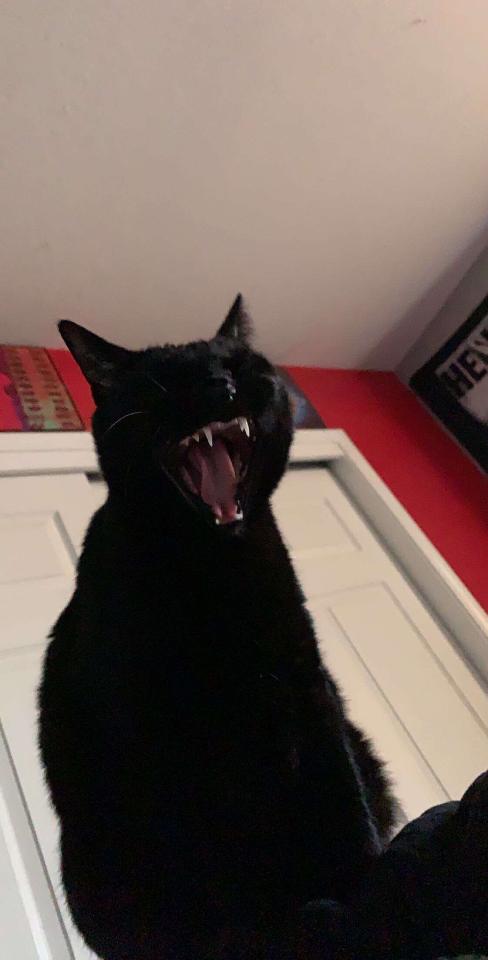
Bijou, a fragile kitty.
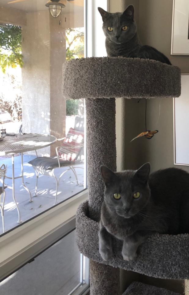
This is what her other two cats saw.
Doesn’t play well with others.
She had led such an erratic life with so much activity and
unexpected actions, activities and unsettling inconsistencies, she was skittish
and defensive. She did not play well
with others. Syd and Sam, her two new brothers, were bookends. They were fairly
mellow and had full run of the house…until now.
Bijou was a mess around them – picking fights and acting
untamed. This spread to her reaction to her new people too – the fear of the
other cats made her skittish to the point of biting and scratching for
seemingly no apparent reason.
Her new owner knew that if she took her to Animal Humane
that she would have difficulty finding a home with her bad behavior and
therefore would more than likely be euthanized. This was not an option. For all
of her crazy, she was still loveable and had become part of the family.
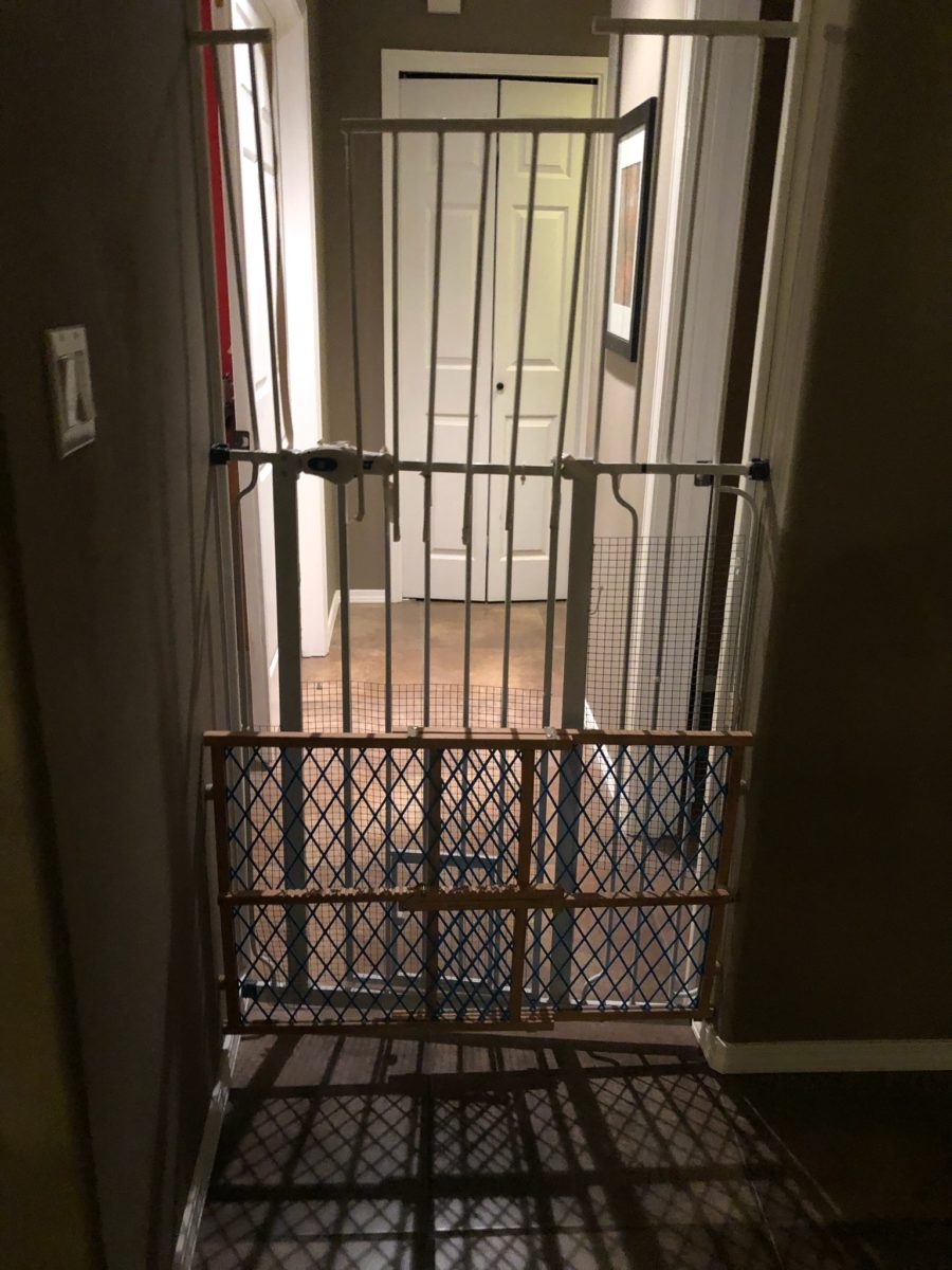
Being isolated to the daughter’s bedroom and end of the
hallway bath, Bijou had a quarantined life. And it was not pleasant nor
convenient for the rest of the household either.
Cat solitary…
Cat psychology and medication were not working. The light bulb went off and her generous and
soft-hearted new owner imagined a
“catio.” With that she began
gathering examples from all sources. Some were elegant and lavish while others
were smaller and efficient. But the idea was to provide an environment where Bijou
felt safe and could commune with nature, relax and release her tensions and
enjoy life.
The plans began…
The idea…
The crude beginnings to plot the location and size evolved…
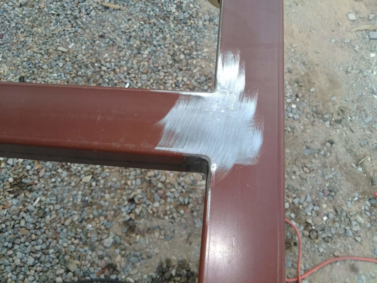
Our magician of a cabinet maker – fine craftsman and
designer of amazing wood cabinets and free-standing furniture, who continues to
claim that he is NOT a welder stepped in to save the day. Against his better judgments,
but with our strong encouragement, Enrique started to investigate.
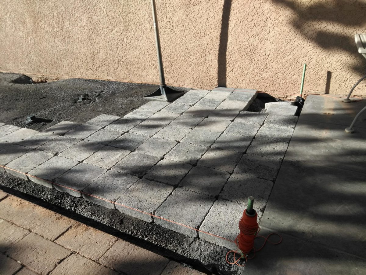
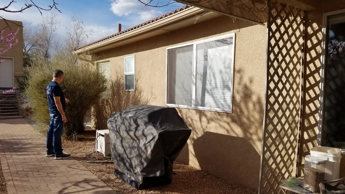
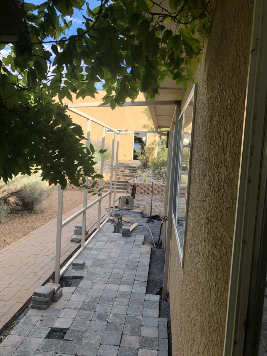
He and I went on the search for materials. Handsome pavers to compliment adjacent materials, (creating a border of gravel to match landscape material and act as a transition between non-matching surfaces), roofing panels, the right gauge of wire and size of tubular steel.
Who knew that the seemingly common corrugated fiberglass panels were not to be found at the national home improvement stores?
We wanted a durable, translucent roof…diffused to protect from the harsh orientation of the summer sun, but to allow softened daylight to wash the space with protection from thee rare downpour during the monsoons.
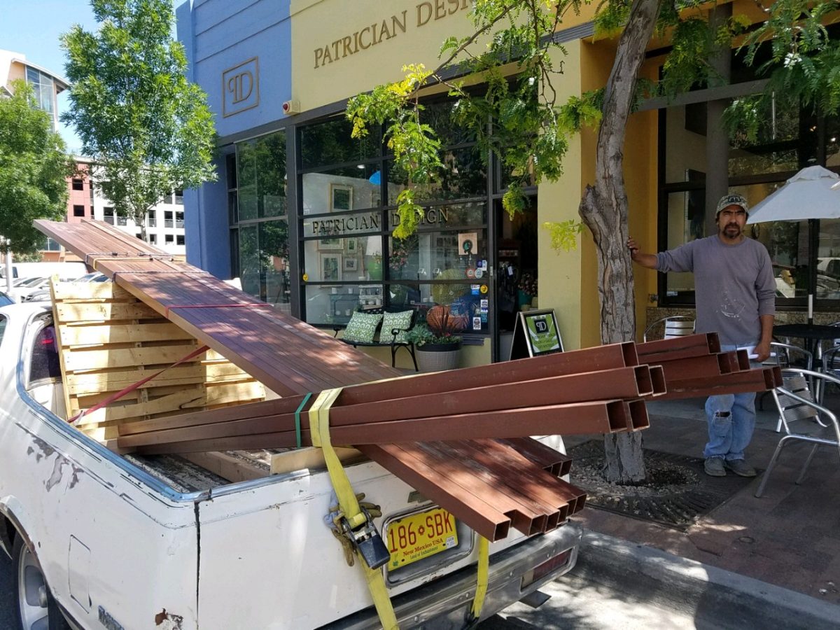
Soon thereafter he pulled up on the curb of PATRICIAN DESIGN with the first load of raw steel.
Enrique’s El Camino is loaded down with steel!!!
With many meetings discussing details including access
through the master bathroom window, entry door for humans outside, hiding place
nook, evading code issues with house egress maintained, space for adjacent
barbeque area, dodging and/or accommodating existing sprinkler valves and
transitions between existing pavers and pavement – the physical work began.
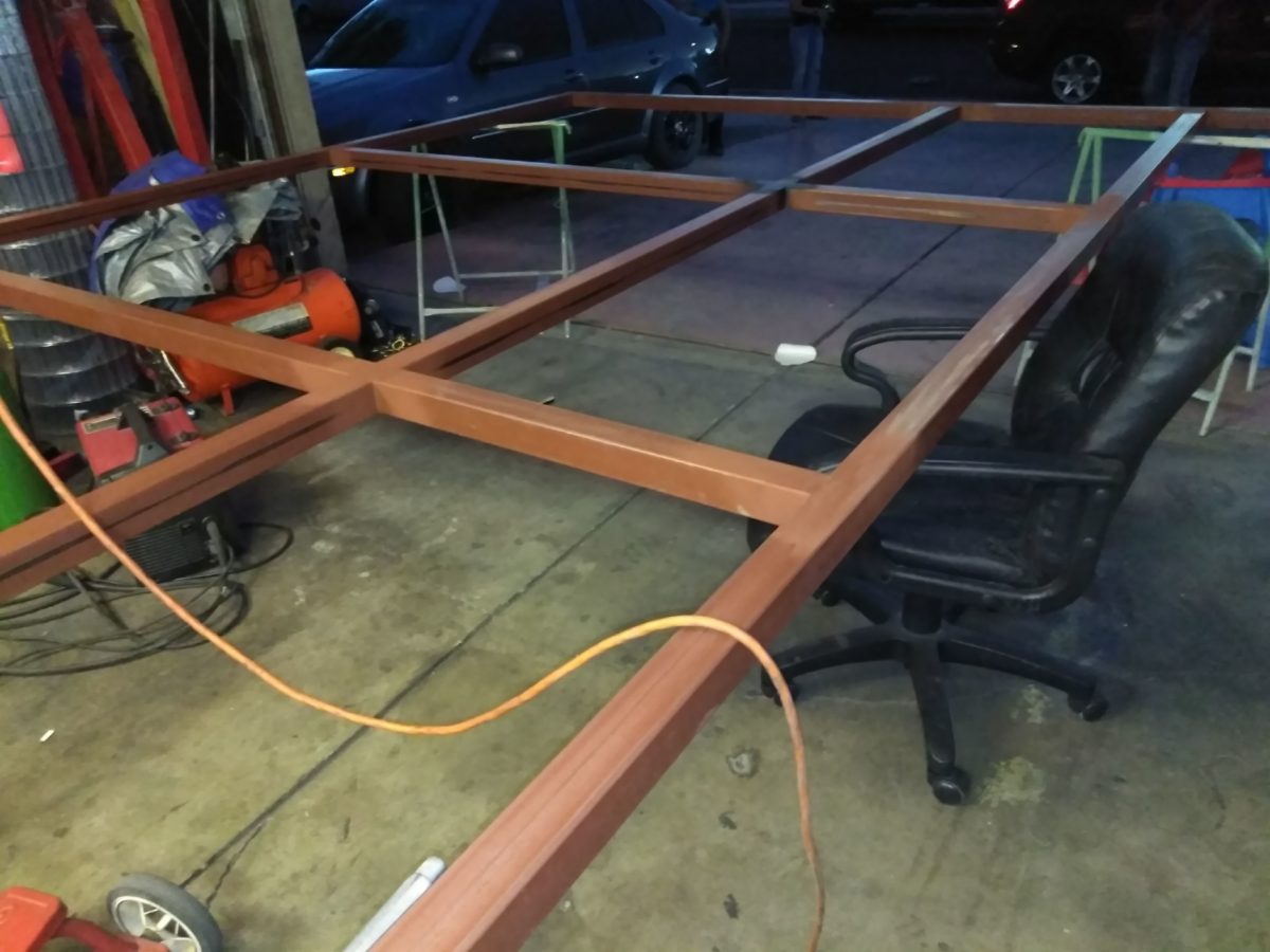
Weeks turned into months as summer passed and construction
continued. The work is tedious. The work is perfection. The welding is
invisible. I remarked that Enrique treats iron and steel like fine wood. He is
precise, careful, attends to every detail and proceeds with the intention that
joinery is invisible and details are fine.
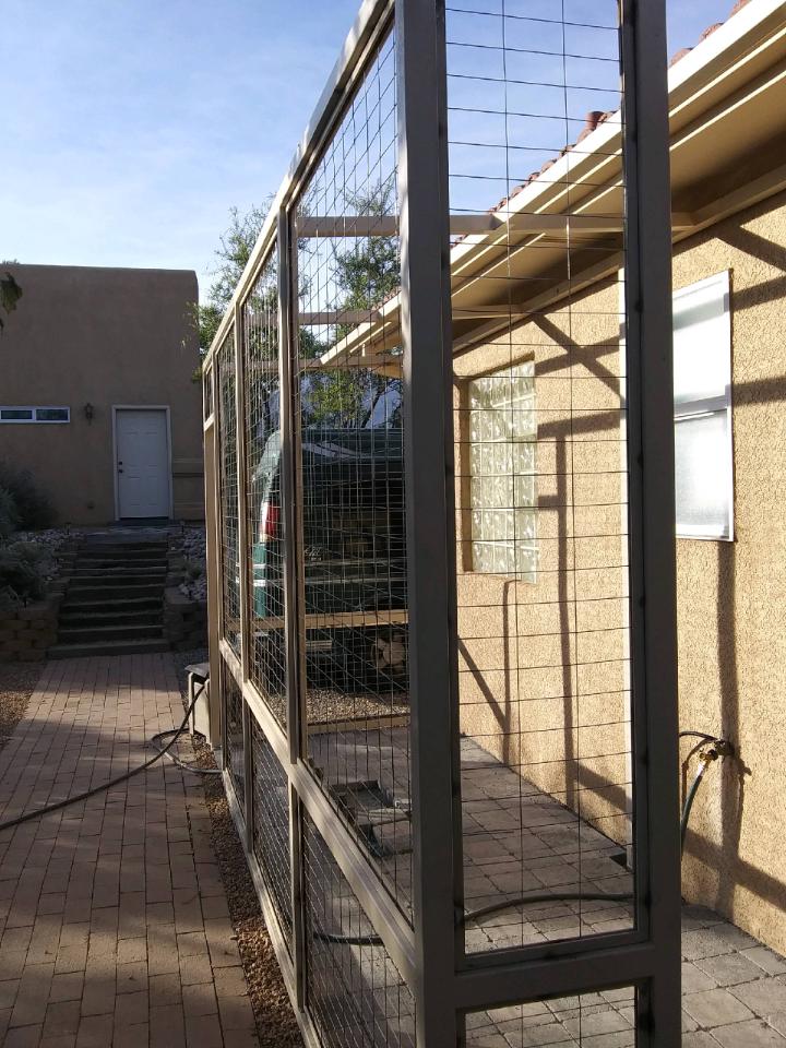
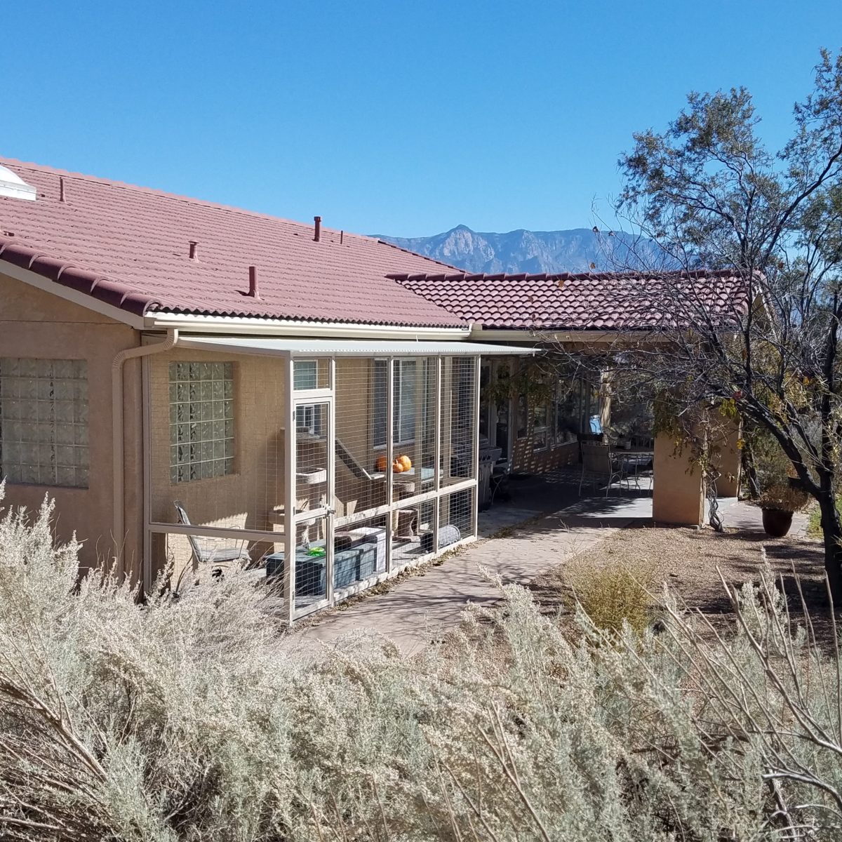
Glass panels are inserted into channels and will ultimately be lit at night with the intent of having the family each paint an image on the glass depicting cats, nature – whatever speaks to them about this very special catio.
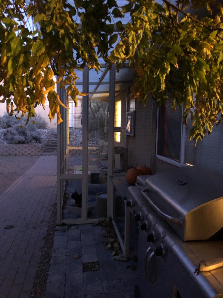
The roof structure is extended the full length to allow for a new covered grilling area – bonus detail!! A low “hiding area” for Bijou is a work-surface for the grill too!
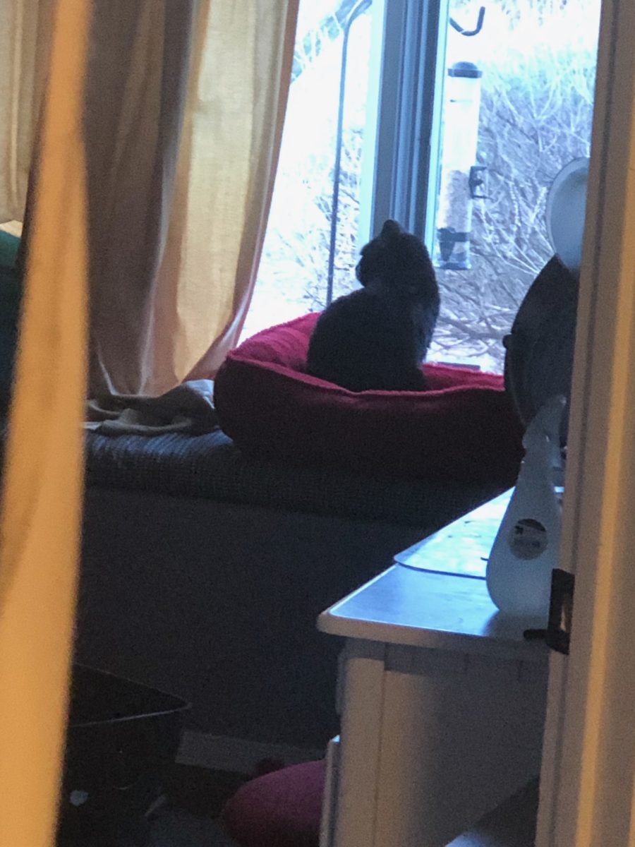
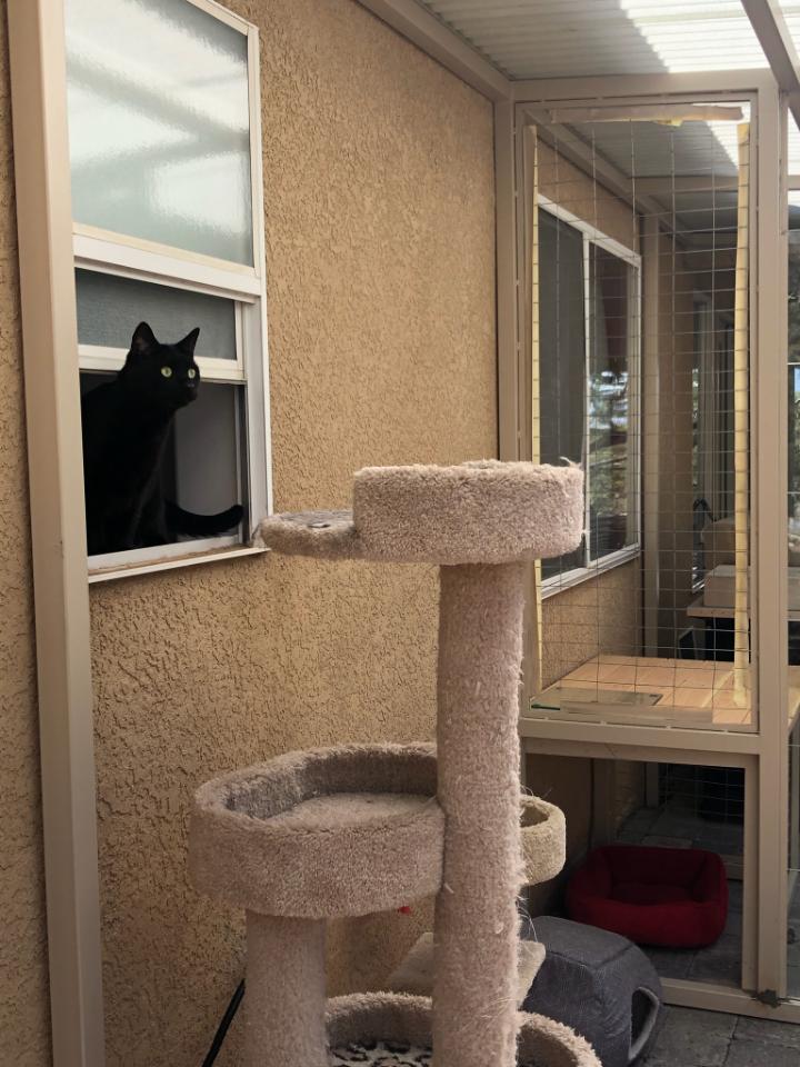
Bijou has just been introduced to her new environs.
She came in through the bathroom window…
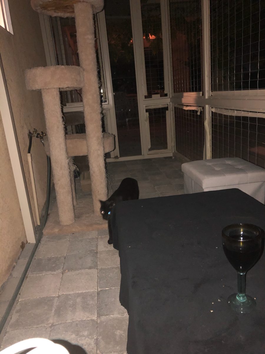
The weather is turning and there is a chill in the evening air, but she and her benefactor enjoy sitting out there with a glass of wine and listen to the crickets as night falls.
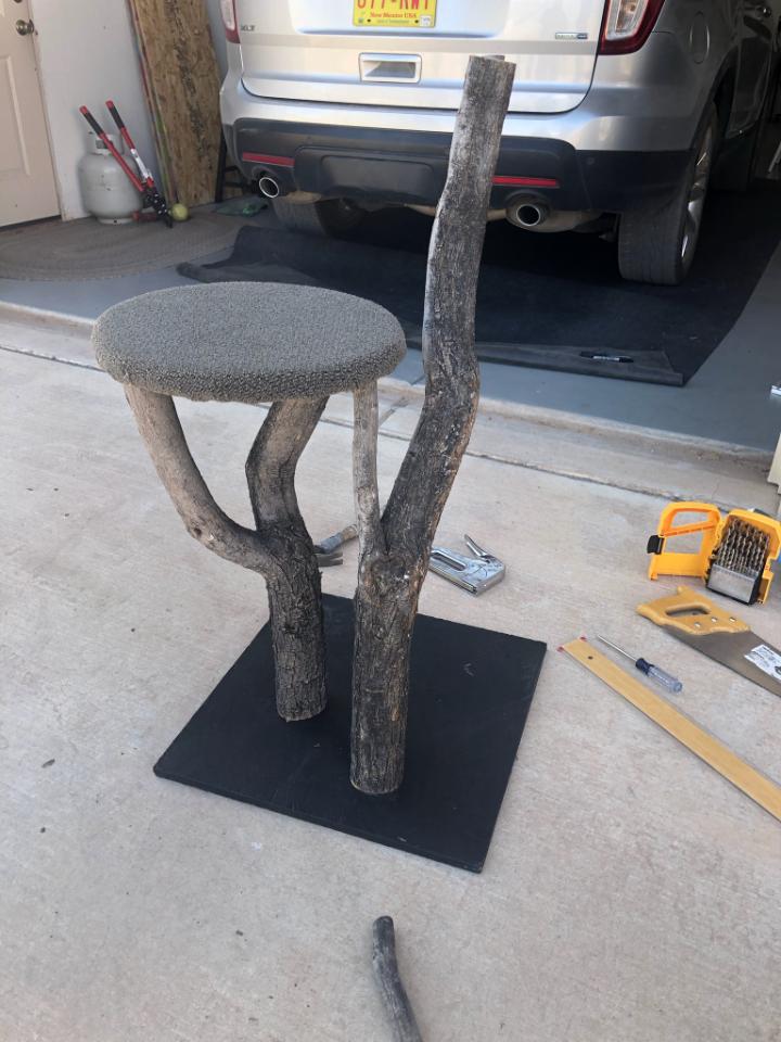
The kind-hearted husband is getting into the swing of things by making this perch using weathered wood from their backyard and left-over carpet from their interior remodel.
More finishing touches will be coming in the way of the painted glass panels, ramps and ledges for Bijou, …
…so that every day will bring a more beautifully outfitted catio for this very lucky cat! Watch for the finished product!
Had I planned this blog, I assure the readers that it would have been more thoughtfully compiled. However, as it is a pure reaction to recent exciting experiences, I am without much fodder that, although was before me, I neglected to document. Such as card racks full of Georgia O’Keefe greeting cards featuring prints of her magnificent work and exact pairings of the amazing landscapes we witnessed with her paintings and her magnified flowers too. Dashing in and out of her distinctive museum just off the Santa Fe Plaza bearing her name and thoughtful work (a MUST see when visiting Santa Fe), to stepping up the steps at the Ghost Ranch Abiquiu property, I didn’t document as I was too busy looking at and absorbing – so much. Yet without prior planning, I seem to have assembled enough that surprises me and therefore has become the body of this blog, about taking time to look…
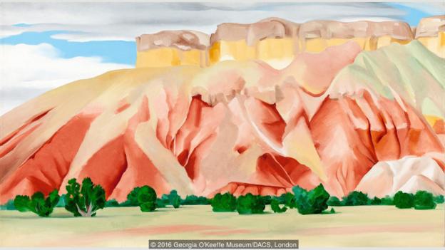
The striations of color are as though painted – nature and its creator – amazing art and artist.
On this recent road trip and surrounding days in our immediate environs, I experienced inspiring images and pairings, beauty and detail, color and form…that evolved into this blog featuring the landscape and expressive paintings of Georgia O’Keefe. Captivated by the remarkable light and surreal landscape as have been so many artists, O’Keefe settled into the colorful backdrop of Abiquiu where the formations of color, sand, rock, and sky were interwoven with sparse, but all the more beautiful vegetation and flowing water carving its way through the enchanting scenery.
Those of you who enjoy taking photos, capturing moments, items and scenes will appreciate the exhilaration and awestruck sense of this humble presentation.
An iconic land form Abiqui, New Mexico
Art and nature. Design and nature. Nature
inspires artists and designers with color and proportion. The natural world is
a limitless collection of examples of perfection, majesty, detail and form.
Living in New Mexico presents amazing opportunities for studying so many
offerings from the natural world – verdant valleys and lush bosques to towering
mountains, contoured mesas, golden plains, glistening rivers and rainbows of
geology rising up from the earth. The sculptural land formations are what seem other-worldly. And yet there they are – majestic sculptures
against the sky.
O’Keefe was keenly aware of the extraordinary
world she encountered and she captured it through her eyes and expressed through
her strokes with fluid sensitivity and sense of color.
Georgia O’Keefe loved and appreciated around the world for her sensitivity and ability, to capture and convey her enchanting surroundings.
Very real and hauntingly beautiful landscape of Ghost Ranch – Abiquiu, New Mexico translated into the sharp, crisp, colors and forms of O’Keefe’s paintings.
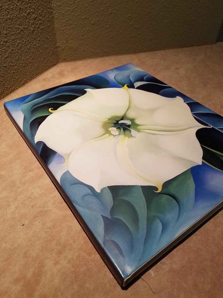
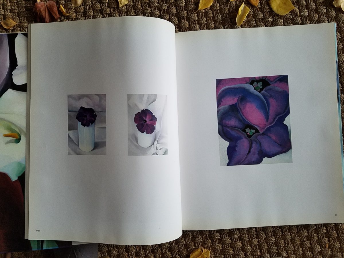
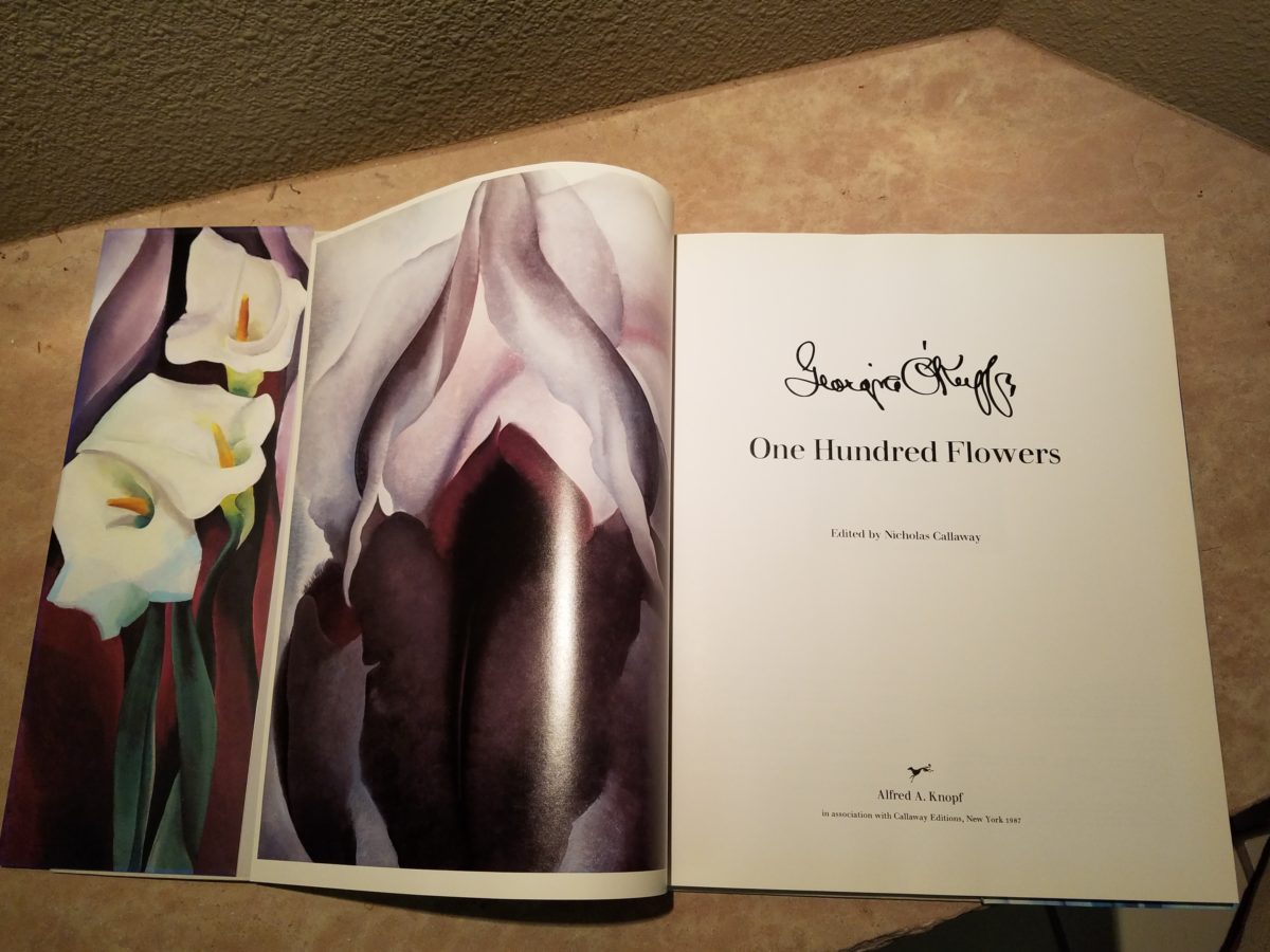
Years ago a very dear friend gave me an exceptional gift, of a book. The farther along I progress in this world and enjoy the vast opportunities to appreciate the beauty of nature, limitless boundaries of design, art and all that is produced by talented, creative, observers, treasures such as this have increasingly greater meaning. One Hundred Flowers a 1987 masterpiece collaboration of photographer, publisher, editor and scholars presents an outstanding collection representing this significant subject matter – flowers – that she took time to observe.
Up close and personal…in intimate detail she saw and rendered sensational studies of flowers. Expanded to enormous scale well beyond their reality, these explosions of color and contrast, fluid form and detail are amazing to encounter. Even in the pages of this stunning book her work is startling. In person it is awe-inspiring.
Upon returning from the Abiquiu visit, I retrieved my beautiful book. I took great joy in the dust cover – suitable for framing. A brilliant white squash blossom captivates, before even opening the cover. As I leafed through these large format pages in this lovely, exquisitely bound tome, I realized that, within a week prior to this O’Keefe familiarization trip, I have taken photos of flowers for a similar reason as she – stopping to look and observe their singular beauty amidst all else in the surrounds.
Unknowingly, a couple of days earlier I captured this spectaculalr squash blossom that had survived our first frost.
Just a few days prior to the Abiqui visit, while walking among the petroglyphs at the base of the dramatic black volcanic rock rubble of our west mesa, we came upon a singular, stellar squash blossom. Having survived recent frosts, this one was luminous and brilliant among so many other spent blossoms dried and shriveled away for the season. It was irresistible.
Little did I know, at the time we encountered this beauty of a squash blossom, that I would soon revisit O’Keefe’s studies of this wild and magnificent bloom.
Here more studies from the One Hundred Flowers book featuring this dazzling white squash blossom.
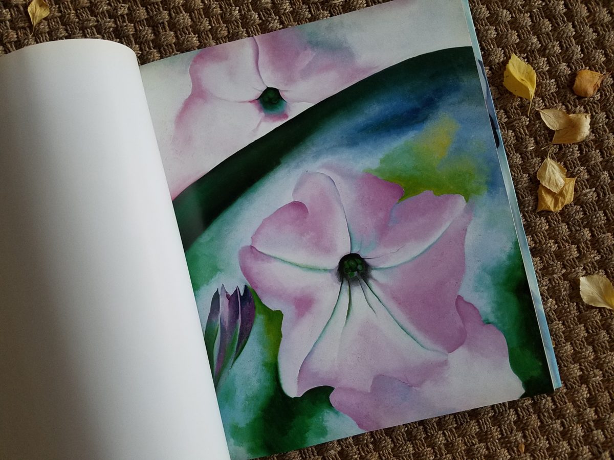
In the design world, we often quote architect and furniture designer Ludwig Mies Van Der Rohe (1886-1969), one of the founders of modern architecture and an advocate for the simplicity of style with his popular phrase “less is more.” I felt that O’Keefe’s interpretations distilled the forms of her subjects to the essential elements that best conveyed them in a manner of simplicity. Her flowers are bold and clear sweeps and contours, of the design of each. Distilling to these essential elements is the practice of “less is more.”
Her bell-flower trumpets of petunias and hollyhocks in purples, pinks and even arresting blacks reminded me of a photo that I took less than two weeks prior to enjoying my book for this study.
However, she was not sparing with color nor scale. Fabulously daring color combinations and contrasts are signatures of her interpretations along with her magnificent sense of magnification – presenting bold gifts to we, her viewers.
The opening of the book quotes O’Keefe about her profound
appreciation for a flower.
“A
flower is relatively small. Everyone has many associations with a flower – the
idea of flowers. You put out your hand to touch the flower – lean forward to
smell it – maybe touch it with your lips almost without thinking – or give it
to someone to please them. Still – in a way – nobody sees a flower – really –
it is so small – we haven’t time – and to see takes time like to have a friend
takes time. If I could paint the flower exactly as I see it no one would see
what I see because I would paint it small like the flower is small. So I said
to my self – I’ll paint what I see – what the flower is to me but I’ll paint it
big and they will be surprised into taking time to look at it – “ Georgia O’Keefe “About
Myself,” 1939
Be surprised. Be inspired. Be aware of your surroundings, for all the beauty of nature and its influence. Embrace color and contrast, punctuations and accents. Take time. How might your next design project reflect observations from nature?
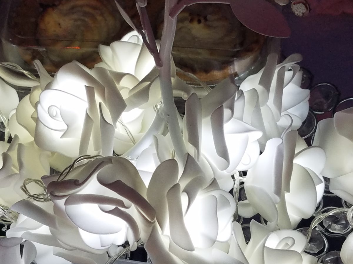
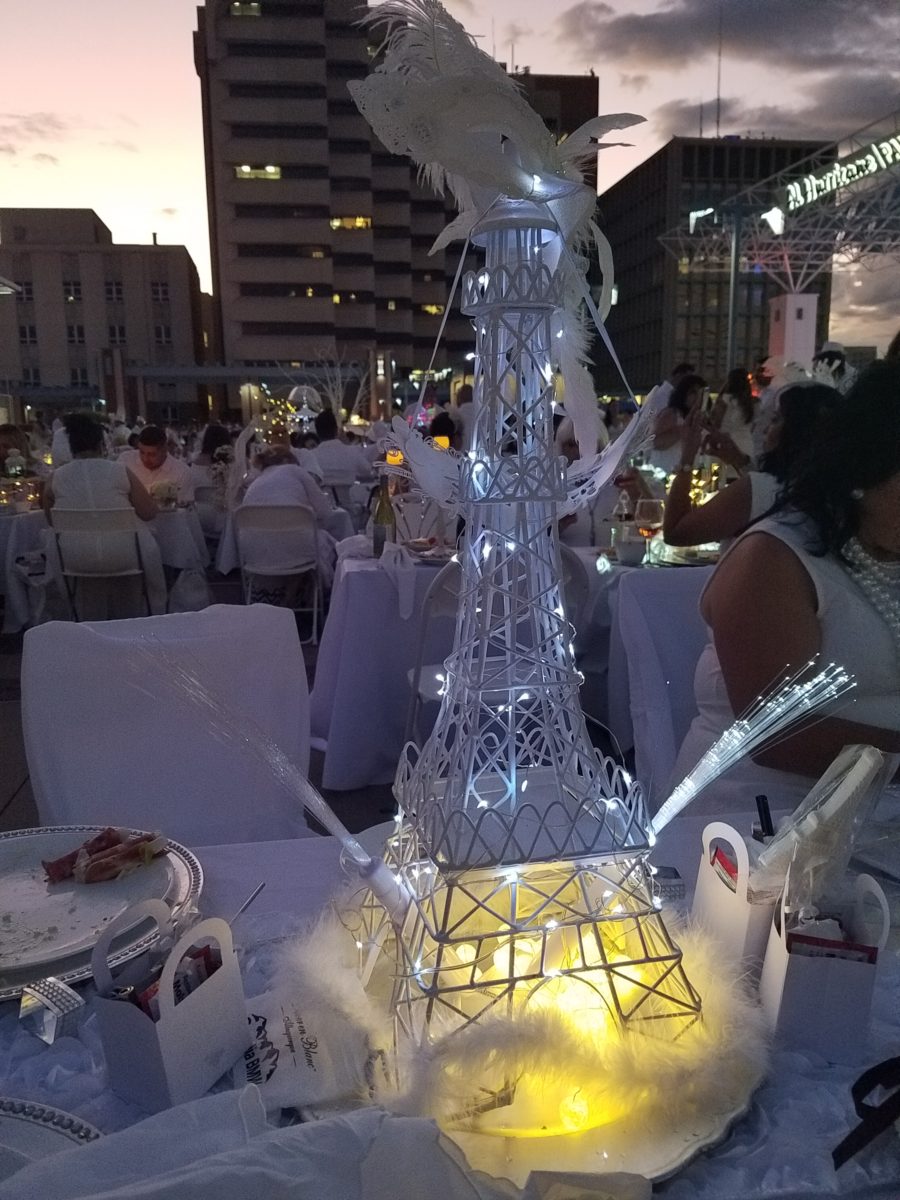
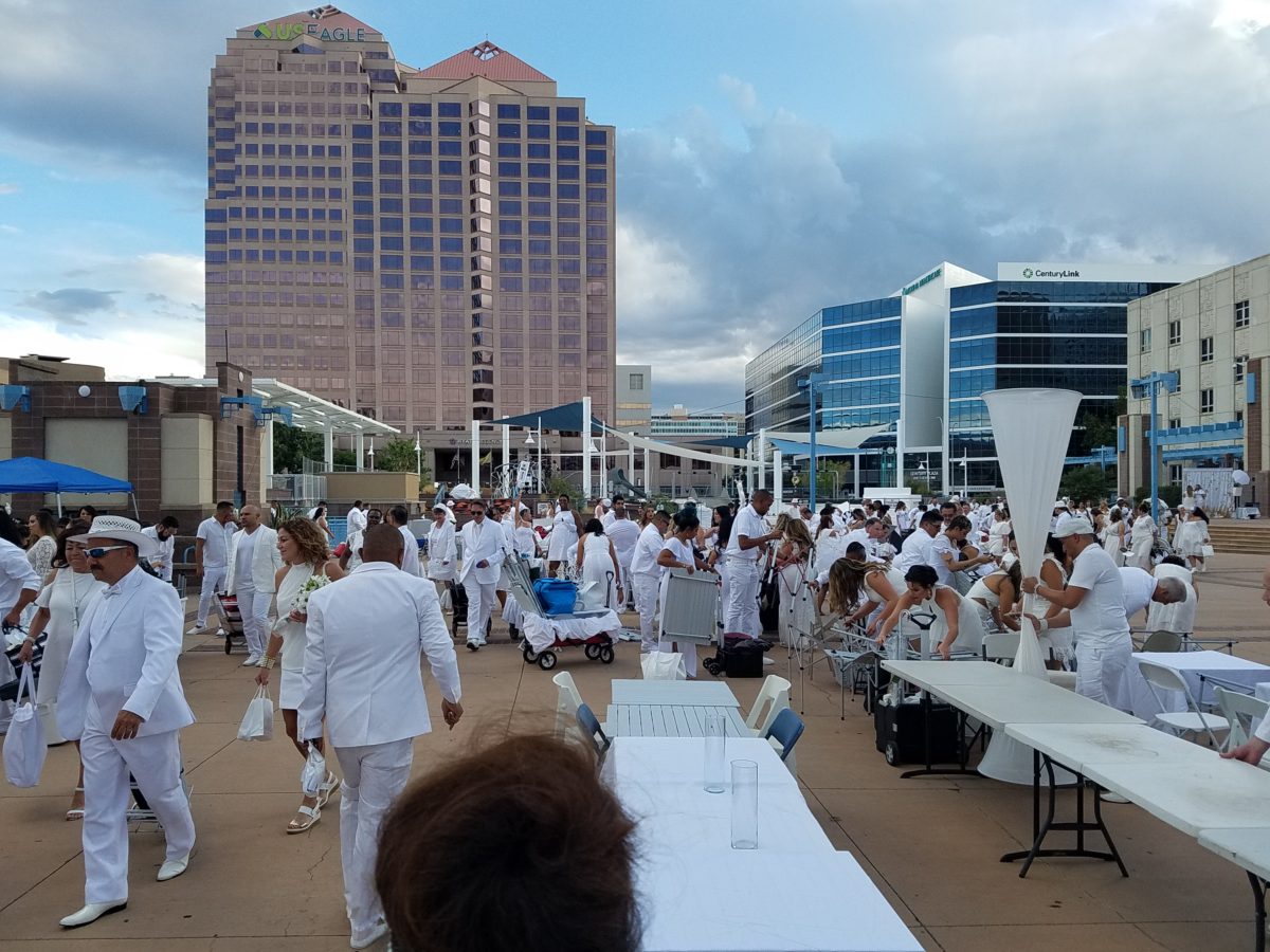
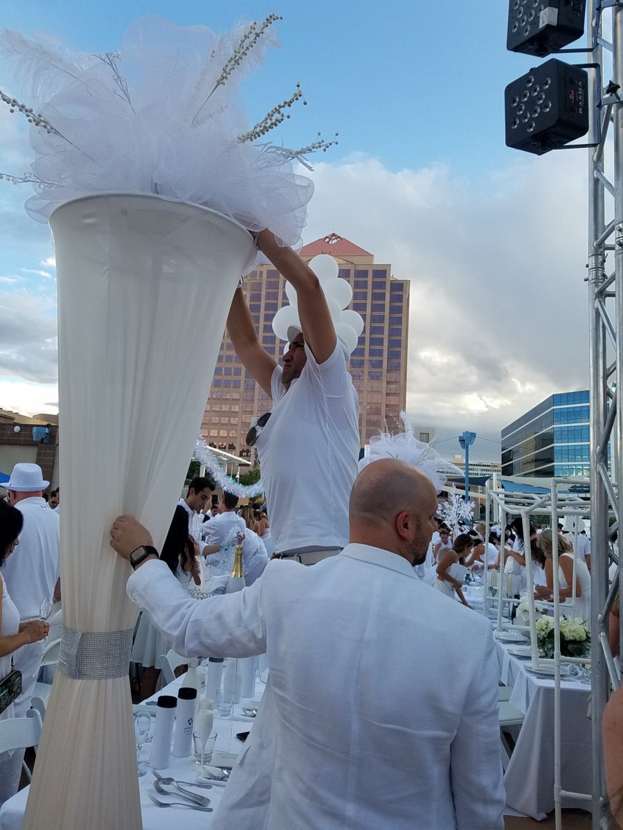
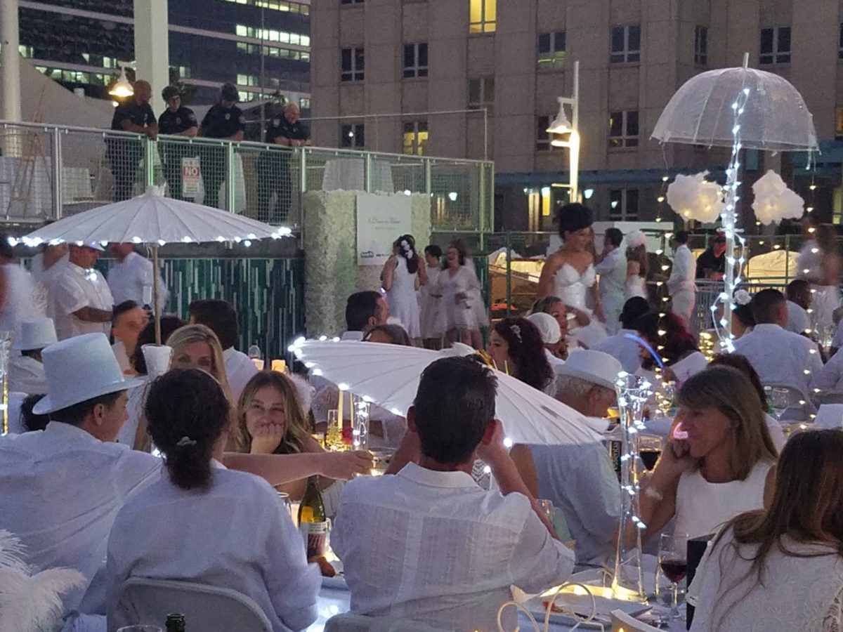
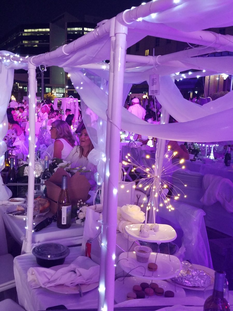
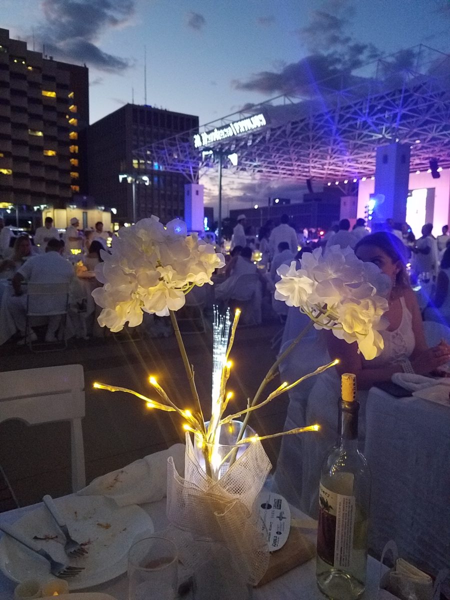
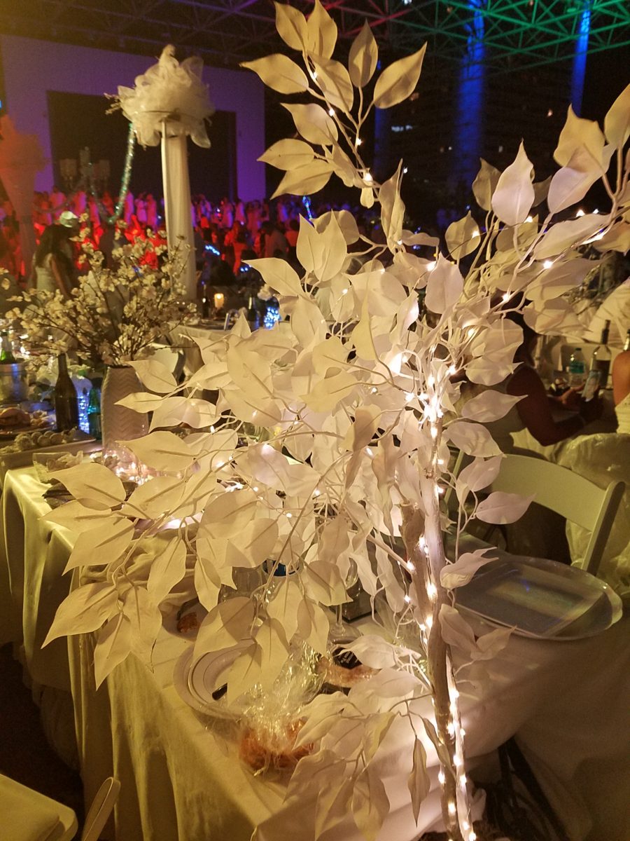
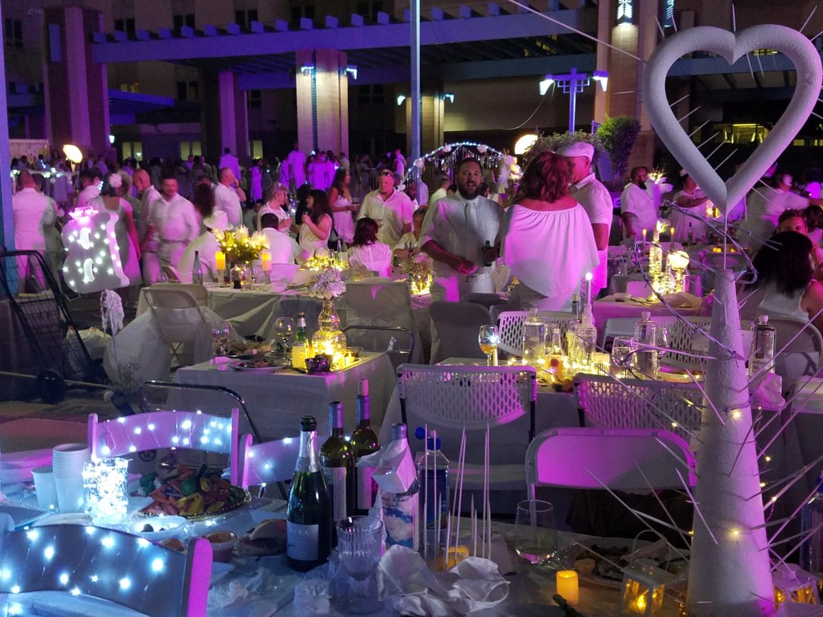
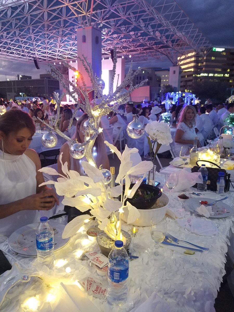
Inspiration for centerpieces – here – a neutral color scheme – white on white on white…Often limited to weddings, take a tip from a social phenomenon – Diner en Blanc for dramatic centerpieces! Any of which could be ablaze with seasonal color – depending upon your desired theme. And with the advancements in LED lighting, the colors are limitless and instantly changeable.
The Diner en Blanc is an international event that began in Paris, 1988. An amazing concept that began with an invitation among friends to an elegant al fresco affair. This unique gathering was prestigious and decadent.
The remarkable event spread around the world and Albuquerque has celebrated this creative event for several years. This is my second experience with this white fantasy. Every year the venue is kept secret only to be revealed at the last moment when attendees are assembled and usually transported on buses to the destination. This surprise location was right across from the designated gathering places downtown. And instead of boarding a bus each group, expecting just that, cued up as though to go aboard – only to be led single file across the street to the expansive Civic Plaza!
One big patio party!
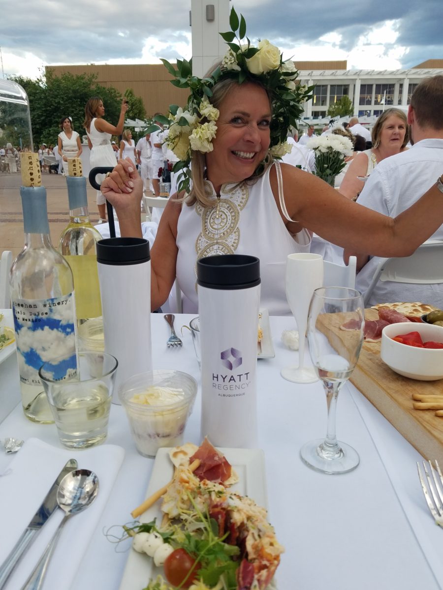
This year with the Hyatt Regency team screaming with creativity from the table dressings…to the phenomenal food…to the fabulous frivolity – it was magic!
Would you believe luscious, chunky lobster salad served in a half tail, sliced beef filet and many artfully decadent extras…
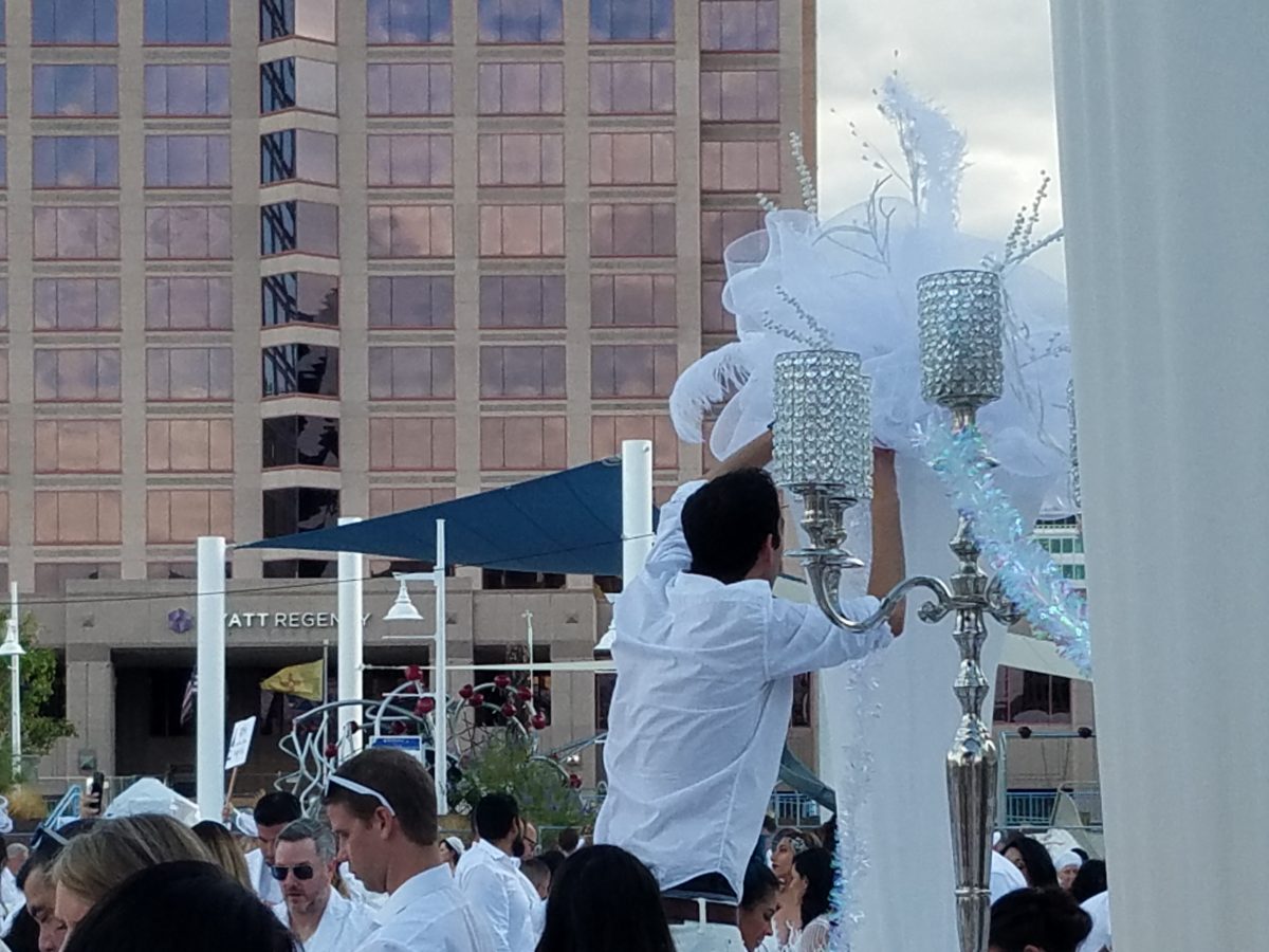
Asked to wear white, bring your own tables, chairs, table
dressings, centerpieces – all in white – the evening unfolds with exciting
flurries of fabric, flowers, statuary, lights – all intended to make a
spectacular statement for each group’s table.
Imagine all of this theatrical staging with 2,000 performers (we) in one enormous space – outside in the perfection of a last ditch of summer evening. It is a remarkable event.
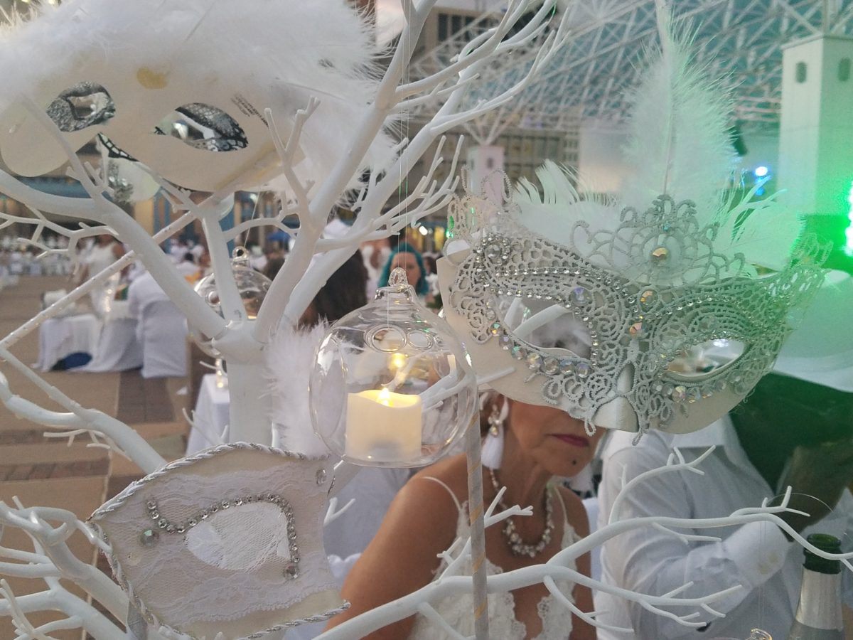
Pretty parasols…mysterious masks…
As I strolled through the tables capturing photos of the various “tablescapes”, I realized that the creativity was applicable to so many possibilities of table dressings – with color added!
LED lighting set the scene aglow with myriad magical colors! It changes the perceived temperature of a scene.
So enjoy seeing these creations and imagine them in seasonal splendor – fall now…winter coming…spring bursting forth and summer ablaze with color – for your upcoming parties throughout the year!
The scene changed and darkness fell..
With magnificent mariachis to flowing flamenco dancers the entertainment was dazzling and morphed into an enthusiastic DJ who rocked the stage for dancing into the night… It was an exterior nightclub – an excellent setting for a many faceted affair! https://www.facebook.com/DinerEnBlanc.Albuquerque/
An elegant table for Dion’s Pizza and water bottles!!!
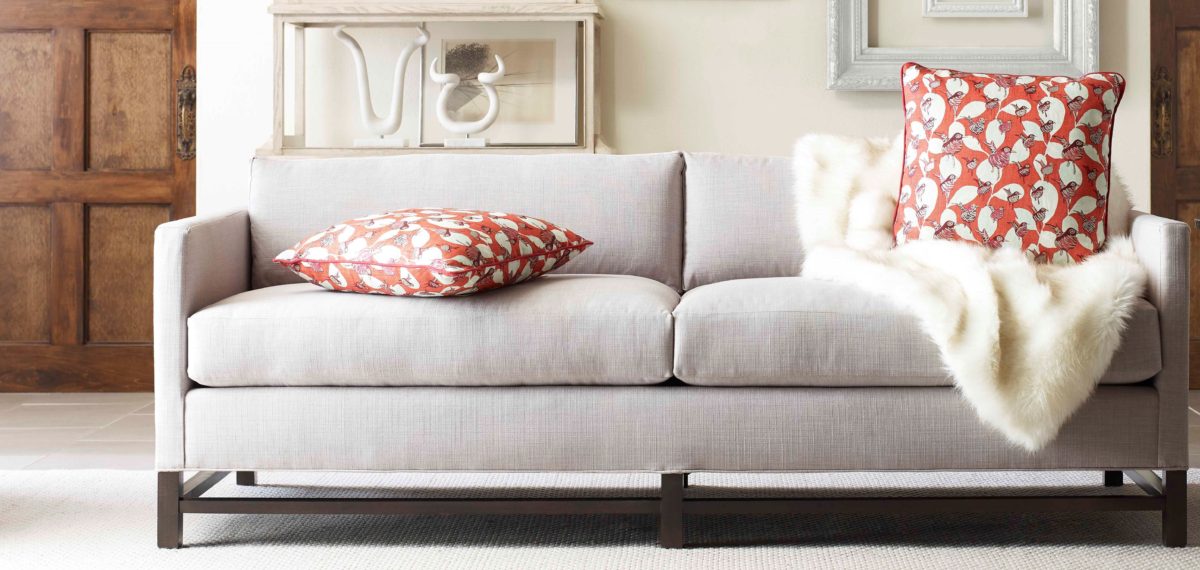
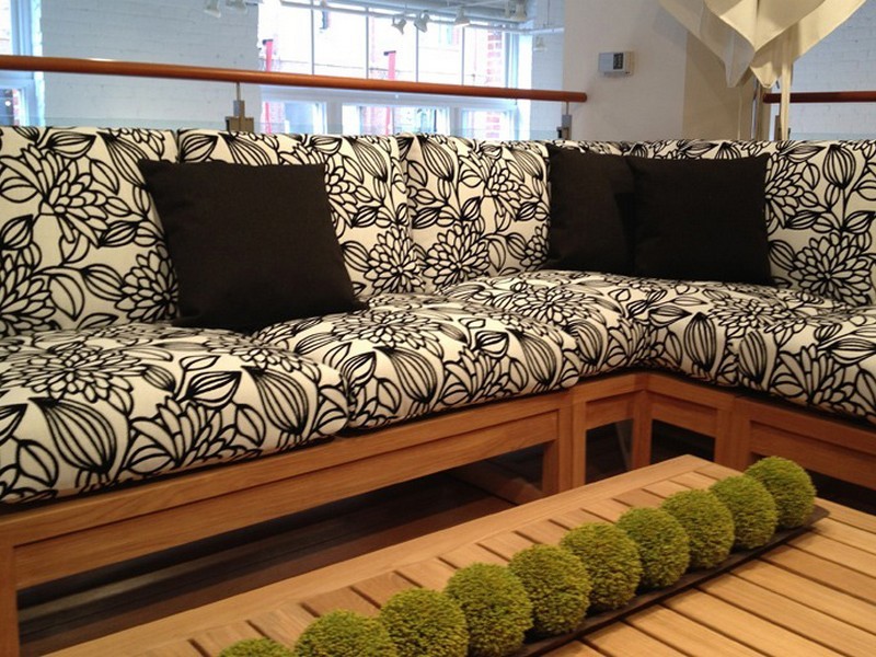
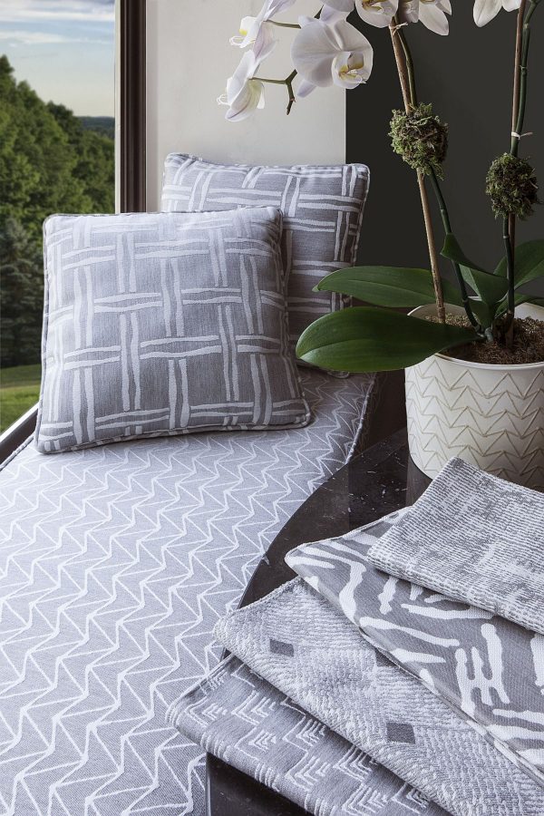
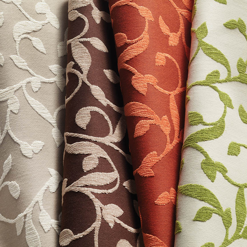
Some fabrics are just so fabulous that they can carry a design scheme. You could wrap a rock with them and feel that they are accomplishing the design statement to set the theme, mood and encourage interest, if not confidence in comfort! Stimulating the senses is a major part of design.
Often, a throw pillow can make an effective accent. We joke often when we find exclusive fabrics in the hundreds of dollars a yard and say “Perhaps a throw pillow?” Knowing that the projects affording such luxury for miles of drapery panels are few and far between!
Duralee offers statement furniture pieces of unpretentious luxury and comfort with a collection of fine fabrics that will satisfy any budget. Birds take flight from this delightful Duralee pattern.
Sight Sound Smell Taste and Touch – you know. Colors and textures catch one’s attention. They set the mood.
Upon entering a space you take-in the colors and textures and if fabric is in play.With further tactile examination fabric contributes greatly to these two sensory perceptions – sight and touch.
This playful Donghia organic has fuzzy tactile balls sprouting from the linear twigs. From the “ground” to all the intertwining and overlaying weaves, the complexity of textiles is exciting. Come see these exceptional designer fabrics in our studio.Many fabrics have multiple colorways. If you see an intriguing fabric that’s not “your color”, its worth asking about the entire collection.
Juxtaposition can also be an effective technique. When placing a modern pattern on a vintage piece, you breathe new life into the forgotten history – refreshing and capturing the best of both worlds!
You might not have a lot of confidence in someone who wants to wrap a rock to make a design statement. However, my point is, when you love something you want it regardless of the delivery system! Find fabrics that you love and insert them into your rooms – home or office. It’s like your favorite flavor. Sweet or savory – slather it on a piece of cardboard and you’ll be significantly satisfied. You need not struggle with how to do it – just make it happen. So to get a little taste of an exciting textile, make a table runner, simple dining chair seats, select a backing and make a throw or an accent pillow. Bring the joy of exciting textiles into your interiors.
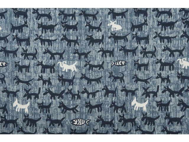
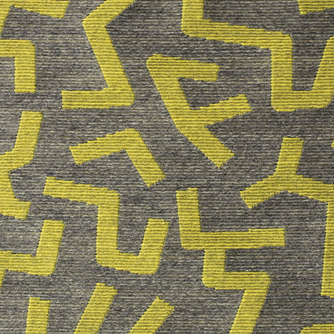
Here are a series of fun fabrics from our source library – tools of the trade. We LOVE fabrics and must touch the texture, feel the weight and evaluate the colors. Seeing images on-line do NOT do justice to the many incredibly creative textiles are available to enhance interiors.
Cute critters march across this sophisticated yet whimsically novel woven.
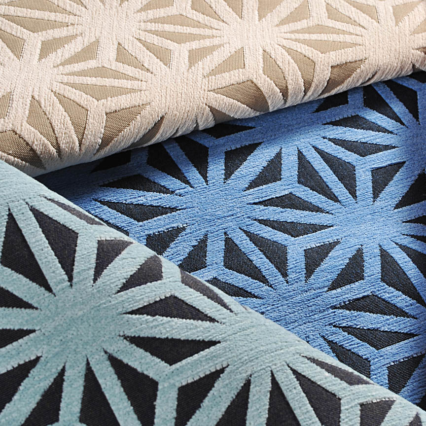
Other considerations not necessarily in evidence are the wear-ability/durability of a fabric and the resistance to ultraviolet rays, mildew and other elements. Wool is inherently flame retardant, for example. And exteriors have come alive as these amazing performance textiles will often fool you in disbelief that they have the properties to withstand the radiating ultra-violet rays of the sun and damp conditions which invite mold and mildew. These incredible fabrics are truly indoor-outdoor in appearance and extraordinary performance!
High-performance luxury weaves such as jacquards, piques, tapestries, matelassé, ottomans, damasks and sheers defy their extraordinary performance properties.
Roy Hamilton a recognized designer in many media, brings fresh patterns to Chella. Roy Hamilton, designer of exclusive ceramics, sculptural and textural interior elements and fabrics for over sixty years.
Call for an appointment to explore our source library for the most unique fabrics in the world!
Floor-to-ceiling shelves of samples await your exploration for commercial and residential application!! You can order most textiles by the yard!
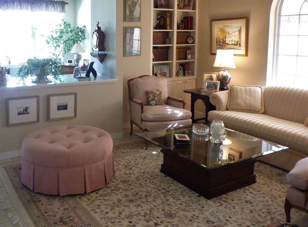
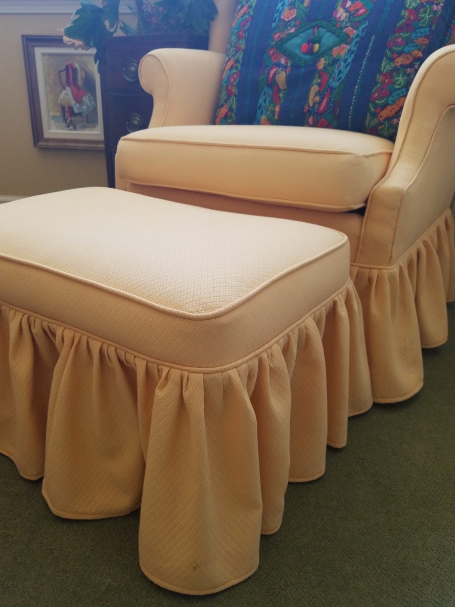
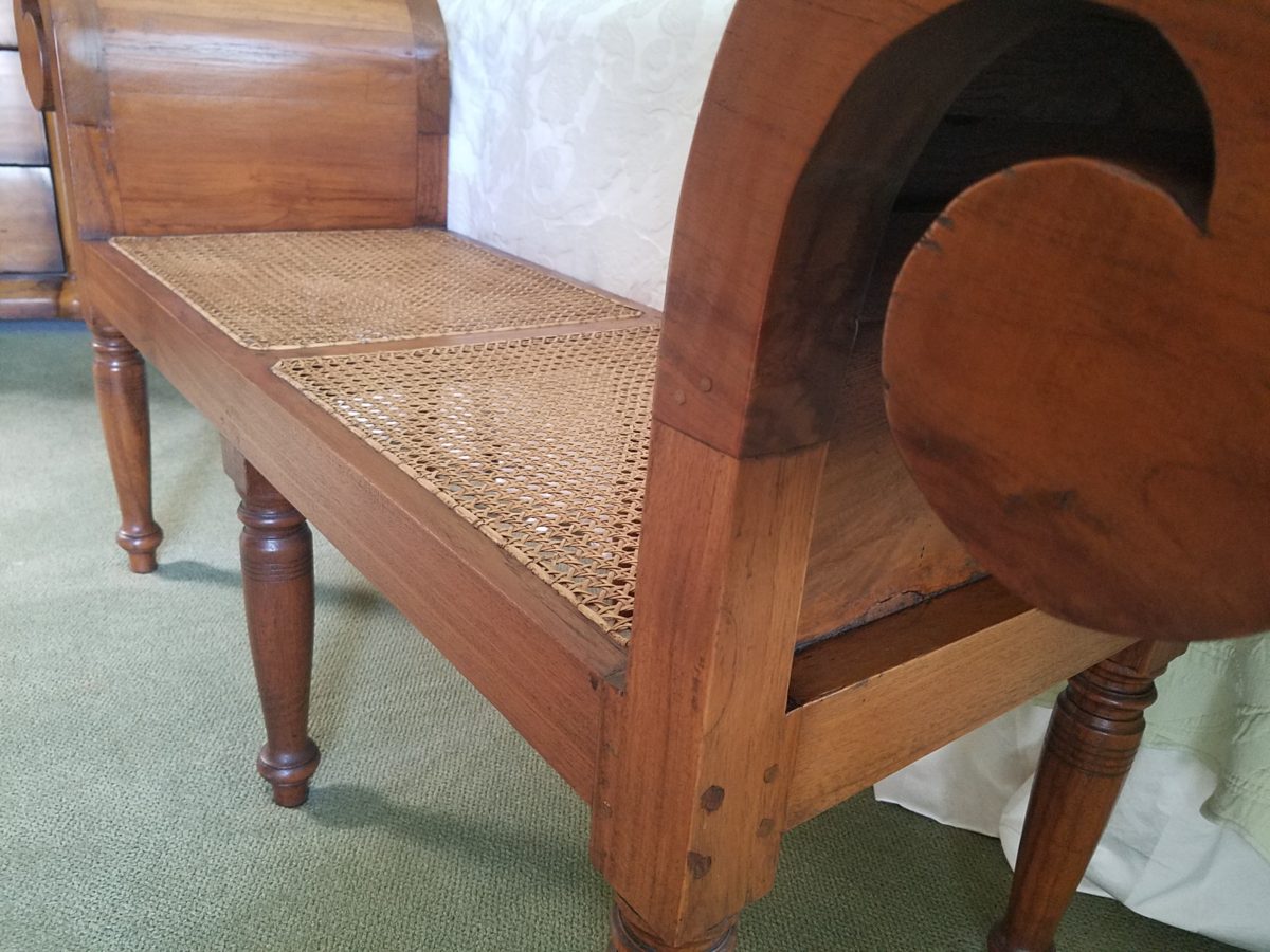
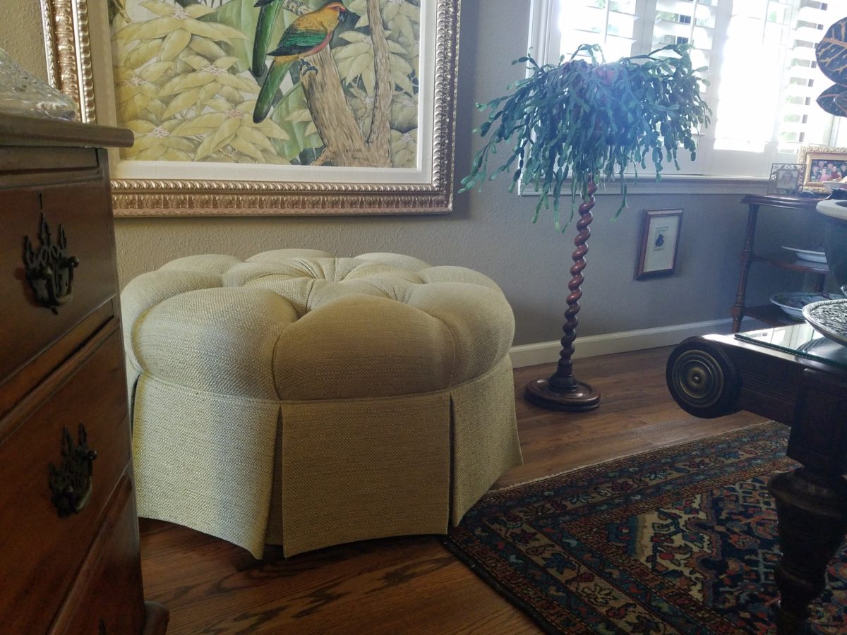
It’s always a good idea to have extra seating, but in small spaces, it’s not always easy to make a room arrangement work. Apartments, lofts, condos…pulling up dining chairs isn’t necessarily the best solution. What is a great solution is something low that does not block the scene and can be easily moved to change the groupings.
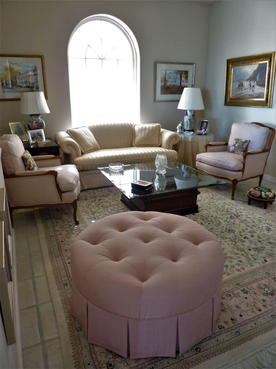
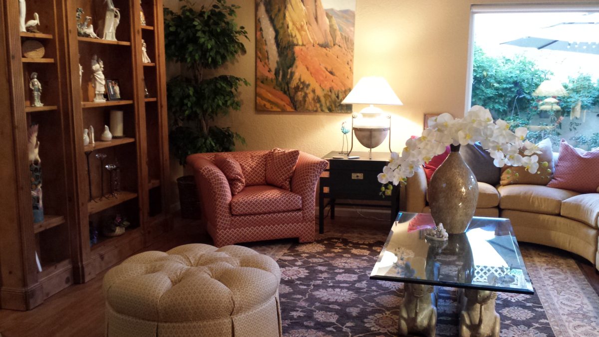
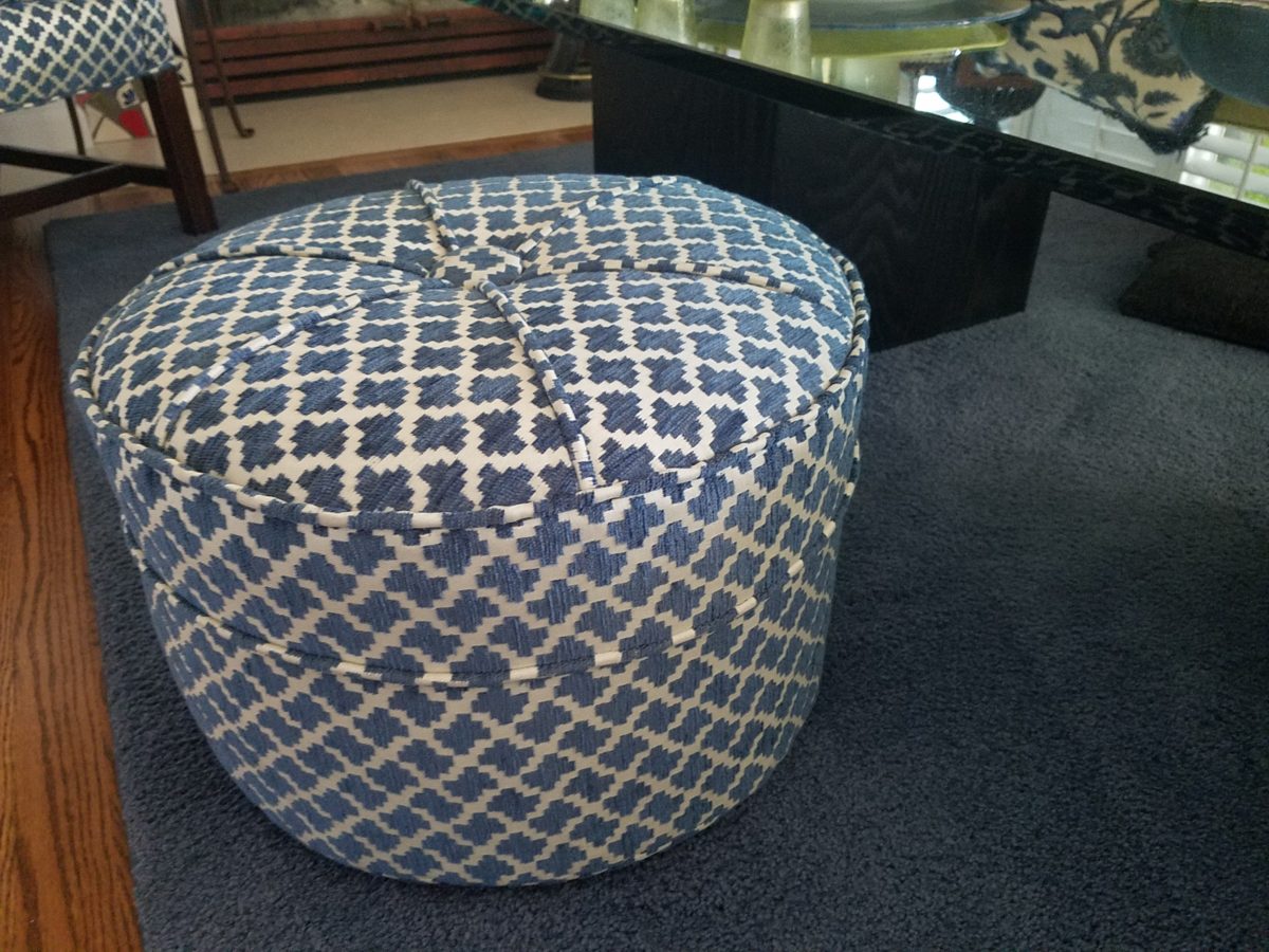
Footstools, benches, poufs, ottomans…as an ensemble with a chair or a stand-alone piece, the options are endless. Trends are often spawned from necessity or convenience of not change for the sake of change.
Bedrooms can also offer footstool/ottomans when there is only room for one chair. For reclining to read or as a pull-up for a second seat.Benches are a great seating option.It’s not a wonder that we have sold numerous of these clever SURYA Cotton Poufs in myriad colors in our shop!
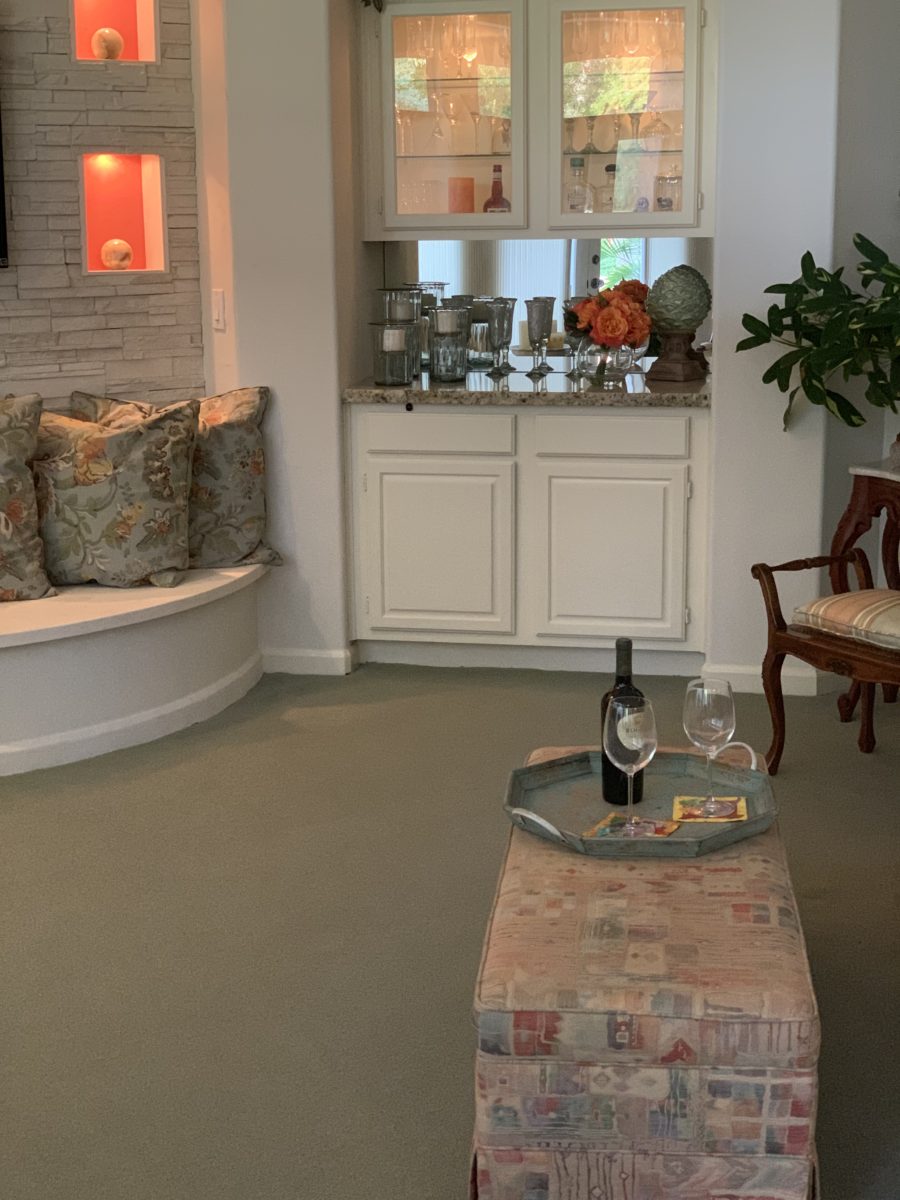
Often used for coffee tables – with a tray for stability beneath drinks, benches or ottomans can double as a foot rest or table-like surface.
An upholstered bench can be pulled in front of the fireplace or used as a cocktail table with a sturdy tray.
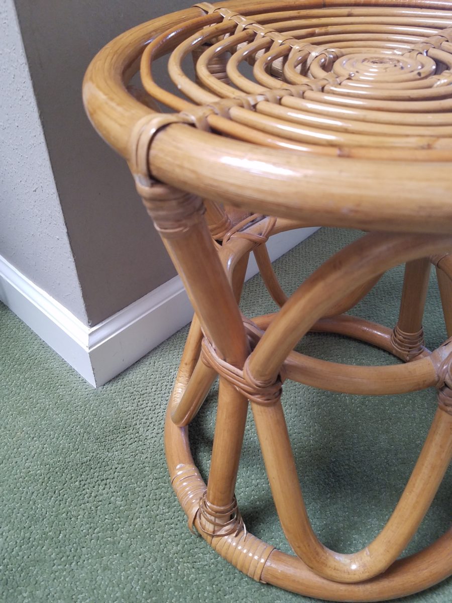
Something as simple as a rattan stool can be easy to pull-up.
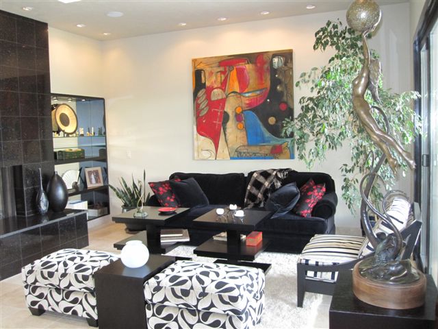
A pair of ottoman frame a seating area. An ottoman never has its back to anyone or anything.
You can seat more than one person on a good-sized piece.
A round one can have guests facing different directions to join in different conversations around the room.
Low in front of a fireplace, tucked beneath a coffee table or a console table, they can easily be pulled out when needed.
Here a pair of square cubes are stowed beneath a console and pulled up to the group for extra seating.
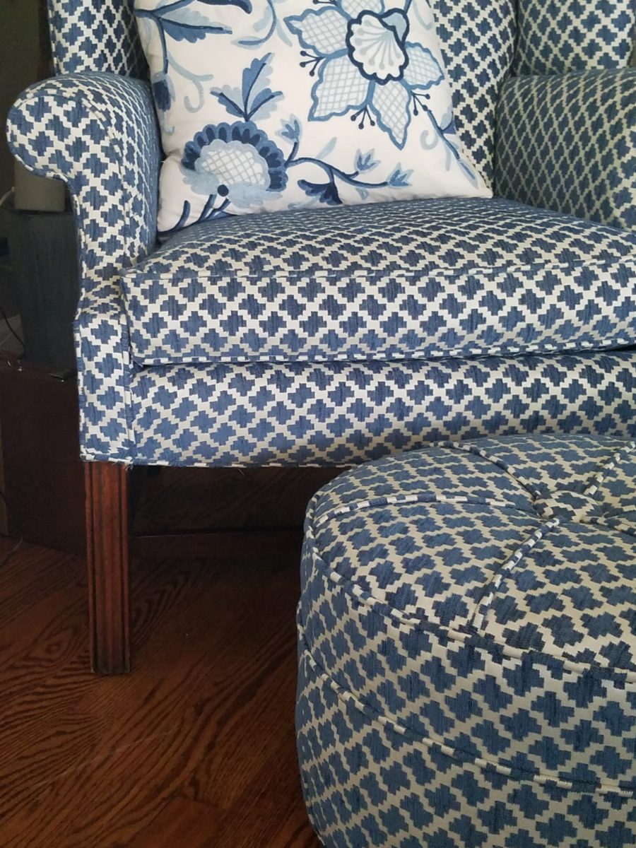
They add a splash of color or pattern.
Or they can meld in with the color scheme.
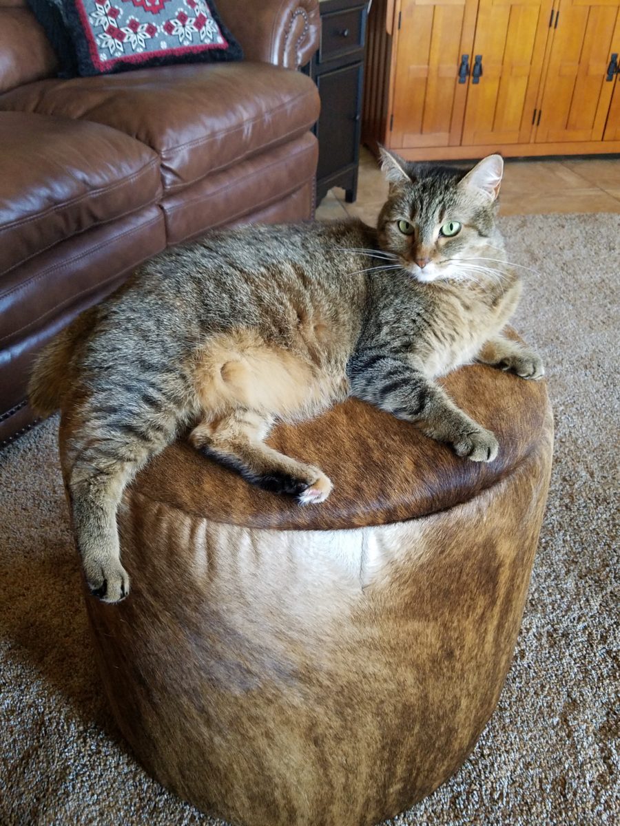
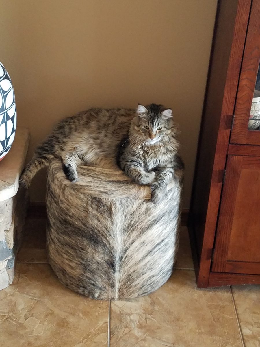
These cats think they are hiding on these custom fabricated cow hide stools. Cow hide camouflage makes the perfect perch for these cats…but they are intended to be handy for guests as pull-up seats around the coffee table in front of the fireplace.
Look at your room and see if it wouldn’t benefit from an extra low-profile seat or two.
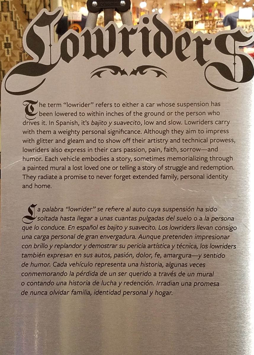
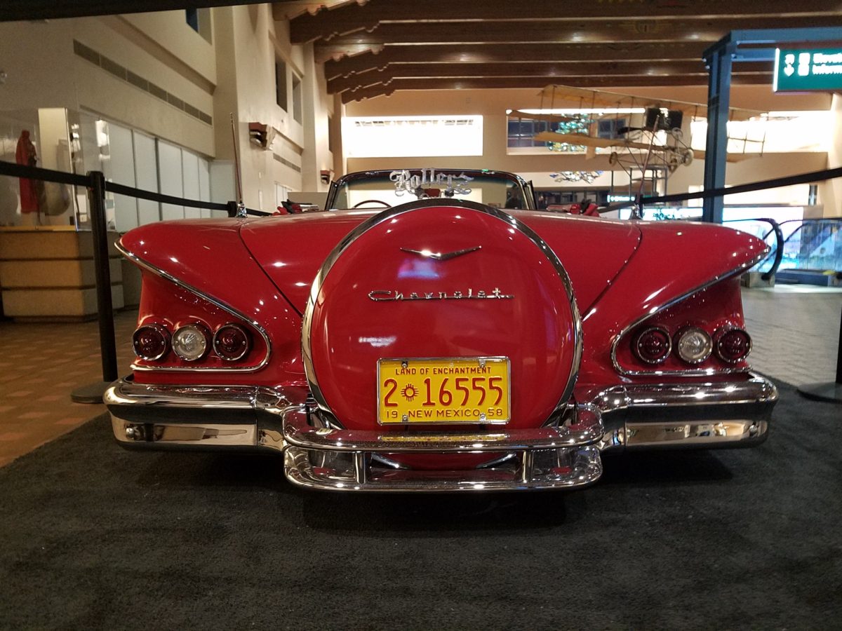
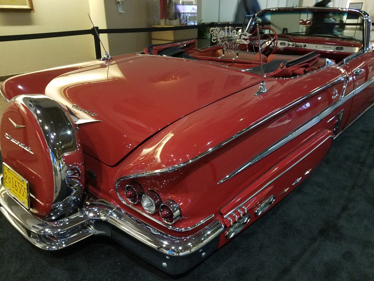
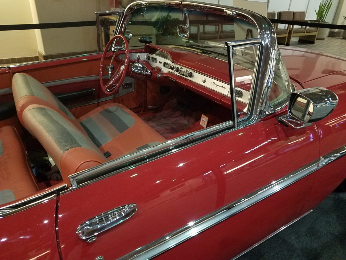
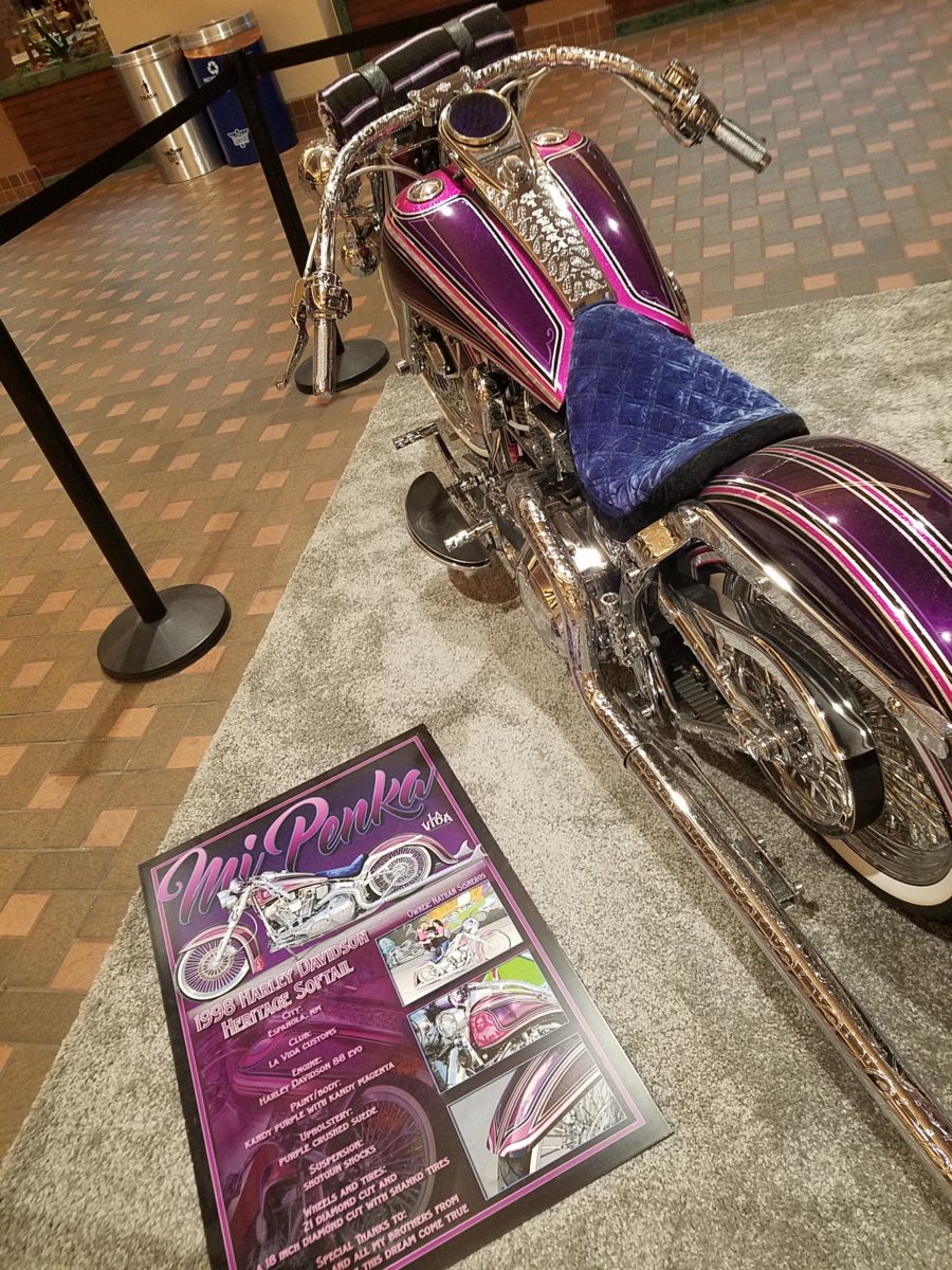
Racing through the Albuquerque Sunport several times this summer, I had seen in swift passing the blindingly brilliant bling of the Low Rider exhibit that had been set-up at the end of June. Last week I had an opportunity, while waiting in the arrival area, to peruse the many amazing rides that commanded the concourse.
This powerful art exhibit of the unique Latino culture of Low Riders represents great personal pride and emotional attachment on behalf of the owners and artists (often one and the same).
These finished products are almost like songs…from memorials to love interests, family and friendships – they express heartfelt emotions to present and share with the world.
Once stereotypically thought to be limited to the bad boys taunting law enforcement with their wild paint jobs, gleaming chrome, bold moves, wild suspension, blaring music in a defiant statement of cultural expression, these amazing art pieces have since been recognized by distinguished museums worldwide for their exquisite attention to detail and the stories they tell.
In this exhibit, these moving statements of artistic expression are all home-grown. Yes, each made here in New Mexico it makes it all the more relevant.
Visitors to the Sunport have this wonderful opportunity – up close and personal – to examine the seemingly flawless machines adorned with sensational color, pattern and design. “Kids” of all ages will appreciate this show!
Each as though a canvas for the artist…motorcycles, kid’s versions and cars adorned with glitter, shine, polish and paint colors all contributing to the each unique statement. From airbrush to tedious handwork and limitless patient detailing results in exciting assemblages.
There are also decades of photos featuring the evolution of
the culture here.
By highlighting these fine, local examples the City hopes to elevate the art form on its merits and dismiss some of the stigmas attached with the stereotypes.
And we all will have a little fun imagining the thrill of taking a ride in/on one of these beauties!!!
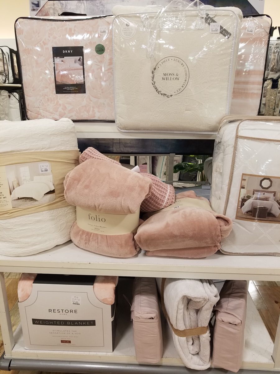
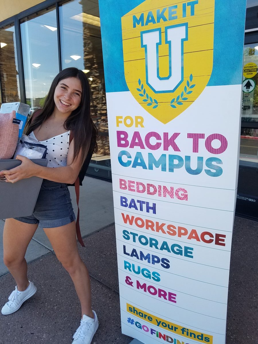
It’s that time again…the end of summer and getting kids back to school…exciting, hectic, a bit stressful and today, very nostalgic. I (who saves everything) still have my little black and white Sony TV, embroidered fiber art that hung on my wall, floral twin bed sheets and bath towels! I remember the white chenille bedspreads that I got – giving one to my bestie/roommate so we’d match – even though she was a red accent person and I chose blues and greens!! We picked each other, our college and designed our neat and tidy package.
Earlier this weekend, as Victoria navigated this information highway that is the lead-up to getting her dorm room assignment, roommate and all the related details, she texted her yet-to-meet roomie and asked what her color scheme was going to be. Victoria, having established her pink (dusty rose) and grey scheme last fall upon entering her freshman year elsewhere, was hoping that she was not going to have to share her intimate space with a shocking orange scheme or similarly discordant color. All of a sudden, from the back seat came a exclamation – “NO Way!” To what, we asked – “What?” And she said “Guess what her color scheme is? Pink and Grey!!! YAY!!! What were the chances?”
Well, strolling through the stores with their piles of offerings displayed in tempting color-coordinated arrangements, pink and grey still carries over from last fall in a big way – so the chances, it seems, were not all that far-fetched!! LOL.
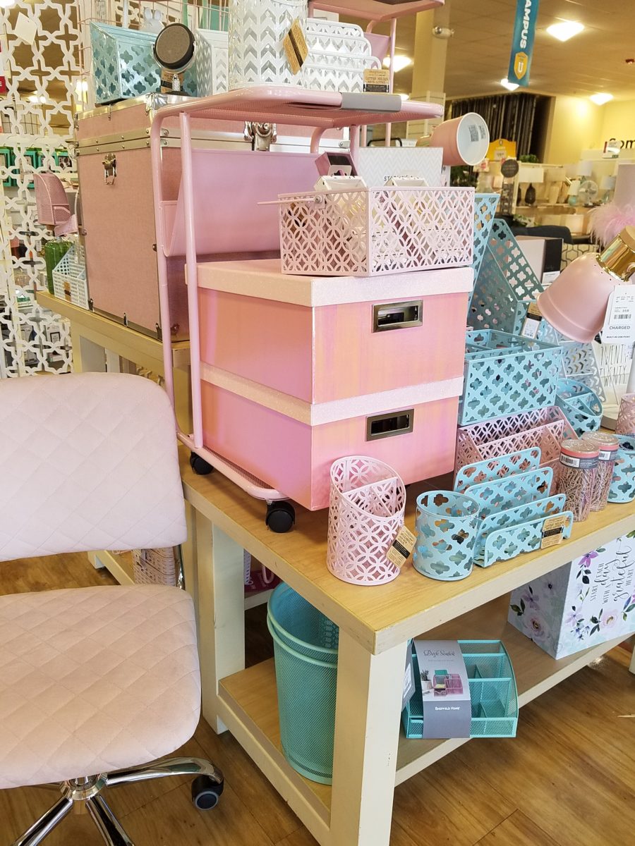
With the prominent pink and grey, popular turquoise and grey and for the boys (if we are being color/gender-esque) black and grey – seems grey is the common denominator facilitating merchandising and keeping everyone in color-trend order.
Pro-tip #1 Make a list of what you’ll need prior to hitting the stores with their limitless temptations for dorm decor! It can be daunting if you go shopping – cold. It can be daunting anyway – but best to attempt to be prepared! As I looked around all the displays leading these trends…leading these kids…I wondered how many – if any – might veer off course and pick an orange and lime green theme or brilliant cherry red…and what does it say about one if they buck the established trends? Some might be oblivious to the trends – despite being bombarded in every store by the “must have” selections. Those independent thinkers who like what they like – if it matches or not. The eclectic ones who are driven by memories, personal expression and acquisitions gathered and honed over the years that were not guided by trending decor influencers.
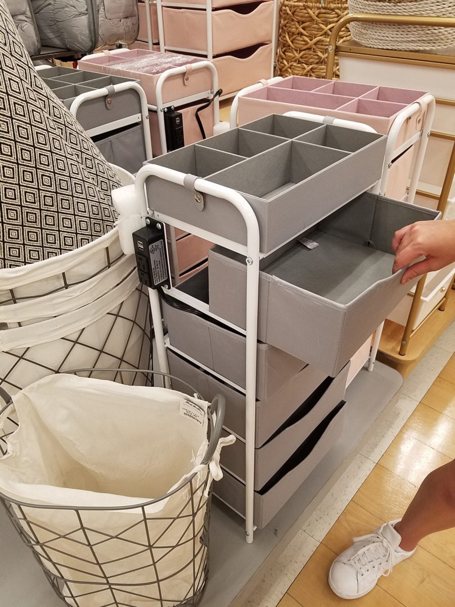
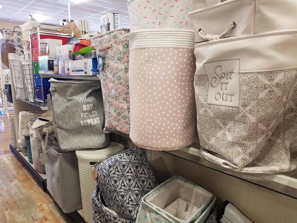
However, it is entirely possible to genuinely LOVE the trends and invest in the colors for more than the first semester of eager dorm room decor! We were living it! What was purchased last fall was saved and expanded upon, with new-found knowledge of the tips learned from the pros! There are boxes, bins, rugs, lamps, staplers, desk organizers, linens, bulletin boards, throw pillows, blankets and throws – all color coordinated making the job relatively easy and swift.
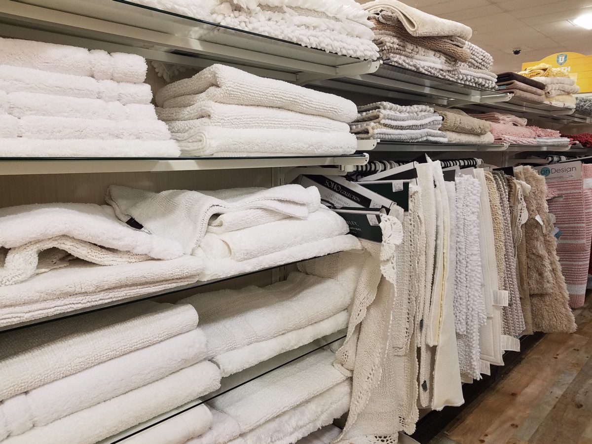
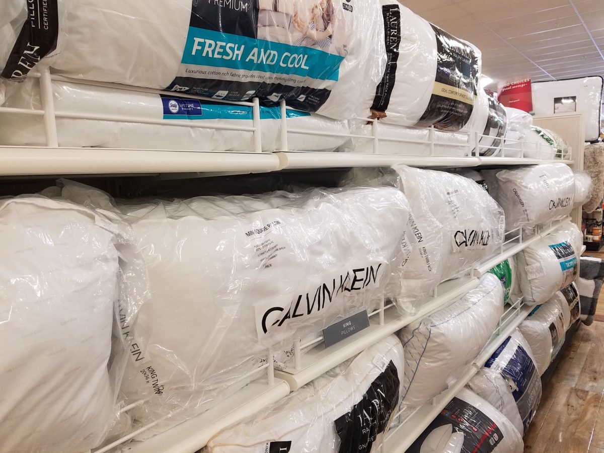
The stores are prepared. Welcoming students – their signs
are out and their shelves are stocked! Rows of pillows, mattress covers, foam
pads, artsy accessories and accents galore…all to enhance the otherwise bare
rooms that will soon come to life!
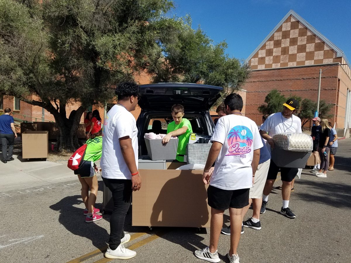
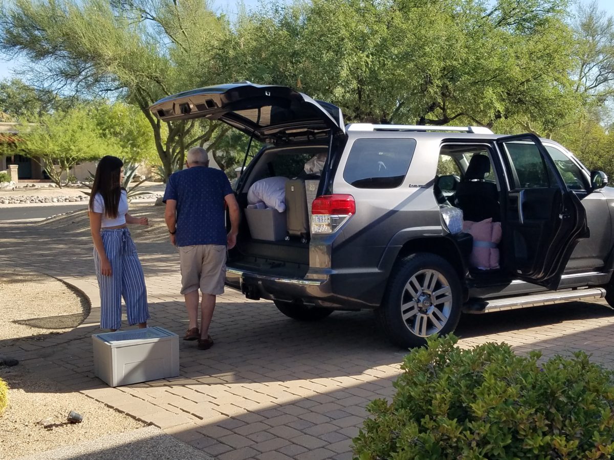
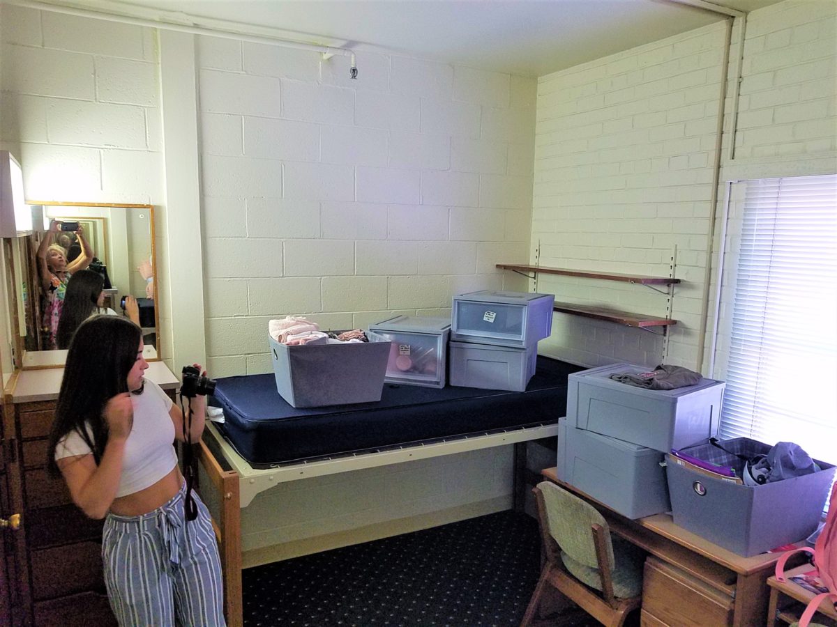
The morning of the move, they staggered the move-in time to insure an orderly point of arrival and processing to the rooms. We were assigned 9:30 and met curbside by a handsome posse of volunteer boys who were armed with rolling cartons cleverly created using carpet-wrapped moving dollies upon which were mounted large, sturdy cardboard cartons. These rolling bins were piled high with contents from the cars and wheeled into the dorm rooms with efficiency. Co-eds in red t-shirts identified them as the RA staff – the ones with the answers to all of your questions.
Being organized is key. Victoria had benefit of a previous semester where she watched the pros and got their tips! Pro-tip #2 Be organized!
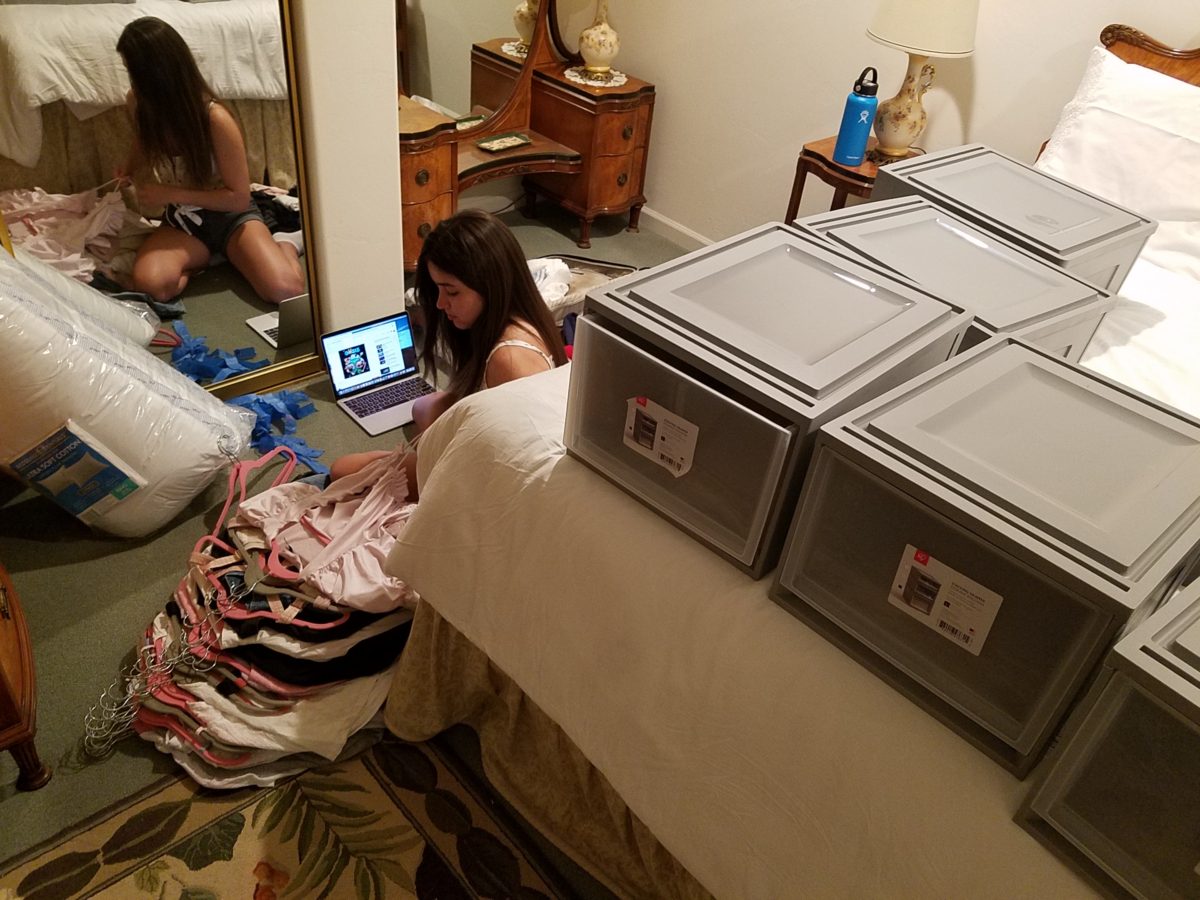
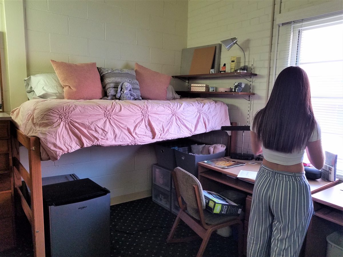
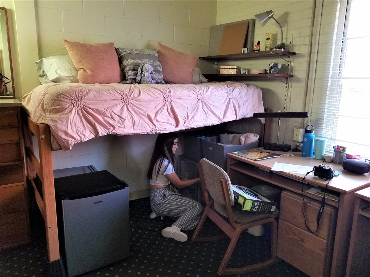
To that end, utilize your limited space to the max! Capture all available real estate! Pro-tip #3 Bed risers. The beds are high – high enough to stack storage drawers/bins beneath them. They can be raised even higher with risers. Pro-tip #4 The plastic stacking drawers are cool because they make easy access to contents just like added dresser storage space.
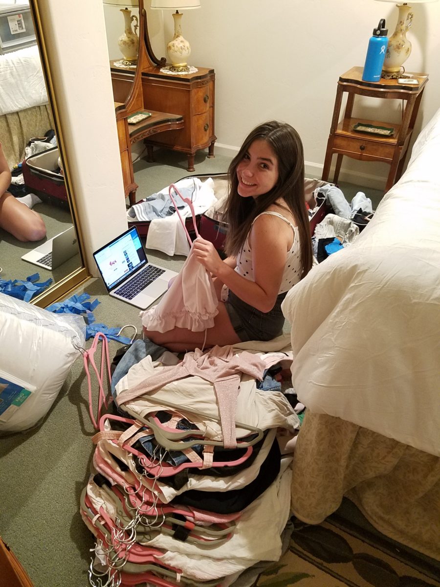
Victoria had it all figured out. Pro-tip #5 To consolidate luggage, she packed a lot of her clothes
in the bins – all in very specific order and folded making it easy to transfer
once in the room.
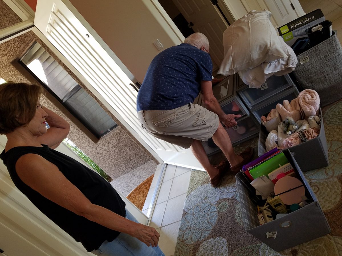
Once in the room, she raised the bed even higher on 4 cone-shaped plastic riser units that she had purchased. She then placed her new mini frig (Pro-tip #6 Get a mini frig) and bins beneath the bed in an organized fashion. She emptied the bins one-by-one into the chest of drawers thereby freeing the bins for other supplies such as snacks, kitchen supplies and miscellaneous other necessities.
Having a mini frig in the room keeps personal perishables under control and handy instead of having to label things in the shared frig down the hall.
Pro-tip #7 Take
extension cords and multi-plug surge protectors. This was handy for the reading
lamp waaaaay up high above the now super high bed and also to run power to the
mini frig. You can never have enough power sources and another bonus was that
one of the set of four bed-riser units had power outlets and a short cord!
Pro-tip #8 Get a collapsible shoe rack/shelf (for ease of storage and transport). They have nifty wooden ones – but we took ours back as the closet had a tidy set of built-in shelves perfect for shoes.
Once the power was all connected and the bins organized clothes put away, it was time to make the bed and add the finishing touches.
It was beginning to look like a home-away-from-home! Pro-tip #9 With hanging implements that will not harm the wall like Command Strips, the walls will gradually come to life with strings of photos clipped with clothes pins, twinkly lights, bulletin boards and other imagery.
Pro-tip #10 Take photos – the memories are priceless!!!!!!
Everyone loves before and after shots – they are so telling, dramatic and fun to compare. How about during? This week, we are nearing completion of a project that has been in the works for the past few months. Not quite finished, here is a little story about the stages of the design process…
Are YOU planning a remodel…a room an entire house?
Once a project is identified, the options are studied. Usually each party involve has their preconceived notions…images and ideas come to mind. The mind is that arena from which it is tough to articulate images and especially between people. The design process requires that ideas need to be expressed, defined and argued – pros and cons.
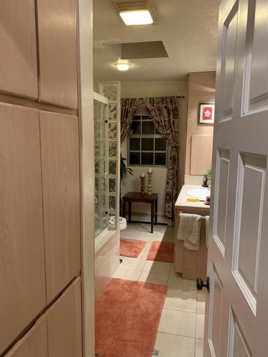
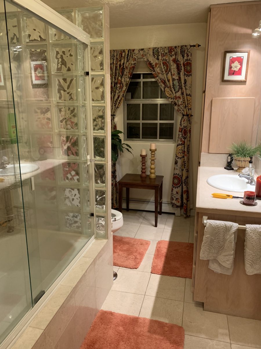
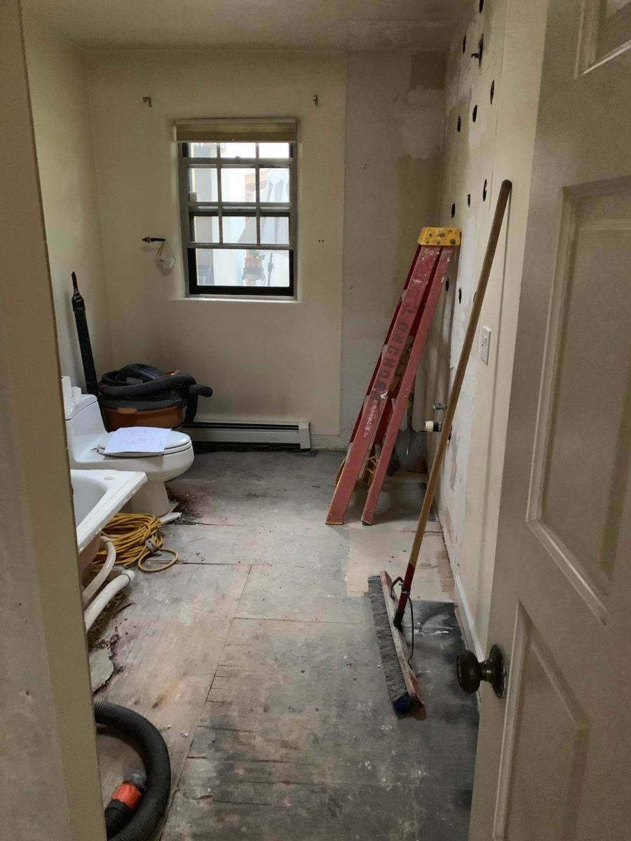
This room was dated and fussy. The finishes were tired and needed refreshing. The project was described as a complete makeover to compliment other recent updates in the home.
The scope of work was to remove the tub, replace the cabinets, add a second sink and create an opening into the guest room. At that point, the “what ifs” began.
Healthy arguing ensues – meaning sharing ideas back and forth, explaining the approach and concepts. More like presenting than arguing. It’s actually a fun, creative process – full of choices, ideas and seemingly limitless opportunities. It’s the “What if…” stage. Sketches are used, arm-waving and samples, photos and words all contribute to the compilation of the ultimate design. Each person contributes to the process until a common plan is adopted.
Whether formal plans are needed depends upon the code requirements, if applicable (“cosmetic only” changes requiring no modifications to structure, electrical or HVAC – for example – might not need formal drawings). Therefore, the development of documents is dependent upon the requirements of the municipality and/or methods of the contractors. Regardless, sketches begin the process.
If code requirements necessitate permitting, the process
must proceed through that stage prior to commencing the work. So after weeks of
ideas being tossed about, a plan was conceived, client approved drawings were
made and the process moved forward.
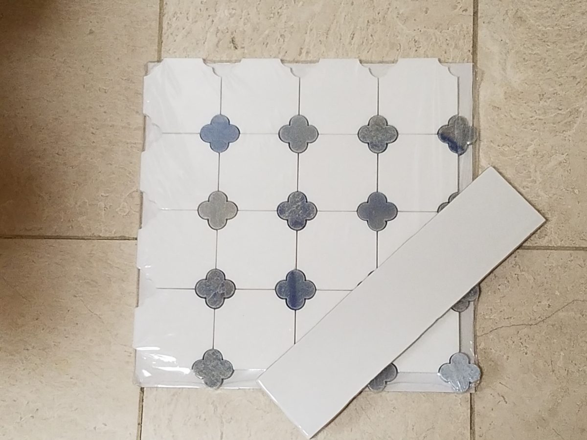
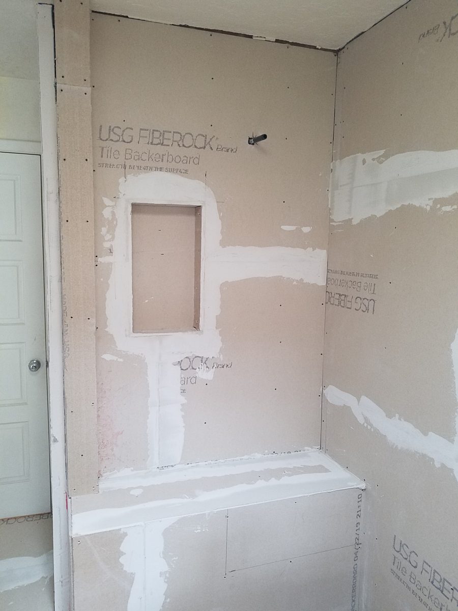
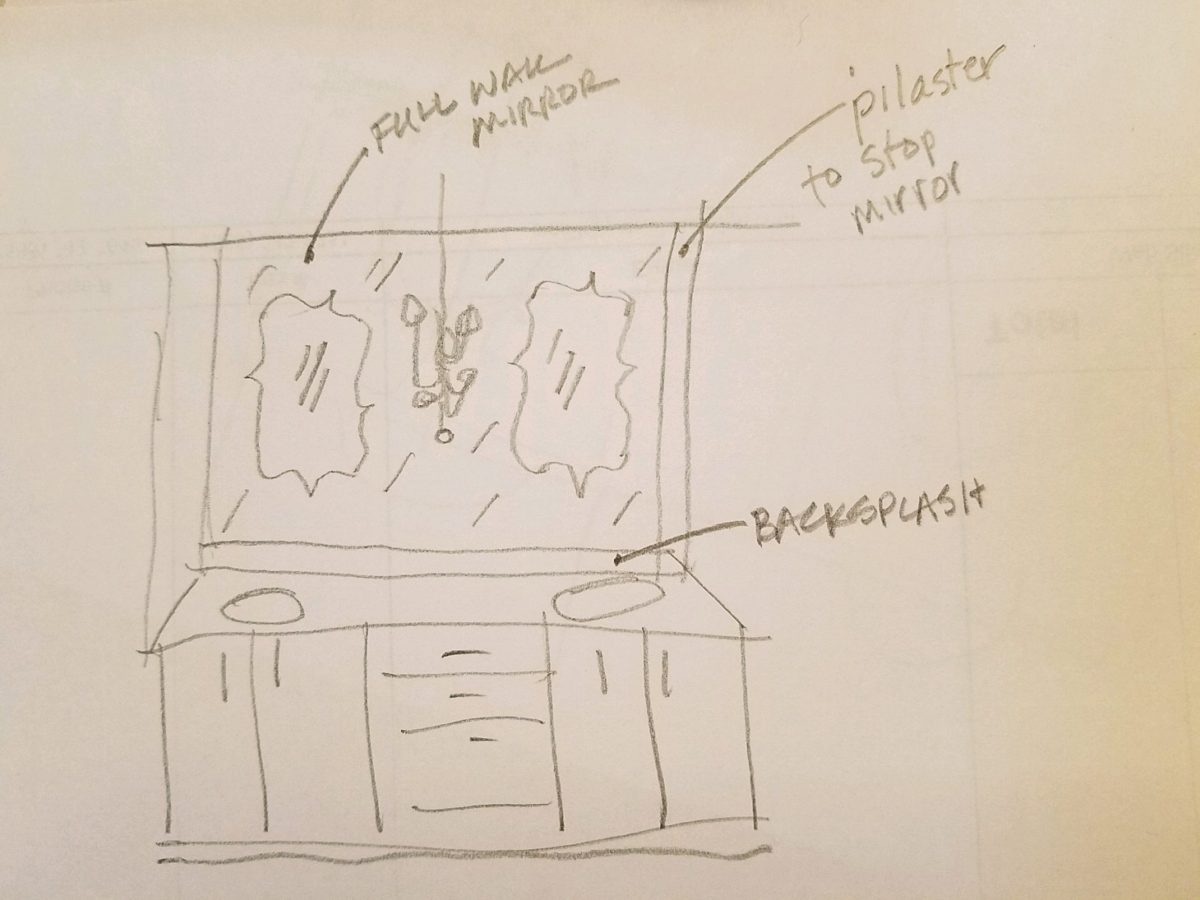
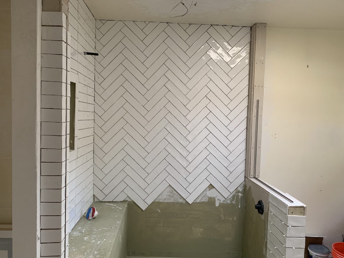
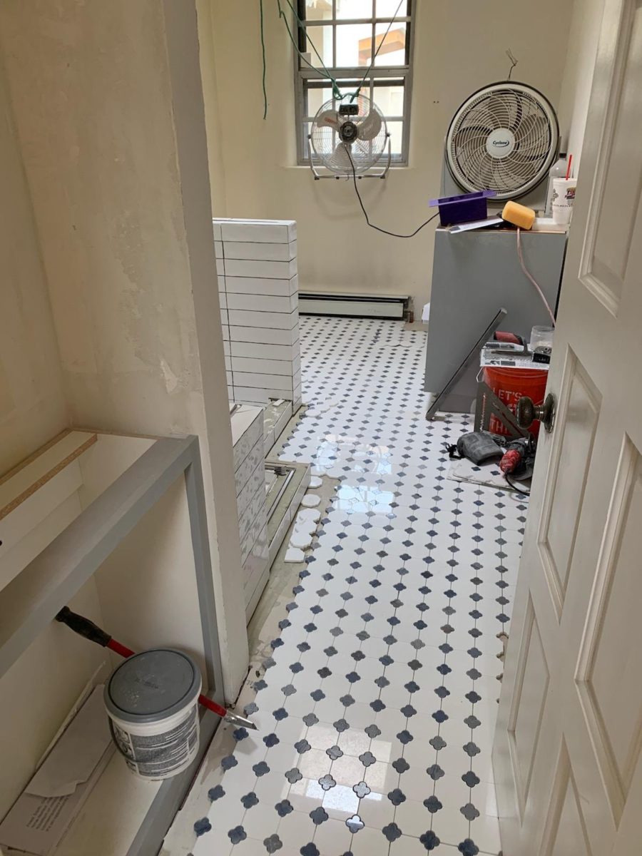
The scheme was set with the first materials selected – glossy glazed imperfect wall tiles for an interesting and textural herringbone pattern with a stone mosaic for the floor.
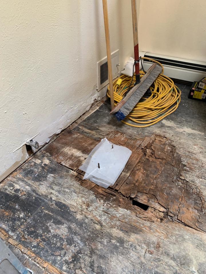
The demolition – always a shock – but “you have to break and egg to make an omelet!” Unbeknownst to anyone, the floor was rotted beneath the toilet and required repair. Mirror, glass block, tile and much sheet-rock was removed.
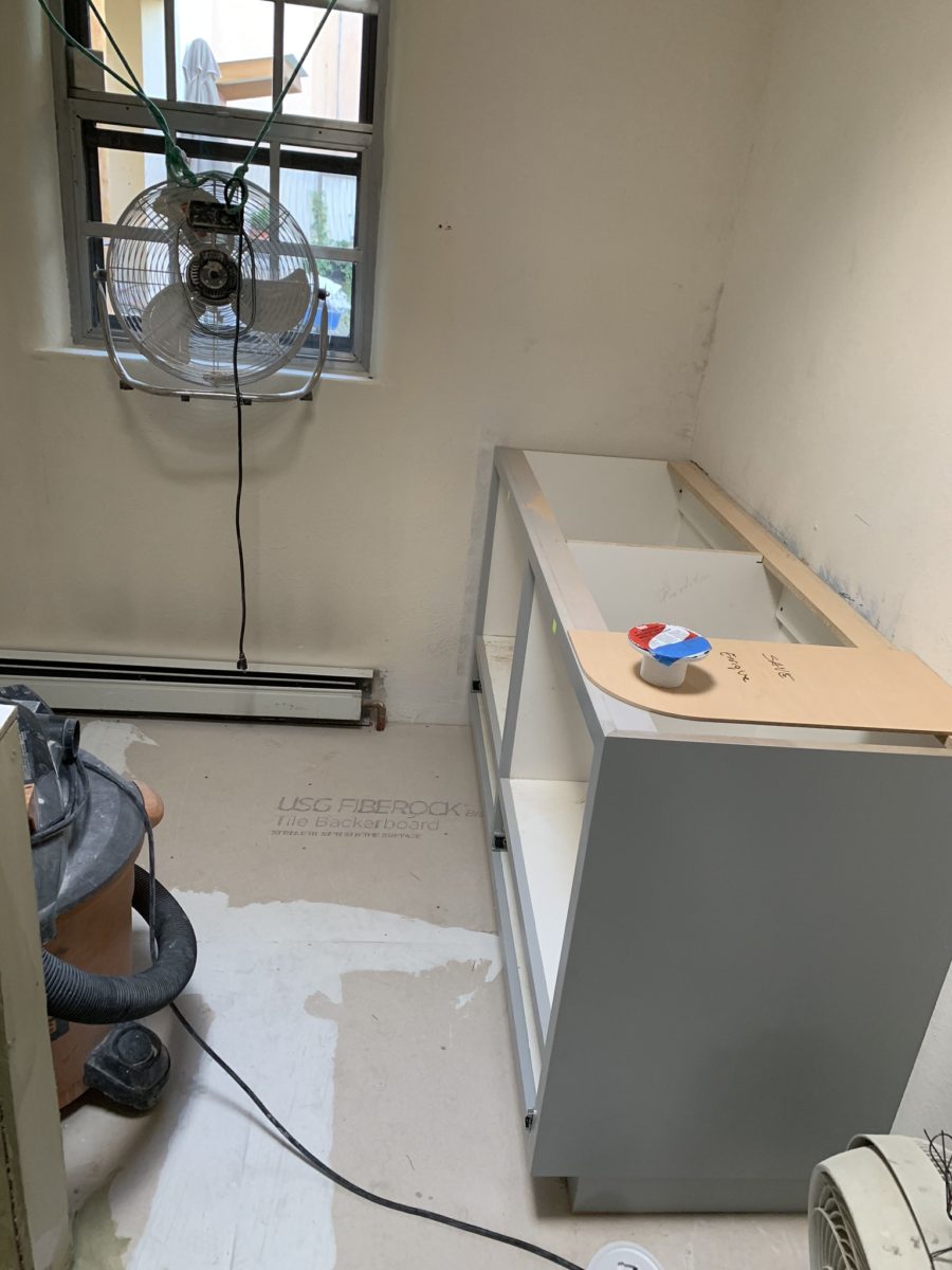
Old cabinets were removed and after all the dust had settled, the bare bones exposed and a clean slate presented, the new work began.
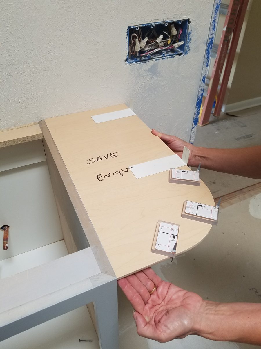
The new cabinets were to accommodate a second sink and slightly longer counter-top. To make sure access between the shower and counter-top was not too restricted, I designed a radius to ease the squeeze. Enrique made a template of the radius that would be represent his end shelving and counter-top. When Rocky Mountain Stone arrived to shoot their lasers to measure for their templates, the radius template Enrique had made was very helpful.
The end of this cabinet will have radius shelves with counter-top following the radius. Until then, Enrique made a template of the shape so that the counter-top could be measured in advance of end piece being completed and installed.The laser process to template the counter-top begins…with the help of the mock-up of the radius!
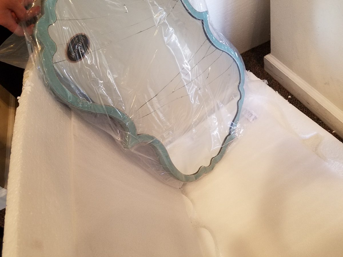
Decisions regarding lighting had not been finalized, with the completion of the plans. Having eliminated the desire to have recessed fixtures, whether to use a center sconce, two flanking sconces or a single pendant in the center between the sinks was still up in the air. Love the pun! Debating a full height panel of mirror versus two wall hung framed pieces, was also undecided.
But here’s an “oops” when we discovered the power for the light fixture off-center for a center-hung pendant.
Taking the risk to be disappointed, but with little investment
to do so, our client elected to buy the
two curvy framed mirrors that almost promised to be too small. Upon arrival one
of the two mirrors were broken. Bummer.
The inevitable, unexpected happens on every project…we had decided not too use these so rather than have the one of the pair replaced, we requested a refund. However, upon further study, we modified the design to accommodate both mirrors – we are re-ordering the second mirror.
But in an effort to determine if we wanted to have the
broken mirror replaced or refunded. We held it up on the wall, as we feared, it
was confirmed that they could not carry the space. We asked that the company
not replace the broken mirror, but refund the cost.
We really loved the
whimsical quality of the curvy framed mirrors and their distressed turquoise finish
was a great addition to the otherwise blue and white scheme. So, a week later,
after pondering the dilemma of the mirrors…I offered what seemed to be a radical
suggestion (but not really), and that was to install a full-panel wall mirror –
backsplash to ceiling – and then mount (over it) the two mirrors. To do so, our
very able and talented glass master, Robert, would have to cut (prior to installing) holes
in the mirror panel located behind where the framed mirrors were prepared for hanging. The result would be the
pair of mirrors hanging on top of the full panel creating a floating, multi
dimensional effect. Watch for “afters” in a couple weeks, of this
completed installation.
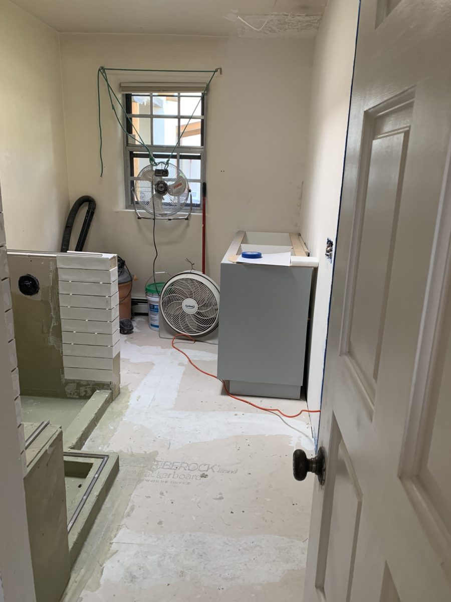
As the project proceeds, the flooring is nearly completed and all but the finishing touches remain.
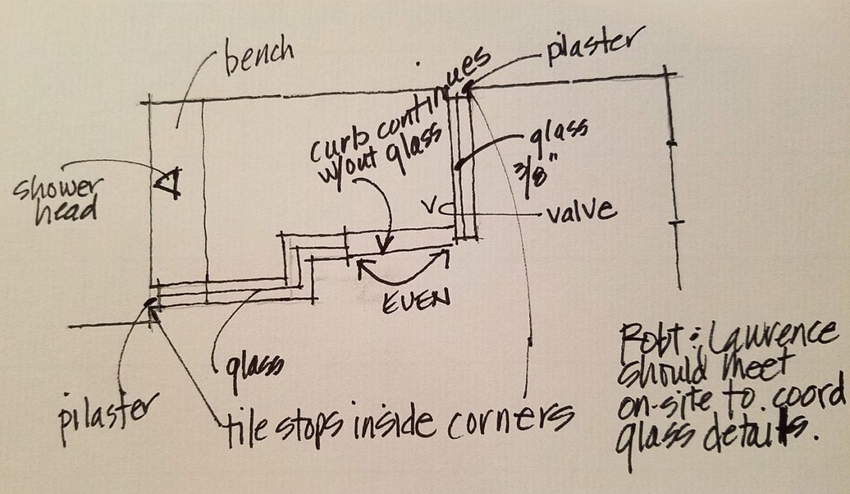
Pilasters were added at each end to stop the tile on an inside corner, rather than having it quit flush on the wall. The shower will not have a door, but nearly encapsulated with frame-less clear glass to give an illusion of a more spacious room.
Best to stop here and reserve the finale for the finished “after” shots as promised.
When designing for a vacation rental property, the first order of business is to select things that are durable and easy to maintain. This means finishes to furnishings. I know this from practical life experiences and also working with commercial/hospitality interiors. To do so, one needs time to place and receive the orders with enough contingency for mishap. It is also dependent upon the housekeeping arrangements planned for on-going maintenance.
In this recent project, the work began 12 months out – plenty of time you think…but it was all about the physical remodel. We began with the drawings for floor plan re-configuration and specifications for new lighting, cabinets and finishes throughout. The decision to furnish was not made until nearly 10 months later with a deadline to complete in less than 7 weeks. The delay was partially due to an indecision over how many of the 4 units (all on one floor) were to be short-term or long-term rentals. Then a new city ordinance imposed a moratorium, of sorts, on short-term rentals and while that was tossed about over several weeks…more indecision ensued.
It’s a riot to see overnight design projects transform interiors in 24 hours. That’s due to a free-reign for design decisions, a team(s) and vehicles to pick-up/deliver, all trades on deck, a single director calling the shots and an organized chaos that results in a magical finished project – yes, like magic. Open your eyes, be stricken with awe, cry a little and exclaim repeatedly that you “just can’t believe it!!!!”
Real life is generally not like that. Real life has in-put by owners, limited schedule openings by the various trades, little spontaneous decision-making and fleeting time riddled with unwanted surprises and delays. Real life, in this case, was a theme provided by the owner, a preconceived “look” developed in the mind’s eye and scratch paper of the designer during the selection of finishes and floor plan modifications and vacillation for several reasons, of what units to furnish and when. Over the course of a year, leading up to less than the last 30 days, the project was to be fully furnished and finished – ready to rent!
The good news is that with controlled frenzy, changing
availability of products, focused efforts and teamwork, we are pleased to present
the Lobster! Completed all but hanging the TVs by the requested July 1st
deadline, it is beautifully appointed and offers a colorful and a bit
whimsical, spacious, clean and did I mention enviable location- 2 blocks from Pacific Beach
in San Diego?
This entire project, except the move-in this last week, was done long-distance with the owner in Maine, her management company SHORE on-site in California and we the design team in New Mexico. This is not at all unusual, but Maine prompted the owner’s desire to name the unit Lobster. Not your spiny lobster from the local waters, but the New England version from the Atlantic with the classic recognizable form that accompanies the imagined crustacean – including the brilliant reds of the often appreciated steamed version!!
With fond memories of her childhood helping her elders maintain this property, the owner wanted to commemorate the building with an entry plaque visible from the street on the new redwood gate (soon to be completed). In addition, we suggested an individual name/theme for each of the 4 apartments which were all initially designated as fully-furnished short-term rentals – hence the bold identity for each! I designed the new name plaques and had them fabricated by Artistic Bronze in Florida. The backing was built by our talented Enrique Jimenez, in New Mexico, and all shipped to California. Bronze was selected for its timeless presentation, handsome durability and commanding respect. Parisienne was the font I selected which may now be used to identify the property as though a logo to tie-in with the on-site signage. Subliminal cues that are recognized even slightly are effective reminders and triggers for recognition. The idea was intended to offer a fun, but lasting, introduction and identification which was to be reflected in the interiors. The Lobster was the largest unit with 2 bedrooms. It was ultimately chosen to the be one fully-furnished unit and owner’s second home when visiting the area.
For budget and availability, we sacrificed certain durable
features that would have been better long-term investments, resulting in some
knock-down furniture that was never intended for much abuse. Fragile painted
table surfaces – for example – better in laminate, wood or stone…but time
will tell.
The look is clean and fun, colorful and beachy – with a slightly up-scaled twist. Cool aquas accent a few walls in the otherwise crisp white interior. Red punctuates effectively in lobster accent pillows, decorative accessories and the full-wall mosaic glass tile treatment in the kitchen. Yes, once again, we like to treat tile on the walls as not mere back-splashes, but wall-covering full height and width!
Weathered grey toned LVT (Luxury Vinyl Tile) in the way of interlocking planks were an easy to maintain and durable floor finish. The faux wood adds warmth and is softer underfoot than other hard surfaces. Perfectly matched with all trim pieces, this flooring is fabulous!!
Lighting is key and here we added recessed directional lights to spot the walls and related artwork. Switching was also an important detail to have options for the lighted areas and accents.
The owner found a novel lobster rug with a great textural,
tufted, yarn system that brings fun and great color and warmth to the bunk-bed
room! Busy, colorful bed dressings intentionally selected (over the hospitality
white that is still trending) contrast against the bright white bed frames
stacked for space optimization and a little kid fun!
A cool find in the way of the glass vessel lamp…where
usually the stem with electrical cord feeds down through the center of the base
and of the back, this one feeds from the socket stem with a cork top that
removes allowing the vessel to be filled with treasures – in this case southern
California beach shells and fragments! And for a little more animation, I found
a carved wooden shark to insert cruising above the shells to make the lamp even
more interesting!!!
A pair of vintage photographs of a lobster shack and fishing
boat contributed by a friend in Albuquerque – taken by him in Maine in 1962 –
were enhanced with bright red mats in their original polished silver metal
frames along with a large painting on canvas of a Maine lobster/fishing boat sent
by the owner in Maine provide interest to further perpetuate the lobster theme.
The master bedroom is a comfortable retreat with another
lobster pillow for punch! To give the room the best approach and make it feel
as large as it can be, placing the bed in front of the windows was the
solution. Beds facing the entrance to the room are always preferable to
arriving into the side of them – for visual space and a more inviting
orientation.
The original bathroom layout was all one space with tiny
appointments jammed together…so we removed the tall storage cabinets and sink
vanity allowing more room for the commode beside the tub/shower and added a
privacy door. Then the new cabinets and counter have their own space with
another privacy door resulting in a two-compartment bathroom area for maximum
use and enjoyment. Red mosaic glass tiles were repeated from the kitchen to further
coordinate the theme.
The bold color scheme was thoroughly distributed throughout
the unit which is an intentional design emphasis especially effective and novel
in a short-term vacation rental – where such a thorough scheme might be too
intense for one’s primary place of residence.
Effective design both functionally and visually should be a significant asset in the marketing of rental property. When used consistency in marketing material with logos and repeated features, this and other properties with attention to detail should attract the discriminating guests. Once there, repeated stays are the key to maintaining a strong guest population – of desired visitors.
Please watch for the entire slide show of before and afters of this dramatic transformation in the commercial projects section of our website, in coming weeks, entitled Emerald Green Beach Rentals – Lobster!
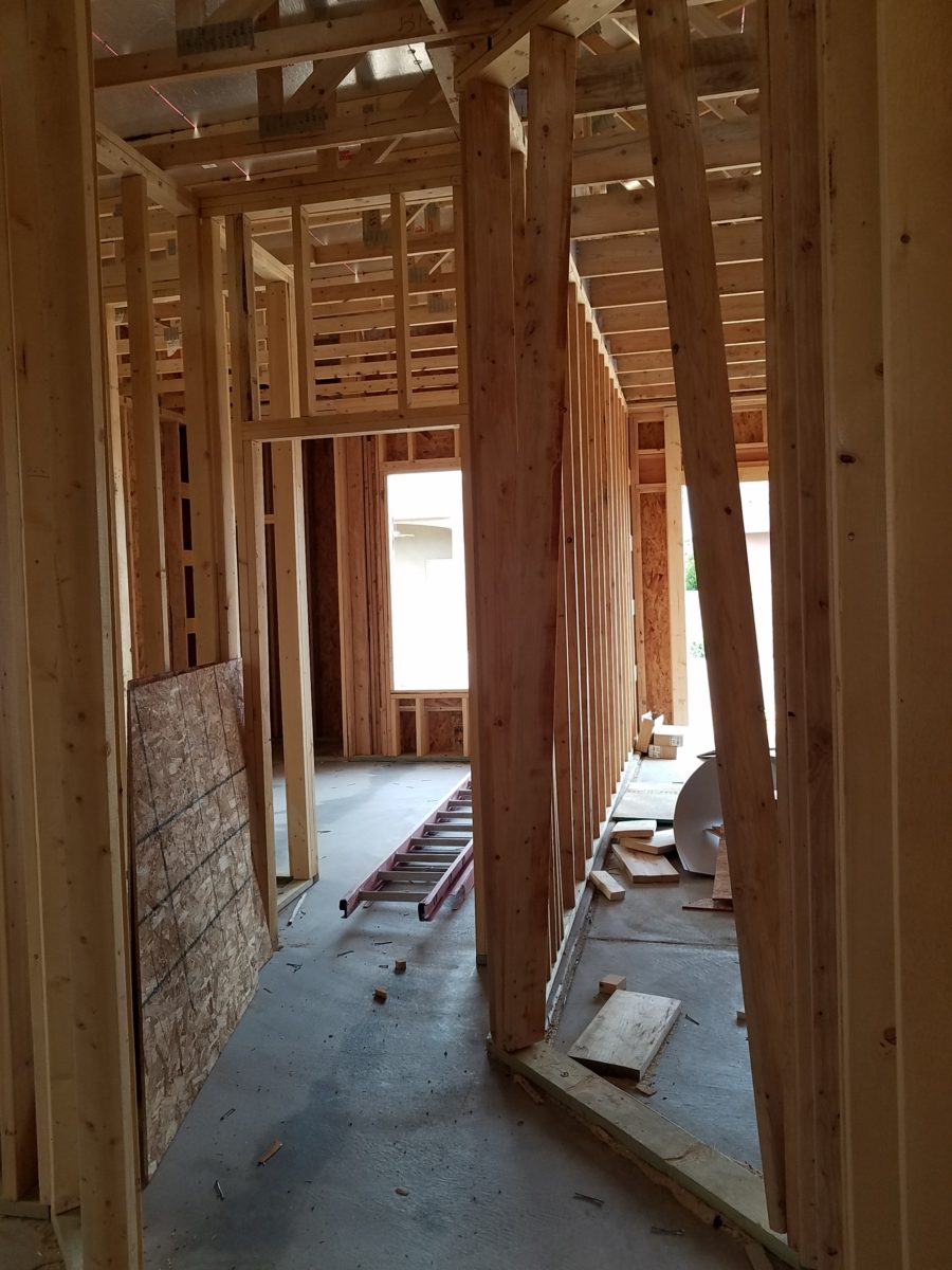
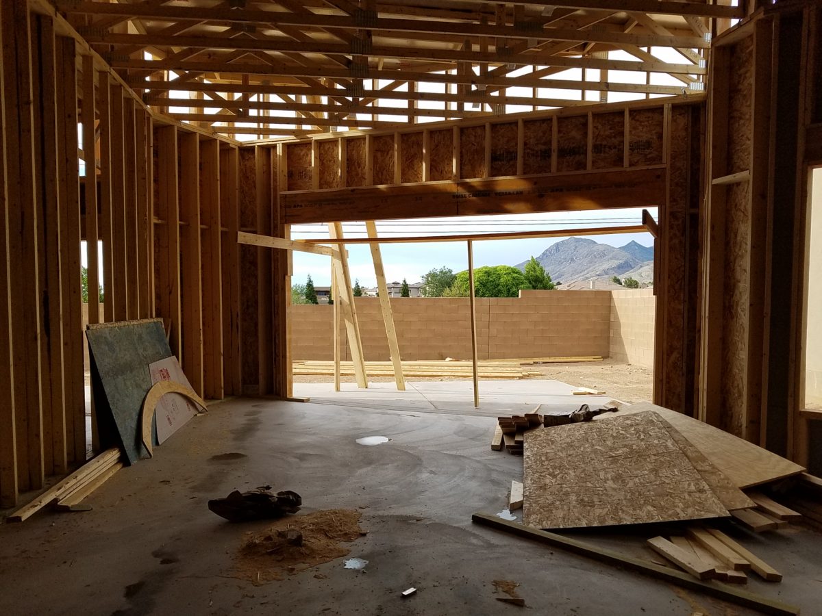
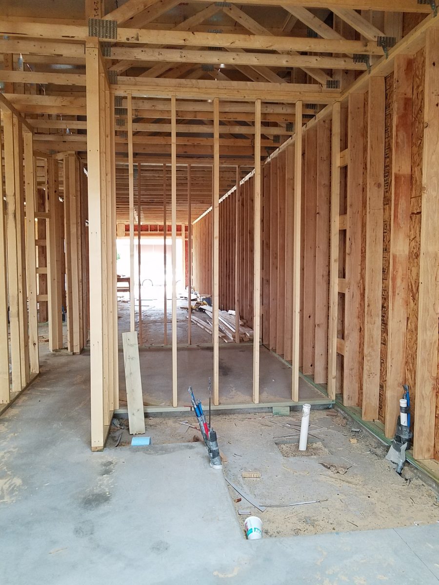
Building a new home? There are many ways to go about it. Here are a few photos of a semi-custom home, in the framing phase, that is currently under construction. Watch for a future blog featuring progress photos and finished shots!
Upon arrival, here at the entry, is a recessed niche – or as we say out here in New Mexico, a nicho! It is a perfect focal point, yet the dimensions are not illustrated in an elevation. The owners have an opportunity to have it sized for an existing piece that they own, plan for a custom piece or allow it to be framed-out by the contractor, without further specification, and find something that works.
From a tract home, with all the decisions distilled to a narrow selection featured in a model home and/or sales office…to the very custom where the owners select everything, from a world of choices with their consultants, there are commonalities that are worth noting to assist with the process .
In the tract home, a price for a finished product is presented and all standard, pre-priced details are included – within a range of narrow selections. The selections are recorded, but not often incorporated into the plans which are is usually generically pre-designed. Changes are usually not an option. It is efficient, for both contractor and owner. In full-bore custom projects, all is decided, selected, designed and recorded on the plans to the last detail prior to pricing and breaking ground. All costs are identified, yet changes are often in the mix as owners have new ideas that they have the prerogative to change. They exchange or pay for every modification – every “change order”.
In the middle is the “almost custom”, but still packaged product. This is a package that is presented with pre-established designs and details, budgets and allowances. Potential buyers are shown examples of homes – models or occupied recent completions. A cost for construction is determined based upon square footage and amenities, as illustrated in the examples. This is a great way to get a more custom home with easier to execute plans and design details.
Which process best describes your project? In any of these new home design and construction approaches, there are similarities that challenge the owners along the way. Even for the seasoned professional, circumstances alter cases (changes in availability of materials, weather delays, clients who continue to visualize, imagine and fine-tune their ideas and involvement in the details). All can challenge the schedule and alter the intended smooth progression of the project.
With the tract home approach not many, if any, of the on-going wish-list items can or will be implemented. They are not set-up to make changes, alter plans or deviate from offerings and the signed-off package, in any way.
In the very custom design-from-scratch home, with the “world is your oyster” approach, changes are welcome and accommodated – after all, that is the goal – to create the perfect home, for this client who is paying for the flexibility, world of choices and luxury of it all.
In the middle is the interesting situation where the owners perceive custom flexibility, have budgets assigned and make selections based upon those numbers. Once these numbers are created to establish the budget, examples are usually presented so the owners have an idea about what their dollars will buy during the selection process. Often that method is a bit unrealistic. As estimators know, this is a tedious process – yet presenting it, in an overview, seems easy.
After examples have been shown, floor plans drawn, finishes and other design details have been budgeted, the owners sign-off on the basic idea of the home and then set out to fill-in-the-blanks. What will the flooring be? What light fixtures? What door hardware and finish? What sinks, faucets and towel bars? What countertops? What wall tile, paint or other treatments? It is usually not until that very process of assembling all the selections that an owner will know if the budget they created will satisfy their ultimate needs and desires.
With this sense of “custom” paired with the packaged example, comes the owner’s complacency – through no fault of their own – to miss details that arise from the attempt to create a unique product, plan, design – but without having seen the actual example. It doesn’t exist – anymore than it would in the very custom home. That’s why it is unique. However, unlike the very custom home, where there are layers of design assistants from architect, interior designer, lighting consultant, A/V consultant, landscape designer, general contractor, and subcontractors who work together to best explain options, implement wishes and get it all on paper for clarity, the middle approach proceeds with pre-determined practices that don’t require recording on plans and rarely elevations, as all is based upon an expeditious course-of-conduct for the like-kind of homes presented, at the out-set. But having seen the examples/model/features, the homeowners make their plans guided by the project managers which might include a general contractor, subs and a few hours with an on-staff design consultant. Inevitably details are over-looked in the process.
Here are a few tips
for proceeding with a new home project.
Don’t be afraid to ask for sketches of design details or
photos of examples.
Walk through the floor plans, in your imagination. Start at the front door and shut your eyes and try to visualize the progression. Make notes along the way. Do the same from the garage or any other alternative entry, into the home. I will suggest you do this several times – each time with a different focus.
Be mindful of window locations…exterior fenestration and interior placement as they relate to furniture and artwork. Consider them both from inside and out! One they are framed and ordered, this is either difficult, expensive or impossible to change.
The first focus might be to walk through from each exterior entry and visualize where the light switches are located and what they operate. Do you want some of your switches to be three-way? This means, for convenience, that there are two different locations to switch on/off the same light or appliance.
Secondly, as you walk through the spaces in your mind, picture if there are things that you wish to highlight such as a piece of art on a pedestal or painting on a wall, sculpture in a niche or even a spot on a table for games or hors-d’oeuvres. Some things might be lit by free-standing lamps – depending upon where they are located. Beware the dreaded, but often necessary, floor plug!!
Light fixtures….locating the power sources – the junction boxes…will you have recessed fixtures, surface-mount, suspended, or wall mount? Consider the heights of the ceiling, what is centered or not, from where you will see the fixture, and where you want it to illuminate and how. This will help plan the location of the j-boxes.
With changes in technology, wireless systems, phone apps, etc…these details will change. Know the pros and cons of advancing technologies and select the best for your present and future needs. Consider the longest period of time you will be in this home and design accordingly – aging in place.
Consider what things are easy or cost-effective to modify later, if needed, and what makes sense to install initially, to be the best investment. This might be temporary light fixtures, in favor of more expensive ones once you recuperate your cash-flow! Perhaps you don’t need glass shower enclosures at the outset – can be added later…additional cabinets…many things can be upgraded later. While other items such as the flooring material, cabinets/countertops, wall treatments, skylights, electrical sources and others…should be considered in the first-pass.
At every turn, when you are walking through the space in your imagination, see your focal point. As you enter – what is dead ahead? As you turn to the right – what do your face? Do the same to the left and make your way through the house and see each focal point, in front of you, to determine what will be placed there, how will it be lit (with each exercise – imagine daytime and nighttime), does it require power, is there enough room to place the piece you intended to go there? Inches might count.
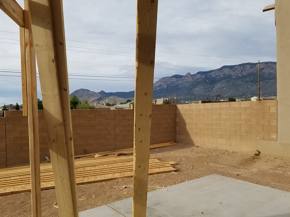
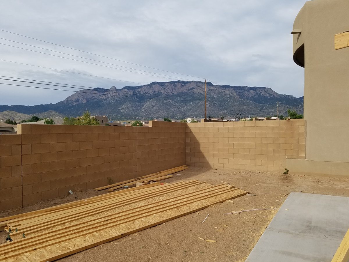
While walking through and around the plans or even during the early stages of construction, also look out the windows. What do you face? What do you see? Capture views and avoid what you don’t want. Should the wall be higher? Will this be a landscaping opportunity or necessity? Check patio covers and light sources. Consider the compass – what faces what? Seasonal temperature considerations are worth a nod. And think about exterior lighting.
A spectacular upgrade of over-sized sliding glass doors and flanking windows were selected to maximize this view…only to learn, after the slab was poured and framing up, that there was a massive corner column planned to support the yet-to-be erected patio cover . A modification was still possible, by sharing the load on two separate well-spaced columns and cutting back the patio cover between them to avoid a cantilever that was said to be cost prohibitive.
Check to see if things, inside and out, that should be centered ARE centered. And if they don’t, make sure from all angels that it won’t matter – or will in some advantageous, artfully, asymmetrical manner.
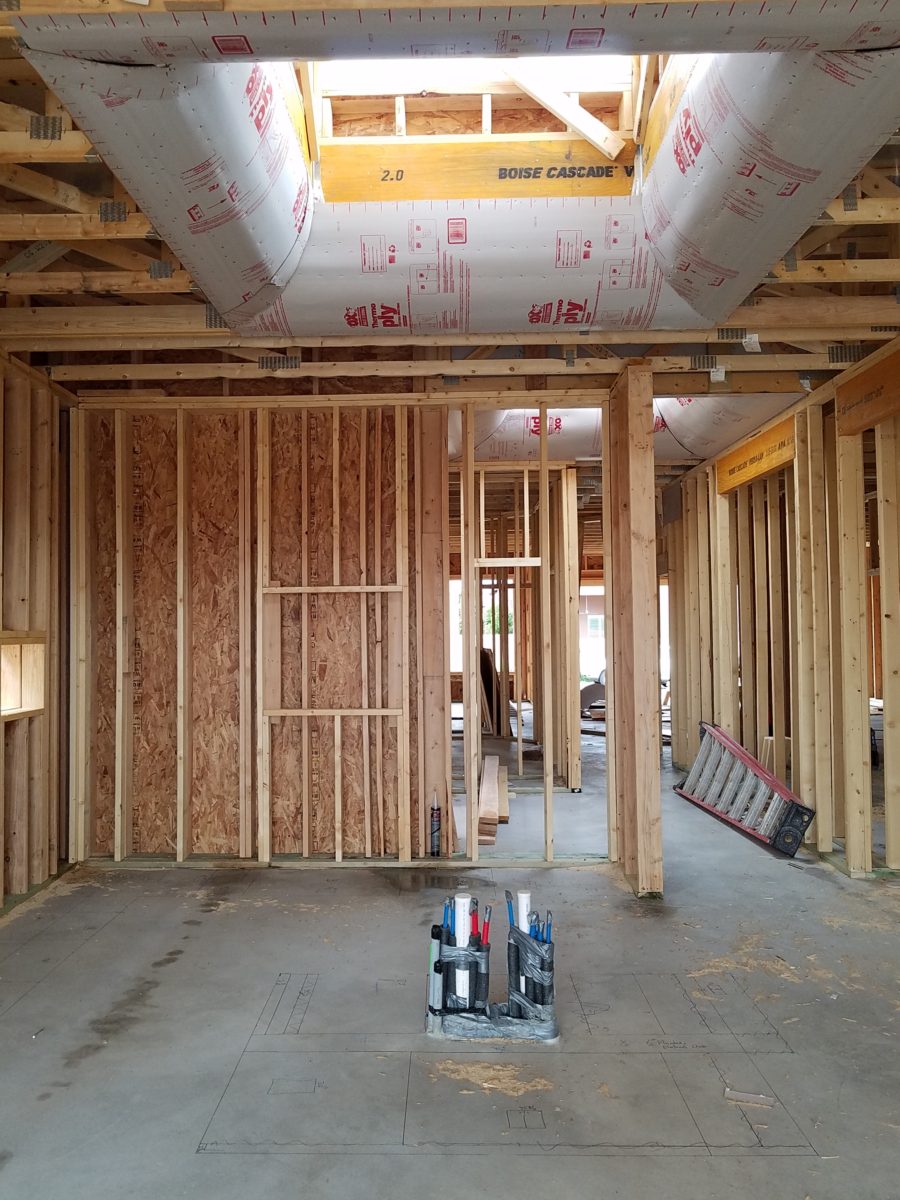
Per the plans, the island was not centered beneath the skylight. The cabinet-maker was doing his field dimensions and asked it this was the desired position. To which we replied – no – as it impacted the location of the pendant lights in addition to being off-center from the skylight.
Furniture layouts should be placed on the plan before you finalize the plans and certainly before you break ground. If you visualize a sectional sofa from which to watch the TV – make sure you can plan for one that exists. If it is from a sofa that you will view the TV- is there a space for an adjacent guest? Make sure some collection of desired furnishing or possibilities is realistic. If you have actual pieces you own – it is an imperative and so easy to accommodate on paper before the slab is poured and framing begins.
By not centering the bed and coordinating TV and dresser which was intended to occur on the opposite wall, the master will have a entire seating area off to the side. Had the recessed niche for the TV along with wiring and backing installed for the articulating wall-mount bracket, the bed and flanking nightstands would wither have been forced to center or been awkwardly off-center to best utilize the floor space.
As previously mentioned, beware the dreaded floor outlets – will you need them? Layout the furniture, to have the best chance of getting the location right.
Yet-to-be installed fireplace, in the far corner of the room, dictates the furniture placement. Floor plugs will allow lighting to be located, on floor or tables, away from the wall – floating in the center of the space. They were placed prior to a furniture layout having been specifically planned. This might pose a challenge.
Ask friends for their opinions. Examine their suggestions from every angle. Don’t wait to ask friends for their opinions too late, in the process!
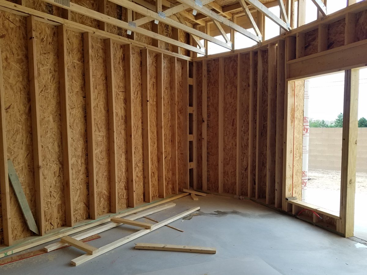
A fun snail shower enclosure will have no door…but the placement of product niches, termination of the wall tile and transition of the floor tile are critical details.
In any approach to this process…plan. Don’t guess anything that you don’t need to guess.
In about 3 months, this patio will be in full-swing for entertaining. Hopefully all the anxiety of the process will be left behind…….
Be prepared to have new or changing ideas as things proceed – but prior, proper, planning will better serve the entire process.
Don’t be that guy like in the old joke about purchasing a vehicle…after signing the purchase agreement, you realize something is missing and mention it to the agent who replies, “Oh, you want wheels on that car?”