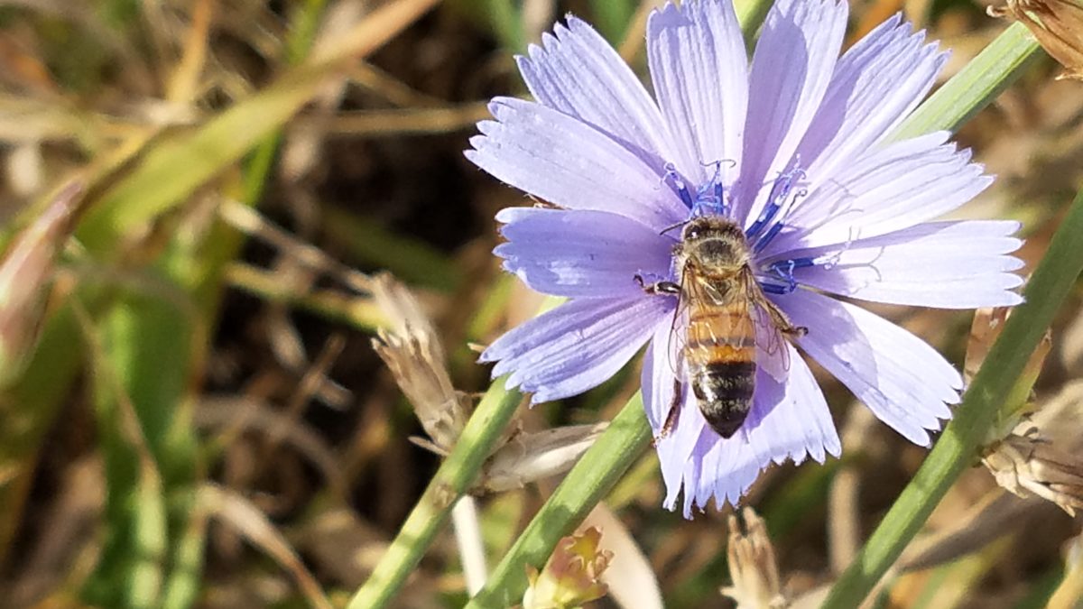
What’s all the buzz about bees this week?? Seems it has been studied and determined that they can discern between blue and yellow in order to prove they can perform remarkable arithmetic.
Last fall while hiking in Boulder, I spied this little fellow on a cornflower.
Yes, it’s official – they can distinguish colors – blue and yellow – in order to prove their math skills! Want to know more? You can immerse yourself in the study here:
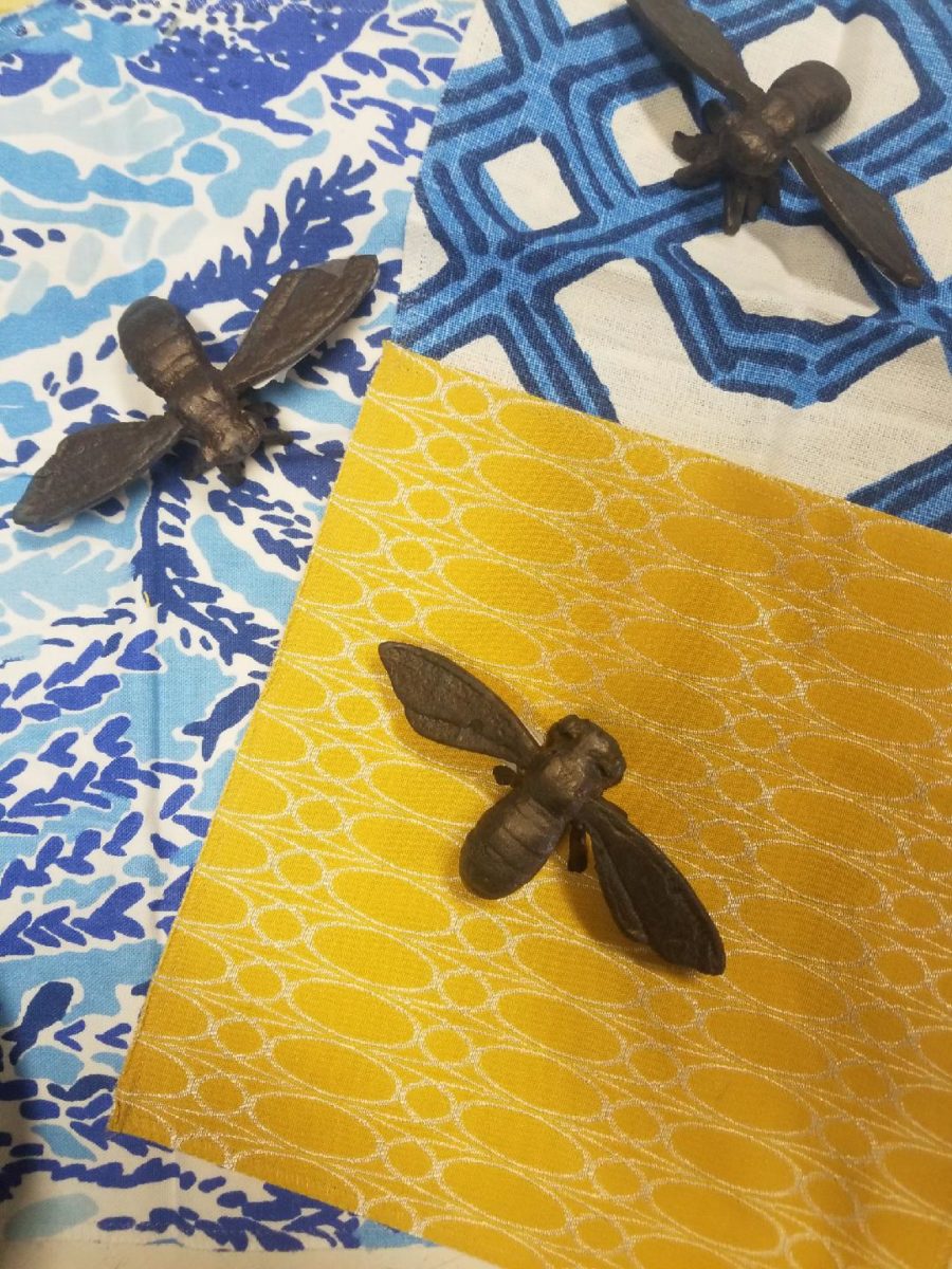
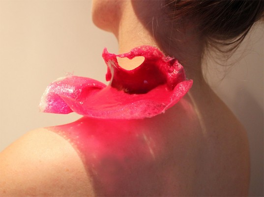
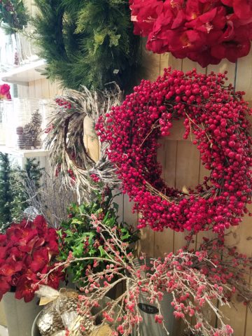
In our source library at PATRICIAN DESIGN, we have hundreds of fabric samples from designers all over the world…these little iron bees were irresistible for our purposes today!!
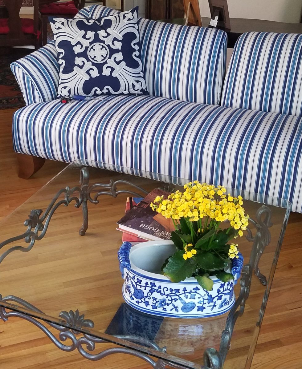
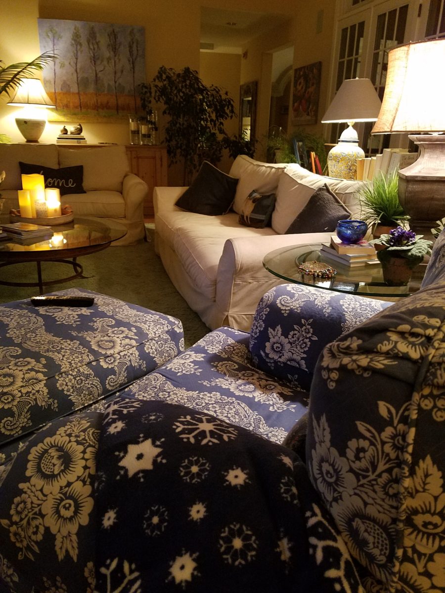
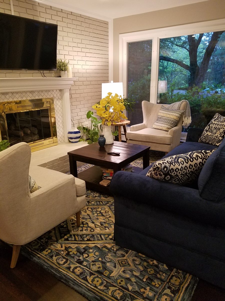
Blue and yellow as a color palette is classic. I never tire of it. I find myself encountering it often. Blue and white…often punctuated with yellow. It transcends styles.
Color schemes are the basis for so many design related exercises. Finding your color preferences for your lifestyle from clothing fashions to interior appointments – it’s about personality, temperature, lighting…
Here’s a great link to get you thinking about color palettes
or finding one that suits your personality.
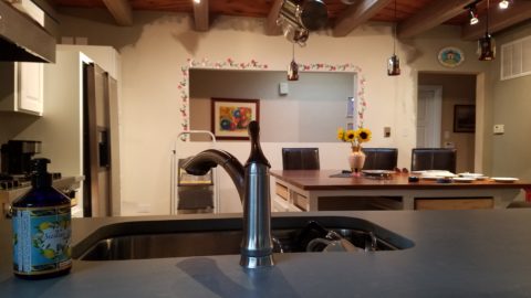
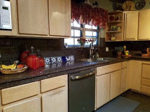
Time to remodel the kitchen!! This charming little bungalow had already experienced its share of remodeling – well, not so much structural – although, many interior design transformations had occurred over the decades. In the mix, the well-used and enjoyed kitchen was feeling a quite tired and dated.
You might remember I have used this now completed project, in the last few months, during its transformation process to identify certain features and design practices. Here is the as-promised unveiling of the before and after photos for further discussion about the design process, intent and results.
We loved the mottled color and organic character of the existing slate floors and opposing green-grey beams with spanning boards of a caramel stain. These were the two elements that went well together as though intentionally planned. Yet in between, the pale, peachy pickled oak cabinets with their radius detailing and red-rose/black matrix of the tiled granite counter-tops, didn’t seem to speak at all well with the ceiling treatment and slate floor’s greens, rusts and charcoal tones. It was a dark, confused space.
When observing and “listening to” the house, it was evident that the current kitchen, in addition to being poorly coordinated, had absolutely nothing to do with the original architectural intent. The new owners had brought a few very fine antique pieces into the home. The mid-century circa 1964 age of the house accepted them on its original hardwood floors also adorned with their fine antique rugs…but something was missing. There was no cohesive thread running through the house. Over the years finishes and decorative elements had been selected and installed without any consideration for original materials or an attempt to introduce compatible and harmonious materials for the good of the home’s overall theme.
In all fairness, had the entire interior been gutted and a
contemporary interior been uniformly installed into the framework/shell of the structure,
I might have considered it a success. However, this multiple decade decor was a
mix of disparate trends and preferences that had no commonality.
To begin the process of bringing this home into a cohesive
design last year, we had redesigned the living room. There we introduced a classic
blue and white color scheme derived from the Persian rug in the adjacent dining
room.
To the corner kiva fireplace, we added a sandstone hearth and
mantle with just enough blue and white Talavera tile trim at the base of the
hearth to subtly coordinate with the new scheme. The Talavera was an
appropriate material for this New Mexican bungalow.
The original fireplace had a dark, broken brick quarry tile hearth and no cap on the mantle.The face-lift replaced the hearth material with broken-edged sandstone slab and matching mantle cap with Talavera detailing at the bottom.
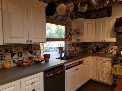
With this living room having been so successfully re-designed, the obvious thought came into the discussion to continue the vernacular of the blue and white Talavera into the kitchen. As a bit of a purist when it comes to application and termination of materials, I was not content for a mere back-splash. No, if the tile were to be effective and commandeer the stage, it had to be used wall-to-wall as though an entire wall treatment.
Treating the Talavera tile as wall-covering, it continues from the kitchen, into the adjacent pocket-space housing a desk and laundry machines.
But wait! The addition of an earthy aqua handmade tile from
Spain offered an appealing and unexpected accent woven intermittently through
the Talavera. It created a coordinating thread from the colors found in the mottled
slate floors and ceiling beams.
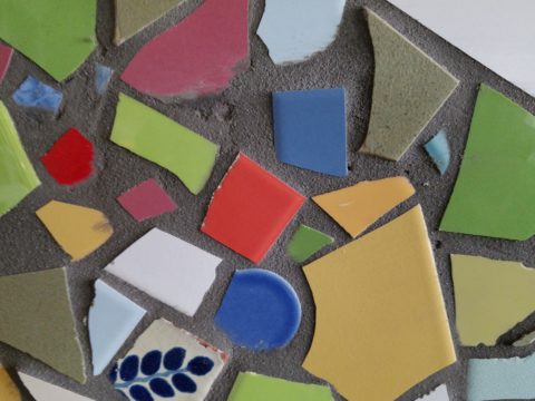
Pre-grout shot shows the individually cut 1″ pieces inserted as mosaics into the random field of Talavera
The cabinets were in excellent condition, but the doors were
sadly dated and in no way spoke to the home’s other cabinets, doors and finish
carpentry.
The confused interior finishes we in need of a transformation!
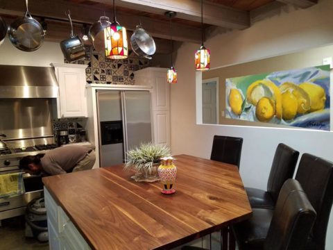
With the white raised panel theme throughout the home’s original appointments, we elected to salvage the cabinet boxes and replace the doors and drawer fronts with a similar raised panel detail. The same red oak was used and, with a glossy white paint applied, the grain “read-through” with a very intentional yet subtle moiré-like pattern. The new raised panel white doors and drawers, with crowning top molding provided a crisp, timeless motif. The random patterned Talavera used as an entire wall-covering was very effective. The kitchen was quite gussied-up!!
The transformation was dramatically successful!
The existing slate floor was beautifully organic and I felt, from a design standpoint, was a must to salvage. Making it look like an intentional selection – part of the new scheme – was imperative. Therefore, selecting a counter-top that communed with the tones in the floor resulted in a selection of concrete-like engineered Italian quartz material – balancing the floor with the next horizontal plane and ultimately with the stained and green-grey boards of the existing ceiling treatment.
The new concrete-like Italian quartz counter-tops coordinate well with the other materials.
Another asset was the connection to the outdoors, however the existing window over the sink was high and small.
The window over the sink was high and small…
By bucking the warranty of the Pella people, we had a new double-hung window made to close down onto the new counter-top that passed through from inside to out. They would not fabricate the window to do what we intended, so we had the contractor remove the bottom of the new window frame, thus rendering the warranty null and void, in order to have a completely open, uninterrupted pass-through when raised.
Amusing and interesting…existing family pieces of blue and white ceramics are being discovered and used as decorative accessories in the new kitchen!
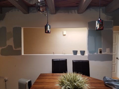
We also captured the opportunity to open the opposing wall into the hallway adding pass-through light and dimension to the space. This exponentially expanded the space and made the encapsulated kitchen feel much less confined.
Before, the kitchen felt small and dark…Opening the wall into the hallway brought in additional light and dimension.
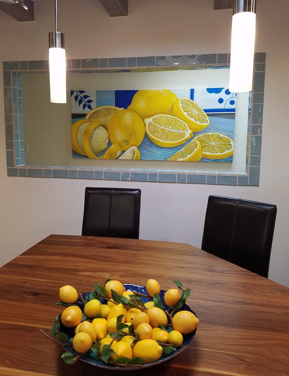
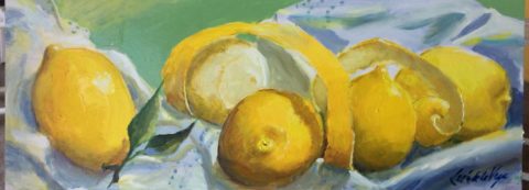
To add drama to the newly created dimension, we discussed having a painting commissioned to pop an accent of yellow into the blue and white scheme on the far hallway wall. Lemons, a perfect citrus for the kitchen, was decided for the theme.
A miniature oil painting by Federico Leon de la Vega was used to Photoshop into the scene to inspire and convey the design intent.
The additional POP of yellow is a dramatically effective contribution to the overall composition. After consideration, the owners selected a local artist to paint the full-scale painting.
A local Albuquerque artist, Thomas Tomlinson rendered the lemons in acrylic with blue and white tile details.
In summary…keeping the original slate floor, existing cabinet boxes (replacing door and drawer-fronts only), with a bling of new chrome cabinet pulls, switching out the stained glass pendants, replacing the island’s surface with a handsome solid walnut top and a new coordinating concrete-like counter-tops on the periphery, with the decorative embellishment of the Talavera tile continued from the subtle introduction at the living room’s kiva fireplace, the transformation of the kitchen is stunning – not trendy – and was truly, uniquely designed for the architecture and forward, on-going contextual design conversation of the home.
Uniquely designed…
Look around and listen to the environment for and in which
you are designing. What makes the best sense for the design direction
considering the function and context of your project?
Colors for fashion, interiors or a composing a bouquet are like the many ingredients, spices and herbs selected for great food. Creating dishes with fine flavors and visual appeal, by selecting the right combination, is good culinary design. So we see the spices and ingredients of design everywhere!
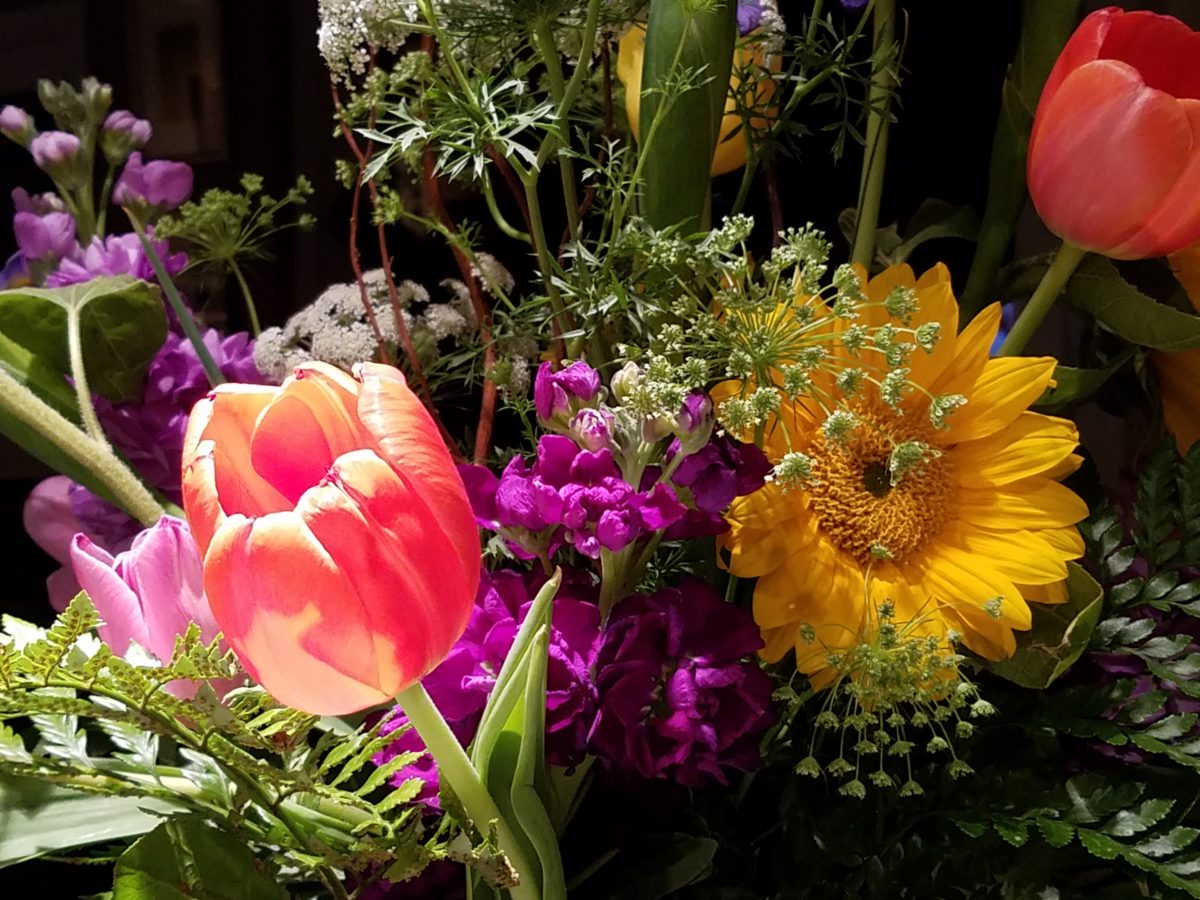
Assembling the colors, textures and shapes in a bouquet…
The art is in gathering the right combinations, textures, colors, flavors,…ok – maybe edible bouquets…Well, we’re not tasting the interiors – but some are scrumptious! Ooh – good enough to eat! And the fashion – yes, we’ve seen edible fabrics…generally not attempted in draperies – but who knows? The sky is the limit in design!!!
A few years ago, Kingston University Fashion Student, Emily Crane began pioneering a new strain of edible couture created from gelatin and seaweed! Brilliant and beautiful!!
Inasmuch as edible couture and creating fabrics from edible materials is fascinating, I digress…the actual point of my story is to recognize the common denominators between gathering materials for all forms of art – the assemblages result in the creative finished products. In this instance, interiors and their color schemes which bear likenesses to beautiful foods!
Color is the most apparent ingredient of most artistic design endeavors. It is the most obvious and first to catch your eye. Assembling an interior is usually grounded by a desired color. The foundation of a room begins with deciding a direction with color. This might seem to be contrary to the concept that form follows function – but I believe that the designing for the two are often concurrent events. The vision occurs while the function is simultaneously examined. Most people visualize in color.
I often write about color. It is an ongoing fascination to discover who prefers what color(s) and why. It offers the beginning of the visualization of a concept. As the framework is discussed – such as programming a kitchen. Inevitably, in the early stages, colors and materials are discussed. They might change. They might not end up as first imagined, but color aids in the visualization and process of design.
Look around your world and consider color. Why did you choose your interior colors? When selecting a color for the surfaces, fabrics and finish materials what would you do differently and why. Taking care not to merely react to trends, what colors will bring you joy? Trends often tempt. They are enticing and new, but they move along…It takes thorough examination to determine if a trend is truly applicable or merely a passing temptation. The validation of design is the approval of the occupants or function for whom/which it serves. Not just the feature of a new trend.
So have a little fun seeing these interiors
paired with edible color schemes as dishes are correlated to interior schemes.
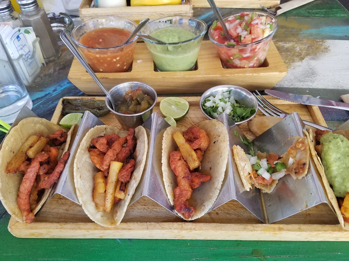
The spices and ingredients selected to create the flavor bursts might be hot green jalapenos, serranos, tart limes, dried red chiles balanced by the soft and warm yellow of corn tortillas.
What interior might look like a spicy platter of festivity?
Perhaps bold wall colors sprinkled with myriad decorative accessories and
functional art.
Spicy colors in this festive kitchen.
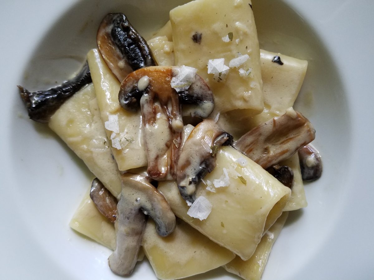
Imagine creating a creamy white-sauce mushroom pasta with
velvety texture and soft finish. The ingredients you would reach for would be
the cream, pasta, white pepper and perhaps a touch a sherry. Sautéing the
mushrooms in butter for a luscious golden brown.
Invitingly divine.
An interior that captures a similar feel derived from the same palette of colors…
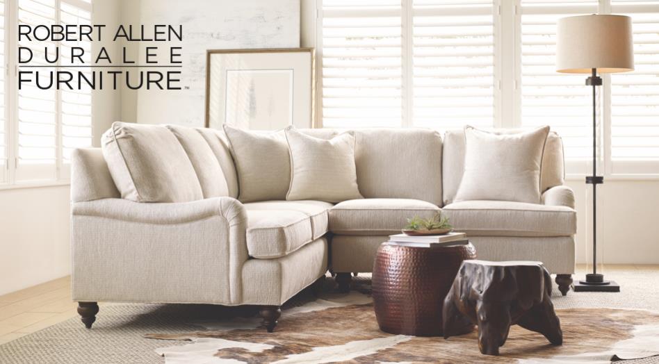
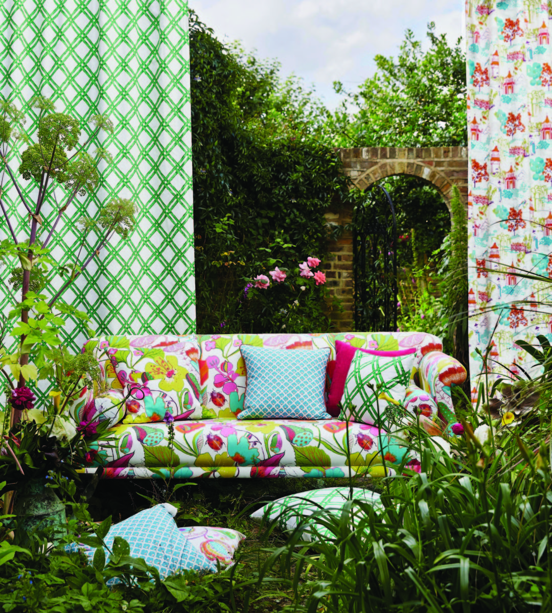
Mimicking the creamy mushroom palette, rich wood, copper and steel tones contrast against the creamy whites in this interior featuring one of our favorite furniture and fabric lines – Duralee/Robert Allen! Duralee/Robert Allen has many collections providing the perfect fabrics and furnishings for so many deliciously diverse interior projects!
From creamy, soft and warm to cool and refreshing…
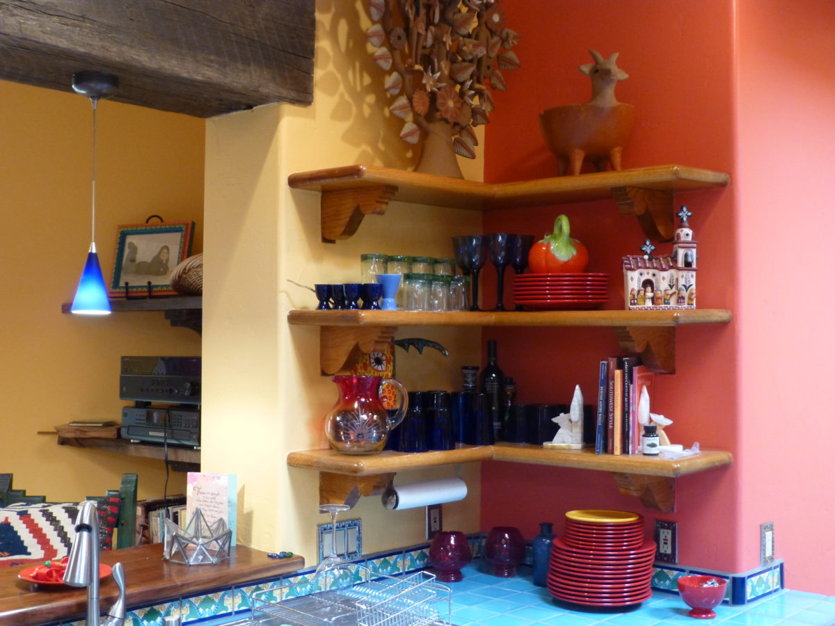
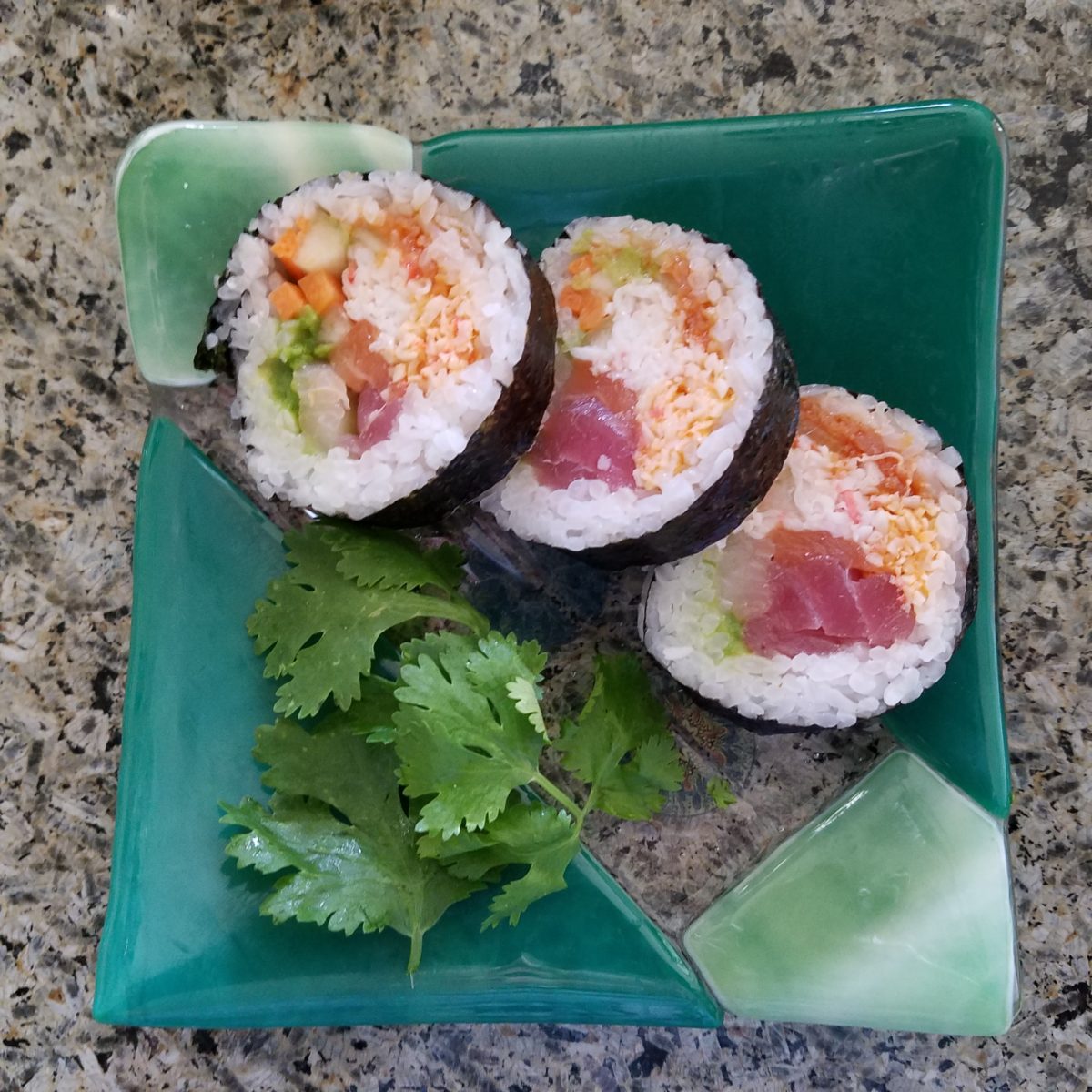
Cool sushi plates featuring the pink and orange tones of tender fresh fish, cilantro sprig greens, and so white rice!
An interior possessing similar colors – the perfect ingredients to create a stunning design!
Durlaee encompasses many fine collections. Here the Clarke & Clarke Oriental Garden fabrics are gathered together to present a fresh scene reminiscent of our colorfully fresh sushi plate!
Ready for reds?
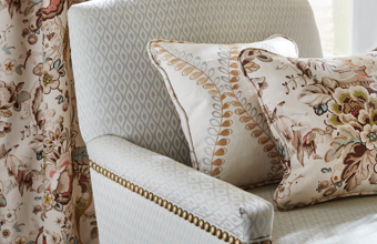
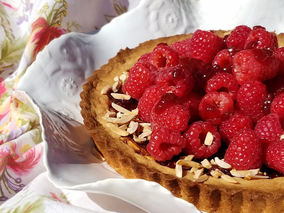
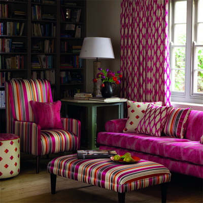
A berry lovely dish with creamy whites…Our delectable raspberry tart presented on a lace-embossed white pottery piece accented with finely sliced toasted almonds sets the stage for the next interior color scheme… Once again we are featuring Duralee’s Clarke & Clarke statement called Zanzibar a brilliant raspberry and red ethnic statement inspired by the exotic and vibrant world of Tanzania, Africa. Discovering the creativity of colors and fabrics in distant places offers a mélange of ingredients with which to create an exciting interior design!
Mix it up. Gather the
ingredients that will bring you joy and result in a deliciously creative
interior!!! Come see and feel these fabulous fabrics and furnishings from
Duralee/Robert Allen in our comprehensive design resource library at PATRICIAN
DESIGN! Call us and we will send samples!
With all the New Year buzz about the new color forecasts…I started taking notice of the seeming non-color, white. It is often considered the absence of color when in fact it is a very complex color of many shades and values. Just try to select a white and you will know what I mean.
When you look at white paint samples, you will notice the nuances. There are pink whites and blue white, grey whites and yellow whites. Each white is off-set and contrasting to another. You see the differences by comparison and by context. You think you have just the right white until you place it against another sample and see that it is grey or cream and then second guess yourself again…and again…How do you know which white is right?
Dunn Edwards groups their whites and pastels in a separate section of their fan deck as do other paint companies. What is interesting here is that the background is a sheet of white copy paper. Notice how is reads against the colors in the samples…it seems to be a purple blue color. This shot was taken under a full-spectrum LED lamp. The colors should be true. The range of “white” is amazing.
To intentionally design with white is bold. To have the confidence, to decide that white IS the color and that white IS the scheme, is challenging. To effectively design with white, you not only have to select the right white(s), but you have to know just how much of anything else might be effective yet not detract.
Le Leche in Puerto Vallarta is a fabulous example of designing exclusively with white. Only with minimal punctuation with black lettering on the wall of containers and also by allowing shadows is the white interrupted. But the blacks’ minor interruptions gives depth and fine detail.
White design can be cold or warm. Depending upon the desired effect, mood or function of the space, the whites need to be carefully selected. This is true with lighting as well. Warm whites or cool whites…what gives you the desired result?
Popular white string lights add festivity and a warm glow to an evening scene.See how many lighting colors you can identify in this scene…Starting on the left, a cool pocket glows through the underbrush. The walkway has a warm pink-ish light. The very cool blues of the pool area give a dramatic read. A bold yellow accent peeks from the far left and also over on the right. The palm trees are wrapped in a warm white tube lights while the far right side illuminates the entry to the dining palapa with a cool white light source. The foam of the surf on the beach is captured with a cool white spotlight that maintains its naturally expected white color.
Knowing when to add color to a white scene to achieve an intentional POP is an art. The color itself, the amount and placement is all part of the success of a good design result. From the fine black detailing in the previous shot of La Leche to this still-life composition of a tropical cocktail that I propped the other day, the minimal punctuation of color is key.
White mosaic shards of tile in the background of this composition featuring a peeled coconut and the POP of a pretty pink party umbrella result in a white-on white scene. Yes, this shot says PARTY with a perky smile!
The bench which served as the backdrop for the coconut cocktail is a dramatic serpentine sculpture of site furniture that plays with the white-on-white of the tile and grout.
Contrasting against the organic wood decking, this white monolithic bench snakes around the periphery of this outdoor lounge area. The sunset is casting a soft pink wash over the all white glazed tile.
Beach settings using white materials compliment the white sand and greenery of the tropical plants. From wood frame platform cabanas to the sprinkling of umbrellas, white is a wonderful, fresh color for a crisp clean scene.
Whites on whites…creamy sand colors to crisp white terrycloth, the white-on-white scheme is soft, inviting and clean.Greenery compliments the white umbrellas and sunning beds on the lawn by the beach.Palm trunks and other fruit trees are often painted white to protect against insects and what insects insist on climbing the surface are easily spotted by birds who appreciate the help to capture a snack! In this case, they contribute to the white design theme.
The soft creamy off-white folds of fabric offer a soft, inviting scene.
Shadows in the creases and depths of the folds add the dimension to the luxurious feel of the cotton damask fabric.White stucco is dappled by shadows and greenery while given a warm, strong base by the brick pavers. White as an architectural finish is only successful if the context compliments it. This is true in all design.
Architectural color and texture of surfaces is a moving target. A recent discussion about a white building with black detailing would not have proved right for this particular use of white. The hard, commercial read would have been too severe for the intended effect. Yet that same project, with a warm white and an ochre accent, will be just the right combination to achieve the desired result. Watch for this project to be featured in a few months.
Architectural surfaces incorporating tones and textures of white provide interesting opportunities
Block and crumbled edge accent bands on the facade of an exterior wall.
White in design is an exciting selection. Knowing how, when and why to use it is a test of your creativity. Picking the right white is the challenge.
The limitless colors of white found in a pile of gravel…..
So the next time you think white, think a lot about it. Study the context and what you are trying to accomplish. Feel freed by the fact that white is a color to express and enjoy.
After
last week’s Color of the Year observations, I furthered the subject regarding
the importance, influence and value of colors.
I
don’t know the science behind how individual’s eyes perceive and translate
color… rods and cones and the anatomy of the eye as it speaks to the
brain…but what I do know is that
COLOR and the context of COLOR MATTERS even if it is not perceived exactly the
same by everyone.
My
parents were coincidentally both apt to notice, remark about and describe color
specifically. To them, and ultimately to me, colors were something to
regard and absorb, for better or for worse, and all colors deserved acknowledgement
and specification.
I distinctly remember their descriptions, “Parrot Green, Sapphire Blue, Lemon Yellow, Fire Engine Red and Brown as a berry” – a compliment which indicated that you had tanned sufficiently! I think it was a result of our island home-away-from-home that prompted many of these titles. We, for sure, had no parrots making their presence known in Virginia! But for some reason, colors in the islands prompted unusual appreciation and scrutiny. This parrot green was like grass green but a bit more intense – saturated – not a dark green and certainly not a spring green – just a brilliant, clear, secondary green! The result of true, primary blue and yellow mated to make GREEN!
Color is a communication tool to convey – color. But what color? What type of color? What specific color? Is your version of a color the same as mine? Do we “read” color the same way? Do we express the description of color the same way? How might you explain a color to a person who is blind?
I’m writing this today from the tropics and it seems worthy to note that colors are abundant here in brilliant evidence through all seasons. Whereas in a decidedly changing seasonal and climate, colors come alive in spring, progress through changes and pretty much crash for the dormant winter months. Contrarily, the topics meld their rainbow of blooming floribunda, bounty of fruits and palette of these brilliant colors year round.
Maybe
it is because we straddled both worlds. The lush, verdant, colorfully blooming
and always reliable tropics countered by the decidedly and distinctly changing
seasons through dormancy in the northern climes. There must be an appreciation
for the change. The lovely, yet possibly monotonous climates that produce
blooming color all year round might dull the senses to the seasonal reemergence
and staggering beauty of new growth and blooming abundance and mute the verbal
expression and appreciation thereof.
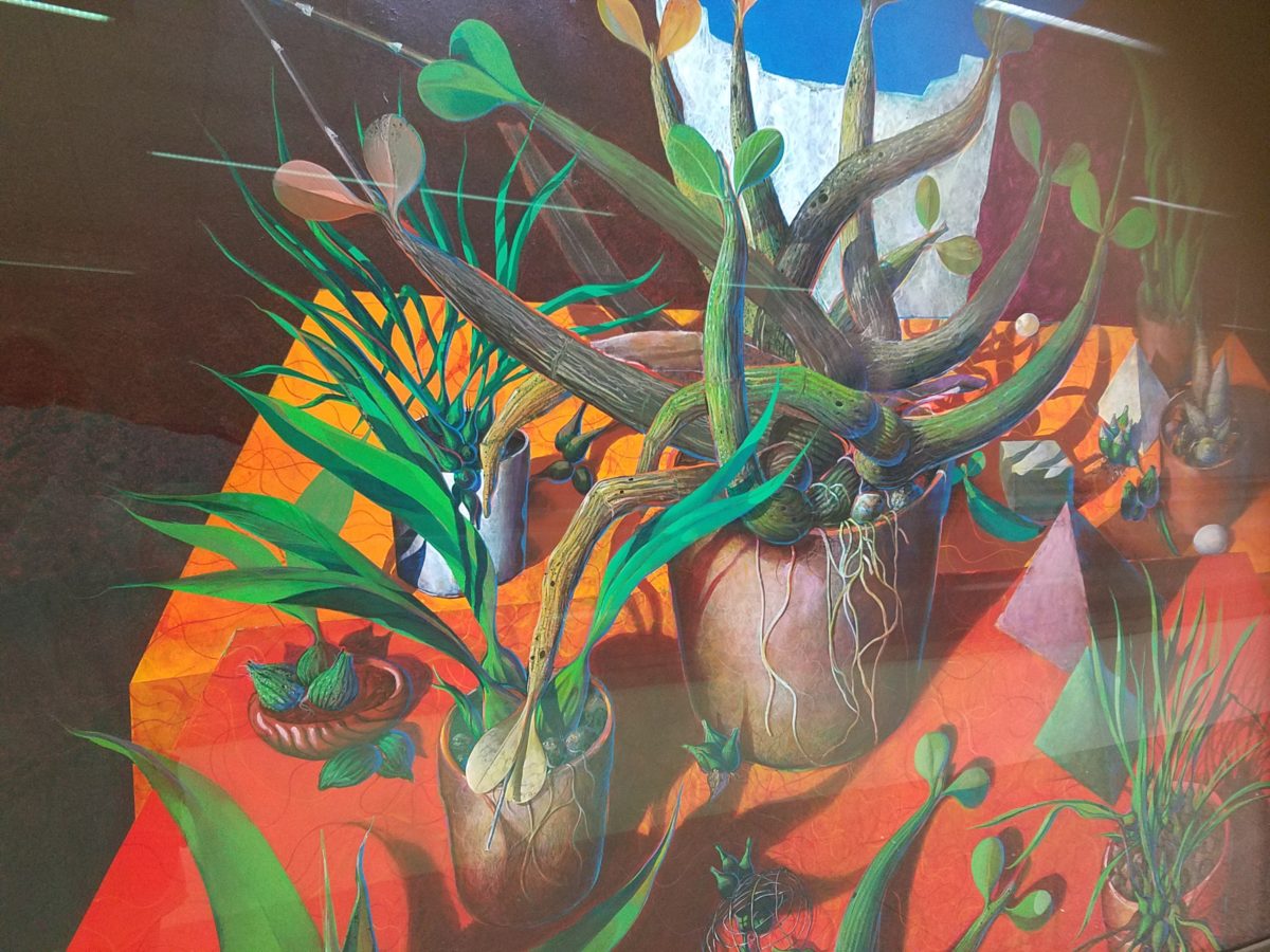
For example, my color antenna is always up and running. As I struggled with my pair of carry-on luggage monstrosities clearly in excess of 75 pounds (good thing there is only a size and not a weight limit!!), I came upon 2 art pieces in the Houston Hobby airport. The colors beckoned me. Although I had noticed them in swift passing, I couldn’t help wanting to see more. So I stopped and dashed back, disassembled my cumbersome haul and quickly took photos of these two paintings on exhibit, in the concourse, in order that I could enjoy them a bit later. Initially attracted by the color, they arrested me allowing and inviting an opportunity for further examination of their subject matter and detail later, when I had the luxury of time.
The wildly organic plant life, featuring an animated orchid that tangled and writhed on the painting’s surface in a variety of verdant green’s set against a perfectly selected fiery orange table surface, was brilliantly alluring and seemed to set the stage as a precursor to my soon-to-be-destination in tropical Mexico. ARTIST: Lucas Johnson Still Life with Schomburgkia
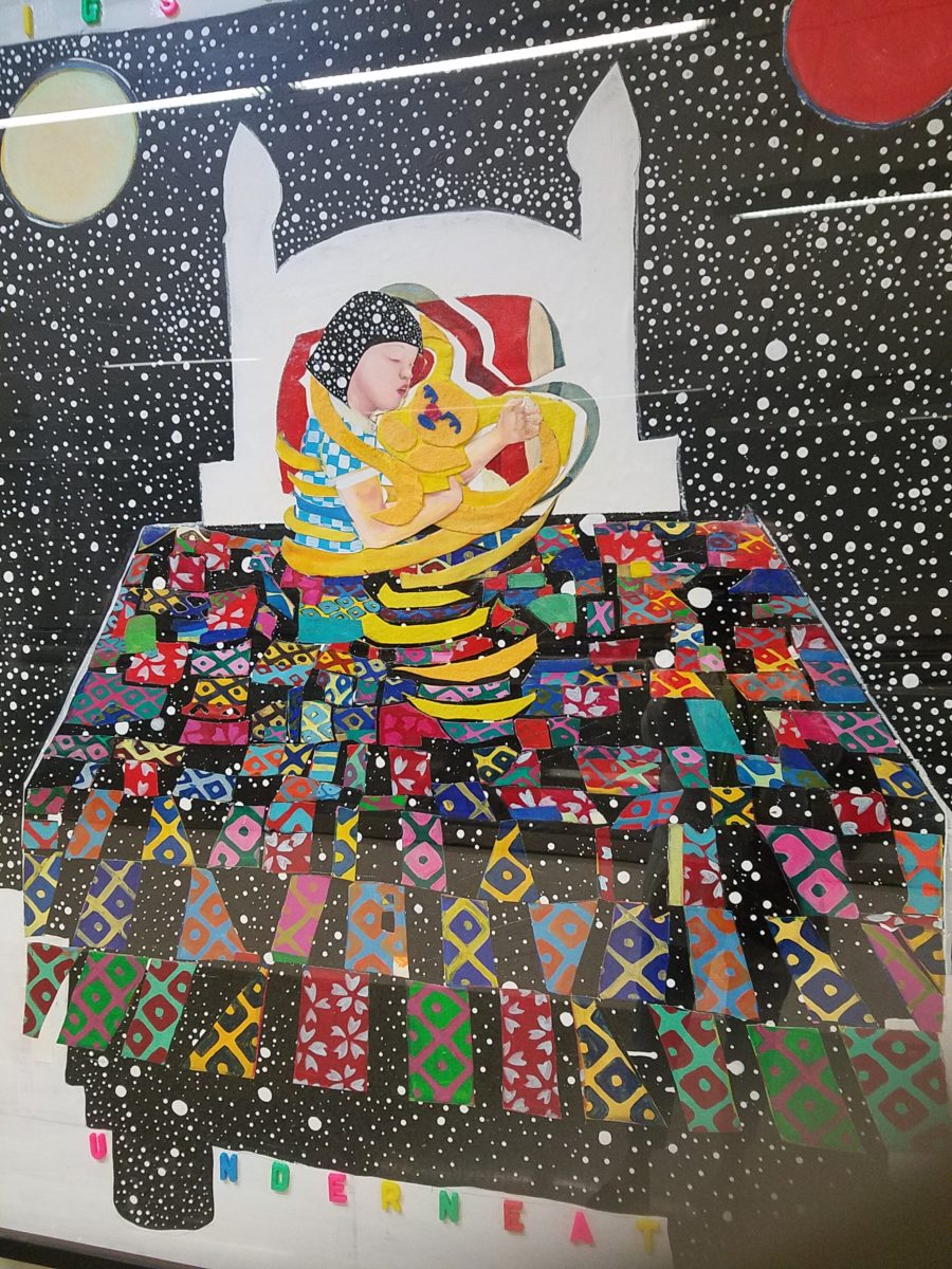
A bit further down the corridor of the concourse another piece caught my attention. Similarly with its colorful invitation, but with entirely different subject matter which upon closer inspection was quite intriguing, a patchwork quilt of batik fabrics and collage with applied letters beckoning the viewer to wonder what might be beneath was magic. The woman or child and beloved pet in the center of the action nestled under a cozy and colorful quilt, wrapped in a cloak of starry darkness which might suggest clinging to each other against the foreboding imaginings of the night.
The intense collection of the brilliant colors contrasting against black was dramatic, mystic and inescapable in this powerful piece, It Helps to Think We’re Sleeping Underneath the Same Big Sky by artist Joo Young Choi.
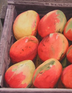
Watercolor
artist extraordinaire, Susan Weeks, captured this crate of mangos at
an exotic market somewhere very south of here. Peru? Ecuador? I don’t remember.
Susan gets around. And, Susan sees color and detail and renders it with
remarkably exacting precision.
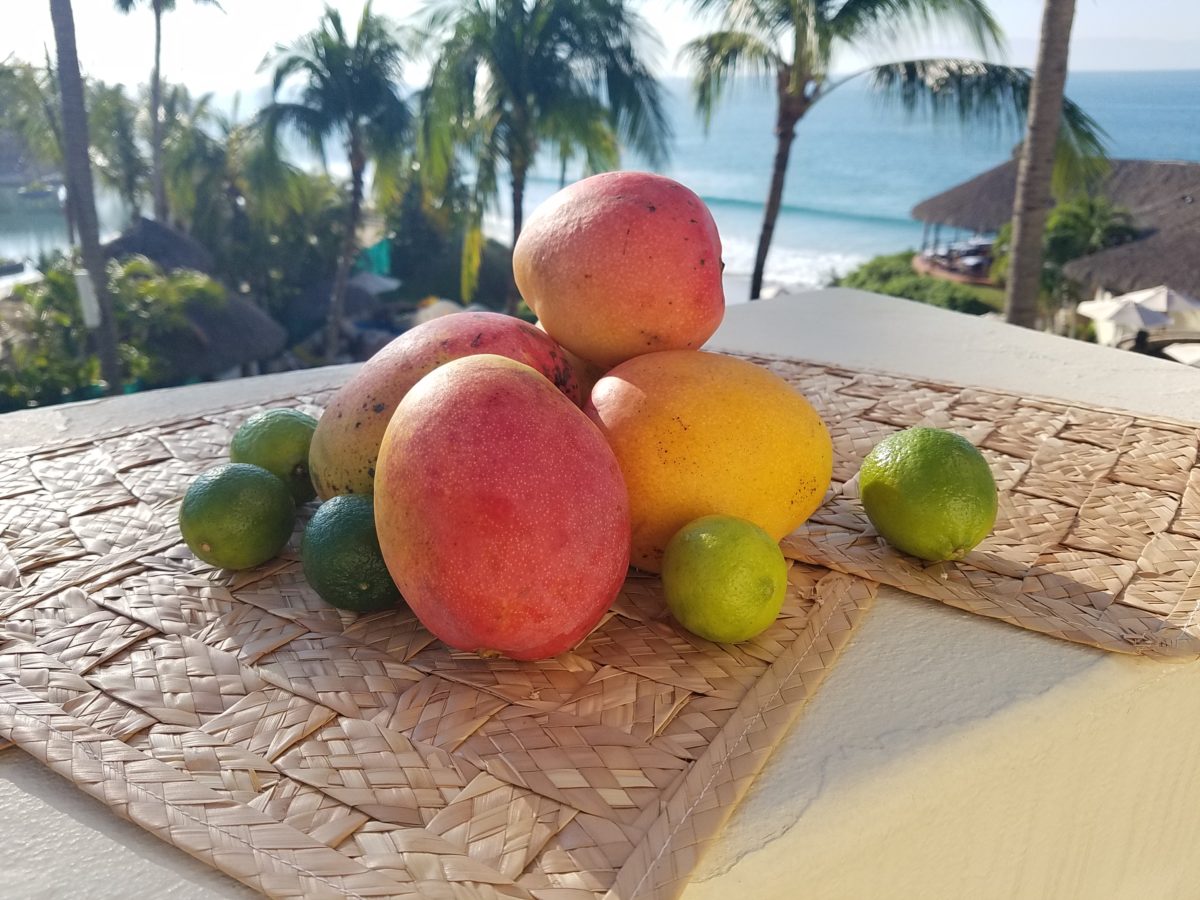
As I greet the day, I’m taking my stash of mangoes out onto the balcony to be seen and photographed in context. Reminded of how Susan rendered this succulent sweet fruit, with the delightfully “hairy pit” (nods to Tricia), I celebrate this colorful collection of nature in a sensational setting! These gorgeous tones of warm golden yellow, baby iguana green and yes, 2019’s rosy warm coral (Pantone’s “Living Coral”) are nature’s color scheme. The orbs are sensuous and the colors are excitingly bright and luscious.
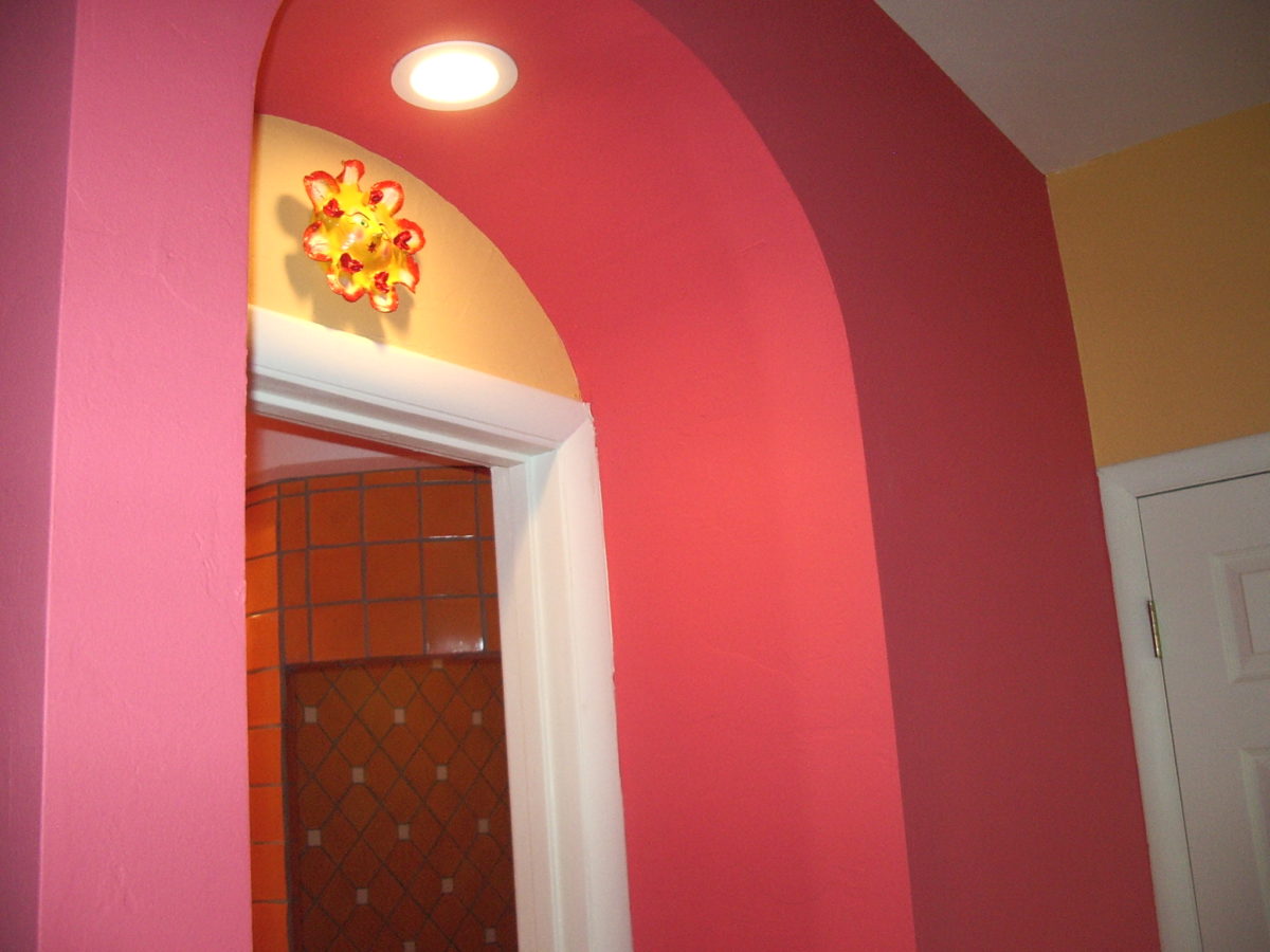
Mango colors of rosy coral and warm, golden yellow are paired in this arched interior entry.
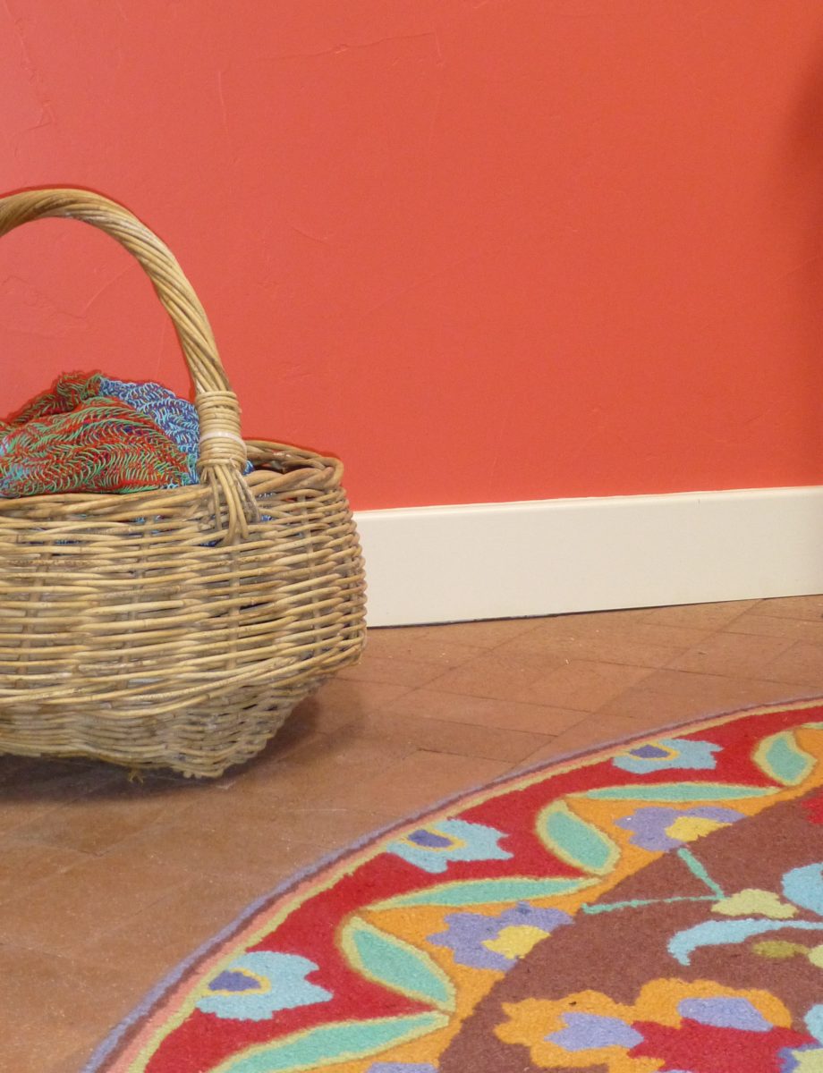
Here a similar scheme featuring one of our favorite Company C rugs illustrates the bold, effective power of color selection.
Try this exercise with color. I have no idea what your eyes see and your brain translates, but walk around and look at things in your world. Notice color. Notice individual items…book bindings to fresh fruit. Evaluate each color’s effect. Does it evoke any emotion…good or bad? If you wanted a painter to paint a wall that color and you didn’t have the paint selected, how would you describe that color in an attempt to get it on the wall as you desired?
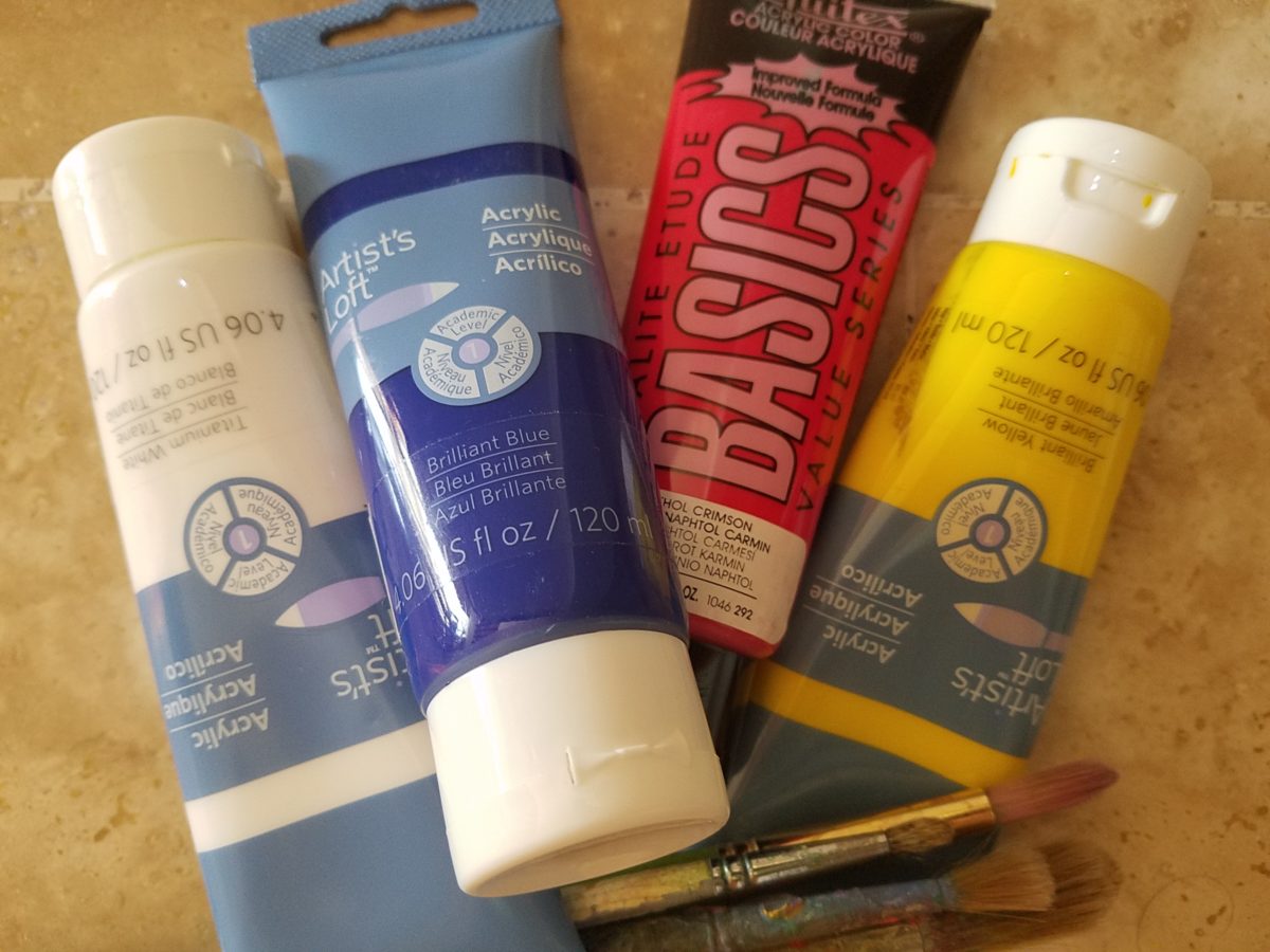
In a more thorough test, you might be prepared with actual paint – like tubes of acrylic from the craft store. Get a print-out of a color wheel to illustrate the primary, secondary and tertiary colors. https://bit.ly/2SVKUMg Buy red, blue, yellow and white and use them to attempt to create the color being described. This could be a party game – but you would need to also have paint chips from the home improvement store or paint store to use as the prompts that would have to be described and used to match the success or failure of the person attempting to create the color.
Noticing color brings appreciation to the details and nuances of our color-filled world. The little exercise/game, to try to convey a color to another person based upon similar life experiences and references, is interesting. Please share your thoughts and experiences, dilemmas and frustrations with this project through the blog’s email.
I hope this encourages you to go forth with a new-found appreciation of color and how it adds layers of depth and interest to all that you see. Examine the natural world, or man-made creations in film, set-design, architecture, graphic advertisements, fashion design or interior design. See why color matters!
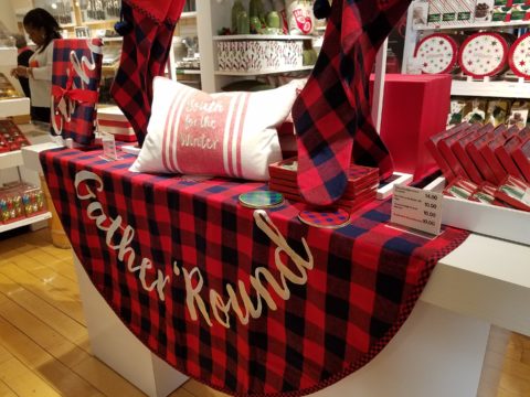
Some retailers put Christmas merchandise out with Halloween and squeeze Thanksgiving autumnal themes in between. But for sure, by Black Friday its all about Christmas merchandising and SHOPPING! The season is in full swing! After salivating over the finely “curated” collections at Sundance, peeking through the dazzling embroidery at Johnny Was, had a taste of Margaritaville at Tommy Bahama’s and elbowed through the throngs at Anthropolgie…among the myriad stores I visited – well, raced through – this weekend, Crate and Barrel is the one where I focused my camera and paused to ponder as they are one of the most prominent trend setters in world of home decor.
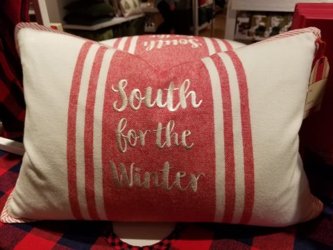
Upon arrival, front and center in the very first display, I was particularly drawn to this embroidered pillow announcing South for the Winter!
It caught my eye as it stated my very thoughts on the subject – although I prefer to stick around for a wintry Christmas and then head south as January sets in…it nevertheless spoke to me. But the combined selection of plaid fabric tree skirt and the cotton pillow had me puzzled. I picture the pillow being in that southerly destination expressing the sentiment but paired with the plaid, like a fish out of water. Plaid in a warm winter getaway didn’t seem to fit. Perhaps it is a pillow that you leave in your chilly, empty, abandoned house with your woolen plaid blankets and afghans as you snow-bird it south? In which case the woolly plaid works, albeit nobody is there to get the drift – snow drift! Or a third scenario that I imagined is when you dream of going south, but are stuck in the northern climes and the pillow states your thoughts in a “wouldn’t it be nice” wishful thinking scenario??!! Three stories for this little pillow…which do you think is the best story?
There on the Christmas display is an intriguing statement of home decor. There it sits, this smart little pillow, all dressed up with the coordinating holiday plaid and exclaiming a statement that might have many connotations…
It’s nice to establish traditions for Christmas and other major holidays throughout the year. Yet like home decor in general, some people are more sentimental than others. While some treasure each year’s addition to a collection or contribution to the spirit of the season, others trade the look with each new trend.
This year an all gold tree…next year it might be jewel tones of amethyst purple, aquamarine teal and ruby accents…and of course the ever popular white on white on white!
Like personal interior design, some switch it out often, with changing fashions, while others nestle in and call it home for the duration. The compromise here is that there might be a family room tree that displays all the traditional ornaments while a more focal tree in an entry or living room makes the trending design statement.
As interior designers we wouldn’t be very busy if everyone nestled in without change for decades, however, even in this staid scenario there is the need for sprucing up the tired, updating certain elements, replacing damaged or broken items…Therefore, reupholstering, replacing of worn flooring, introducing fresh paint colors, improving lighting, opening spaces, face-lifting kitchens and bathrooms…there are many things that we as designers can do to update while not changing the essence of the place called home. Just in time for the holidays and the refresh-during-winter design blitz!!
Back to Crate and Barrel’s merchandising…
The bling that sparkles in the long dark nights of winter is a recurring and uplifting theme.
Red and green are inescapable for traditional Christmas color schemes.
Holly leaves and berries, evergreen needles, brilliant red bows and ribbony garlands.
Having previously stated my love of the traditional blue and white color schemes in so many applications and blogs I have written, Hanukah’s blue and white colors are perfect to crisply punctuate the doldrums of defoliated trees and dormant, bare bones deciduous landscapes of winter. The cool yet refreshing theme is a perfect winter color scheme.
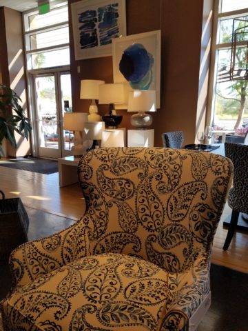
With their modern/retro style melding with a bit of industrial, Crate and Barrel’s stylized wing chairs with their updated lines sport a fresh take on a paisley motif cotton print.
Naughty or nice, reindeer, fir trees, twinkling lights, scented candles, silver and gold, movies and music all stir the senses rejoicing in a healthy economy of vibrant shops, eager shoppers, anxious bargain-hunters, BOGOs and door busters, full of fresh new ideas, products, design trends, toys, gadgets and nearly anything you can imagine!
So get out there and strengthen the fiber of your community, support local artists and fabricators when you can, shop where your neighbors work and where your local entrepreneurs invest their dollars and dreams. Try not to overdose on all the glitz and blitzen of the merchandizing madness!!
In past blogs Patti Says a lot about selecting paint colors. Pondering paint colors and the elusive nature of selecting just the right color. https://patriciandesign.com/5677-2/
Walls surround your world. Walls encapsulate and enclose your personal spaces. They can also frame your world and dramatize a focal point. They add effective dimension when punctured.
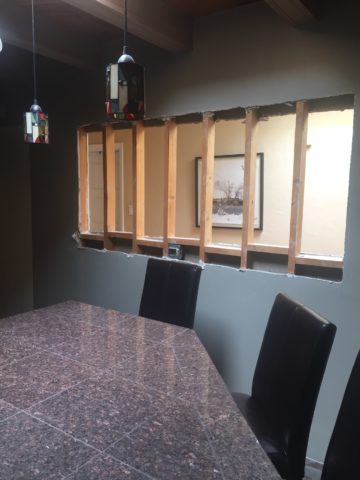
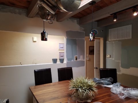
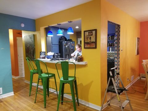
A current study we have in front of us is about those specific things. Walls – opening them, their color and the context of the color decision. Months ago we examined a wall in a kitchen soon to be remodeled. Re-painting it was the most obvious and least complicated of the options. We also looked at creating a dimensional recess to house art or an accent color or something to take the curse off of its up-close, massive, solidness. It was like the 10,000 pound elephant in the room!
The wall encapsulated close quarters. It divided the space between the kitchen and the parallel hallway.
What we were looking to change was atmosphere. This involved improving the dated and worn cabinets and counter-tops, updating the lighting, enhancing the back-splash and addressing the closed, isolated feeling of the room.
Smoke and mirrors might be the answer. Like a magician appearing and disappearing behind a veil/dimension of smoke – or when the physical space is not negotiable, mirrors will give the illusion of added space. They are VERY effective tools, but neither was the right solution for this room’s current condition. Yet, we knew we needed dimension, depth and something to help expand the space.
Hmmm…the window over the sink offered an exciting option to open out to the patio. We did that – save that for another story. However, this large elephant of a wall was still so confining.
Sometimes small spaces can be cozy. Some people prefer tight spaces while others find them to be claustrophobic. This was not exactly claustrophobia instilling, yet it certainly spoke to all of us as an imposing, confining factor that needed attention.
After discussing all the colors and recessed options someone has the brilliant idea to ask – “What about removing the wall?” That seemed a bit radical considering that it only opened to the hallway and it served a purpose of defining the access to the kitchen and opposite bedroom quarters. To open it entirely might have given an orientation to the kitchen that suggested that the island seats be positioned facing that point-of-arrival. Hence looking directly into the far hallway wall. That was not the desire. Rather, we decided to cut a large opening in the wall exposing the far hallway wall while maintaining the orientation of the kitchen toward the outdoors and island seats facing into the kitchen not out into the hall. It worked!
The space was instantly enlarged. Opening the space onto the patio and this opposing generous puncture of the Great Wall of Kitchen changed everything! The light borrowed from the skylights in the hallway was significant and the sensation of enlarging the space was undeniable. Except the footprint had not changed.
The physical feeling of a space is what counts. It was proven here that it wasn’t about enlarging the space but feeling like it was enlarged. Like mirrors, the illusion of space is so important. But, unlike mirrors this space was physically opened creating the sensation of enlarging the space by adding actual dimensional reality . The benefits were immediate. It actually conveyed a palpable feeling of relaxation. It was freeing and created an entirely new experience of enjoyment.
A passing idea for a stenciled surround was entertained…
Tight spaces give some people comfort. Contrarily, open spaces give comfort to others. Personal reactions to space, color, texture, temperature all enter into the equation of good design. What tasks are being performed also play a part in determining what solutions are best.
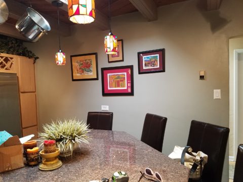
This dark, isolated kitchen benefited from changing the cabinets to a white traditional raised panel style detailed with crown molding which added a refreshingly light element. The house was a decades old vintage bungalow and had been dealt a disservice to have had the kitchen remodeled years ago in a not-so-sensitive, style-of-the-day fashion. But, in addition to the more traditional timeless approach to the design, opening the space resulted in additional natural light borrowed from the hall’s skylight and an enlarged interior over-the-sink window brought more coming in from the patio. Now colors…
So we know that picking colors is contextual.. .what’s in and around the room are all part of the equation. Any walls that are seen beyond (through doorways, around corners) contribute to the layering of colors and therefore, participate as well. The floors are multi-colored mottled slate. The tile chosen to enhance the backsplash and also serve as wall-covering was a blue and white Talavera accented with a soft aqua mosaic. The ceiling mimicked the floor as the beams were a smoky grey with caramel-color stained knotty pine boards between – we embraced these existing design features as their unselfconscious non-trendy nature suggested a more grounded, permanent place – one with organic finishes that might have resulted from local availability sourcing and craft – and probably did all those decades ago. See what Patti Says in another blog about this very project: https://patriciandesign.com/trust-and-custom-designs/
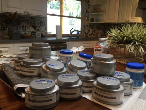
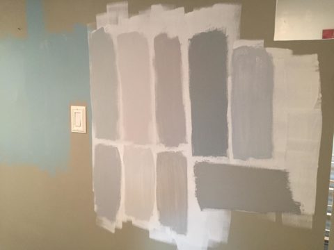
The fact that all of these elements contribute to the equation, for deciding a color, is key to our study today. After discussing the options for treating this newly opened wall, we found ourselves doing the paint sample potpourri on the walls!
Taking cues from the aqua accent mosaic which was derived from those tones found in the slate floor, we directed the color choices toward smoky aquas and grey blue tones.
Sometimes white is actually a color, rather than the absence of color. The wall was currently frosted with smooth crisp drywall mud as an aftermath to the demolition and framing of the new opening. The stark white was clean and fresh. Like matting around a painting – this might just be the way to go.
And at this point, we must introduce the idea that was also in the works and that was to have a painting commissioned that would POP through the opening providing a spectacular backdrop to the kitchen and dress the dimensional contribution that the opening into the far wall of the hall presented.
We knew that yellow was a great color POP for this cool kitchen pallet. A recurring bowl of lemons kept proving that to be true. Lemons became the fresh, culinary subject that seemed to be the perfect fit. So we enlisted our master muralist Federico Leon de la Vega to meet the challenge. Armed with the blue and white scheme and the accents of aqua he created a miniature to test the concept.
Isolating the image and framing it is always an important component in the formatting of scene. Whether to spotlight a sculpture on a pedestal, or properly and effectively matting a painting in a frame, this aura is important to highlight art. The same became true as we considered the painting being “framed” by this opening. The wall itself became the mat. So to get an idea of what this might look like, a quick digital manipulation did the trick.
The final decision seems to be that we will keep the wall with the opening white, as though a matting around a painting, while painting the perpendicular wall a smoky aqua. Another opportunity for layering these two colors occurs when the smoky aqua wall is layered over a receding laundry room wall soon to also be painted white.
Watch for the completion of this wonderfully unique little kitchen to be unveiled with all the dramatic before and afters! Meanwhile, look around your interior and see if opening a wall might be an option to expanding your sense of space. The transformation can be rejuvenating!
Pick a color. What’s your fav? Do you HAVE a favorite color? I was asked the other day that very question and I was really at a loss…I looked at her, furrowed my brow and cocked my head. I wanted to have an answer – a simple answer that stated a definitive preference for a color – my most favorite. Rather than producing a quick sure pick, I faltered as she stepped in and said – I’ll bet it’s purple!
Well, actually I can definitively say that purple is NOT my favorite color, but the funny thing is I can love purple, in certain context. The real answer is that I love nearly any color in a certain context.
When I ponder the question a bit more, I can assertively say bright pinks, cornflower blues, golden yellows, chartreuse and brilliant orange. But the truth is, I love so many colors that I am hard-pressed to select just one! It sounds like a Lilly Pulitzer color board.
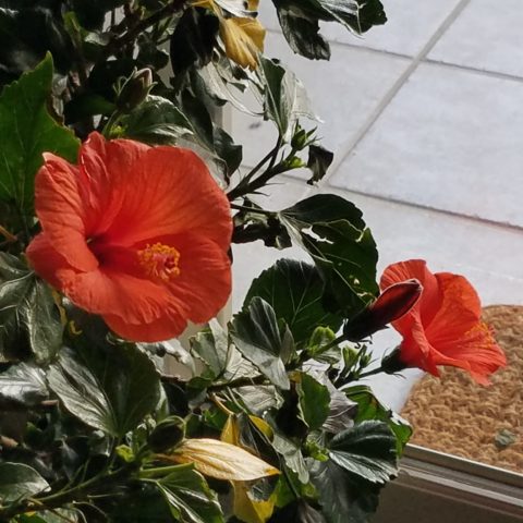
So I thought of a little exercise. I decided to pick a color at random. Then overwhelmed with the myriad colors that might produce one random pick, I fine-tuned random and said to myself, perhaps a color of the season. To me that was currently and boldly orange. So the idea was that I would walk in and around my house today and capture things that were orange.
This screaming orange hibiscus just came in from the patio to escape the chilling temperatures that have swept down in the last couple of days…happy to transition indoors for the winter!
Try it. Pick a color – not necessarily your favorite – but certainly one you like and walk inside and outside of your house and see how many examples you can find, of that color, in your immediate world. Photograph things that have that color – all or in part, even little details – anyplace that color occurs. It’s fun and very interesting to see what you discover!!
Autumn is loaded with vibrant colors, but orange is one of the most fiery.
So I selected orange as my color today. I dashed around the house and collected a variety of things that were orange. I was actually astonished at how many I discovered.
This dramatic Hopi – influenced kachina by Gregory Lomayesva sports stylized antlers in a flat but brilliant orange.
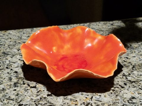
Festive ceramics by Ann Marie Werner Smith – here a graceful orange bowl that sits on the counter…it pops against the contrasting granite.
It is interesting because I know my world is not heavily orange, but I found so many wonderful splashes of it throughout my interior and even startling exterior, in the way of the leaves on the Bradford Pear tree.
From fresh mini pumpkins and flowers…
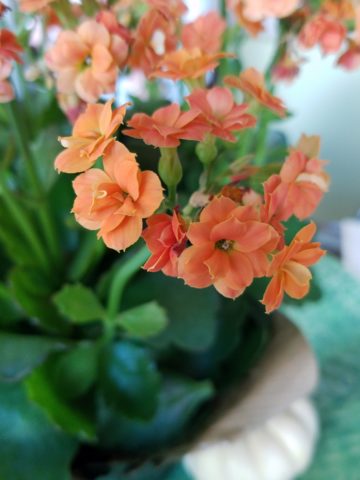
A succulent orange flowering Kalanchoe is our seasonal centerpiece on the kitchen table.
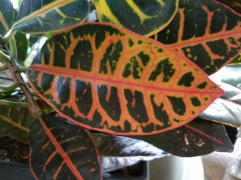
A variegated Croton plant has lacy veining of bright orange, pink and yellow contrasted against it dark green background.
to artwork with swaths of orange streaking through them.
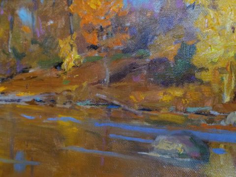
A lovely little oil painting by Jeff Otis depicts a very autumnal New Mexico river scene.
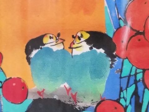
At the last minute, while waiting in the Bejing airport, I found this precious little painting of birds and berries. The background is a vibrant orange. Notice the fresh blues adjacent to the orange. This is a detail of the much larger piece.
Peggy Zuris really knew color. Her bold and confident brush strokes applied in luscious swaths placed adjacent colors perfectly juxtaposed creating uplifting renditions of daily life. This little chicken is a detail of a fanciful rural scene.
The balance of color was so interesting. Where I found orange, I nearly always found blue – unless it was a stand-alone like the glass bowl of oranges – or my coral necklace with its nuggets of bright orange coral.
Fresh oranges with their intricately textured rinds fill a glass bowl on the kitchen counter.
Nuggets of coral look like candy corn tightly beaded on this delicious necklace I wore too Santa Fe today!!
Colors balance and contrast.
Even the coasters that attracted my attention last weekend at a bar. I was so taken by them that I brought them home and had them sitting on the kitchen counter. They were intriguing and offered interest and visual stimulation to my graphic art sensibilities.
I began this story earlier today, then took a break and tootled up to Santa Fe where I came across a couple more bright orange pieces…
And on the way home, I was even blinded by an orange fireball glowing beneath the stormy sky silhouetting the dark mesas and glistening off the wet pavement. It’s intense heat contrasting with the cold, damp asphalt that was a result of our first seasonal snow seen here spitting at the windshield.
Gather your collection of photos of your color today. Ponder how they and the color make you feel. Do you get joy from the color and the things you have discovered? Was this not your thought-to-be favorite color and if not, might it be one of them? How do YOU answer the question, what is your favorite color and having determined that, ask yourself: Do I wear it a lot? Would I paint my walls that color? Do I have upholstery that color? When is a favorite color an accent? Is the joy in the little spots of punctuation? Are they intense, but small, elements of joy without over-doing it? I see a collection of abstract images, details of things – some of which can be cropped more – to create an abstract collage of wall art. Voila!
Color – an amazing facet of design and it’s most versatile component. It’s been a fun test and a compelling story. So what’s YOUR favorite color?
Patience. Good design requires patience. Do you have it? The design process can either take the route of “all planned before anything starts” (everything drawn and detailed, all finishes selected, all fixtures and furnishings, fabrics and accessories decided and specified, for perfect inclusion into the design) or the process of “design-as-you-go”. The “all planned” design process allows for exact pricing and budget planning. But if the process takes too long, some of the things specified might no longer be available – that has happened more than once! The other “design-as-you-go process” is more random. There can be and often is a combination of these two approaches, but the second requires more patience and less precisely scheduled time.
The luxury of time, experimentation, trial and error, wait and see, what if, all are elements of the “design-as-you-go” process. It is decidedly the more fun and more participatory process. It starts and evolves before your very eyes, with the in-the-field options, to change, modify, massage, delete, add, think and re-think, all available while the action takes place, it is like creating an art piece one stroke at a time. Artistic expression rarely progresses in a straight line.
All of the above can be said of the pre-planning process too. You can illustrate, render, draft, erase, alter and change all the while – but you are doing it prior to commitment, prior to actually seeing the actual design unfold in real time.
Changes and additions can arrest the process – whether in pre-construction planning or live-in-the-field. However, live-in-the-field is much more int-eruptive and possibly costly. Changes and additions can cause scheduling delays which can domino throughout the otherwise planned program. This can result in not only cost considerations, but disarray and a prolonged inability to use the space.
As I visited one of two parallel kitchen remodels nearing completion that I have previously mentioned, the owner mused “It’s a painful process.” But as we stand there enjoying the transformation he continues “It is almost hard to remember all the phases we’ve been through to get here. Kind of like childbirth.” We laughed at the fact that the world would be filled with “only children” as no mother in their right mind would go through that pain again!! He and I both never having experienced it for ourselves – yet, “they say” that it’s true. All very much worth it in the end!!! The ultimate reward!
This BEFORE shot of this kitchen shows dated, anemic face-framed radius flat panel cabinets, granite tile counter-tops and back-splash.
Not quite finished, cabinet pulls are being installed, final painting details are underway and the transformation is being unveiled. New cabinet doors add a classic raised panel detail painted white, with new concrete-like engineered Italian counter-tops, and striking Talavera tile back-splash punctuated with mini mosaic Spanish tile accents. A new window opens to the outside patio with the counter-top passing through and the window closing directly on the top.
Residential design – those private, personal spaces always involve knitted brows, vacillation, additional worry and more indecision than commercial designs. Not to say that commercial designs don’t involve interested parties, if not actual owners, the investment in the personal pocketbook and personal emotion is not the same. Furthermore, there are greater personal thrills and disappointments in the residential projects.
Well, back to patience. It’s a virtue and I often struggle to practice it. I tend to be overly eager for instant gratification. But patience is very important when creating something of value and timeless appeal.
Design takes patience during the various stages of design details. We are not talking about building a rocket ship – but imagine the design and engineering required for that!. Let’s just talk about something simple, like custom drapery rods. The client thinks – fastand easy. While on vacay they experience a lovely accommodation that features hand-forged drapery rods. “Cool” they say. Filing that away among their thoughts of interesting interior details. A couple of weeks later, they are in front of an art booth and meet an iron-worker who offers all manner of custom iron work. So they recall the cool drapery rods and inquire as to whether he would do something like they described. “Sure,” he sings and whips out his portfolio of photos among which are very cool twisted iron drapery rods with swirly finials adorning the ends. They’re sold! They invite him over to see their windows and get started. At this point, their interior designer knows nothing of this idea or the contact and engagement.
Remember, they are thinking fast and easy. So they expose their idea and plan that is already underway asking their interior designer on advice for drapery fabric. With this opening, the designer asks about the rods. Come to find, they aren’t sure how far past the windows they have been measured to go, they haven’t considered that the 5/8″ solid stock might want to sag after a while spanning 8 feet and they have no idea how they are going to hang the draperies…”Oh” we need rings? So it seems that the conversation with the iron-worker has been rather cursory. Questions that needed to be asked and answered at the outset had not been thoroughly considered.
Fortunately, these details will now be addressed, issues solved and finished product all as it should be with proper extension past the actual window opening, matching rings to the iron rods, and a stout enough rod so as not to require a center support – an element to be avoided if at all possible. Whew – caught that one before it was too late!! (Watch for the installation of the hand-forged rods and custom draperies in the next few weeks).
Paint colors often wait until other decisions are made. I have mentioned previously that we usually pick things that have fewer options. There are more paint colors than anything else in our design world with fewer fabrics and even fewer rugs. In that order, we might pick the rug first, fabrics to build upon it and paint colors to bring it all together. Not necessarily – but that is a pretty good example.
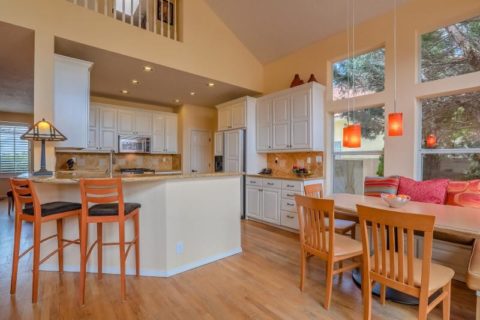
Starting with an existing hardwood floors well preserved by decades of wall-to-wall carpeting, we discussed the desire to create a colorfully transforming interior and opening of the space to better connect the kitchen with the living area.
As we met to hang artwork, discuss iron drapery rods, custom chandelier and finishing touches, the clients remarked that this was so exciting to be nearing the end of this dramatically colorful transformation that so nearly has transported them back to Guatemala where so many fond memories have been established over the years.
Well, back to patience. It’s a virtue and I often struggle to practice it. I tend to be overly eager for instant gratification. But patience is very important when creating something of value and timeless appeal. Go forth and design your dreams with all the patience to make them come true!
Thirteen or so years ago we designed the interior of a home for a young family complete with a toddler. The desire was to bring color and modern accents while still selecting durable materials and hopefully timeless elements.
Fast forward these many years later and this same family now with two beautiful daughters is relocating to another city, another state and a new home. This home was well furnished and much, of what was shown, stayed with the house. The trick was, after having adopted so much from the previous owners, how would they make this house their home?
The point of arrival – the front door – was a tasteful charcoal grey, but by changing it to a bit lighter smoky green, it made a significant difference.
It’s tough to be up-rooted anytime in your school years…these girls missed the only home they had ever had, friends, activities, groups and familiar environs. This challenge was to help all four of them – parents and kids – get settled and assist in making this new house their true home.
As I flew to consult with them, I imagined the scene having seen photos to get somewhat oriented. I made the natural assumption that paint would make new statements to alter the previous owner’s selections and introduce the new family’s preferences. However, despite the change we made to the front door, it wasn’t all about paint once I arrived.
In the previous residence all those many years ago, we punctuated the interior with paint accents. Good design transcends trends and the years. Who would think that this interior was created thirteen years ago?
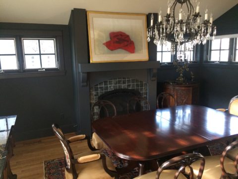
The dining room in the new home was painted entirely charcoal – trim and walls. Oppressive was an understatement and before I even got there they painted all the trim white to match the rest of the home. However, they left the fireplace charcoal – waiting for a discussion as to how to proceed.
Notice the dining room furniture having moved from one home into the next. We decided to paint all the wood trim surrounding the fireplace area white to match the rest. But it produced a startling brightness that will be absorbed once a new painting is selected for above the mantle.
They inherited the chandalier with the home and although it is quite different from their previous dining room fixtures, they are making it their own by mixing their chairs, table, rug and sideboard.
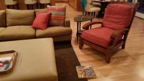
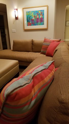
The framed lounge chair found a home in the new living room alongside the large sectional that they acquired from the previous owners of the house.
Here in the previous home, the painting over the fireplace has a prominent position, yet also has a place of prominence in the new home along with the chair and a half and the arm chair in the foreground.
Checking out a sample of a rug to add further color to the otherwise neutral scene.
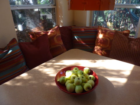
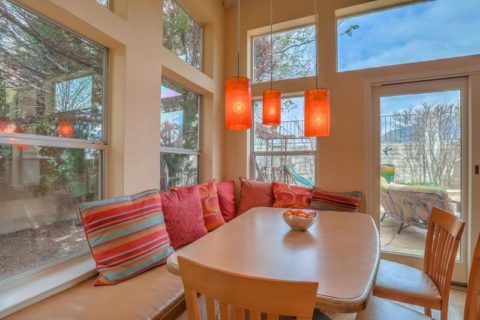
The simple placement of custom throw pillows initially designed for the banco in the kitchen are now colorful accents in the living room, on the newly acquired sectional left by the previous owners, are a remarkable save.
These pillows had seen their share of spilled milk and ground-in cereal over the years. But with periodic cleaning, they maintained their appearance perfectly.
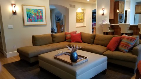
Here the pillows are the perfect accent on the camel-colored sectional that came with the new house. The painting has been a family favorite for years.
The rest of the collection of throw pillows from that original breakfast nook are being re-purposed on the sectional in the lower level media room/office. They add the necessary splash of color in this neutral scene.
The fully upholstered chair-and-a-half also transferred from old to new. Previously in the family room, now in the music room/office. The master bedroom transferred completely. The girls’ rooms have a mix of their things and some new features. All in all it is beginning to take shape.
It pays to buy good materials that maintain well and take proper care of them. Not only will they offer years of enjoyment, in this case they bring the familiarity, to the new house, that is beginning to make it feel like “home.”
Sure, some might like the opportunity to start new without remnants of the previous life – but in this case, they cling to that which was comforting, familiar and theirs. Moving to a new home and being able to mix existing pieces so well with new ones to make this new house a home is a design success story!