Designing with Your Story in Mind

Is your story important? Does anyone care about your story? And what does this have to do with interior design?

Whether you are marketing yourself or your business, your story has merit. It is about identity, branding and connecting. It is about letting people in a bit. It is about sharing history, experiences and process. It is about your unique reason for doing what you do.

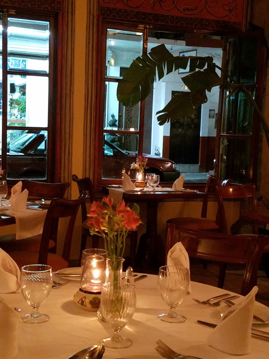
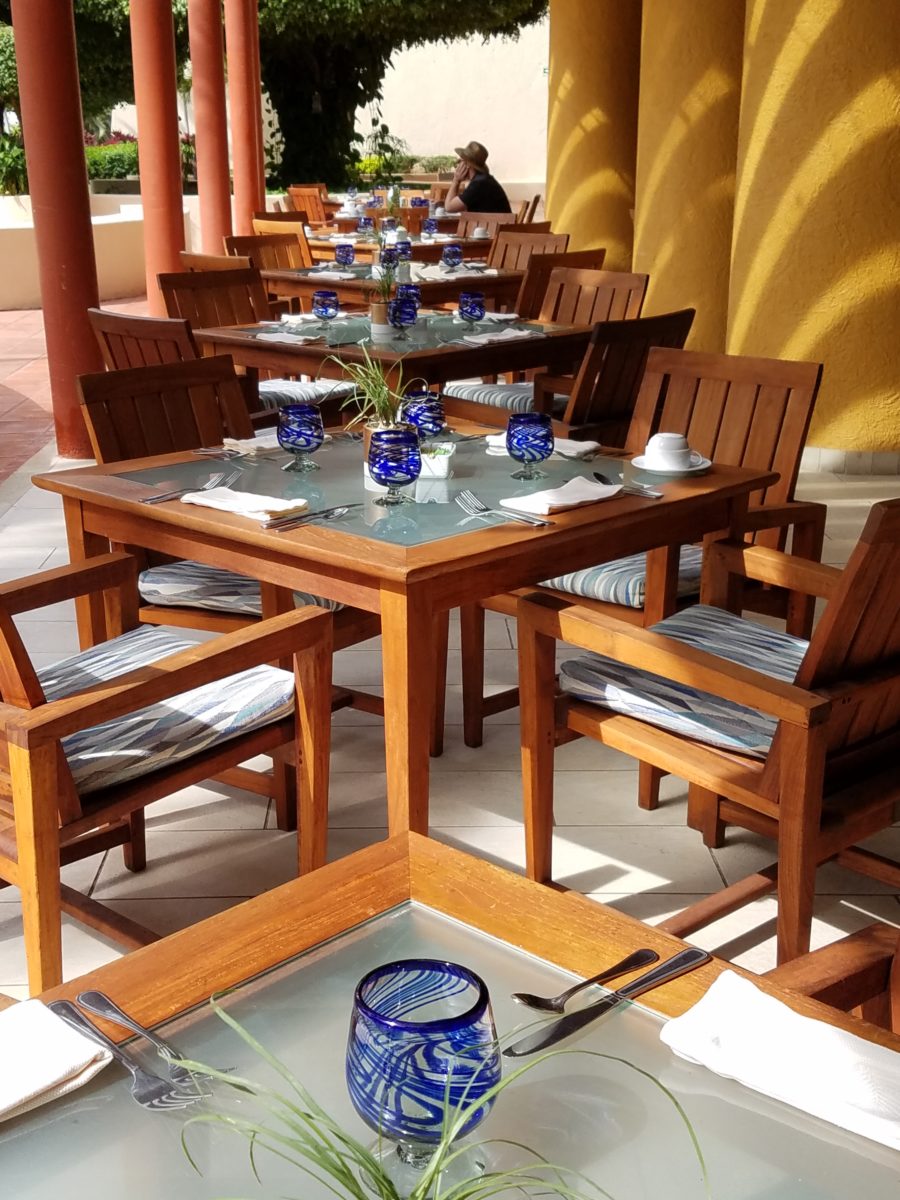
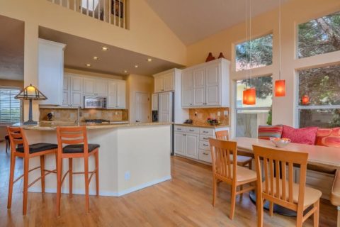
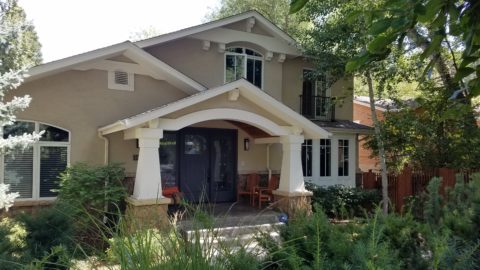
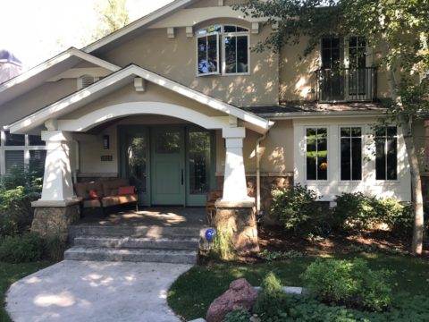
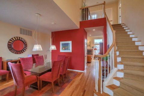
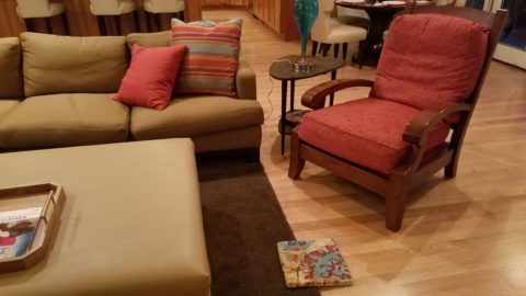
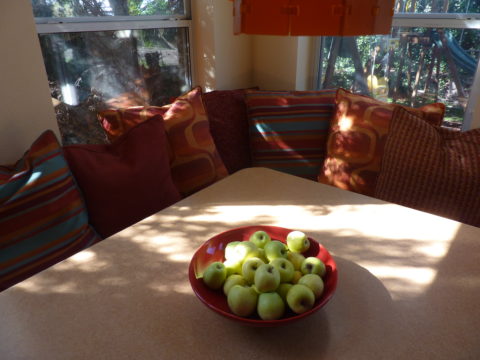
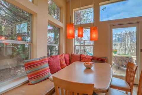
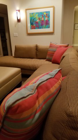
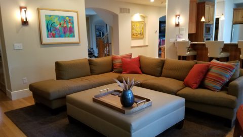
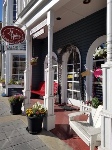
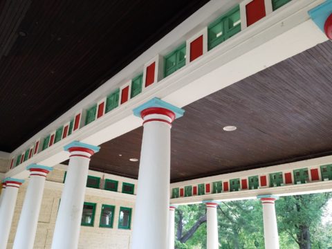
For the past several months, I have been working with a client on a combination of interior design, graphic design, exterior design…it is all intertwined. A successful design laces together all these design elements. And that brings me to “the story.”

Even Facebook features a section to tell “your story.”  Yet, my client resisted presenting/using the story of this new business venture as a part of the design. He told me that was “so seventies.” That he had read that it was a dated concept that was no longer relevant. I begged to differ. For months I begged to differ! We agreed to disagree.

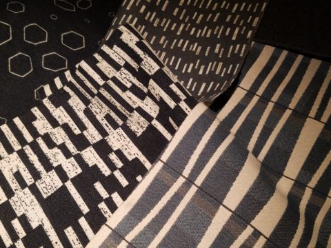
I believe that this is similar to many interpretations of design. What might be considered “dated” is often the manner in which it is used or done – not the thing itself. Whether a color,  a font, a style of furniture, a wall tile or wallpaper, an architectural detail or form…so many design elements are considered dated due to their context. Often, this is fair to observe. But, mix it up a bit and use things differently or with other different elements than the original trend presented and – Voila! You have a perfectly valid, even fabulous design – think outside the box!

The idea of a “story” is not unlike the “mission statement” which became a standard feature decades ago in every company’s presentation on printed media, lobby plaques, conference room walls, break rooms… Some say it is passe, but when something is good and has meaning – re-consider. Like “the story”, “the mission statement” identifies goals and intent…when paired with the story, it provides an overview of the who, what, why that inquiring patrons want to know.

So back to the story…about “the story.”  When a business or any concept is respected or liked, revered or praised, it is natural for people to wonder “How did they get started?” “How did they come up with this idea?” “What is their history in this business?” These are common questions that clever ideas or designs invite. So why not satisfy that interest, create a buzz…Let’s give them something to talk about!!!

In this world of disconnection, making connections seem all the more important. What used to be a natural exchange – of communication, ideas, sharing – is now something that has to be inserted with greater intention.

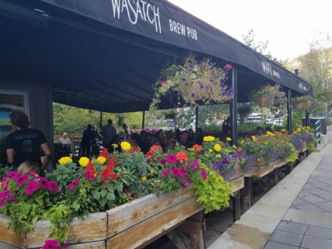
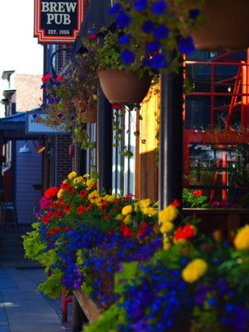
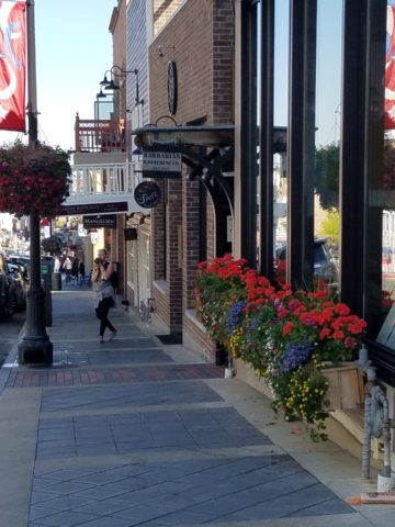
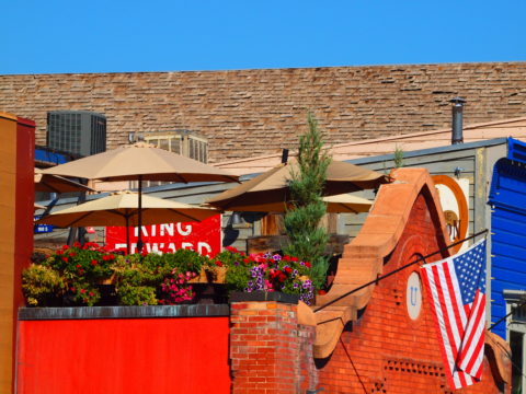
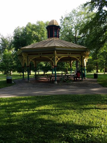
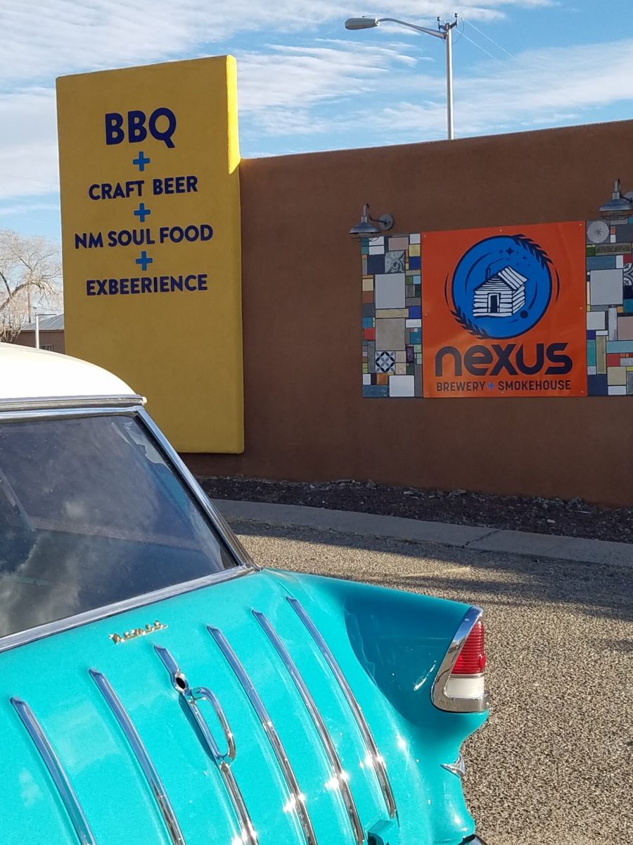
So this new business, for which I have been designing, is a barbeque establishment. There are a million. They have certain things in common. Without my enumerating them here – can you envision some common denominators that you might connect with barbeque joints? As is true with any venture, I asked: “What makes this one different? Better barbeque? Maybe. Cool interior? Hopefully. Are those the only unique traits? Is that the memorable take-away?  It certainly isn’t a bad one – the idea is to have great food – and a fun environment, but what else might contribute to the experience of this barbecue being unforgettable? What might you have, to tell your friends, to spread the word?”

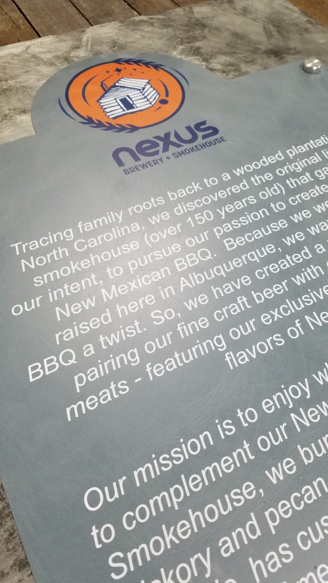
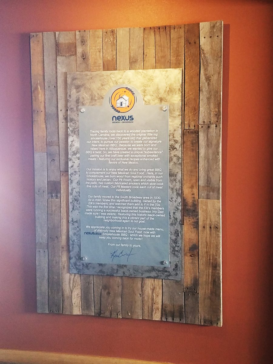
My opinion was a  combination of an intriguing brand and “the story.” But before I go further, they coined a word to express their beer brewing prowess – exbeerience!  This will enter into the story as we go along.

Now maybe my opinion about their story was so worthy of consideration because there was so much to this story. That certainly helps. It happens to be a great story with layers of interesting twists and turns – riddled with history and significance. Plus, it had a local interest angle that has the potential to create a buzz far beyond their actual location.  

To begin to tell the story, I encouraged the development of a unique logo for this specific branch of the brand. Taking the lead to design it,  and incorporating it into interior/exterior design was part of my vision for a complete design package and presentation. Extracting from the story to create the logo seemed natural. The private persona was becoming public.

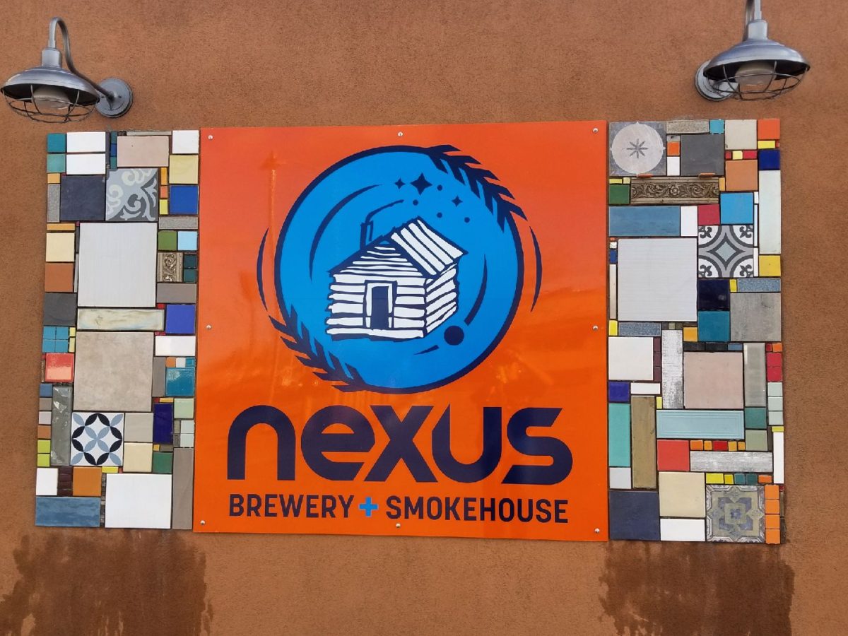
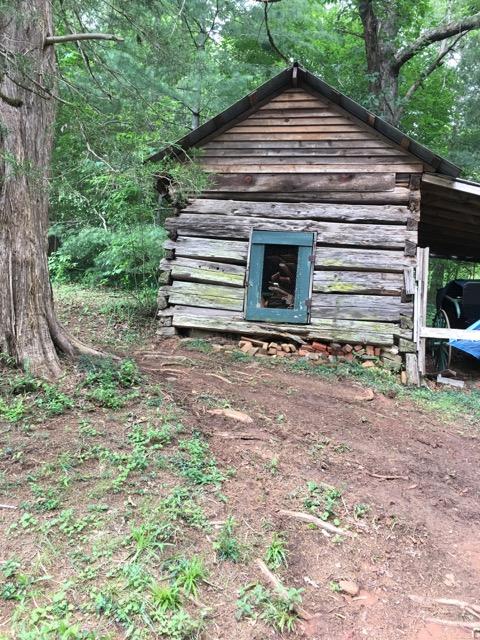
As we developed the logo, featuring a wood-carved graphic of an original log cabin/smokehouse, the story was recorded and edited down to a summarized version.

It was available for printed material, social media, and as art to be presented on walls. Yes, it was intended to become a decorative element too.

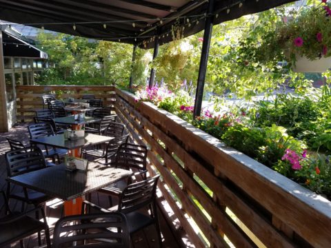
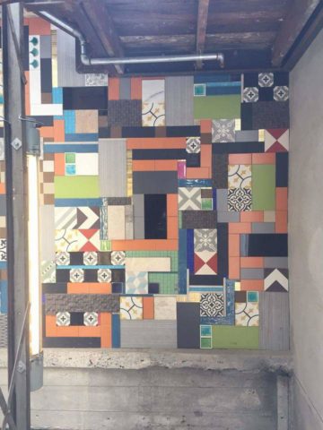
The Story became a focal piece in the interior along with authentic, original photos of the log smokehouse and an interpretation of patchwork quilts entitled Urban Piecework made from leftover ceramic and porcelain tiles, glass and clay assembled in wall-mounted panels throughout the interior and exterior spaces. 

Photos of the original smokehouse in North Carolina will soon be presented to further reiterate the story on the interior walls.
Urban Piecework commands the interior with bold mosaics reminiscent of patchwork quilts – an intriguing backdrop installed both inside and out.

Connecting with patrons, followers, clients, friends, family and acquaintances is valuable. As a business, it wraps who and those elements that are important to you in a familiar cocoon of context. It can instill a level of comfort and confidence in addition to sparking additional interest that might have taken longer to establish, without the introduction of your story.

The final multi-dimensional and multi-textural wall-piece featuring the story and mission is a striking 4’x6′ multi-textural panel. It offers patrons an opportunity to get a few questions answered as they enjoy their “exbeerience” at BLUE.

It was a privilege to promote, extract and produce this story and contribute such an important and valuable element to this business’s marketing and solidifying it’s new, exciting chapter of their brand.

Consider your story. Own it. Share it. Celebrate the uniqueness of your story. Design with your story in mind.

Time to Remodel – Finding a Theme

Time to remodel the kitchen!! This charming little bungalow had already experienced its share of remodeling – well, not so much structural – although, many interior design transformations had occurred over the decades. In the mix, the well-used and enjoyed kitchen was feeling a quite tired and dated.

You might remember I have used this now completed project, in the last few months, during its transformation process to identify certain features and design practices. Here is the as-promised unveiling of the before and after photos for further discussion about the design process, intent and results.

We loved the mottled color and organic character of the existing slate floors and opposing green-grey beams with spanning boards of a caramel stain. These were the two elements that went well together as though intentionally planned. Yet in between, the pale, peachy pickled oak cabinets with their radius detailing and red-rose/black matrix of the tiled granite counter-tops, didn’t seem to speak at all well with the ceiling treatment and slate floor’s greens, rusts and charcoal tones. It was a dark, confused space.  

When observing and “listening to” the house, it was evident that the current kitchen, in addition to being poorly coordinated, had absolutely nothing to do with the original architectural intent. The new owners had brought a few very fine antique pieces into the home. The mid-century circa 1964 age of the house accepted them on its original hardwood floors also adorned with their fine antique rugs…but something was missing. There was no cohesive thread running through the house. Over the years finishes and decorative elements had been selected and installed without any consideration for original materials or an attempt to introduce compatible and harmonious materials for the good of the home’s overall theme.

In all fairness, had the entire interior been gutted and a contemporary interior been uniformly installed into the framework/shell of the structure, I might have considered it a success. However, this multiple decade decor was a mix of disparate trends and preferences that had no commonality.

To begin the process of bringing this home into a cohesive design last year, we had redesigned the living room. There we introduced a classic blue and white color scheme derived from the Persian rug in the adjacent dining room.

To the corner kiva fireplace, we added a sandstone hearth and mantle with just enough blue and white Talavera tile trim at the base of the hearth to subtly coordinate with the new scheme. The Talavera was an appropriate material for this New Mexican bungalow.

The original fireplace had a dark, broken brick quarry tile hearth and no cap on the mantle.
The face-lift replaced the hearth material with broken-edged sandstone slab and matching mantle cap with Talavera detailing at the bottom.

With this living room having been so successfully re-designed, the obvious thought came into the discussion to continue the vernacular of the blue and white Talavera into the kitchen. As a bit of a purist when it comes to application and termination of materials, I was not content for a mere back-splash.  No, if the tile were to be effective and commandeer the stage, it had to be used wall-to-wall as though an entire wall treatment.

Treating the Talavera tile as wall-covering, it continues from the kitchen, into the adjacent pocket-space housing a desk and laundry machines.

But wait! The addition of an earthy aqua handmade tile from Spain offered an appealing and unexpected accent woven intermittently through the Talavera. It created a coordinating thread from the colors found in the mottled slate floors and ceiling beams.  

Pre-grout shot shows the individually cut 1″ pieces inserted as mosaics into the random field of Talavera

The cabinets were in excellent condition, but the doors were sadly dated and in no way spoke to the home’s other cabinets, doors and finish carpentry.

The confused interior finishes we in need of a transformation!

With the white raised panel theme throughout the home’s original appointments, we elected to salvage the cabinet boxes and replace the doors and drawer fronts with a similar raised panel detail. The same red oak was used and, with a glossy white paint applied, the grain “read-through” with a very intentional yet subtle moiré-like pattern. The new raised panel white doors and drawers, with crowning top molding provided a crisp, timeless motif. The random patterned Talavera used as an entire wall-covering was very effective. The kitchen was quite gussied-up!!

The transformation was dramatically successful!

The existing slate floor was beautifully organic and I felt, from a design standpoint, was a must to salvage. Making it look like an intentional selection – part of the new scheme – was imperative. Therefore, selecting a counter-top that communed with the tones in the floor resulted in a selection of concrete-like engineered Italian quartz material – balancing the floor with the next horizontal plane and ultimately with the stained and green-grey boards of the existing ceiling treatment.

The new concrete-like Italian quartz counter-tops coordinate well with the other materials.

Another asset was the connection to the outdoors, however the existing window over the sink was high and small.

The window over the sink was high and small…

By bucking the warranty of the Pella people, we had a new double-hung window made to close down onto the new counter-top that passed through from inside to out. They would not fabricate the window to do what we intended, so we had the contractor remove the bottom of the new window frame, thus rendering the warranty null and void, in order to have a completely open, uninterrupted pass-through when raised.

Amusing and interesting…existing family pieces of blue and white ceramics are being discovered and used as decorative accessories in the new kitchen!

We also captured the opportunity to open the opposing wall into the hallway adding pass-through light and dimension to the space. This exponentially expanded the space and made the encapsulated kitchen feel much less confined.

Before, the kitchen felt small and dark…
Opening the wall into the hallway brought in additional light and dimension.

To add drama to the newly created dimension, we discussed having a painting commissioned to pop an accent of yellow into the blue and white scheme on the far hallway wall. Lemons, a perfect citrus for the kitchen, was decided for the theme.  

A miniature oil painting by Federico Leon de la Vega was used to Photoshop into the scene to inspire and convey the design intent.

The additional POP of yellow is a dramatically effective contribution to the overall composition. After consideration, the owners selected a local artist to paint the full-scale painting.

A local Albuquerque artist, Thomas Tomlinson rendered the lemons in acrylic with blue and white tile details.

In summary…keeping the original slate floor, existing cabinet boxes (replacing door and drawer-fronts only), with a bling of new chrome cabinet pulls, switching out the stained glass pendants, replacing the island’s surface with a handsome solid walnut top and a new coordinating concrete-like counter-tops on the periphery, with the decorative embellishment of the Talavera tile continued from the subtle introduction at the living room’s kiva fireplace, the transformation of the kitchen is stunning – not trendy – and was truly, uniquely designed for the architecture and forward, on-going contextual design conversation of the home.

Uniquely designed…

Look around and listen to the environment for and in which you are designing. What makes the best sense for the design direction considering the function and context of your project?

Animating Interiors – for Fun!

The total sum of an interior…comprised of the shape and volume of a space, the colors and textures, architectural details…then layer the lighting, furnishings and decorative accessories and ta-da! But is that all there is?

The beauty and intrigue of interiors is what keeps us discovering and creating. Yes, finding intimate pockets or grand expanses that please and dazzle.

The romance of this setting caught my eye…the far table by the window – set for two seemed a likely scene for a tete e tete to take place!

While traveling in the tropics these last few weeks, I discovered many interesting places. Oddly, while experiencing all the sights and sounds flavors and colors of this paradise, I immersed myself in the unlikely and completely opposite world of early 20th century Russia with A Gentleman in Moscow.

Just for fun, I sat with Federico Leon de la Vega today as he did 4 – minute sketches of some of my photos…needless to say, proper illustrations would have proved more telling of my romanticizing the talents of artists conveying imaginary activities in interiors…but it was fun to play with this today!

The beautifully and artistically articulate writing style of Amor Towles held me captive. And what a dichotomy to play ping-pong with my brain as I digest the restricted realm of Count Alexander Ilyich Rostov while basking in the warm sunshine with fresh sea air and palms rustling overhead…It seems that the extremes of this pairing suited me well as it was a dual escape – a vacation getaway while taking me further into fantasy with another dimensional experience of this incredibly great read!

Although there were many fascinating observations made by the author, it was this passage regarding the Count encountering a young artist/architect that prompted this subject for this week’s blog. The architect, finding himself in Moscow in the post Czar age of socialistic experimentation and implementation, bemoans the lack of work “The way things stand, I’d be happy to design a birdhouse.”

“The way things stand, I would be happy to design a birdhouse!” Sketch by PH

The mayor of Moscow has made an observation espousing the birth of  “the golden age of the prefabrication, cement-walled, five-story apartment building”  – with the very practical  “four-hundred-square-foot living spaces with ready access to communal bathrooms boasting four-foot tubs (after all. who has time to lie down in a bath when your neighbors are knocking at the door).” The mayor further emphasizes and rationalizes “So let us not get bogged down with elaborate designs or bow to aesthetic vanities. Let us apply ourselves instead to a universal ideal that is  fitting for our times.” A horribly inhuman decree in my opinion, rather than a should-be, truly magnanimous spirit. Humans are designed to design!!

The sentiments of the new regime left the architect with having to find avenues to utilize his talents – specifically sketching as he set forth to illustrate a brochure of the city’s finest hotels as retained by the Intourist department. How sad to possess the talent and passion and be reduced to capturing the grandeur without having the opportunity to design??!!

So three things struck me about this situation…one – that the artist was practicing only a portion of his talents and not the true, complete creativity that beckoned him to pursue his career…two – that renderings not only offer the opportunity to preview the proposed design of a space, but they can use artistic license to animate the space for its intended function and three – that spaces are not truly realized until they are filled with the people that are intended to occupy them.

So much so is a room not really finished until it is occupied by the inhabitants for whom it was intended to function, but Towles observes through the renewed appreciation by his architect, “I suppose a room is the summation of all that has happened inside it.” And that is what I enjoyed being revealed as a result of this simple exchange in this one of many experiences in this remarkable storyline .

Humans are designed to design. Rooms are intended to perform a function. They cannot function until they are animated with whatever they were intended to serve. Sketches allow the preview. Sketches are more spontaneous and artfully creative than computer generated versions of the same. Celebrate beauty, creativity and artists!

WHITE by Design…

With all the New Year buzz about the new color forecasts…I started taking notice of the seeming non-color, white. It is often considered the absence of color when in fact it is a very complex color of many shades and values. Just try to select a white and you will know what I mean.

When you look at white paint samples, you will notice the nuances. There are pink whites and blue white, grey whites and yellow whites. Each white is off-set and contrasting to another. You see the differences by comparison and by context. You think you have just the right white until you place it against another sample and see that it is grey or cream and then second guess yourself again…and again…How do you know which white is right?

Dunn Edwards groups their whites and pastels in a separate section of their fan deck as do other paint companies. What is interesting here is that the background is a sheet of white copy paper. Notice how is reads against the colors in the samples…it seems to be a purple blue color. This shot was taken under a full-spectrum LED lamp. The colors should be true. The range of “white” is amazing.

To intentionally design with white is bold. To have the confidence, to decide that white IS the color and that white IS the scheme, is challenging. To effectively design with white, you not only have to select the right white(s), but you have to know just how much of anything else might be effective yet not detract.

Le Leche in Puerto Vallarta is a fabulous example of designing exclusively with white. Only with minimal punctuation with black lettering on the wall of containers and also by allowing shadows is the white interrupted. But the blacks’ minor interruptions gives depth and fine detail.

White design can be cold or warm. Depending upon the desired effect, mood or function of the space, the whites need to be carefully selected. This is true with lighting as well. Warm whites or cool whites…what gives you the desired result?

Popular white string lights add festivity and a warm glow to an evening scene.
See how many lighting colors you can identify in this scene…Starting on the left, a cool pocket glows through the underbrush. The walkway has a warm pink-ish light. The very cool blues of the pool area give a dramatic read. A bold yellow accent peeks from the far left and also over on the right. The palm trees are wrapped in a warm white tube lights while the far right side illuminates the entry to the dining palapa with a cool white light source. The foam of the surf on the beach is captured with a cool white spotlight that maintains its naturally expected white color.

Knowing when to add color to a white scene to achieve an intentional POP is an art. The color itself, the amount and placement is all part of the success of a good design result. From the fine black detailing in the previous shot of La Leche to this still-life composition of a tropical cocktail that I propped the other day, the minimal punctuation of color is key.

White mosaic shards of tile in the background of this composition featuring a peeled coconut and the POP of a pretty pink party umbrella result in a white-on white scene. Yes, this shot says PARTY with a perky smile!

The bench which served as the backdrop for the coconut cocktail is a dramatic serpentine sculpture of site furniture that plays with the white-on-white of the tile and grout.

Contrasting against the organic wood decking, this white monolithic bench snakes around the periphery of this outdoor lounge area. The sunset is casting a soft pink wash over the all white glazed tile.

Beach settings using white materials compliment the white sand and greenery of the tropical plants. From wood frame platform cabanas to the sprinkling of umbrellas, white is a wonderful, fresh color for a crisp clean scene.

Whites on whites…creamy sand colors to crisp white terrycloth, the white-on-white scheme is soft, inviting and clean.
Greenery compliments the white umbrellas and sunning beds on the lawn by the beach.
Palm trunks and other fruit trees are often painted white to protect against insects and what insects insist on climbing the surface are easily spotted by birds who appreciate the help to capture a snack! In this case, they contribute to the white design theme.

The soft creamy off-white folds of fabric offer a soft, inviting scene.

Shadows in the creases and depths of the folds add the dimension to the luxurious feel of the cotton damask fabric.
White stucco is dappled by shadows and greenery while given a warm, strong base by the brick pavers. White as an architectural finish is only successful if the context compliments it. This is true in all design.

Architectural color and texture of surfaces is a moving target. A recent discussion about a white building with black detailing would not have proved right for this particular use of white. The hard, commercial read would have been too severe for the intended effect. Yet that same project, with a warm white and an ochre accent, will be just the right combination to achieve the desired result. Watch for this project to be featured in a few months.

Architectural surfaces incorporating tones and textures of white provide interesting opportunities

Block and crumbled edge accent bands on the facade of an exterior wall.

White in design is an exciting selection. Knowing how, when and why to use it is a test of your creativity. Picking the right white is the challenge.

The limitless colors of white found in a pile of gravel…..

So the next time you think white, think a lot about it. Study the context and what you are trying to accomplish. Feel freed by the fact that white is a color to express and enjoy.

2019 Pantone’s Color of the Year LIVING CORAL!!!

Color. Fashion and trends. Pantone’s annual pick and announcement – this year, based upon observation of the field of design scenes namely Airbnb and Apple, really? I find that amusing. Described by Pantone as “an animated life-affirming shade of orange, with golden undertones.” If orange had golden undertones, it would be more yellow-orange – a golden orange – NOT the pinky-orange suggested by their swatch of Living Coral and myriad examples that are being set forth.  However, a few months ago I noticed and saved (because I liked the colors), a Smith’s Food Store envelope featuring peaches that illustrated the cozy combination of the rosy-orange coral tones with the golden yellows – a perfect pairing.

This pinky coral – a hot, but smooth, orange-ish color – has been one of my favorites for years! In 2004 I referenced it as “lipstick” that wonderful color between red, orange and pink! A hard-to-find  lipstick shade sought by many!!! It melds fabulously with citrus colors and is cooled and contrasted by blues. A wall of colors depicts this perfectly.


We painted the wall, took a photo of it and emailed it to Federico Leon de la Vega in Mexico to commission him to do this grapefruit painting with its luscious, pink center and coral shades, wrapped in  a yellow peel and surrounded by cool, bold, brushstrokes of whites and brilliant blues.

A few years later we devoted an entire project to the fresh, citrus, color tangerine – which because of my personal preference leaned toward the coral shade of orange rather than the pure, natural tangerine. But art is about taking liberties and when developing an orange accented color scheme, all versions are allowed. Right?

This project was punctuated with orange tones from tangerine (for which it was named), and deep warm coral-pink shades. The hue and its many vibrant values!

However, to photo these nuances of color is tough. I walked around the Tangerine project a couple of days ago. It has  stood the test of time by beating trends by a few years and not adopting any particular design elements that would have given it away today.


Look at how much nature played a part in the staging of these coral infused scenes!

My advice is to pick the colors that  you like – the colors that make you feel good. Once determined, develop design based upon when to use that/those colors and when to contrast them or perhaps neutralize them.

Coral is bold and warm. It can read hot and energized – although is softer than red and less harsh than orange.

Nature is abundant with coral – not just the living sea coral – but flowers and the rare fabulous accent fur of Vietnamese monkey the red-shanked douc!

Vietnam’s red-shanked douc- brilliant coral accents in his coat!

The thought of warm saltwater and fresh sea air at this time of year is tantalizing. Living  coral doesn’t just say – coral, (of which there are many colors) it  evokes that shade that we snap to when mentioned. Hot, soft pinky coral – a color of seduction. It is featured in jewelry and art renderings, architecture and interiors.

My advice is to pick the colors that  you like – the colors that make you feel good. Once determined, develop design based upon when, where and how to use that/those colors and when to contrast them or perhaps neutralize them.

A little whimsy to celebrate this bold exciting color of the year!!!

Have fun with color – any color- all colors! Welcome Pantone’s Living Coral, into the conversation and design elements, for this New Year!!!

Relocating – Making a new house a HOME

Thirteen or so years ago we designed the interior of a home for a young family complete with a toddler. The desire was to bring color and modern accents while still selecting durable materials and hopefully timeless elements.

Fast forward these many years later and this same family now with two beautiful daughters is relocating to another city, another state and a new home. This home was well furnished and much, of what was shown, stayed with the house. The trick was, after having adopted so much from the previous owners, how would they make this house their home?

The point of arrival – the front door – was a tasteful charcoal grey, but by changing it to a bit lighter smoky green, it made a significant difference.

It’s tough to be up-rooted anytime in your school years…these girls missed the only home they had ever had, friends, activities, groups and familiar environs. This challenge was to help all four of them – parents and kids – get settled and assist in making this new house their true home.

As I flew to consult with them, I imagined the scene having seen photos to get somewhat oriented. I made the natural assumption that paint would make new statements to alter the previous owner’s selections and introduce the new family’s preferences. However, despite the change we made to the front door, it wasn’t all about paint once I arrived.

In the previous residence all those many years ago, we punctuated the interior with paint accents. Good design transcends trends and the years. Who would think that this interior was created thirteen years ago?


The dining room in the new home was painted entirely charcoal – trim and walls. Oppressive was an understatement and before I even got there they painted all the trim white to match the rest of the home.  However, they left the fireplace charcoal – waiting for a discussion as to how to proceed.


Notice the dining room furniture having moved from one home into the next. We decided to paint all the wood trim surrounding the fireplace area white to match the rest. But it produced a startling brightness that will be absorbed once a new painting is selected for above the mantle.

They inherited the chandalier with the home and although it is quite different from their previous dining room fixtures, they are making it their own by mixing their chairs, table, rug and sideboard.

The framed lounge chair found a home in the new living room alongside the large sectional that they acquired from the previous owners of the house.

Here in the previous home, the painting over the fireplace has a prominent position, yet also has a place of prominence in the new home along with the chair and a half and the arm chair in the foreground.


Checking out a sample of a rug to add further color to the otherwise neutral scene.

The simple placement of custom throw pillows initially designed for the banco in the kitchen are now colorful accents in the living room, on the newly acquired sectional left by the previous owners, are a remarkable save.


These pillows had seen their share of spilled milk and ground-in cereal over the years. But with periodic cleaning, they maintained their appearance perfectly.

Here the pillows are the perfect accent on the camel-colored sectional that came with the new house. The painting has been a family favorite for years.

The rest of the collection of throw pillows from that original breakfast nook are being re-purposed on the sectional in the lower level media room/office.   They add the necessary splash of color in this neutral scene.

The fully upholstered chair-and-a-half also transferred from old to new. Previously in the family room, now in the music room/office. The master bedroom transferred completely. The girls’ rooms have a mix of their things and some new features. All in all it is beginning to take shape.

It pays to buy good materials that maintain well and take proper care of them. Not only will they offer years of enjoyment, in this case they bring the familiarity, to the new house, that is beginning to make it feel like “home.”

Sure, some might like the opportunity to start new without remnants of the previous life – but in this case, they cling to that which was comforting, familiar and theirs. Moving to a new home and being able to mix existing pieces so well with new ones to make this new house a home is a design success story!


FLOWER POWER – A Marketing Imperative

While in Park City this weekend, I pondered what might the subject of this week’s story be. Dazzled by the smart presentation of this hidden little jewel of a town, I was continuously remarking about the fresh abundance of flowers, well maintained facades, manicured lawns and medians and the obviously collective appreciation for what draws patrons to want, if not need, to invest in property, art, clothing, home decor and food! Yes, need – it can become an imperative!

Here a restaurant has dressed their facade with brilliant red flowering boxes beneath the sidewalk window.

Oh – oops…do you think it might have been the Ferrari that was drawing attention?

Imagine your patrons being drawn into your establishment as an imperative – a must see, or must buy here, or must try this place, or must check out their wares, or must taste their food or drink their craft beer!

The patio of this brew pub is surrounded by fresh flowers in rustic wooden boxes.

Preparing to open for the day, this pub also has light strings to animate the patio at night.

You see this charming presentation potential in small resort communities and those who have cultivated their assets to the max, reap the benefits of their vision, smart development and on-going maintenance.

 Another brew pub sees value in an eye-catching floral frontage. Courtesy – Heather Harrell

The architecture is decidedly mountain themed, vintage 19th century colorful and textural, but interestingly punctuated by modern elements and fresh ideas. The practical pitched roofs, quaint scale, textural wood trim and detailing, all contribute to this charming scene.

Courtesy – Heather Harrell

To dismiss the value of flowers in marketing is to ignore the Flower Power!

Some places take a little more work to grow seasonal sprays of abundant color in pots, buckets,  bowls, barrels and boxes, but the effect of drawing people is undeniable.

 Courtesy – Heather Harrell

From Key West to Anchorage, the results are proven. Beauty, color, nature sells.

It’s a combination of color being a visual POP amidst concrete and brick, but it is also the positive life-affirming statement that it projects.

We know color in advertising is a draw and we know that anything that adds animation is a draw – flowers colorfully animate the street-scape and draw customers to them.

Here the passers-by are drawn to the menus posted in the window by the red geraniums that brilliantly are placed in planters in front of them.


Courtesy – Heather Harrell

They infuse the built environment with nature.


Like hummingbirds swiftly hone in on the finest blooms or like bees collecting pollen, we are drawn toward that which speaks visually from the surrounding foliage.


Courtesy – Heather Harrell

Texture is another element in this mix. We know that good design is about balance. Flowers balance the otherwise hard surfaces in their periphery. The finishes on a streetscape or sidewalk scene are generally, if not exclusively, hard. Flowers soften the surrounding surfaces and also balance the smooth and hard with random shape, texture, flexibility and even movement.

Whether a casual bar or fine dining restaurant, retail shop or any business wanting to attract and invite the public to them, flowers are an asset.

I feel about flowers similarly to how I feel about twinkling lights on a patio or in public trees. The advantage in the lights is that they can survive the frigid elements and make their statement in all seasons. Lesson here – once the plants are spent for the season, keep the lights on!!! Both elements are valuable draws and enhance the atmosphere of any establishment or environment. (Go back and notice how many photos have visible stringed lights in them!)

And if possible, plant those past-season pots with hearty pansies, ornamental kale or evergreen shrubs to keep the life calling from the sidewalks.

An art gallery has boxwood in steel vessels at the entrance.

A potted evergreen will add life to the paved surfaces when the flower season has passed.

And  for the sake of broadening the reach on this subject, to include not only the flowers and the mention of stringed lights, is the inclusion of creative signs, banners, flags, umbrellas and other elements that contribute to the festive nature that attracts peoples interest and draws them into your business.

Courtesy – Heather Harrell


Rooftop bar with flowers, flags and umbrellas – King Edward too!        Courtesy – Heather Harrell

Celebrate the the power of flowers!


Decorative Wallcovering – Fun with Tile

When you think about finishing a wall, you probably think about paint colors…you might think about a wallcovering – wallpaper, or even a mirror – I’ve previously noted how mirroring an entire wall can exponentially expand a room – a dimensional effect/illusion that suggests the room extends well beyond its actual size. But another wall treatment, with which I LOVE to play, is tile!

All over the world, the art of designing and creating decorative finishes with tile has been evolving for centuries. All cultures have utilized mud and clay, glazes and fire to bake beautiful patterns and colors onto geometric slabs. Shapes of rectangular, square, octagonal, dots or diamonds – the geometric shapes are many and the designs are limitless.

As is true with other wall treatments, I prefer not to stop on an outside corner. I believe that the color or material should suggest a built mass – part of the architecture. To stop on an outside corner suggests a veneer. It proves that the finish on the element is not a structural/integral part of a built mass. When you paint into an inside corner and stop, it allows the mass the read as though solid and not merely superficially treated. The same is true with tile. Don’t stop it until you get to an inside corner – if possible. There are situations that force a finished edge on the flat plain of a wall – but avoid outside corners at all cost!!

This entire shower is tiled floor to ceiling, around the pony wall, bench…no door…it reads like a built environment of stone tile.

Think of the surface as an architectural element. Tile from floor to ceiling, inside corner to inside corner – wrapping corners, if needed, along the way.

Take a backsplash…customarily used to do just that – catch splashes at the back wall of a wet area (sink) countertop…bathrooms and kitchens, behind sinks and between upper and lower cabinets – but why stop there?

The entire back wall of this kitchen is mosaic marble tiles in a herringbone pattern.

Think of it as a true wallcovering – wallpaper. Commit to the entire surface. Here are more effective examples…

The backsplash and entire adjacent wall were covered in glass mosaic tiles. It “reads” like wallpaper.

here again, the classic blue and white Talavera tile backsplash is continued along the entire wall from floor to ceiling.

We are currently working on a couple of kitchen projects that will soon be completed. They both use tile liberally. Each quite different from the other. Stay tuned for the finished products!

In bathrooms, the area around a mirror can be more than merely the backsplash. Embed the mirror into the tile surround or tile the entire wall and hang a mirror on top of the tile surface.

This mirror is flush with the surrounding tile, suggesting that it is embedded into a tile wall.


Planning this transformation, the mosaic vase was the inspiration. Then loose tiles were scattered on the countertop and the concept began. Note, the existing mirror was attached to wall with light fixture mounted above it and a medicine cabinet off to the side.


The transformation involved removing the medicine cabinet, taking the floor tile up the wall and wrapping it floor to ceiling. It was also cut into smaller squares to use behind the sink as a “full-wall backsplash.” Then punctuated with glass and glazed tiles to create an updated design. Relocating electrical to flanking the mirror for a pair of new sconces and a new countertop, faucet and sink with existing cabinets painted resulted in a cost-effective design.


Here a mirror is mounted on top of the fully tiled wall. Inside and outside of the shower enclosure the tile is a true wall treatment.

I recently received this advertisement in my email. It was such a spectacular collection that it caught my eye and I share here one of the patterns and context shots as the backdrop to a range.

Mosaic assemblages can be fun! Here is a fireplace surround.

The addition of three-dimensional pieces adds interest.


This exterior fireplace surround tolerates the elements – an all-season installation.

Here is a mosaic mural of a dynamic geometric abstraction  discovered in New Zealand. We are using this inspiration to establish a theme in a current restaurant project. An interpretation of this in the form of geometric tiles of various sizes, colors and patterns  will  be used to create a cohesive repeated design element through various areas of the restaurant – both inside and out. Watch for this completed project in coming months.

Commercial restrooms can benefit from full-wall tile treatments too. Not only does it look complete, but it is an ease of maintenance consideration.

Three dimensional tiles add interest to this cactus motif!


Fun with color and texture, tile are also easy too keep clean – terrific for public restrooms.

Murals are also terrific ways to use tile as art in your  interior/exterior designs!

This is embedded into the stucco for an integral installation.

When using outside though, remember to consider the range of temperature and moisture to which  it will be exposed. Porcelain is the most durable in areas where the temperatures get to and below freezing. Freezing and thawing can destroy tile. Many murals are made from clay that is not suitable in cold climates!

Inset into the tile wall treatment is this stunning glass mosaic abstract mural.

Tile – it’s a nearly limitless medium. So consider the possibilities for your next project! As a piece of art, an accent wall or an entire installation – full-wall treatments make a statement! Have fun with tile!


Discovering Patterns

This week began with a juicy fabric presentation. I say juicy because it got my design juices working and I was inspired to take photos and imagine the opportunities to insert these wonderful colors, patterns and textures into upcoming projects.

Take the chicken and the egg scenario. Do YOU often find that exciting design elements invite thoughts of projects for which to use them?

A fun exercise is to take your camera and search for patterns to photo…patterns are everywhere from cast shadows to fabrics, signs and graphics to fallen leaves.

Seeing these exciting new fabrics – you had no intention of changing all your throw pillows, but these stimulating samples might make you consider changing your entire collection!

The opportunity to offer unique fabrics for clients who would otherwise never be exposed to the samples – not know of the possibilities – is exciting. Being able to make this introduction is a treat.

This first batch was of clean, sophisticated, woven, geometrics in blacks, whites and charcoal tones.

Whimsical patterns and textures, with splashes of color, offer more possibilities.

Now see these rich woven patterns and colors in this next series. An explosion of color and pattern  with a decidedly native direction – prime for New Mexico and design projects looking to evoke the elements of the southwest and other opportunities inspired by indigenous art.

With all this freshly implanted in my ever-swirling brain of design fragments waiting to be assembled, I traveled north this weekend for an enchanting New Mexico wedding that further fed the theme of indigenous art, pattern and design.

The lobby of Buffalo Thunder was riddled with magnificent pueblo pottery. The designs were wonderfully intricate and I saw them as stand-alone elements that could easily be fabric motifs. Here on pottery – but so fascinating to consider as possible inspirations for fabric patterns and designs.

Anasazi Buffalo Pot – Acoma Pueblo

Suggestive of a court jester, this expressive piece tells a figure story. The bold patterns make a powerfully beautiful statement. Who loves bold stripes? Do you wear them? Do you upholster with them?

Evening Star by Katherine Wall from the Jemez Pueblo

Cut-outs on lobby lounge chairs, with geometric upholstery, atop bold zig-zags of the area rug proves combining patterns creates a fine line between exciting juxtapositions and pairings – and risking possible disturbing disruption of order. Comedian Steven Wright uses dry wacky wit delivering hysterically funny observations to convey a sense of the obvious with a twist. I’m paraphrasing one I remember from years ago… “You know that feeling that you get when you lean way back in a chair…way back on the back legs…back so far that you are just about to fall…I feel like that all the time.” That’s like that feeling with challenging design. It goes just far enough to get your attention…designers get that feeling as they push the theoretical limits of design – all the time!

Ok- this is not perhaps THE most outrageous example of this theory – but a fun, eye-catching combination nonetheless!

Buffalo Thunder resort was the jumping off point to then venture beyond into the thrilling landscape of La Mesita Ranch.

Mixing different colors of brick make this random patterned walkway very pleasing and interesting.

The setting was natural, organic and inspired.

Simply lovely centerpieces

See a lovely, intense example blooming blue and white and much more in Nantucket on the cover of the new June 2018 issue of Architectural Digest.  http://www.theenglishroom.biz/2018/05/29/nantucket-beauty-by-markham-roberts/

So look for patterns all around. Discover exciting opportunities to mix patterns and textures.

Be brave – play with patterns!


Inspiration Aroused in a Fantasy Pleasure Ground

Like gardens? Like ornate, ornamental, architectural fantasy structures? Do magical forms and colorful design elements arouse your creative juices?

Memorial Day and the holiday weekend offers festivities with family and friends, time to honor in memory those who have performed with honor to preserve and protect our freedom, reflective moments away from the rigors of the work-week, and in our case this weekend an extraordinary encounter with one of the country’s most magnificent “pleasure grounds!” Yes, an introduction to Tower Grove Park (thank you Ali-bali) and the awesome written description of its inception and extraordinary design in the 1860s was our sensational, design stimulating, multi-sensory, experience.

Perhaps these photos will provide ideas for your fence or railing detail or even a backyard gazebo!


If you would like to enjoy the language of the beautifully written original intent of this property in a manner and style that is not often experienced, please follow this link and be enchanted with great vision, joyful optimism and intimate appreciation.

https://www.towergrovepark.org/mcadams1

Art and nature intertwine in these magnificent verdant grounds of Tower Grove Park with its wonderful gardens, charming Victorian pavilions and significant statuesque monuments. Conceived and donated by the visionary, Henry Shaw, in 1866. The writings of David MacAdam (found in the above referenced link) reference taking “ramblings” in the park – originally designed for driving in and through but with emphasized encouragement to go afoot to observe closely, in one’s casual time, these wondrous fields and arbors, around ponds and through gardens.

He writes “A visitor who takes a summer ramble in the park starting from the east entrance and noting the objects of interest we have mentioned, must certainly admit it is a most interesting and agreeable place. Every few steps will open a different view, ornamental structure or some work of art.”

Peeking from pockets of this enchanted scene are fanciful pavilions each with a singular identity.

We hear that winter scenes in the park present a wonderland of snow frosted evergreen trees, quiet pavilions, sculptural dark trunks, statuesque bronze figures and serene blankets of white dotted with the dormant shrubbery that comes alive once again each spring.

MacAdam further notes, “The artist of the graceful and cultivated style pursues, then, a middle course between the picturesque and the formality of the purely artificial, aiming always to preserve the harmony of natural forms and scenes.”

While the landscaping is magnificent, the architectural detail is captivating – conjuring up fairy tale scenes of dancing and romance. MacAdam writes further, in thoughtful detail, about the concept of encouraging the public to experience this grand property with all of its engaging ornament and ultimate beneficial consequence.  “To do this thoroughly they can hardly avoid walking a part of the distance, and the attractions of the place should induce them to do this contentedly, recollecting that one of the objects for which it exists is to invite persons of sedentary habits to healthful exercise. ”

I was so excited about the fretwork and fancy  details – the sunlight dappled across the frames of these sturdy yet delicate structures.

Inspiration around every corner with design elements that are timelessly graceful. Grill-work and column lines present powerful progressions.

It was as though these structures were attempting to emulate giant confections of fondant and frosting, carving and detail just shy of excess.

Realizing these structures are over a century and a half old, preserved by the enjoyment and appreciation of their patrons – which are all the people of St. Louis.

“The worrying command, “keep off the grass,” writes MacAdam “when the feet are aching to tread the carpet of youth’s memories, does not harass the visitor by springing out on his eye as he turns each curve. Music too is thrown in free in summertime, and thus all elements of pleasure and beauty are woven together in lightness and brightness for the general good. It is on the fact of this freedom in the use of a public park, the hopefulness it indicates in human nature, an the equal consideration it shows for all classes, is based in faith of those who believe in its refining and elevating influence. Such a place does not sermonize dogmatically, nor does nature. She exhibits a truth instead of voicing a doctrine. It unfolds fair spectacles, without restraint or an air of patronage, for all who care to see, and it thus tends to refute the selfish theories of either extremes of society, to reconcile  divergent elements, to encourage the gentler ideas and tastes, and to promote innocent recreations and purer manners. The poor are forced to see that wealth beyond their control, and without their asking, has created a resort free for the enjoyment of all, and the rich, by the equality in its use, are reminded of the artificial origin of class and the everlasting kinship of man.”

It was a glorious afternoon of optimism, inspiration and enjoyment. Happy Memorial Day weekend to all and may you find art and inspiration around every corner!