Color schemes are limitless. The permutations are endless. Color is exciting and fun. It is personal. Colors evoke feelings, memories, emotions and are key to a comfortable interior.
How often have you been asked or pondered on your own…”What is your favorite color?” Some people hesitate to answer, while others blurt-out readily with their fav. But what color you choose to wear versus what you enjoy in your interior surroundings and how much might be quite different.
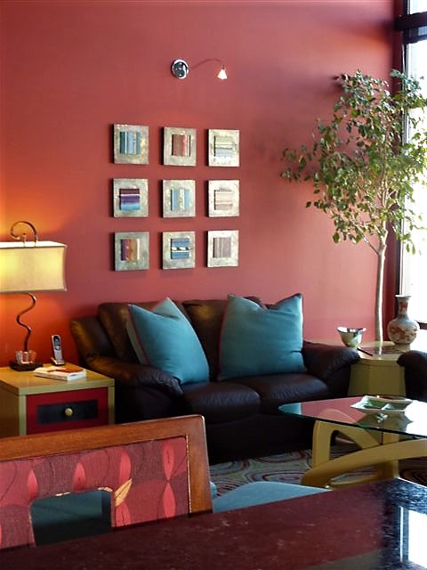
Several weeks ago, I launched a weekly post on our PATRICIAN DESIGN Facebook page called “Color Schemes.” The idea is to inspire design ideas by pairing artwork with designer fabrics. When planning an interior there is always a focal point complimented and surrounded by supporting elements. Whether a key painting will command the space or an expansive window with a view will direct the focus to a scene of outside colors and textures – that key element will greatly influence a successful interior color scheme.
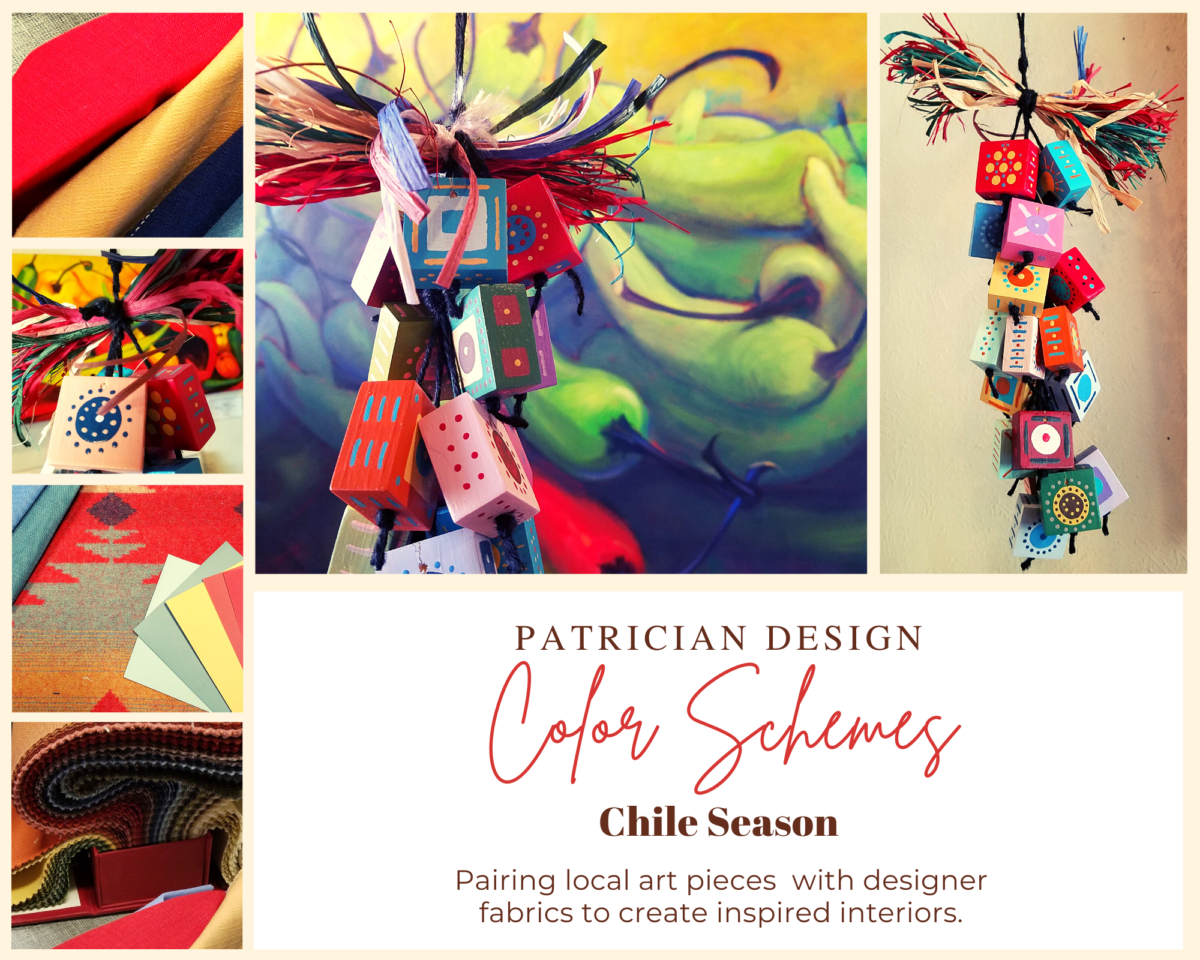
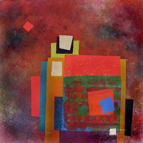
Annette Donald creates colorful cubes in her creative take on our beloved chile ristras. A serrano chile oil painting, on canvas, by Federico Leon de la Vega is quite representational. Paired here with Romo and Ralph Lauren fabrics, Sherwin Williams paints…fresh and festive!
Here is the example of a November Scheme and you can scroll back each Monday for the past few months to enjoy a variety of the Color Schemes! https://www.facebook.com/PatricianDesignABQ/photos/a.243005986618/10157154423221619/
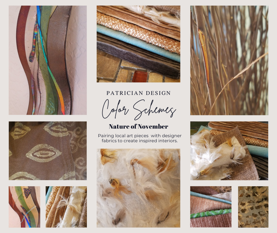
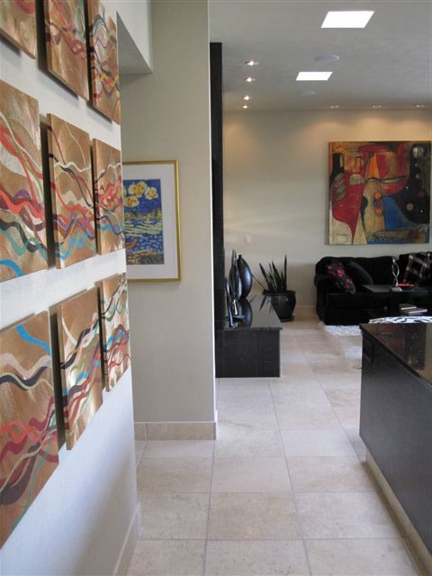
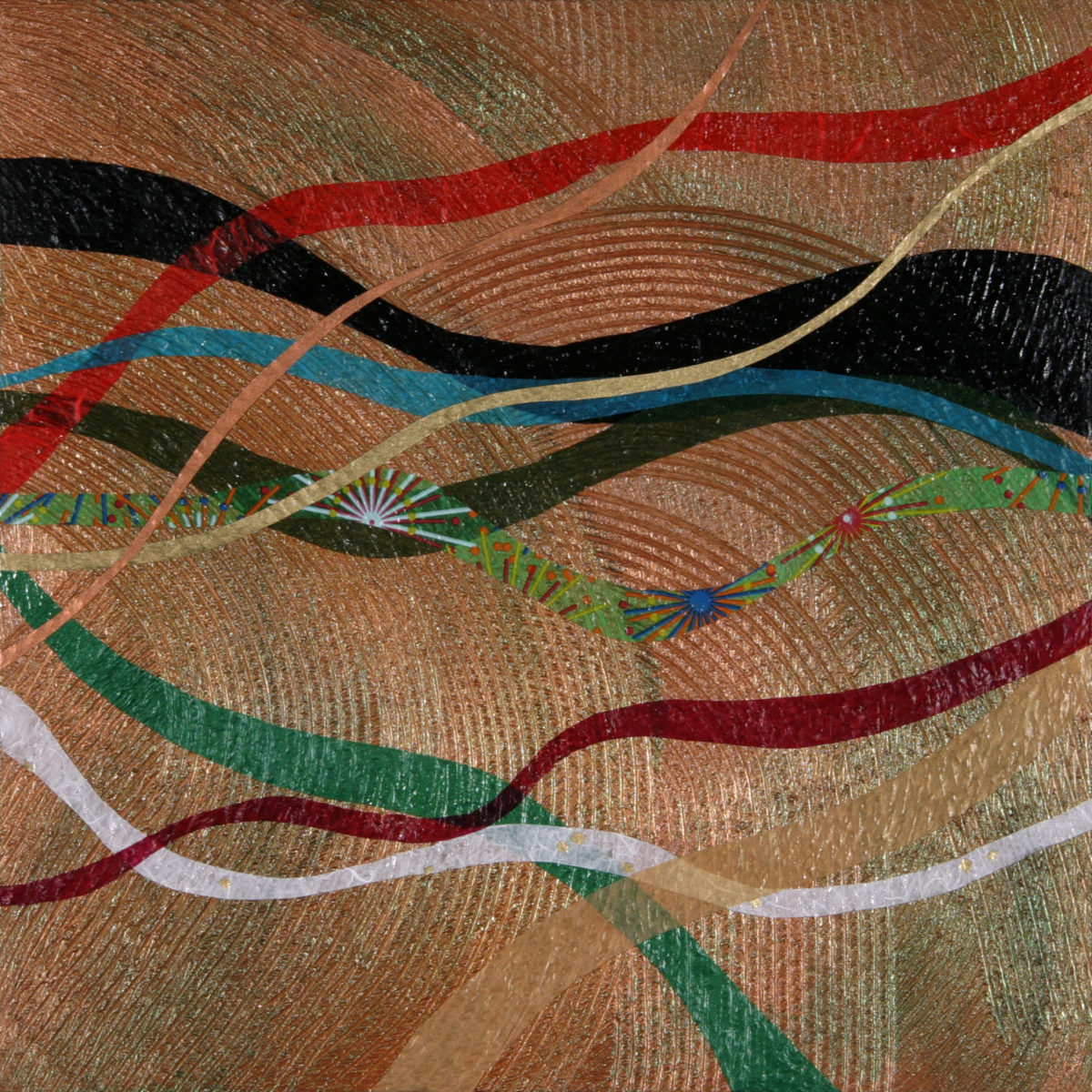
We embrace the The Nature of November with its unique colors and textures. As the air becomes chilly and the leaves fade…warm, soft colors bring us indoors. Featured here an elegant fused glass ribbon wall piece by Lisa Checnoff.
There are four primary considerations that I discuss with my clients when determining which colors to choose, emphasize, avoid, use as accents and where. To establish these selections, we evaluate personal preferences, contextual implications, seasonal influences and even trends.
PERSONAL: In planning an interior, I always want to know what colors make our clients happy, comfortable, stimulated, vexed or relaxed. These personal insights reveal important information for selecting types of materials too.
By examining what might be one’s favorite color, the discussion will navigate the distinctions, if any, regarding preferences for clothes versus interior furnishings. Interestingly, they are not always the same – although, by mere comfort and familiarity, they often are. Simply asking about a favorite color is not enough.
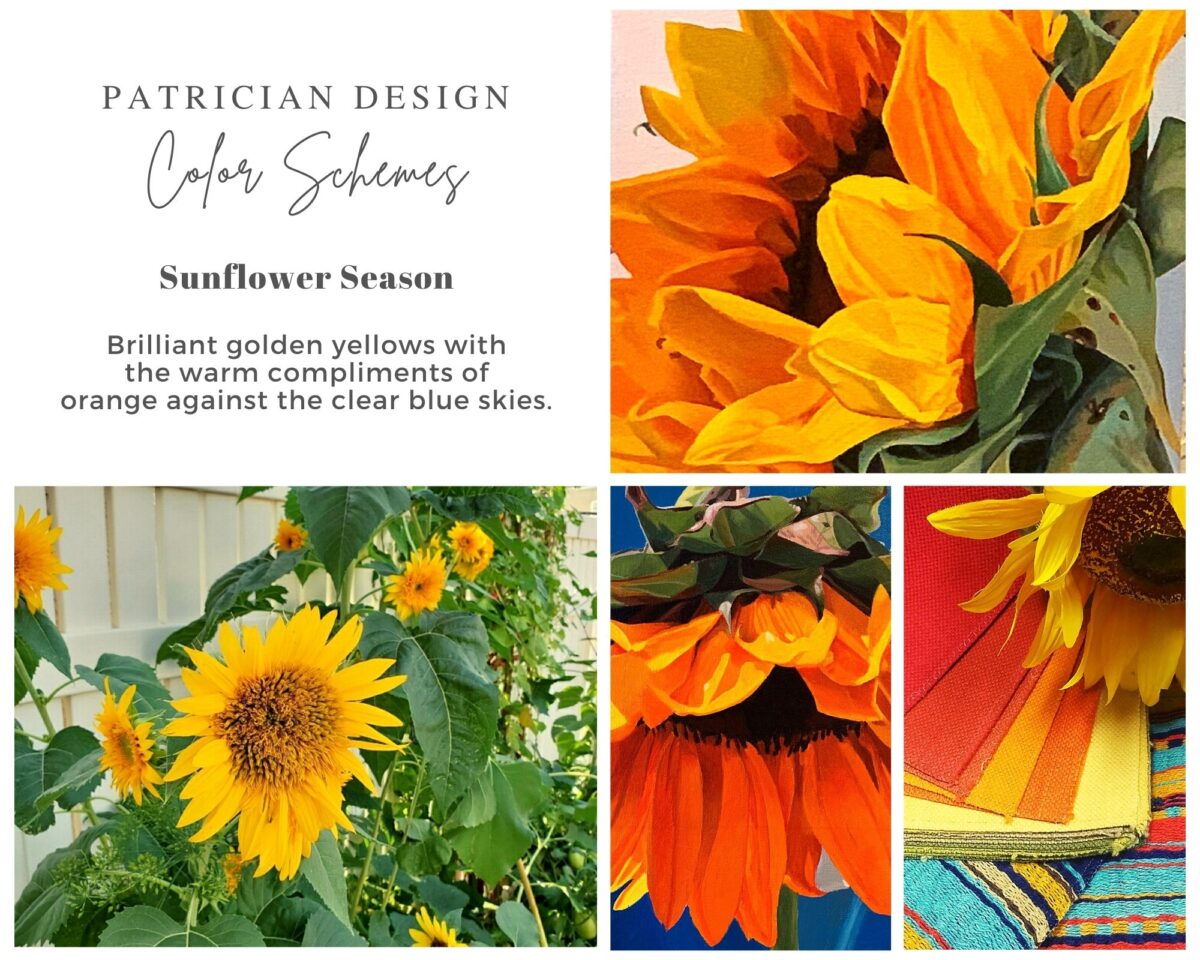
Brilliant golden yellows and blues – splash color! Featured here are fabulous photo-realistic acrylic paintings by Sheri Mays paired with amazing fabrics of the same exciting palette.
CONTEXT: The context of the interior might dictate or at least steer the direction of the design. The luxury of having multiple personal environments offers the opportunity to have different color pleasures exercised in different places. The ski condo might be woodsy and textural with browns, greys, stone and wood punctuated with a pop of color versus the seaside retreat with its crisp whites and cool blues and greens punctuated with pastels or bold contrasts. Therefore, the location of an interior might direct the desired color palette.
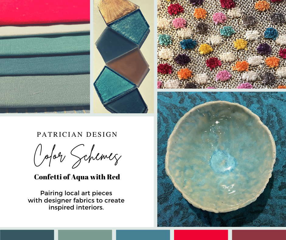
Inspired by this spa-aqua pottery bowl by Penny Roberts and the custom glass tile mosaic we recently combined to face a newly remodeled kitchen wall – the cool seaside/spa feel balanced with ambers and warm dots of color – pink, fuchsia, orange and golden yellow. Durable brushed cotton solids come in myriad colors and are perfect for pillows or upholstery.
SEASONAL: This one is tricky because it plays on the perceived climate outside – even if the interior is maintained at a constant temperature. It takes a concerted effort to plan a color scheme – including textures and finishes in anticipation of changing seasons and relative temperatures. I previously mentioned that a window with a view might be the focal point of a room…imagine the effect the changing seasons might have on the selection of interior colors and textures versus a consistent tropical scene, for example?
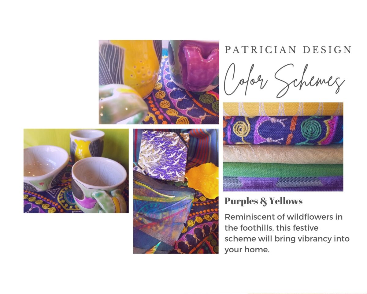
Perhaps you love purple – ever pair it with golden yellow? Here, functional, fantasy pottery designed and crafted with the most precise attention to detail by Jen DePaolo inspires our boldly brilliant scheme.
TRENDS: Inasmuch as I avoid being steered by trends, it is impossible and not advisable – in design – to avoid them. Clients are influenced by them and bring that would-be preference to the table. It is essential to continue to have “colors-of-the-year” and other market-driven colors change to stimulate the economy with buying and selling, replacement and updating. It’s our socio/economic norm. It also serves as an encouragement to re-fresh. But to limit that influence, in favor of long-term personal pleasures, is best. The pressure of this marketing color influence contributes to our being a disposable culture. Not time here for a lecture on such things – but rather to instill an appreciation for and confidence in personal selections an decisions – in this case, color.
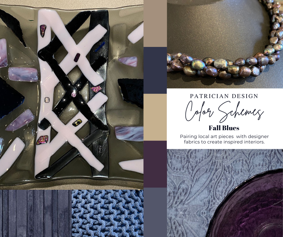
Patinaed pearls and stunning glasswork by Margaret Hidalgo Vanderheyden inspire the soft, greyed lavenders and blues of this cool scheme.
An interesting and on-going test for evaluating a successful interior is when designing in one season – it has to work in all others. For example, when I meet with clients in the heat of July with lush foliage and color, warm temperatures and long days, that same interior has to succeed when it is frigid outside, barren, and with darker, shorter days. What might the challenges be in creating a successful scheme and what might be the solutions to make it work?
Having noted all of this and knowing the different reactions people have to color, isn’t it interesting when an interior is so successful that it appeals to many, if not the majority, of those who experience it? This is more applicable to commercial or public spaces – from doctors’ offices to hotels. However, the challenge and success is in knowing the many things to be considered and implementing a balance of them throughout all aspects of the interior.
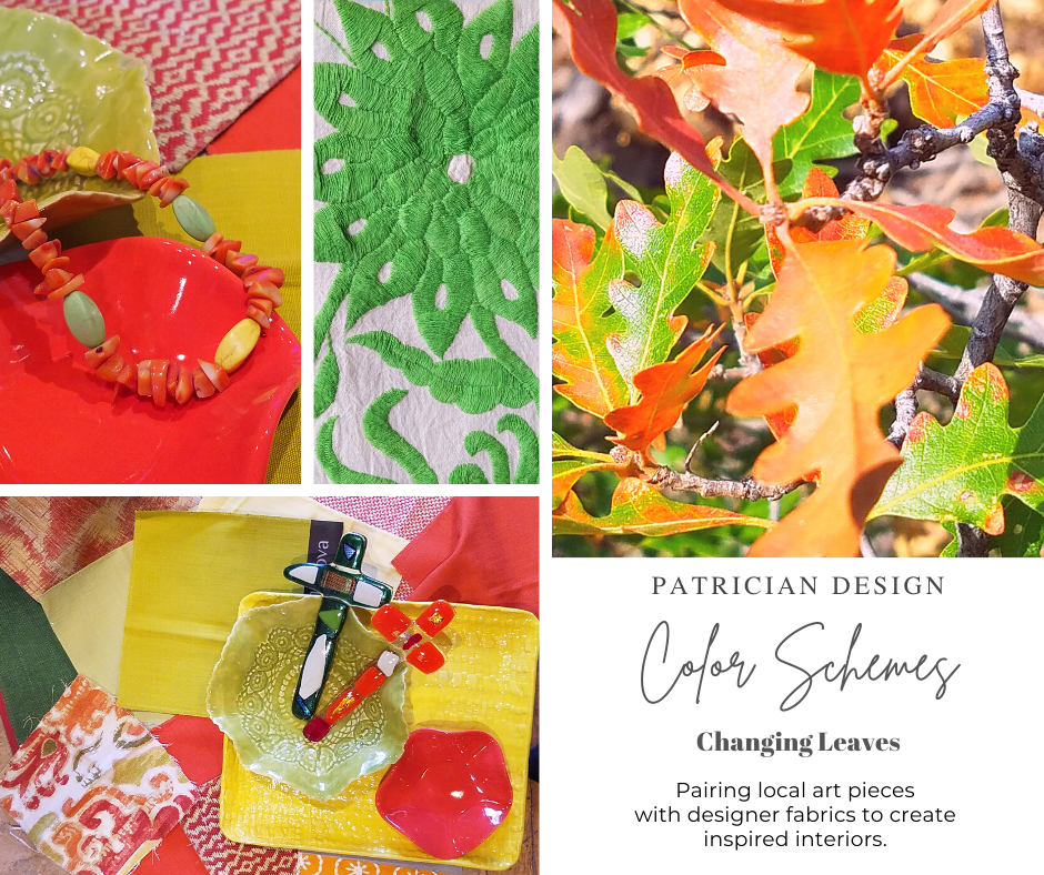
Anne Marie Werner-Smith’s brilliantly glazed pottery here with Margaret Hidalgo-Vanderheyden’s lovely fused glass crosses along with coral and dyed stone necklace and woven table runner from Chiapas reflect the changing colors of fall leaves…
Appreciating color is a gift to designers. It truly is an imperative to appreciate all colors and have the sensitivity to discern the nuances between various values and the effects of selections and combinations from the infinite choices.
I hope this has given you ideas and inspiration to move forward with YOUR color schemes! Sign-up for our weekly email of Color Schemes with classic blue and white and stunning neutral greys coming!! And follow the posts on Facebook every Monday.
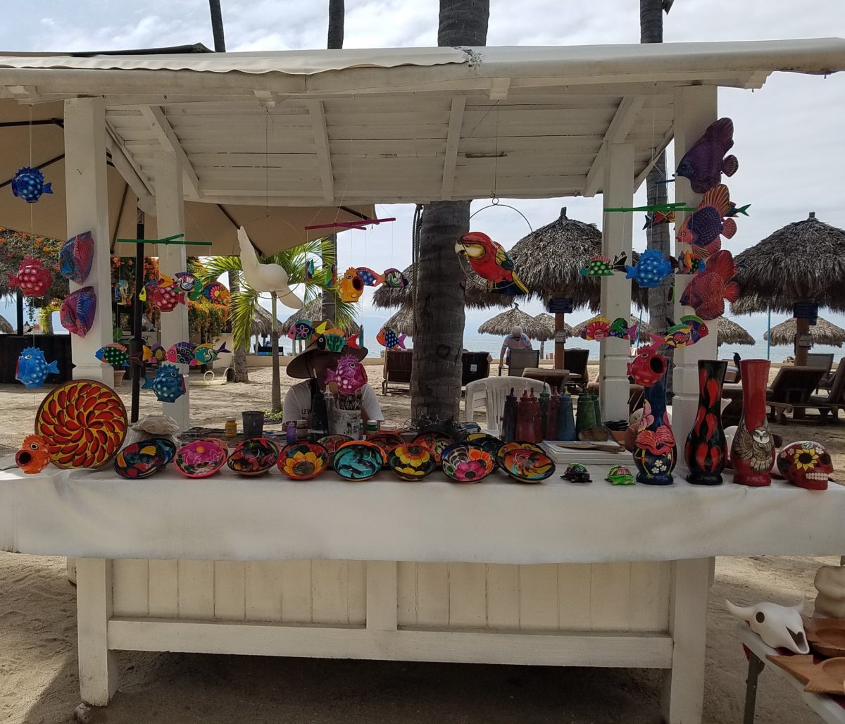
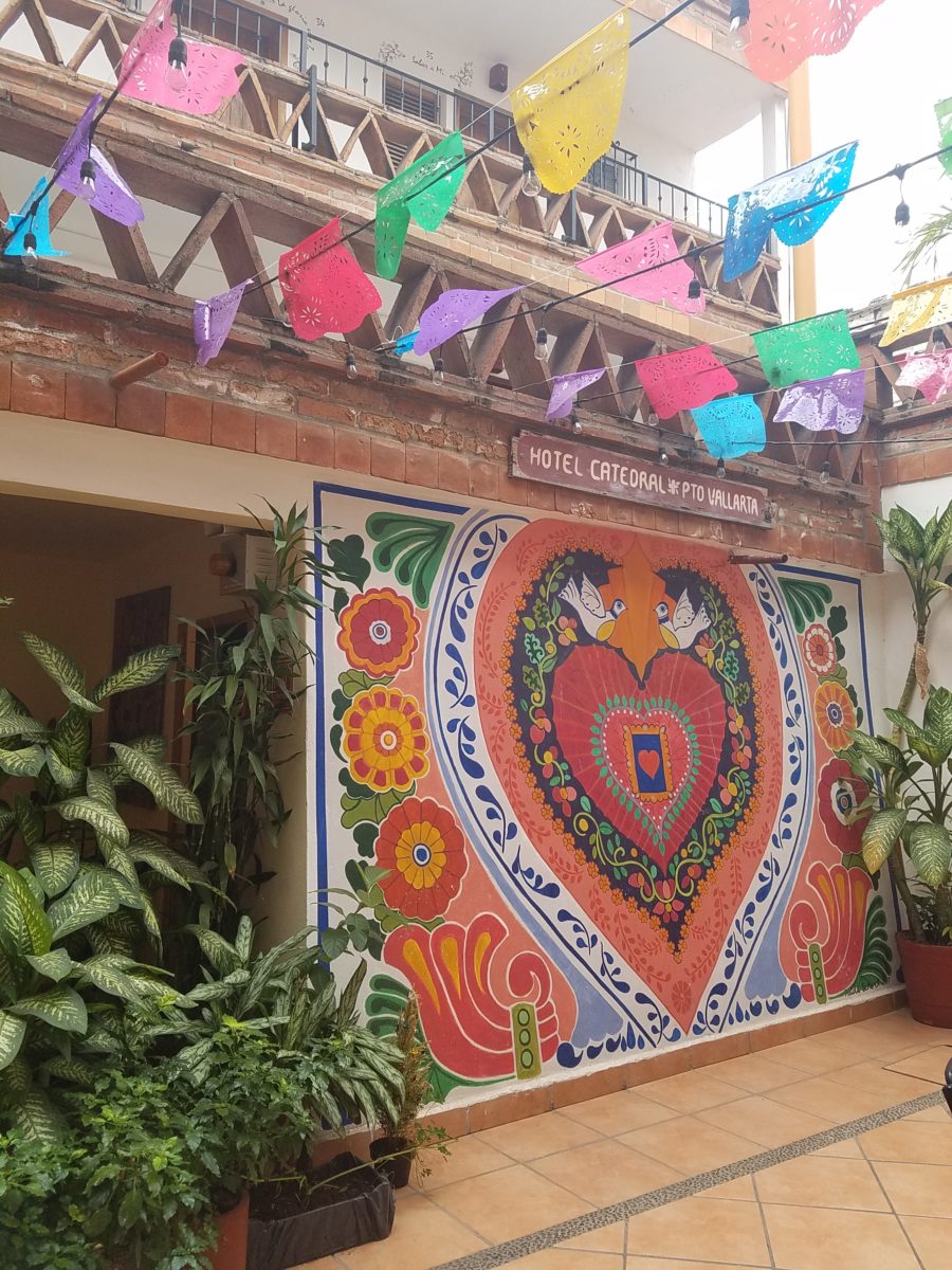
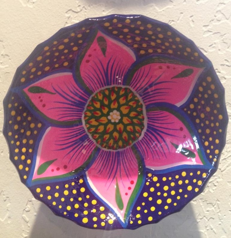
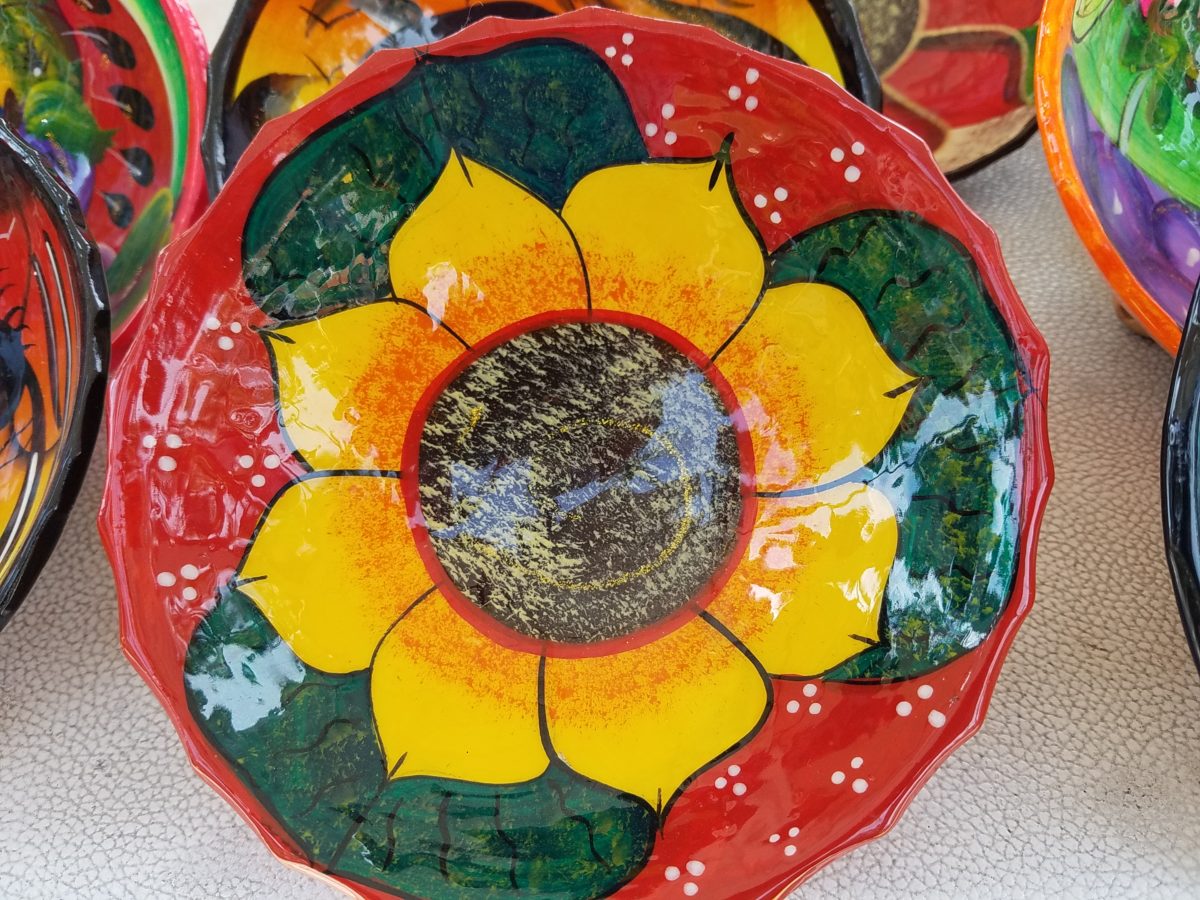
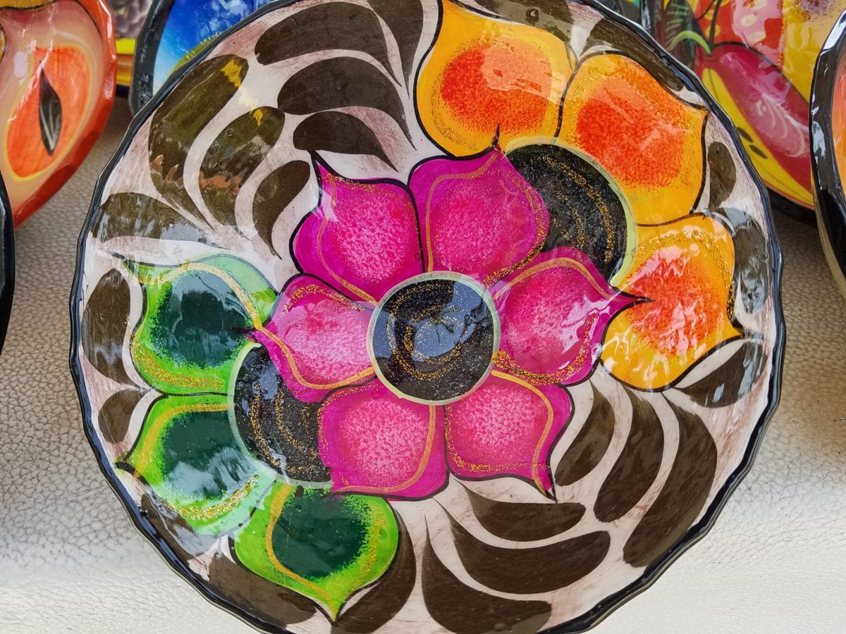
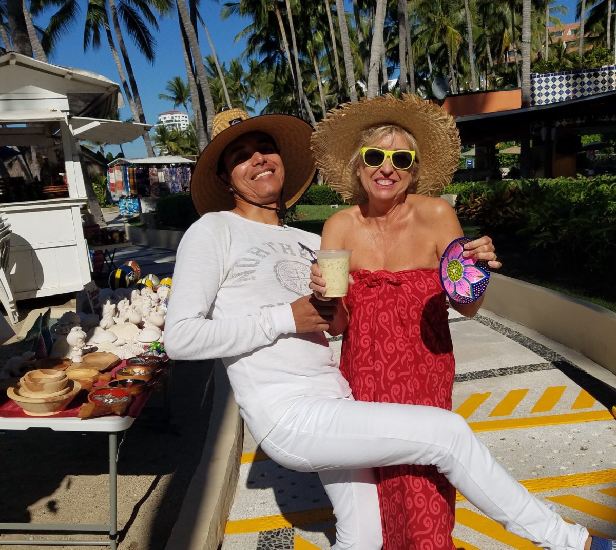
Hidden genius can be found amidst seemingly redundant arts and crafts. Walking by you might not notice. Passing by many beach stands, they begin to look alike – very repetitive. The colorful wares and handcraft are striking and eye-catching and full of fiesta, yet if you pay attention you will notice the nuances. Discovering the true designer/artist.
An escape to the tropics and especially to another country offer a reprieve from the cold and add an exotic element to getting out-of-town. Discovering the many indigenous art forms that come from all over Mexico is fun and exciting. Getting to know the makers and the distinctions in their work is another exciting level of appreciation.
As is true with so many things, detail and design matter. I buy a smattering of things for my gallery/gift boutique. I like to support the local vendors and makers that produce these fantasy-filled folk-art pieces. From fabrics to stuffed animals, painted pottery to murals and mosaics, the art is abundant and deserves to be examined.
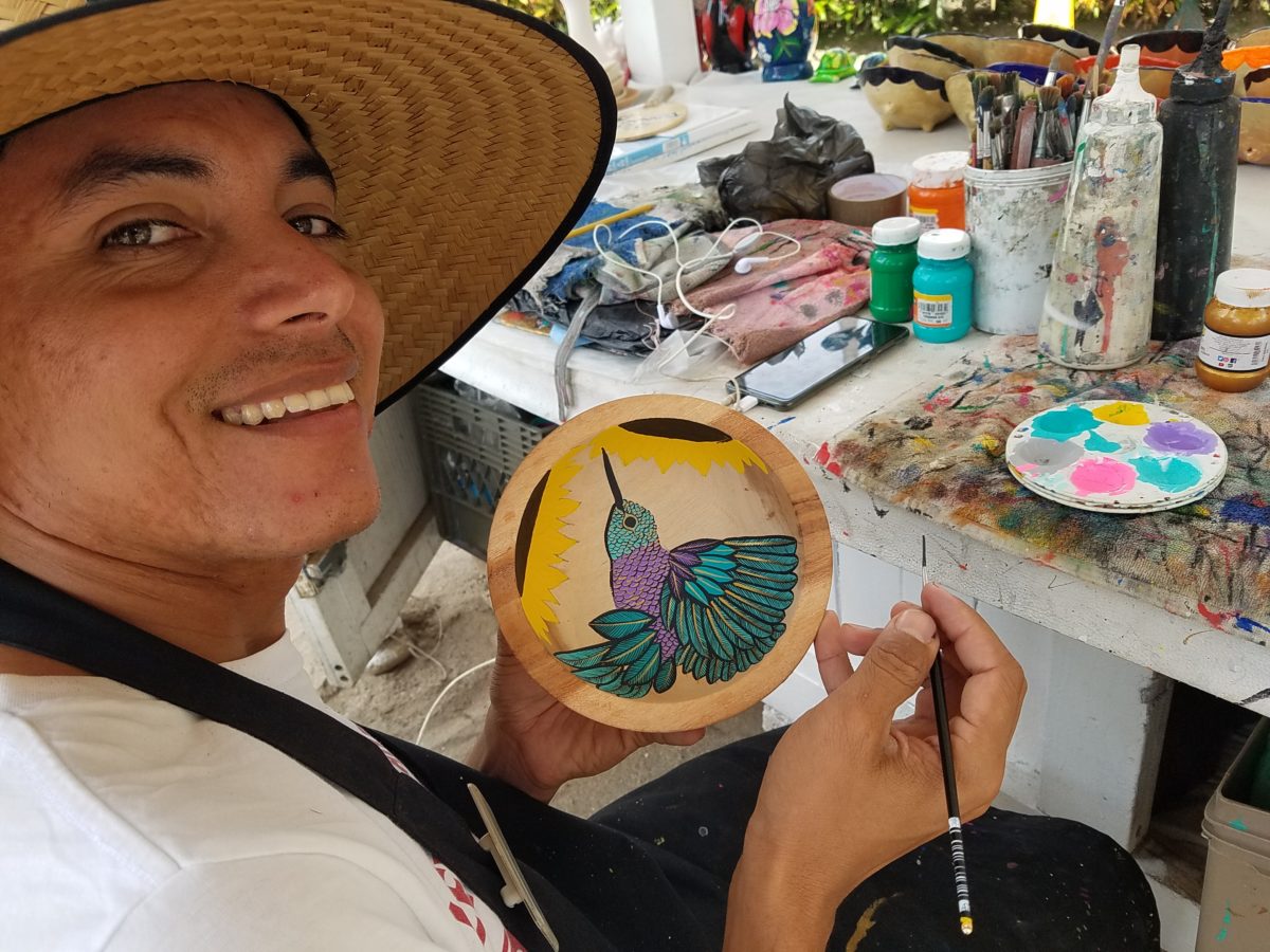
As an example, I am focusing on Victor Rivera. Victor is an artist and more so, an incredibly gifted designer. His sense of pattern and imagery is exquisite. It reminds me of my mother’s love of Marimekko and Lily Pulitzer in the 60s and 70s. Her appreciation was a tremendous influence on me. The joy of color and pattern was a exhilarating celebration to wear and accessorize your home. Victor seems to possess a like-kind of innate sensibility and talent for devising and executing sensational color, pattern, motif and resulting design. He is currently creating, from a modest beach stand, what I believe is clearly different from others doing what might be thought to be similar work.
Like Maija Isola – a peer of my mother’s, having been born in the 20s her designs transcend the many decades in which she influenced color, pattern and bold imagery. Her work continues to live and influence the evolution of Scandinavian artistic direction and its impact on the world of design. https://www.marimekko.com/com_en/world-of marimekko/design/designers/maija-isola
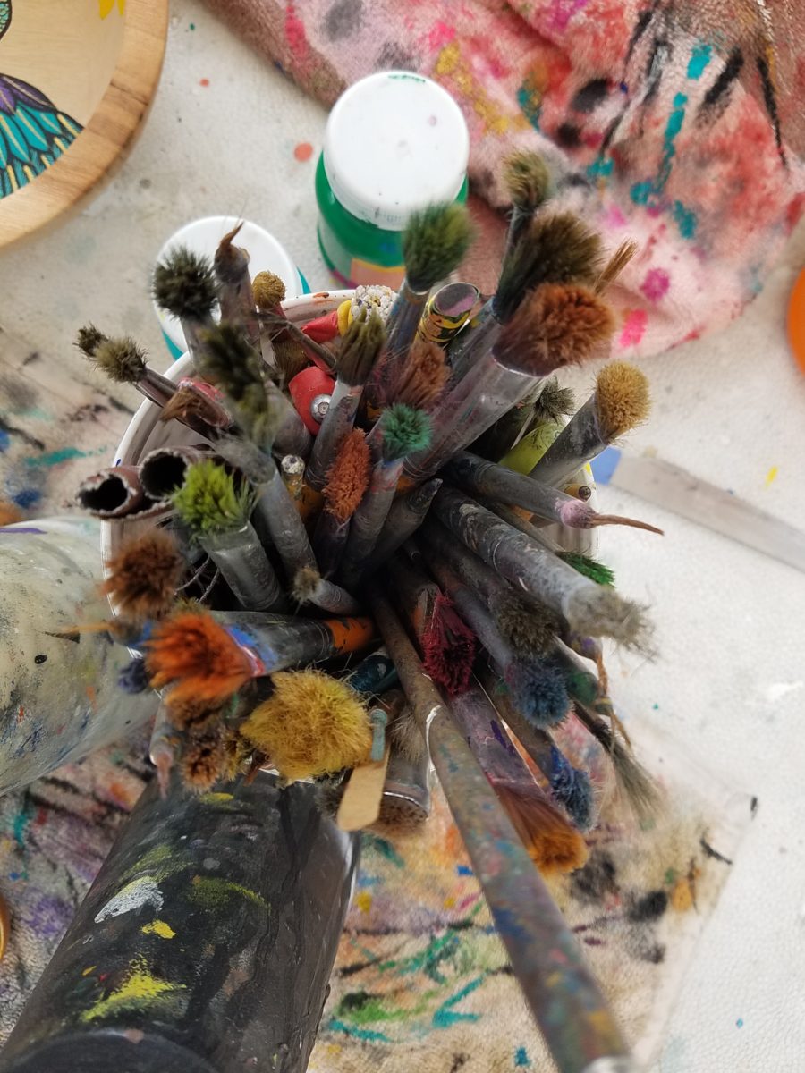
Watching Victor select his brushes, for the various applications and control on his designs, is fascinating and amazing.
The sense of pattern and design is a different category of artistic talent, in my observation and estimation. A master, of pattern, form, design detail and art, is an artist. However, the focus on the repetition and integral connection of patterns – for this purpose in a one-dimensional application – is an intensely different pocket of an artistic brain.
And this brings me back to Victor. I want someone in a position to embrace and promote him, in the world of fabric design and influence, to catapult him to the level to which he can and should aspire. Shout-out to Alegreea and the fabulous designers at Pineda Colavin!!!!!!!
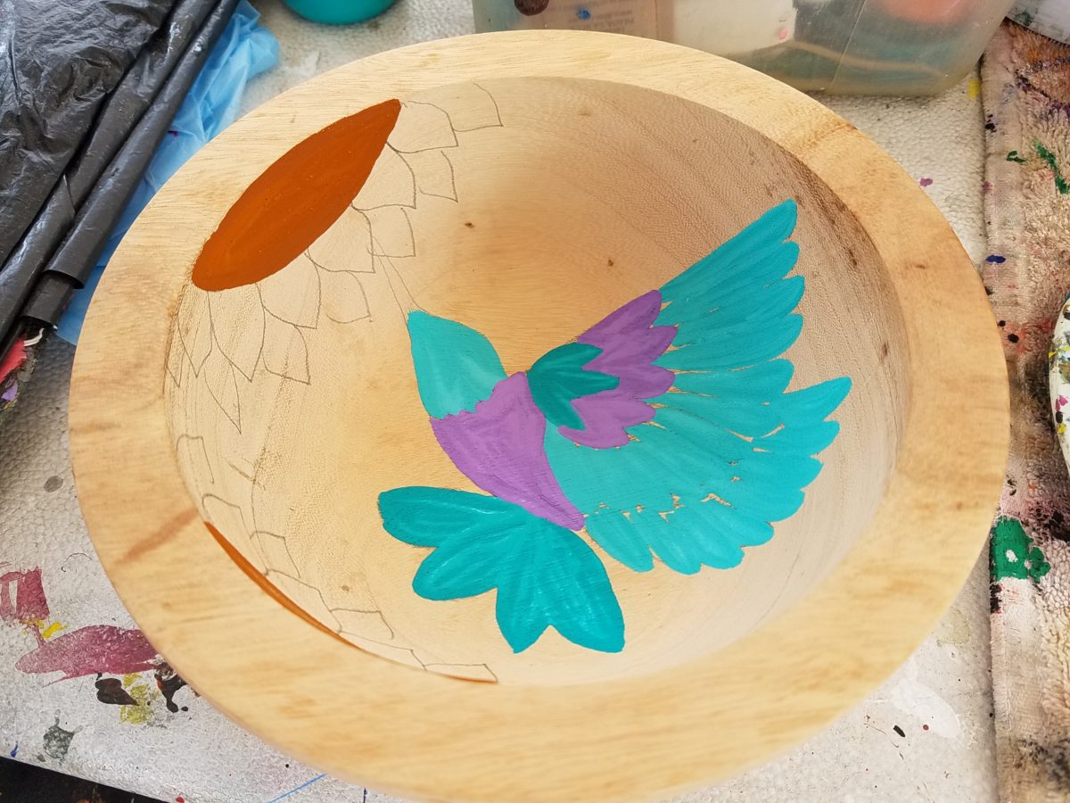
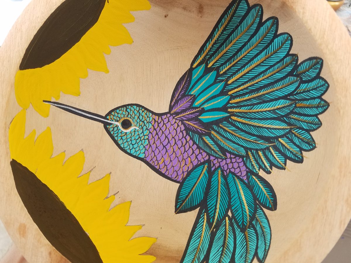
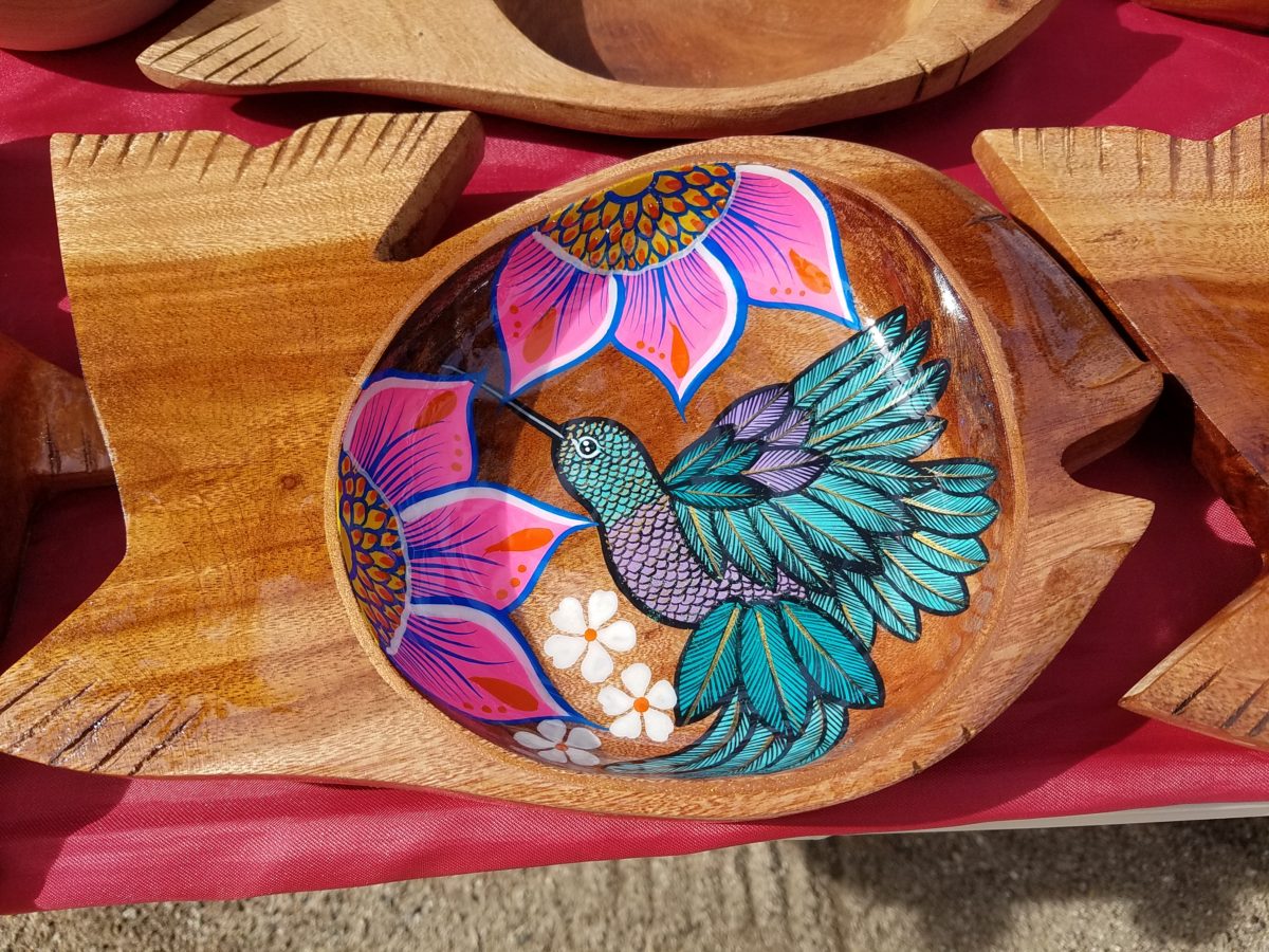
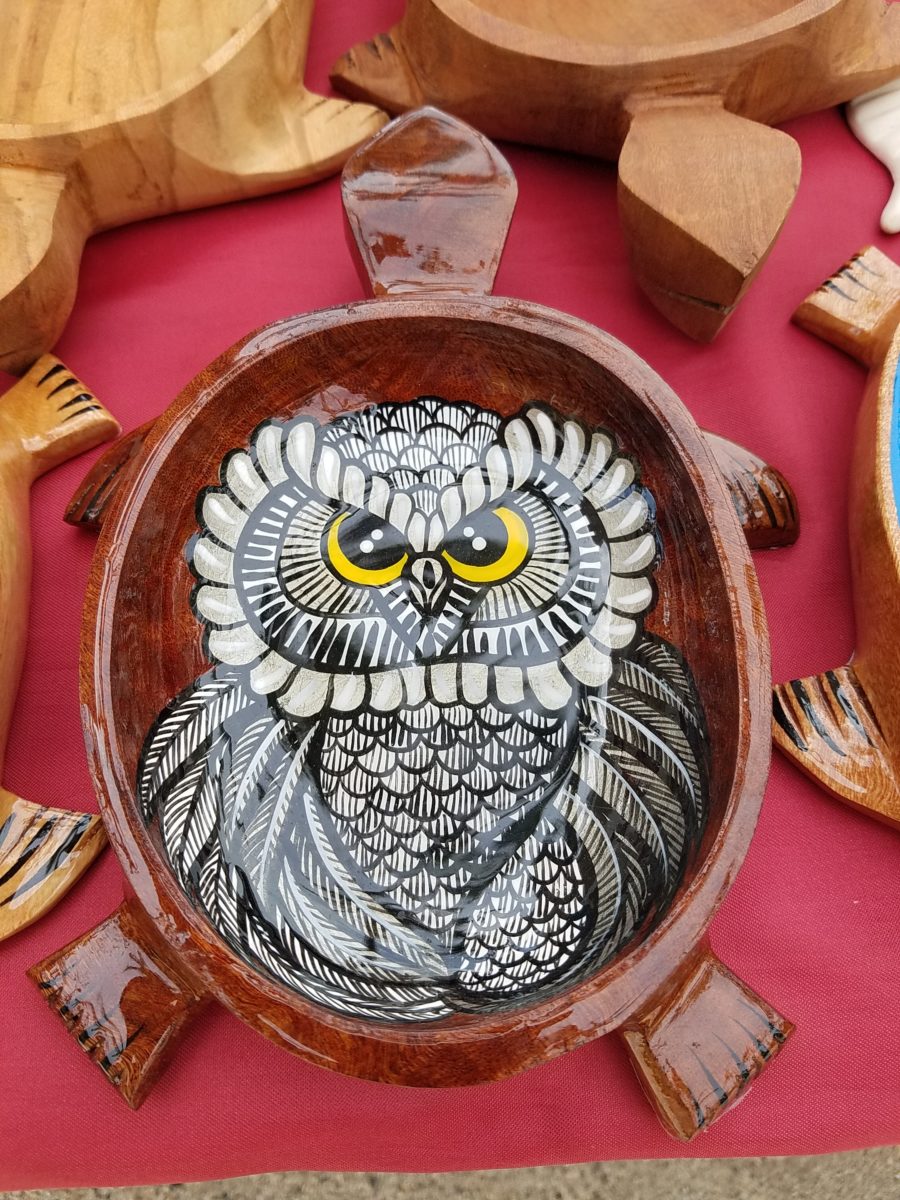
His hummingbirds begin with a pencil drawing and basic “fill” colors at the start. Working on both clay and wood prefabricated bowls by other artisans, his many layers of colors and details take shape.
With myriad, mostly monotonous, Mexican street/beach artists, Victor is a beacon of light that stands out among the throngs. Once you stop to notice – the work he is creating is astonishingly unique and beautiful. His designs are laced with meticulous detail, outstanding color combinations captivating and beautiful.
He will paint expeditiously simple works to satisfy the tourists and keep an inventory at the ready for spontaneous purchase – but when he has quiet time and is caught-up on his table of offerings, he creates amazing pieces that are truly remarkable. It is important to note though, that his more expeditious pieces still have a color combination with strokes of accents that still are above and well beyond the common.
He will paint commissions all day long – but left to his own devices, his creativity is boundless. And, referencing back to the Scandinavian designers, his floral designs are outstanding!
Taking time to examine the world around you and the beauty of detail that awaits, is a joyful experience of great discovery and satisfaction! Not to mention great fun!!!
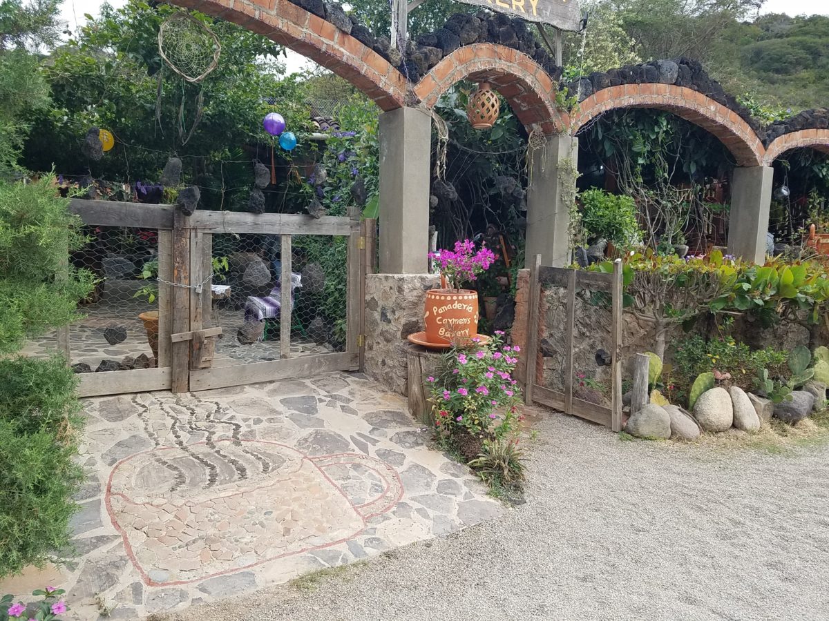
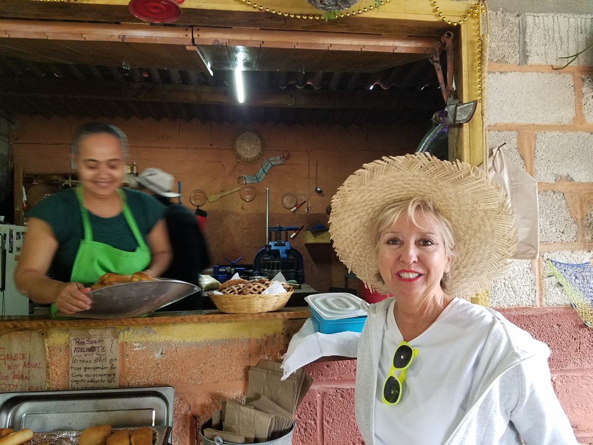
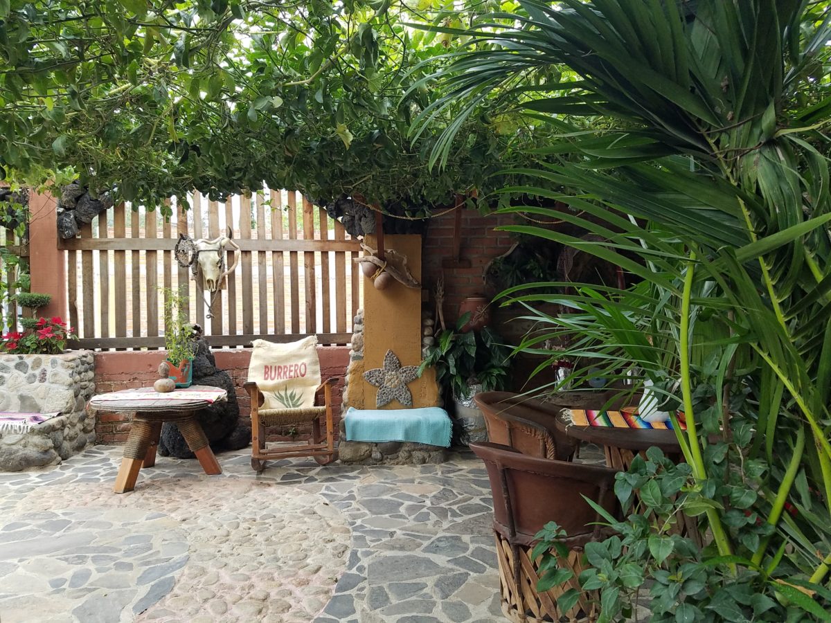
After experiencing and pondering the value of incorporating nature’s elements into architectural planning in the previous blog, I find myself winding into the countryside from sea level to a mile high into jungles and ultimately pine forests, across vast expanses of rivers and towering bridges spanning grand abysses…and stopping at a modest panaderia (bakery) on the side of the road.
You can’t tell a book by its cover as this simple little rural structure – standing alone – looked curiously intriguing and quaint enough, with an unpaved parking area transitioning to well-tended pea-gravel. Traffic cruised by, on the way across the bridge.
Those that knew, turned in. We pulled off the road and were told that this couple had a wonderful bakery and were promised an exceptional treat! Fresh empanadas that would bring remarkably satisfying mid-morning joy.
Very tidy and thoughtfully eclectic, this little destination bakery is a precious find.
Oh, were we in for a surprise! At the entry, I stopped to shoot the whimsical cup of coffee mosaic set in a field of stone and concrete. I thought – what a fun design element to greet arrivals and set the stage. But I had no idea to what extent I was about to be elated. What unfolded so exceeded my expectations that I wanted to stay all day!!!
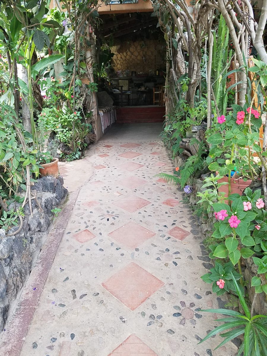
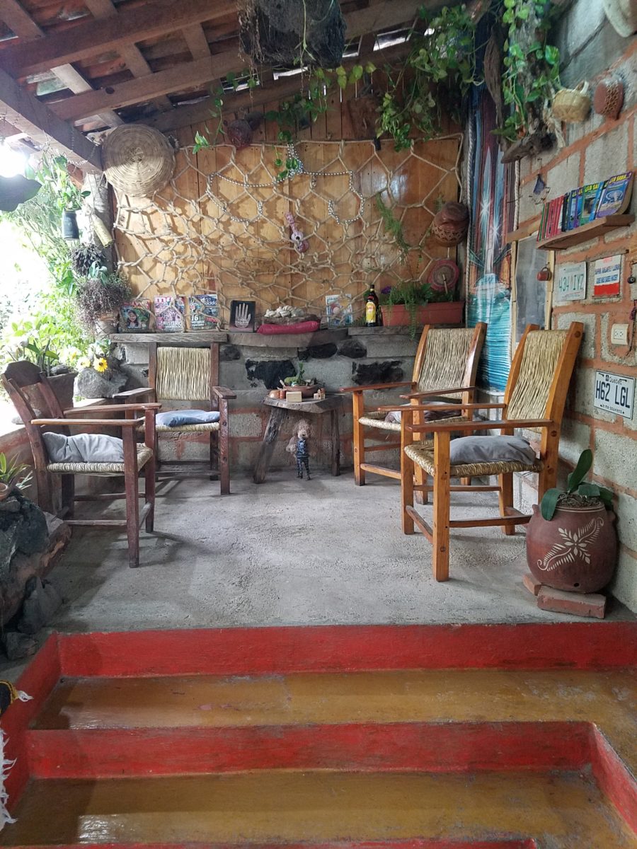
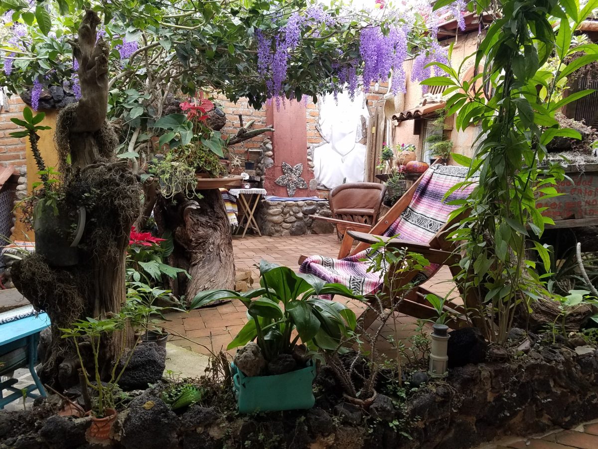
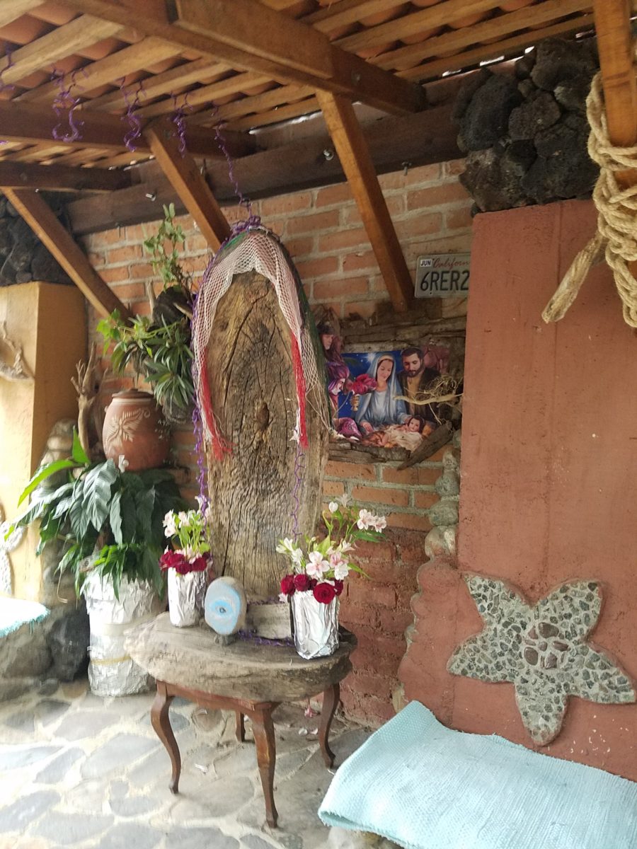
Happy stone and tile-work adorned the pathways. From the textures of stone and brick, tile and wood – it was an organic fantasy – an unexpected design experience.
Simple, yet spectacular – simply spectacular!!!!!
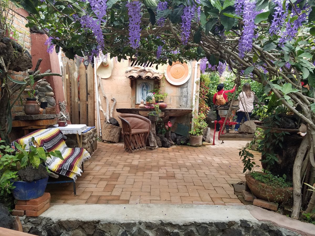
Ceilings of colorful floral blooms – perhaps wisteria – suspended from their vines and other plantings intertwined with the structure.
Spotless and meticulous the eclectic elements were a harmonious creation.Stone walls, wooden slats, vines and adobe all worked together to define the spaces.
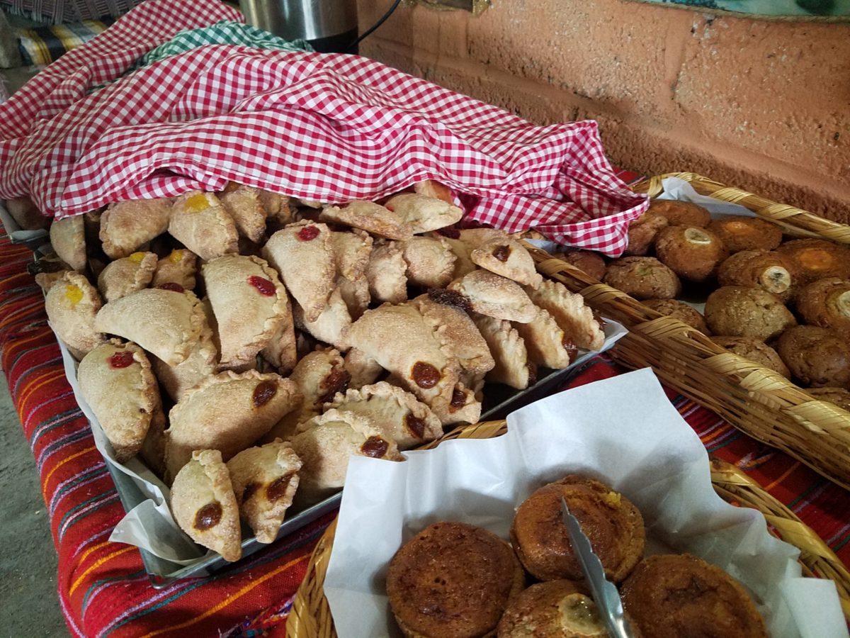
The wafting aroma of fresh baked goods – it was more than delightful. From warm savory clouds with mushroom filling and another with chile-laced sausages – and an array of sweet strawberry, cream and pineapple empanadas to corn muffins, banana muffins and more! All nestled beneath colorfully woven cotton tablecloths.
Light and delicious – the best empanadas ever!! With a tiny sprinkles of granulated sugar, for a sweet crunch, before sinking into the fabulous fillings! Muffins challenged any others and savory treats were so satisfyingly delectable. Little buttons of banana slices on top denoted which were the banana muffins!!
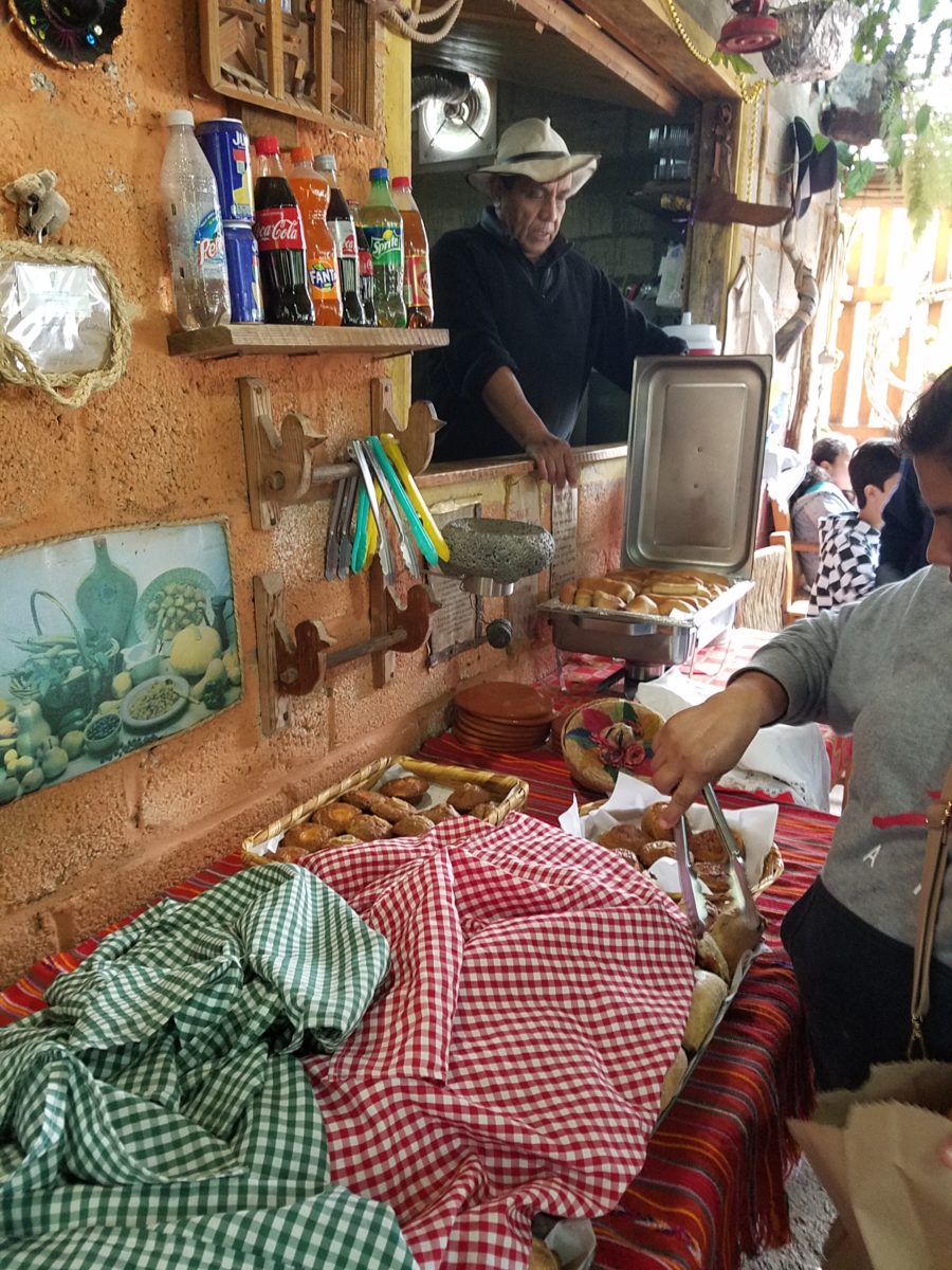
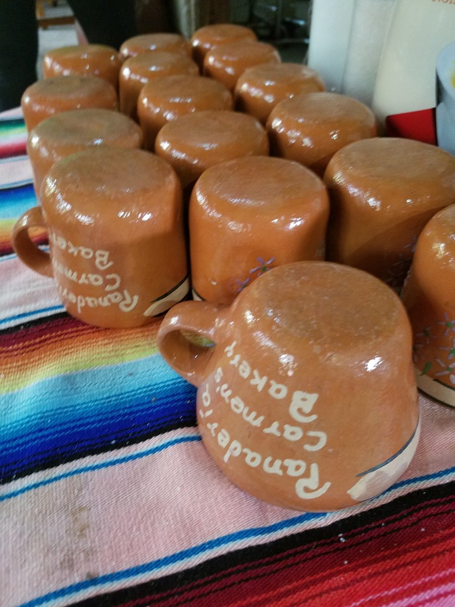
Rich Mexican coffee with a touch of freshly ground cinnamon and luscious hot chocolate were served in custom-glazed “barro ware” complimenting the fresh-from-the-oven confections.
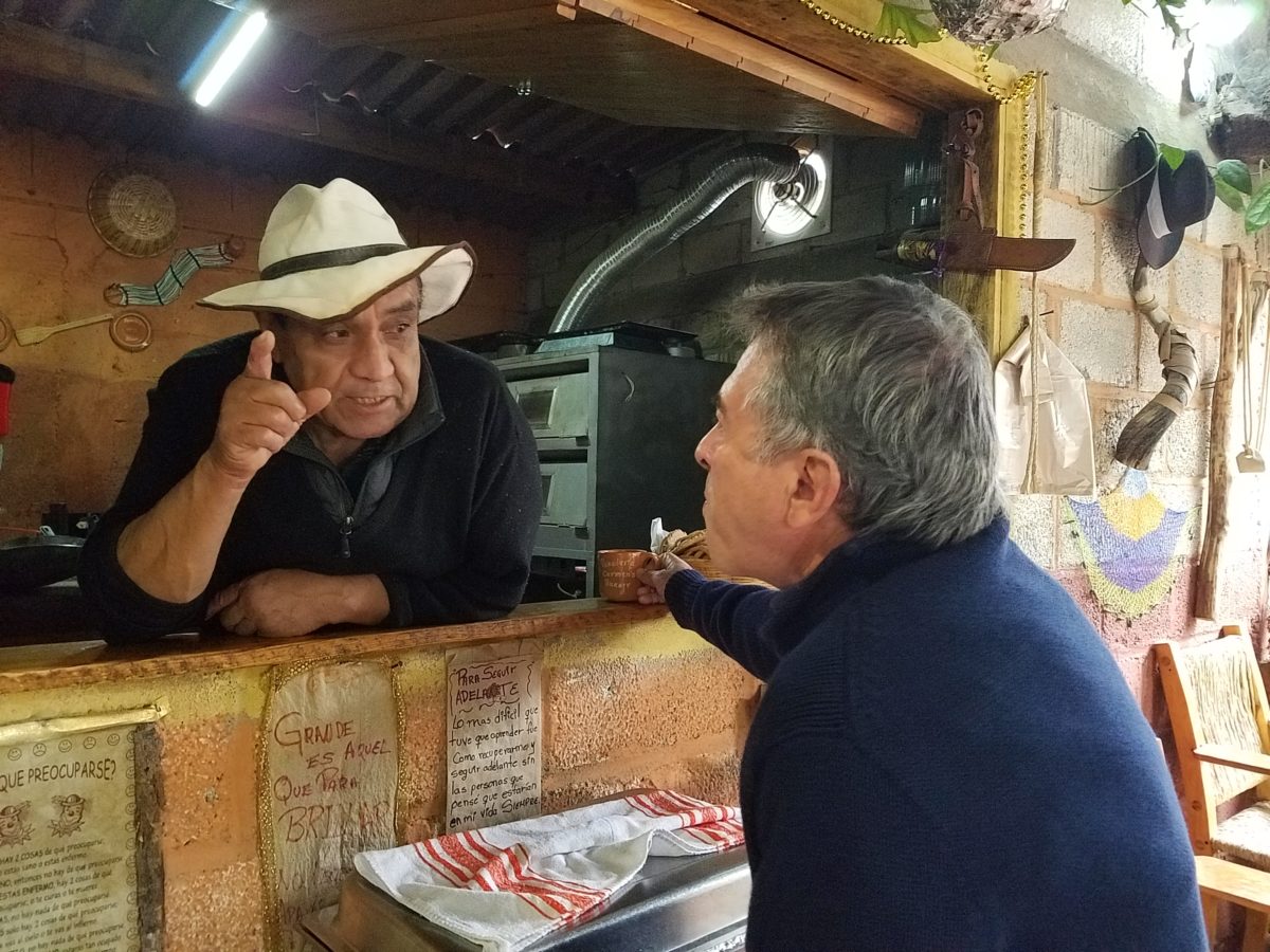
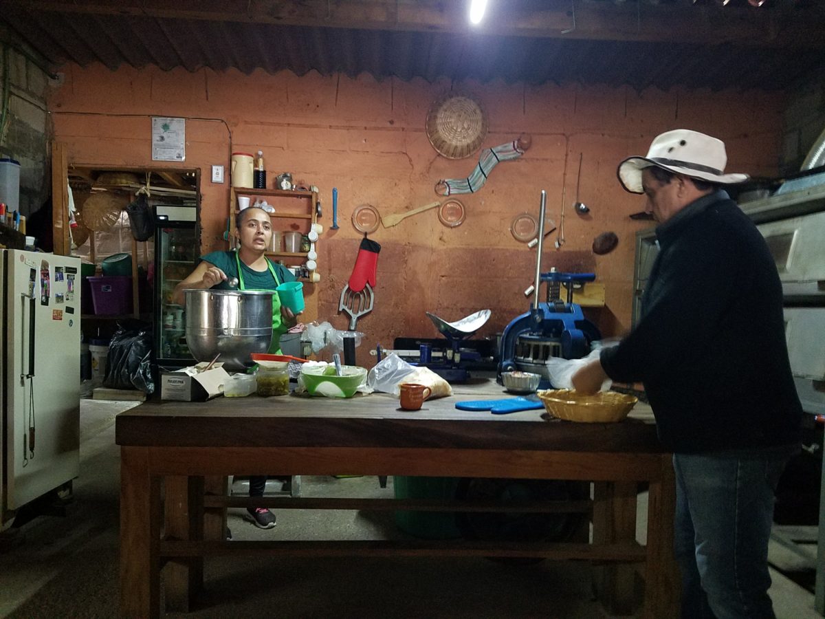
The exhibition baking kitchen overlooked the serving line. The buffet of pastries thoughtfully explained by our gracious and welcoming host, Jesus!
Carmen presents fresh strawberry tarts just from the oven!!! A combination of old and new – tradition and technology meet in this cozy kitchen.
Fragmented spaces open, yet enclosed, offered intimate pockets in which to pause and enjoy.
Color-pops insert themselves effectively around the interior and exterior spaces.Inviting seating areas semi-concealed offer private repose. Tucked away – more areas to enjoy…
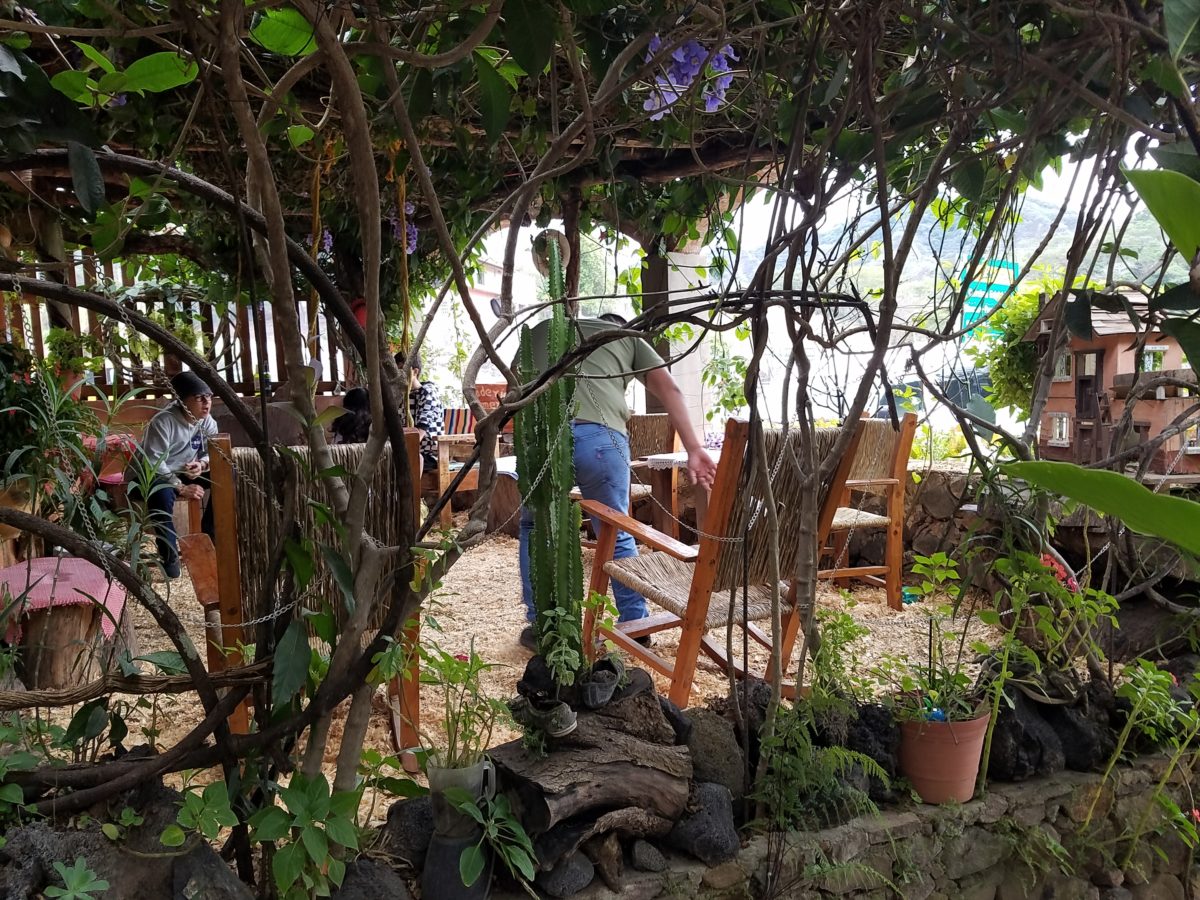
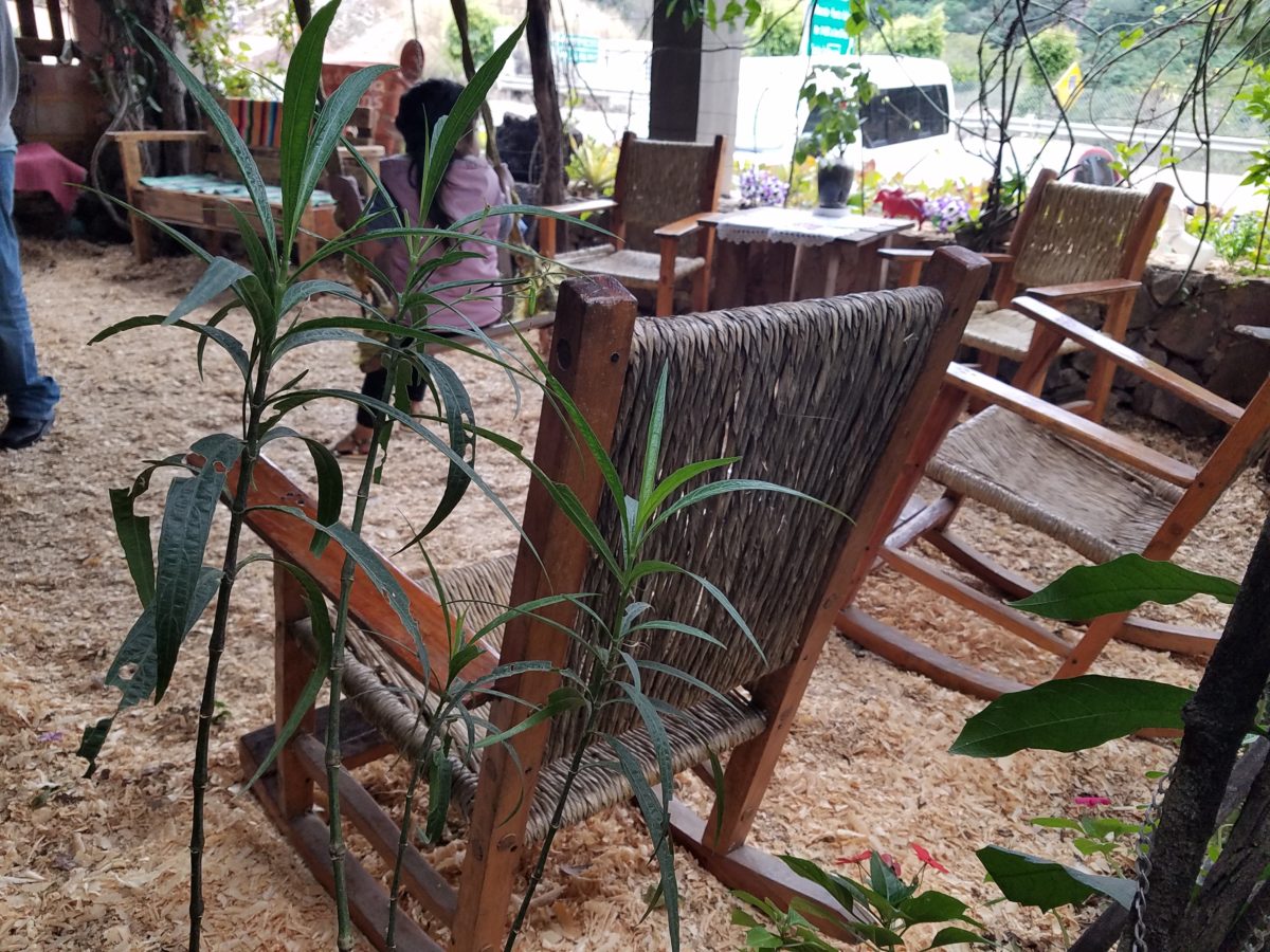
Clever use of clean blond wood shavings on the floor of the main covered patio created a wall-to-wall carpet of fresh aromatics complimenting the inviting aromas emitted from the ovens. Rocking chairs and rigid sturdy versions, with a fun little rope swing, all surrounded by tropical plantings made a cozy area to gather.
Soft underfoot and subtly fragrant – the wood chips make a great shag carpet!!!
As I meandered around exploring all the interesting spaces, textures, colors and plantings, I marveled at the sensitivity with which this had all been crafted and assembled. It was artful interior design with an exterior feel – open air and charming, with a decidedly handcrafted, Mexican sense of place.
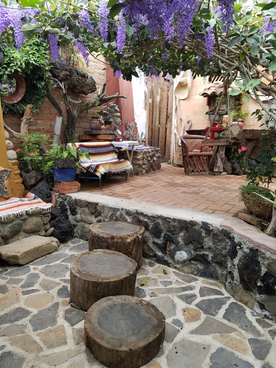
Slices of handsome tree trunks make perfect stepping “stones” with graduated heights.
It was an eclectic collage of furniture, structure and organics – living and static – that was welcoming and artful, delightful and so pleasing, that it was a treat for all the senses.
The cool morning air of the mountains mingled, with the comforting fragrances, creating an atmosphere inviting gentle conversations of people gathered around good food and artfully relaxed surroundings.
Peek in places and through doorways to find worlds of design
waiting to be discovered!!!
Wherever you may be…it’s the time of year when traditions are so much a part of everyone’s holiday experiences. And with that opening sentence – no doubt some of yours come to mind.
Traditions, of course, are not limited to holidays – but for
purposes of this season, it is the primary focus of this missive. Interestingly,
over the past few weeks, I have had a few people ask me about home decor and specifically
starting or perpetuating holiday traditions. I found it so compelling because
traditions are created from repeat practices and experiences.
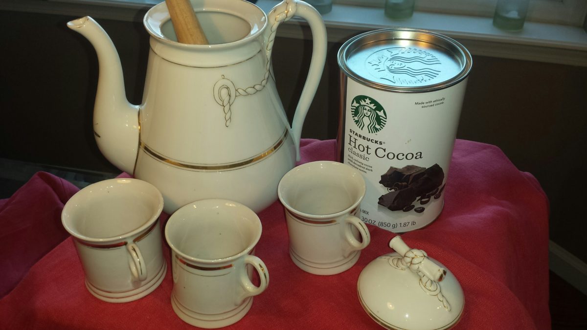
Fond memories of family friends and their annual tradition of making warm and frothy Tom and Jerrys! I found these vintage china mugs just like the ones from my memories. Have have recently seen them re-created – new – just like these! Perhaps its time to start our own tradition of Tom and Jerrys for the holidays!
You can begin to practice things that become traditions – that’s the key. Of the recent conversations, one person approached me about a week before Thanksgiving. He was single, hosting a few friends and didn’t know where to begin. Could I help? The other inquiry was from a couple of years ago as a young woman who was not from New Mexico found herself here, newly married and in a new home. How was she to create the feeling of Christmas? The answers to both of these queries are at the end …
As is true with all consultation whether it is interior design, medical, self-help, physical fitness, IT…it all begins with questions. The consultant must ask questions to establish information that will guide them to make their recommendations. Here are 4 Tips for Approaching Traditions that will begin the conversation.
Perpetuating a Tradition: Memories are personal references that are the basis for traditions. The repeat performance of these various acts establish traditions. Continuing to practice the traditions insures that they repeat as each like-kind of event unfolds. It takes effort to continue to re-create traditions, but to lose the pattern can become irretrievable. It can be an onus or a joy to perpetuate traditions. I would prefer to embrace the latter! Ideally, any tradition that you chose to perpetuate should be a joy.
This vintage set was given to me by a dear friend. It held precious memories from her grandmother having served hot cocoa from it every Christmas. My friend’s experiences dated back to the 1920s. The set preceded her memory…as her grandmother, born in the last quarter of the 1800s owned it for years prior. We enjoy hot cocoa from it nearly every Christmas morning!
Creating New Traditions: Establishing the approach that perpetuating a tradition should be a joy or the act of something that brings joy, the same is true with creating a tradition. Seems obvious that you wouldn’t want to create a traditional around something that does not bring you joy. But you might be surprised. I have recently learned that sometimes people think that they begin something that is a common practice to create a version for themselves, when in fact it is a perceived obligation rather than a joy. Don’t force it- don’t feel obliged to begin a practice just because others do it. Experience, invent or witness something that brings you joy and replicate it. You might recall it from your past, find it in a scene from a movie or experience at someone else’s home, derive it from participating in an activity or, of course, discovering internet ideas that abound. If something interests you to the extent that you want to practice it – then do it!If you enjoy it enough, you will perpetuate it and it will become a tradition.
This little Santa Doll was handmade by a friend of mine when her kids – now grown with kids of their own – were kids. Not originally intended to be a “Crazy Santa,” his accidental facial expression resulted in his name – held now for over three decades. He comes out every Christmas as an amusing family tradition.
Modifying Traditions: We all need to determine how much we want to take on, how much we want to invest (in time or money) and how we achieve the same or similar results to create the joy. If traditions become too complicated or difficult, it might be time to re-think them. Rather than discard them, modify them. The time to discard a tradition is when it no longer brings you joy. But before that might happen and if the event/activity or degree of difficulty challenge your want to perpetuate the tradition, consider modifying it to suit your changing needs, circumstances and enjoyment.
This might happen if you move away from the context in which the tradition originally occurred, change in participants – if any, change in interests, physical or financial limitations…if the tradition still brings joy – find a way to achieve that with the necessary modification. Circumstances alter cases…like where you might have lived or are living at the time. Your fondest memories might be of chilly temperatures, warm fireplaces and the scent of pine trees…then you relocate to the tropics! This provides an opportunity to retain some of the original traditions and introduce some new. Not to mention, you might move to a different country where an entirely new set of traditions will present themselves – or just the different words for familiar favorites. Even without changing languages, in England they hang stockings at the foot of each bed rather than the mantle. Father Christmas is their Santa Claus. The list of similarities and slight differences goes on…
As I walked in the park last weekend, I spotted this fun, dangling snowman! So I stopped to inquire and capture a few shots. This family celebrates their son’s birthday every year with a piñata. Born on Christmas Day, they select another day close-by to have the piñata portion of the party. A family tradition.
No snowy scene for snowball fights or skiing? Toss a ball or frisbee, take a hike or bike, instead.
No enormous turkey? Roast a breast or a more manageable duck
or chicken.
Become a vegetarian? Using the same type of familiar meal
service and table dressings, modify the menu.
Not convenient to cut and haul a tree from the wild? Buy one
instead. Real tree a hassle? Become the proud owner of a magnificent fake tree-
with a bit of pine-scented room spray! In my case, I occasionally give myself a “bye”
break from putting up our tree (Although I love my tradition of collecting
silver ornaments, of which I have dozens). So the “modification” is
to have a magnificent, tall poinsettia on the entry table and several others scattered
throughout the house to punctuate the interior with splashes of red.
No formal dining room? Gather on cushions around a coffee
table – even if it means a piece of plywood from Home Depot on cinderblocks
with a paper tablecloth! Candles and a centerpiece will set the scene.
Sharing Traditions
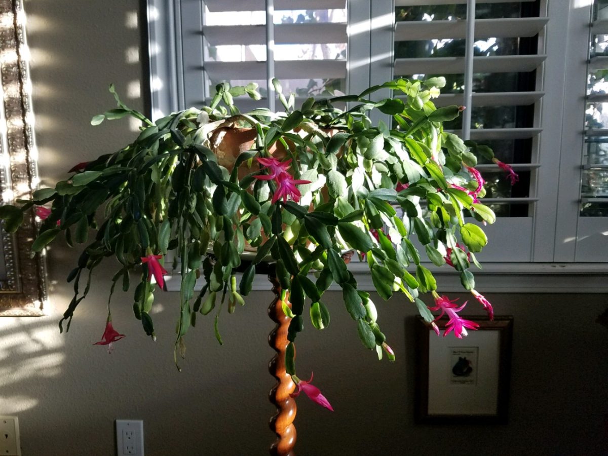
Gifting things that represent your traditions is a wonderful way to share. Obviously, baking and sharing traditional delicacies is prime. Making or finding ornaments to gift is nice. I offer cuttings of our family’s Christmas cactus. My grandmother always kept one or more plants from the original plant that was in her family home in Youngstown, New York. She was born in 1892 and her grandmother remembered the plant and told my grandmother that it preceded her in that same house. We don’t know how far back it goes, but at least mid 1800s. I have kept cuttings and grown mature plants from the very plants that my grandmother had her entire life of over 100 years and kept all the while we were growing up in the same house for 20+ years and now my 40 years since! Gifting a traditional food or a CD you compile of favorite recordings, sharing plant cuttings, passing along a treasured possession – all are ways to share traditions.
But what if you are starting out? Memories from childhood might be the basis for beginning your own adult traditions – whatever the springboard, it should be fun to establish your own holiday traditions.
Colton’s Reindeer – A child’s artwork can be passed for generations.
Whether it is handmade decoration, food centered, activity engaging, music oriented, game playing, object collecting…each person has their focus. Even if one is alone for a holiday, there are sentimental triggers that remind of past events.
Food Centered: Main dishes, baking desserts, crafting cocktails…
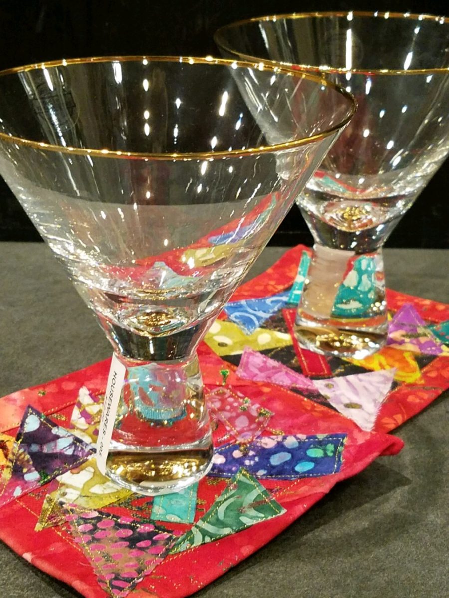
Party cocktails – always a fun tradition…note here the festive cocktail coasters. Handmade by artist Rebecca Speakes, they make a wonderful gift to start a collection.
Activity Engaging: Playing games, sports – live or on TV, taking a walk, driving around to see holiday displays, theater productions…
Music Oriented: Gathering around a piano (guitar, accordion…whatever)
to sing, neighborhood caroling, participate in a choir, Karaoke games, attending
a concert, background music evoking memories for the occasion…
Decoration: Dressing your interior and exterior for the event(s)…
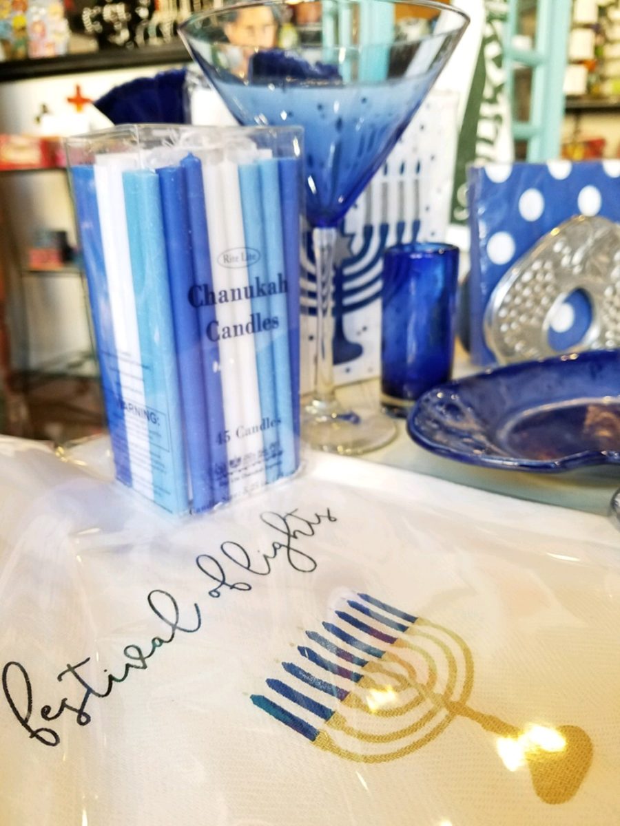
Hanukkah traditions, decorations – the brilliant blues and metallic accents…Color plays a big part in traditions and their interpretation and practices.
Collecting: Adding to collections…handmade series, vintage pieces, new releases…
Remember the guy before Thanksgiving? He had no formal dining room. He was having 7 friends gather. He wanted to do some semblance of what he regarded as a traditional Thanksgiving dinner. I asked him how he preferred to gather – standing with cocktails and appetizers grazing throughout the evening or a “sit-down” approach? He really wanted the feeling of sitting down to feast. In light of not having a formal dining area – and as it turned out, no coffee table either, I advised that he gather on cushions around a coffee table. Since he didn’t have one, I suggested that he go to Home Depot and get a 48″ square cut piece of plywood to position on top of a double stack of cinder blocks. I went in search of finding a table cloth and 8 large cushions (pillows) , votive candles and a centerpiece comprised of a bright yellow mum plant in a basket, with a few mini pumpkins and fall leaves. The scene was set. He used his own plates and utensils, white paper napkins and a package of orange cocktail napkins. He planned the meal and asked for each person to contribute an item that was special for them. After all the dishes were identified, he prepared the main dish, a casserole of boneless turkey breasts surrounded by his traditional favorite, Pepperidge Farm stuffing – baked and beautiful – and two other things that were not being contributed by his friends – canned cranberry jelly (ha ha) and a pumpkin pie that he purchased from a local bakery. Voila!
The gal entering her first Christmas as an adult was not from New Mexico nor was her young husband . They had a new home here and the local traditions were not in her realm of traditions. She wanted a large tree but did not own one single Christmas ornament. She bought a live-cut tree and we bought strings of mini white lights, a couple dozen red feathered cardinal bird ornaments, candy canes and white ribbon. She tied white bows on the tree and scattered the red birds all over it. I cannot believe that I can’t find the photo of the finished product – but it was a memorable solution for a first Christmas presentation.
This year I captured a quick shot of this tree in a friend’s house that reminded me of that young woman’s first Christmas tree. In vogue this year are the bare, stick-like trees that offer twinkly accents and an airy presentation of ornaments of choice and here featured are the very similar red cardinals!
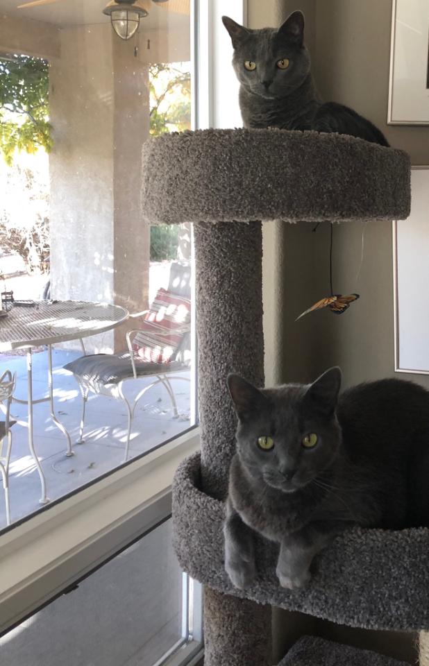
This is the story of a very lucky cat. Her name is Bijou –
French for Jewel. Once the pet, of a
let’s say, “not-ready-for-this-responsibility” somewhat transient
young man living on his own between high school and the next move, she was
along for the ride with kids coming and going, parties and nothing in the way
of consistent comfort and security. Perhaps loved, in a way, but without the
tools or experience to properly care for her, she was collected by a close
friend and given a new home.
This what the new owner saw.
Bijou, a fragile kitty.
This is what her other two cats saw.
Doesn’t play well with others.
She had led such an erratic life with so much activity and
unexpected actions, activities and unsettling inconsistencies, she was skittish
and defensive. She did not play well
with others. Syd and Sam, her two new brothers, were bookends. They were fairly
mellow and had full run of the house…until now.
Bijou was a mess around them – picking fights and acting
untamed. This spread to her reaction to her new people too – the fear of the
other cats made her skittish to the point of biting and scratching for
seemingly no apparent reason.
Her new owner knew that if she took her to Animal Humane
that she would have difficulty finding a home with her bad behavior and
therefore would more than likely be euthanized. This was not an option. For all
of her crazy, she was still loveable and had become part of the family.
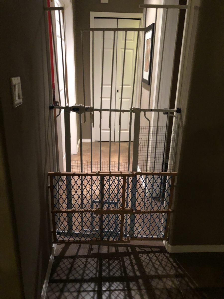
Being isolated to the daughter’s bedroom and end of the
hallway bath, Bijou had a quarantined life. And it was not pleasant nor
convenient for the rest of the household either.
Cat solitary…
Cat psychology and medication were not working. The light bulb went off and her generous and
soft-hearted new owner imagined a
“catio.” With that she began
gathering examples from all sources. Some were elegant and lavish while others
were smaller and efficient. But the idea was to provide an environment where Bijou
felt safe and could commune with nature, relax and release her tensions and
enjoy life.
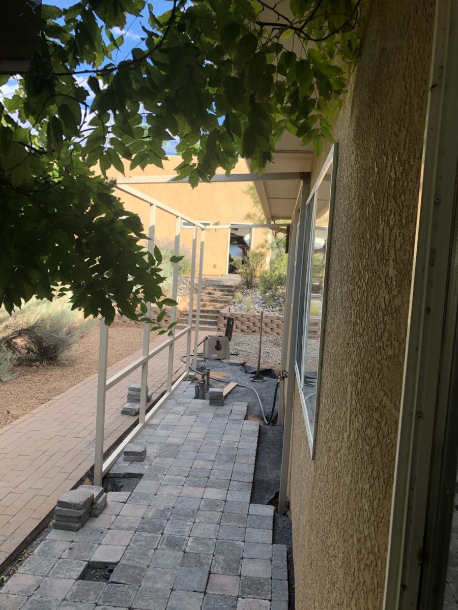
The plans began…
The idea…
The crude beginnings to plot the location and size evolved…
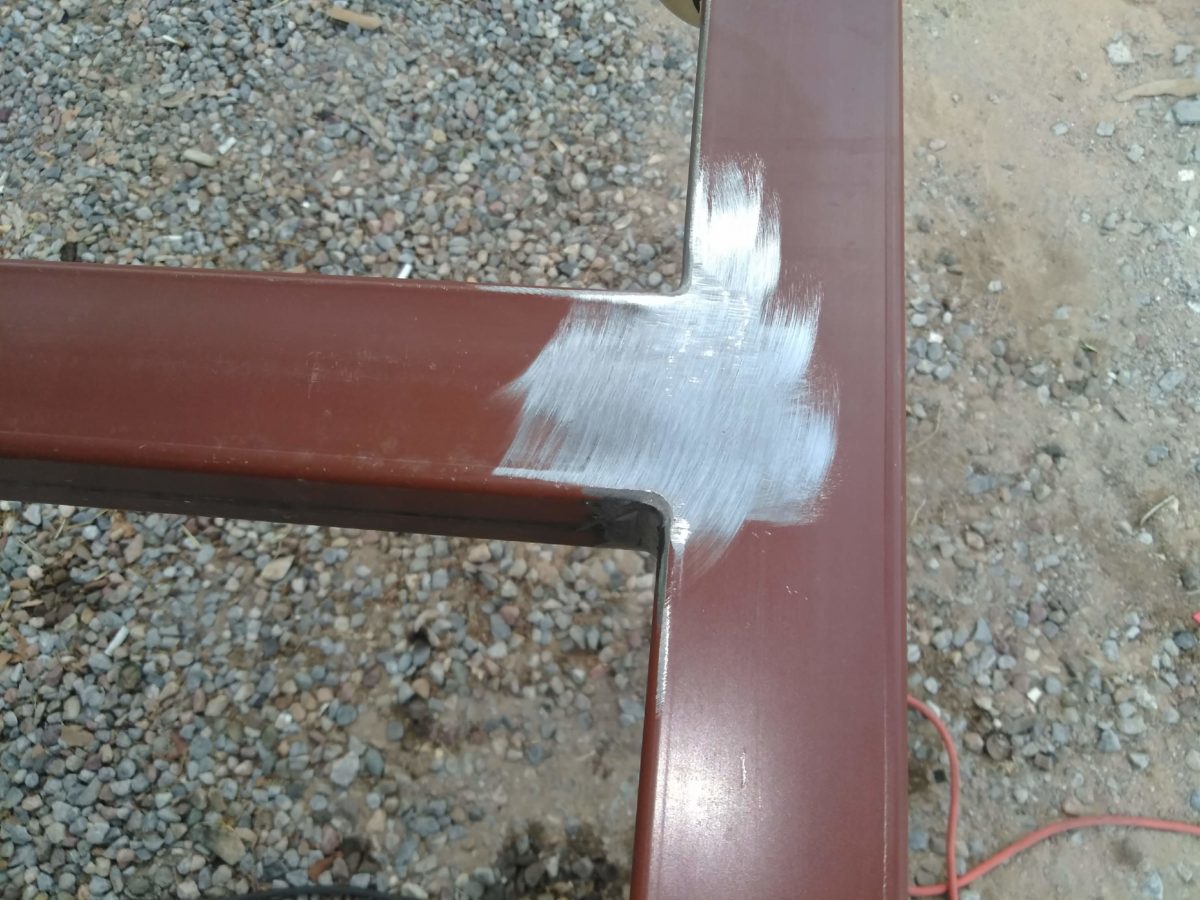
Our magician of a cabinet maker – fine craftsman and
designer of amazing wood cabinets and free-standing furniture, who continues to
claim that he is NOT a welder stepped in to save the day. Against his better judgments,
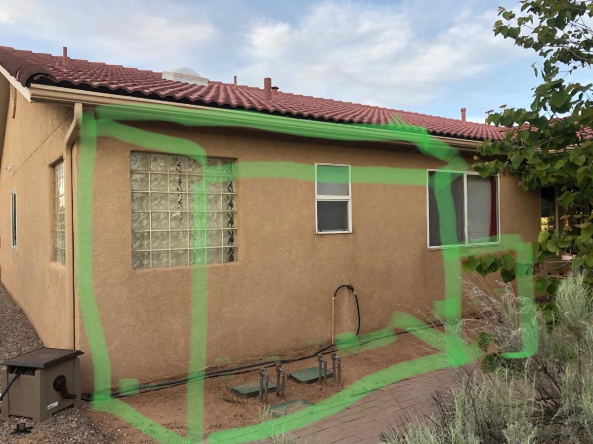
but with our strong encouragement, Enrique started to investigate.
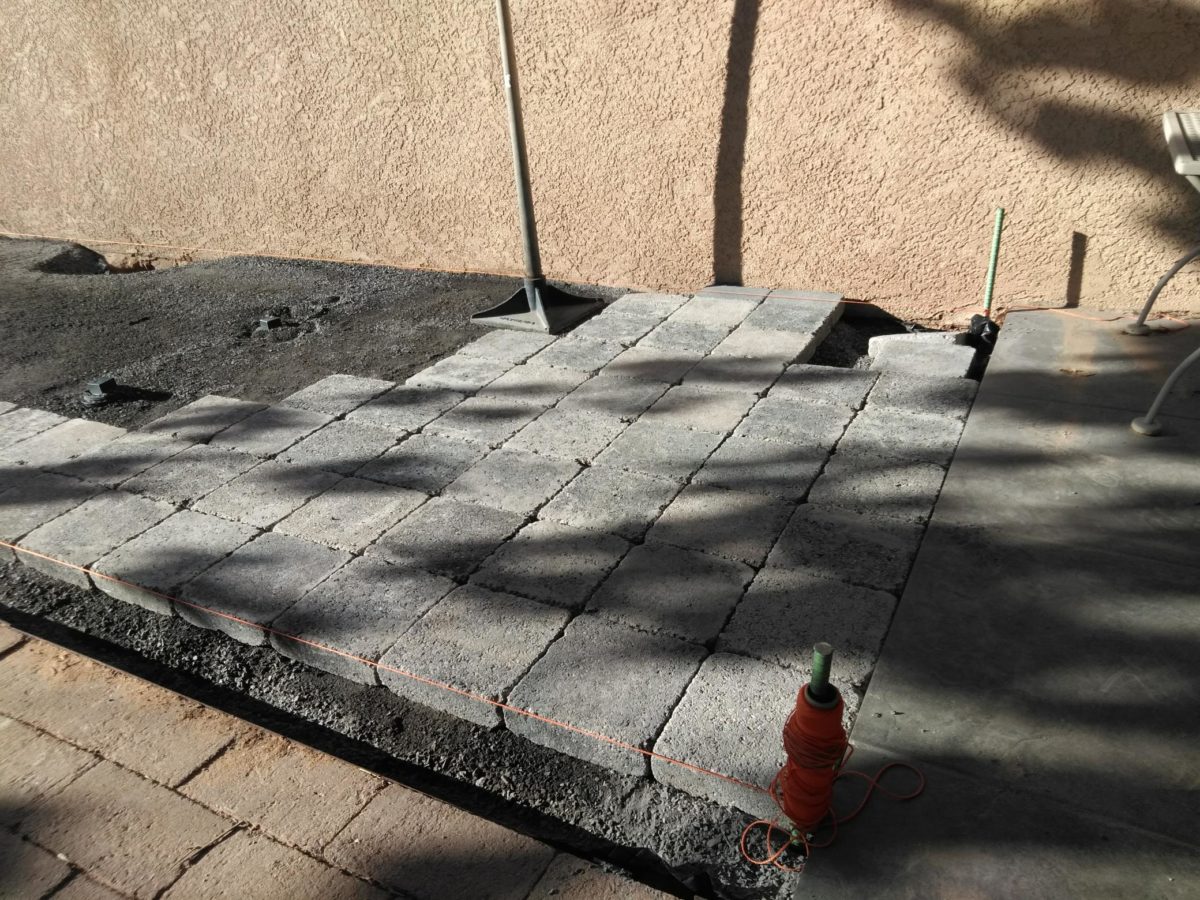
He and I went on the search for materials. Handsome pavers to compliment adjacent materials, (creating a border of gravel to match landscape material and act as a transition between non-matching surfaces), roofing panels, the right gauge of wire and size of tubular steel.
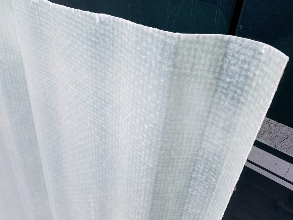
Who knew that the seemingly common corrugated fiberglass panels were not to be found at the national home improvement stores?
We wanted a durable, translucent roof…diffused to protect from the harsh orientation of the summer sun, but to allow softened daylight to wash the space with protection from thee rare downpour during the monsoons.
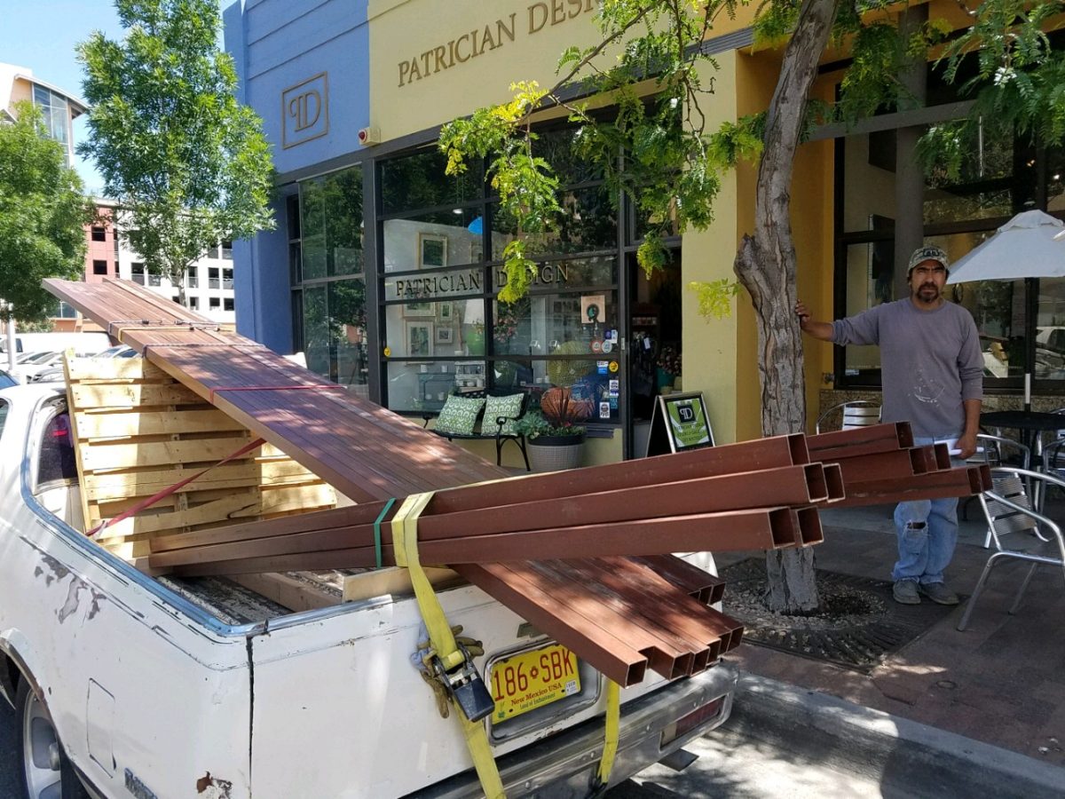
Soon thereafter he pulled up on the curb of PATRICIAN DESIGN with the first load of raw steel.
Enrique’s El Camino is loaded down with steel!!!
With many meetings discussing details including access
through the master bathroom window, entry door for humans outside, hiding place
nook, evading code issues with house egress maintained, space for adjacent
barbeque area, dodging and/or accommodating existing sprinkler valves and
transitions between existing pavers and pavement – the physical work began.
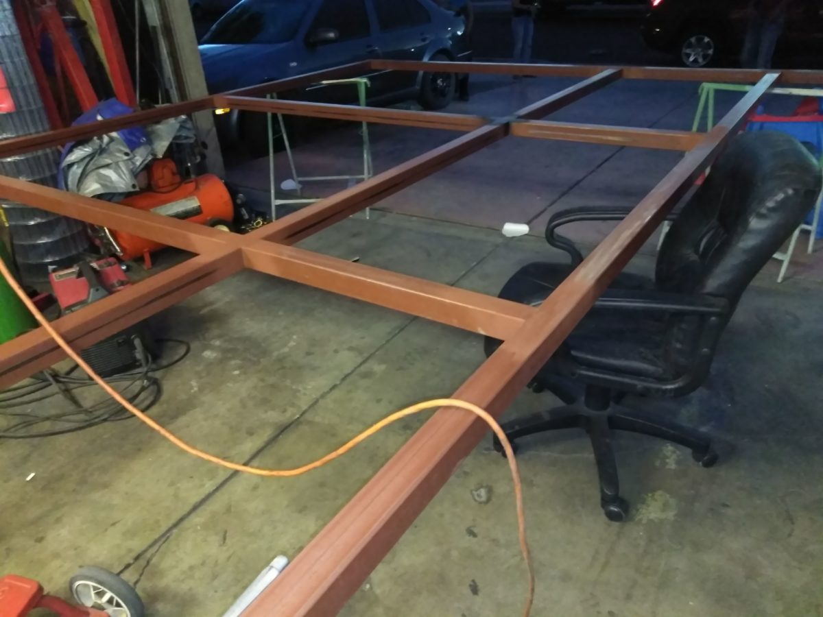
Weeks turned into months as summer passed and construction
continued. The work is tedious. The work is perfection. The welding is
invisible. I remarked that Enrique treats iron and steel like fine wood. He is
precise, careful, attends to every detail and proceeds with the intention that
joinery is invisible and details are fine.
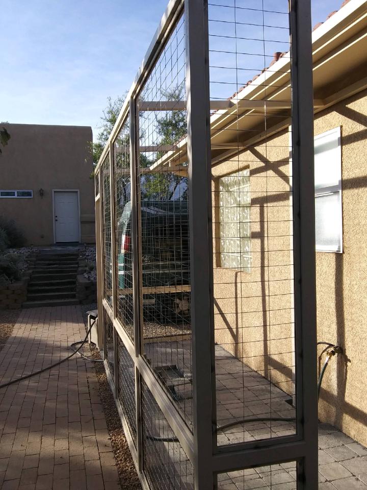
Glass panels are inserted into channels and will ultimately be lit at night with the intent of having the family each paint an image on the glass depicting cats, nature – whatever speaks to them about this very special catio.
The roof structure is extended the full length to allow for a new covered grilling area – bonus detail!! A low “hiding area” for Bijou is a work-surface for the grill too!
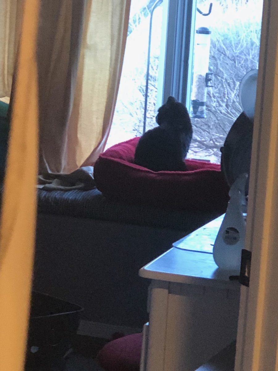
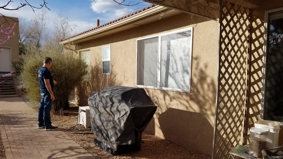
Bijou has just been introduced to her new environs.
She came in through the bathroom window…
The weather is turning and there is a chill in the evening air, but she and her benefactor enjoy sitting out there with a glass of wine and listen to the crickets as night falls.
The kind-hearted husband is getting into the swing of things by making this perch using weathered wood from their backyard and left-over carpet from their interior remodel.
More finishing touches will be coming in the way of the painted glass panels, ramps and ledges for Bijou, …
…so that every day will bring a more beautifully outfitted catio for this very lucky cat! Watch for the finished product!
Artistically embellished
architectural splendor is an understatement for all the wonders that await when
visiting our Nation’s Capitol. Washington, D.C. is my home town. Growing up
inside the Beltway, venturing into the District for work or pleasure was once my
norm. I know I took it for granted. Like
many, when one lives and plays in a place, it often becomes routine. Work the
same place, drive the same route, play in the same spots…unless there is a
special concert to catch or event prompted by others to attend, one often
misses the wonders that are right around the corner.
Therefore, when I visit, I try to
make it a point to investigate and experience things I have never seen or
things that I haven’t seen for quite some time. This visit featured the grand
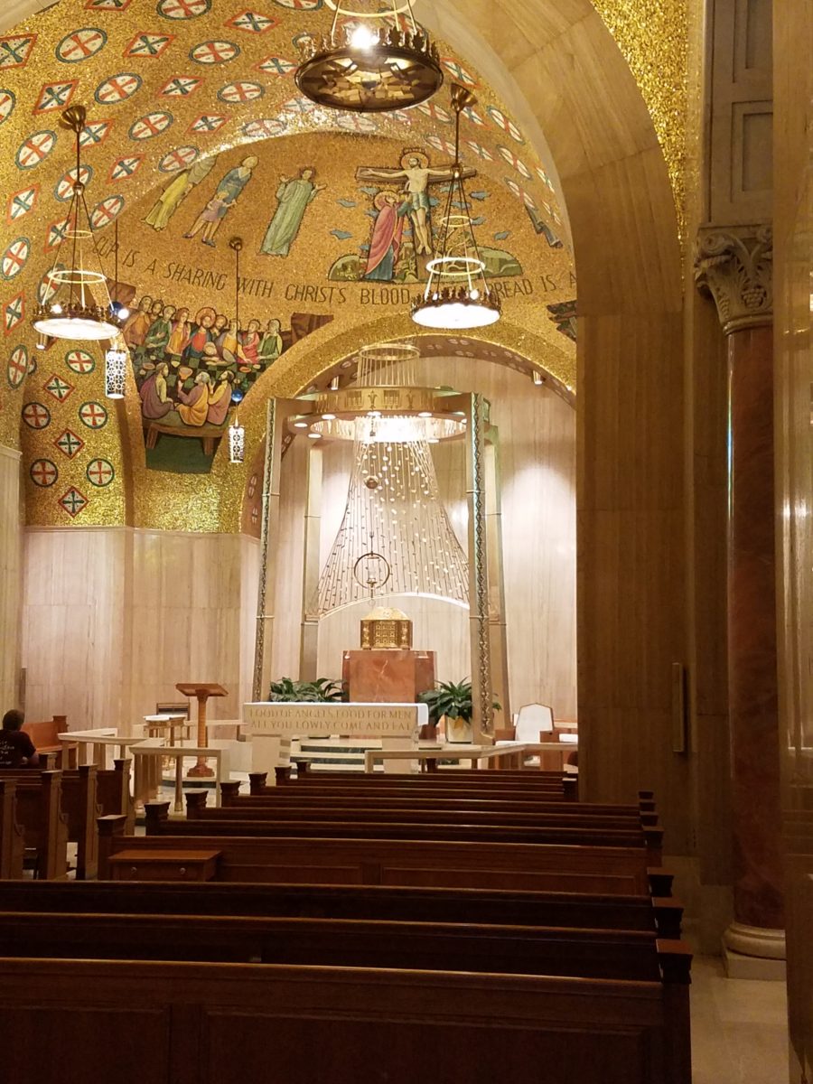
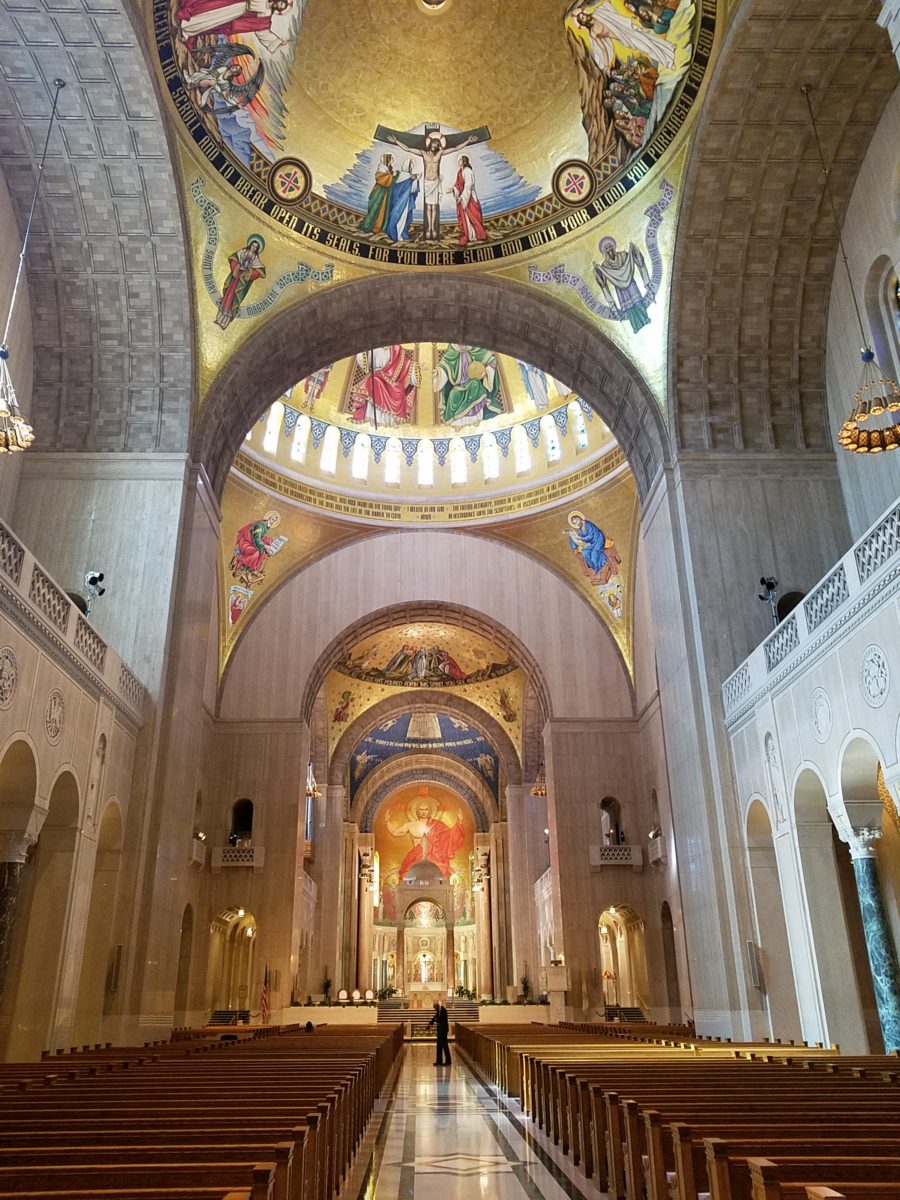
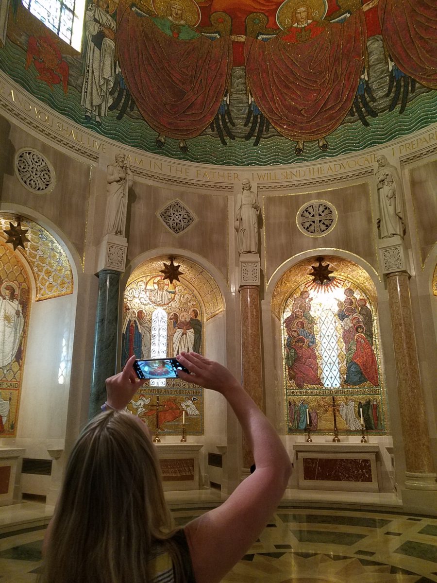
dome of the Basilica of the National Shrine of the Immaculate Conception.
It was the focus of our outing,
but the surrounding chapels and all there was to see became such an educational
and eye-candy dazzling afternoon of mosaic artistry that our eyes and neck were
fatigued from staring at the details and craning to view the enormous vaulted expanses
of blazing glory.
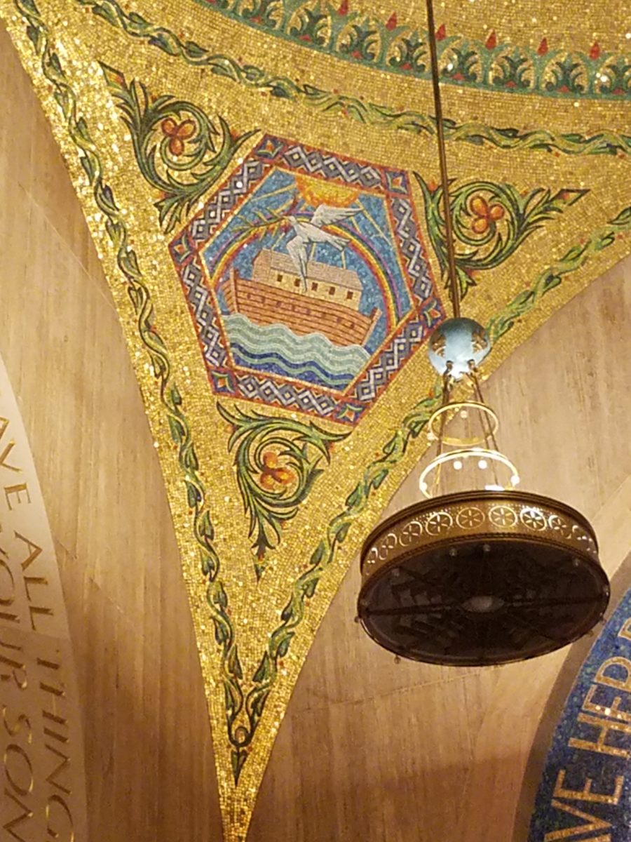
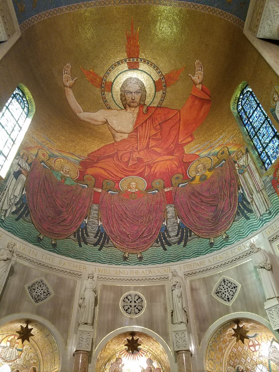
Lest you think I exaggerate, know that the majesty of the iconic images have been rendered in such exquisite detail and with such amazing colors of tiny, precisely placed tiles that the work makes you gasp and say “whoa” at every turn.
And this is just touring the many spectacular chapels on the way to the nave where the vaulted domed ceilings explode with color, detailed imagery and astonishingly expansive scale! It is then, upon entering this awe-inspiring space, that gasps and whoa fall away to near breathless speechlessness as eyes well with tears at the splendor.
The detail was similar to that of
the magnificent mosques we experienced in Istanbul – but there, we walked in
and BAM the spectacular space was huge and instantly revealed – definite WOW
factor – but here at the Basilica, it was a fascinating process of discovery as
we investigated each chapel and made our way up to the grand expanse of the
vaulted nave.
I am not going to give you a
guided tour of what we experienced, nor am I going to attempt to convey any
aspect of the historical tracings of the biblical references…but I am going
to attempt to impart the beauty and artistry that one doesn’t have to be a
catholic to appreciate. Photos can’t begin to accomplish what it takes to get
the full effect of these amazing designs, patterns, details…
Marble columns throughout the Basilica are identified by place of origin of the stone.
I encourage everyone to experience this majestic edifice and the beautiful grounds towering above the trees in NE Washington, D.C.. It will not disappoint. https://www.nationalshrine.org/
Have you ever had a moment or period of time when you longed
to create something just for fun? It might be to crochet a blanket or knit a
scarf. It might be to build a model
plane or learn how to cast a bronze. What have you longed to create?
It seems that everyone needs a creative outlet even though
they might not recognize it as creativity. When speaking to a guy about his interest in working on cars, he
didn’t consider his work “creative.” To work on a car for purposes of
enhanced performance, restoration, maintenance or repair all takes a certain
amount of creativity. The thought process of problem solving and taking action
requires creative thinking.
Gardening, painting, sculpting, carving, pottery, collage…there are so many outlets for relaxing creativity. The idea is to not do it under pressure. Lest one defeat the purpose of the relaxing aspect – just for fun – pure joy.
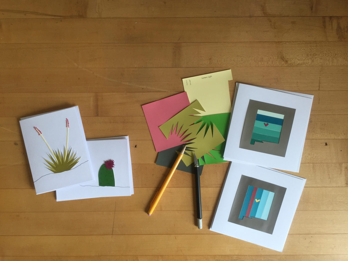
Yesterday I spoke to an architect who said that her creative
juices needed exercising. Despite the fact that her daily work required lots of
creative thought, it was not pure pleasure. It was not all fun. She
wanted/needed another outlet. So she set forth, to do some creative design time,
purely for her leisure. She started creating desert floral collages, in a size
that could be shared, as greeting cards. She brought them to show me, with a
modest timidity, and was most surprised and thrilled when I received her work
with great enthusiasm!
Rebecca has found the medium of paper to be quite
satisfying, It is clean and precise, crisp and conveys her intent. She loves
flowers, lives in the high desert and communes with cacti and appreciates all
flowers – and with that her exciting, yet quiet, introspective, personally
satisfying, creative expression has found an outlet.
With positive feedback from several people, she wants to
launch a re-sale card line! Now the creative process goes another step. She
needs to establish a brand – at least a name for her card line. Will she want a
logo? What about her entire experience can she list in words and cull and
distill to result in the perfect identity?
There are two parts to this situation and the first is to recognize the need for and find an outlet for the relaxing exercise of expressing creative juices and the second is receiving positive reinforcement for your efforts. Inasmuch as the second might seem unnecessary, it is a great affirmation and valid “feel good” feeling to create for the fun of it and have your work appreciated!
It need not be commercial – but “selling” your idea or creative project is even MORE flattering. Although, it is usually not for compliment much less profit.
Creativity can be relaxing, if it is not in a demanding framework. It’s therapeutic. In pondering this subject, I wanted to know more. Seems that this is a complex topic that deserves more investigation. So, I did a bit of reading…I found the Handbook of Creativity edited by Robert J. Sternberg from the Cambridge University Press 1999. In the first section – The Concept of Creativity: Prospects and Paradigms by Robert J. Sternberg and Todd I. Lubart it states “If one wanted to select the best novelist, artist, entrepreneur, or even chief executive officer, one would most likely want someone who is creative.”
It is true for those of us doing hiring – looking for that
spirit that can see beyond…create…are desirable traits. Yet everyone has a
certain creative element in their person. It is the degree to which they have
it and in what capacity or direction which might be more applicable or
desirable, for consideration in a
certain position over another.
The Concept of Creativity
further states that “Creativity is the ability to produce work that
is both novel (i.e., original, unexpected) and appropriate (i.e., useful,
adaptive concerning task constraints) (Lubart, 1994: Ochse, 1990; Sternberg,
1988a; Sternberg & Lubart, 1991, 1995, 1996).
The aforementioned seems obvious.
So is creativity a divine gift? One that makes it difficult to study much less
quantify or discern from another? That is not the purpose of his blog…but to
not mention that query would be leaving something that one might ask – out.
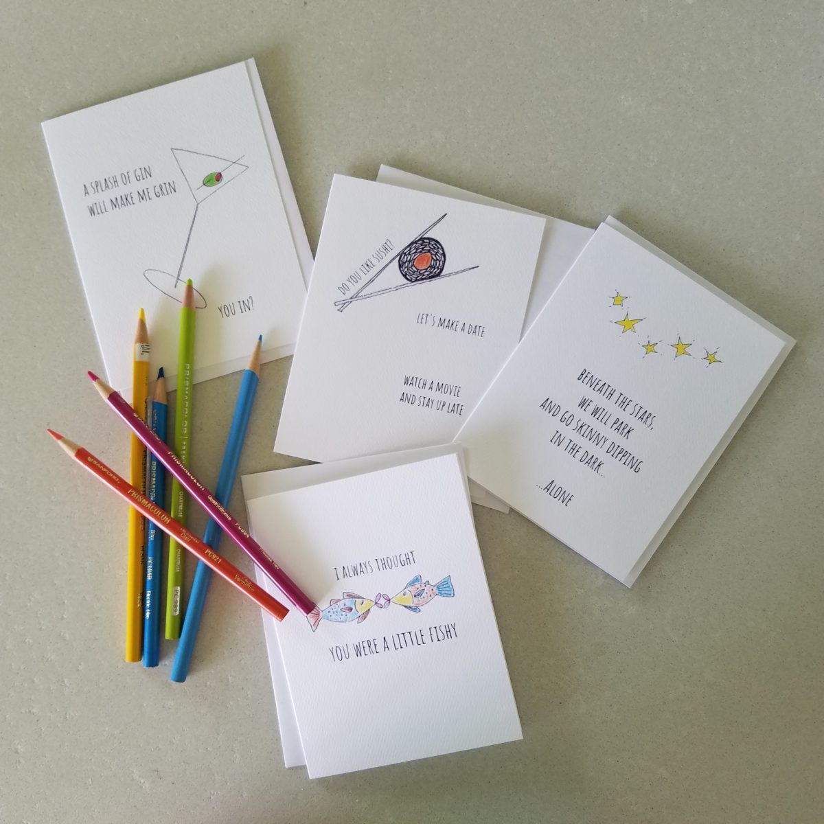
As a professional designer, creativity is part of the daily job description. Yet you will find most designer’s exercise creative outlets that are different from their work. This spring I too launched a greeting card line. It was spawned from hours on the road between San Diego and Albuquerque, with the practice of harnessing myriad ditties that continually race thorough my thoughts. A sudden lightning bolt on one of those trips suggested that I doodle to accompany my ditties. Hence, DATE NITE CARDS were born in March of this year. Little ditties and doodles to bring a smile, start a conversation, set a date, make new friends, rekindle the spark, celebrate friends, love, anniversaries, romance…
Collecting art, investing in art, loving art, designing with
art…one aspect or all of the above, art in interior design has many facets. I
have written previously about and presented a workshop about “I want a
piece of art to go with my red sofa,” a kind of raspberry in the face of curators,
collectors, critics and appraisers who would never take or condone that
approach. But the desire and need exists and as a interior designer it is
wonderful to work with artists who can and want to respond to cues, take on
commissions and create for specific parameters.
Contrary to opinions from the high-brows, this is not to say that these artists lack artistic integrity or meaningful self-expression. Their value is as any other – determined by what the market will bear. The basis for this writing is that we work with many artists who love their work. And creating it (even under direction) brings them and their patrons joy.
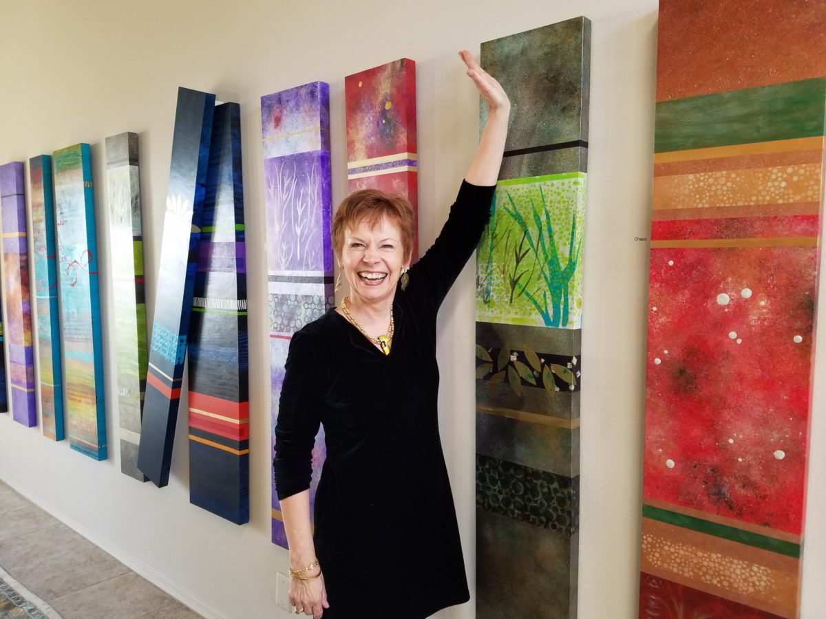
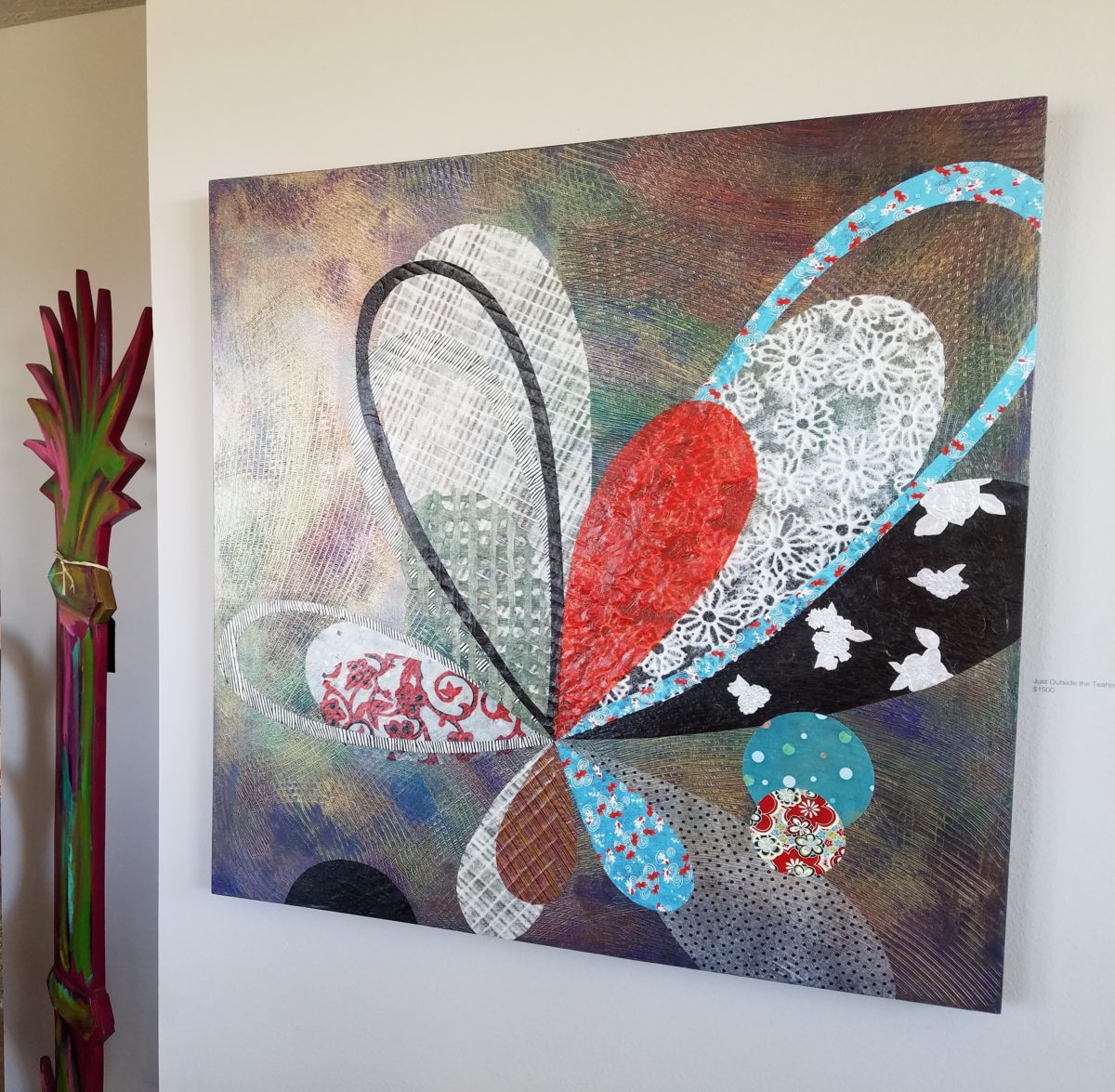
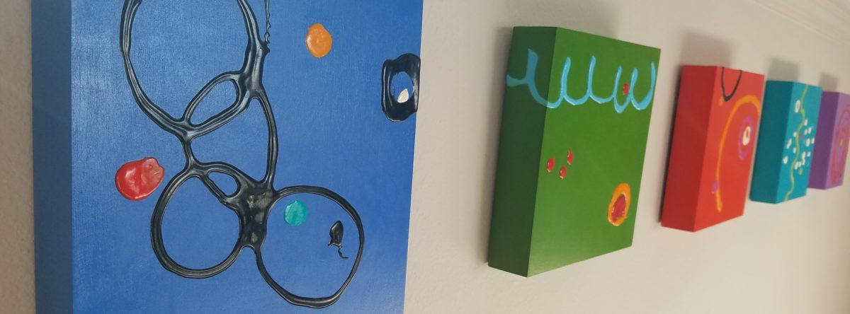
Featured here is the up-lifting, colorful and texturally abstract
work of Patricia Forbes. We have enjoyed commissioning her for specific
interiors over the years and are never disappointed in the quality and creativity
of her pieces.
For scale, diminutive Forbes poses by her Vertical Stick series.
With so many mass-produced art offerings at the trendy home
decor stores, it is refreshing to encounter new clients who are at the start of
their nesting years, establishing their own domains, selecting things that
bring them comfort and identity and who’s appreciation lies in acquiring original art.
Designing an interior is about comfort and personal identity. It is about surrounding oneself with things that work – both functionally and aesthetically. Individual’s requirements, in either of those departments, can vary greatly – but suffice it to say, each person or couple or family unit creates a home environment based upon their likes and needs (and budget).
Enter the interior designer. When calling on the assistance
of someone outside the intimacy of the home, the client is hoping for and
expecting a successful custom-tailoring of their requests based upon the
experience of the professional.
When designing an interior, it is exciting to use existing
pieces already owned by the client. It is gratifying to arrange and place those
items in ways not yet imagined – thereby justifying the investment in design
consultation. After an intense session of rearranging furniture, artwork and
decorative accessories the “ta-da” moment is one of near instant
gratification and satisfaction.
When an interior needs a little something to pull it
together, fill a gap, create an accent or establish a focal point, it is great
fun to engage the creativity of an artist to custom design a piece to fit the
need. Approaching an artist for the express purpose of acquiring a piece of their
work to enhance a space is an exciting
venture. It is a personal connection between artist and patron that creates a
communion, a bond.
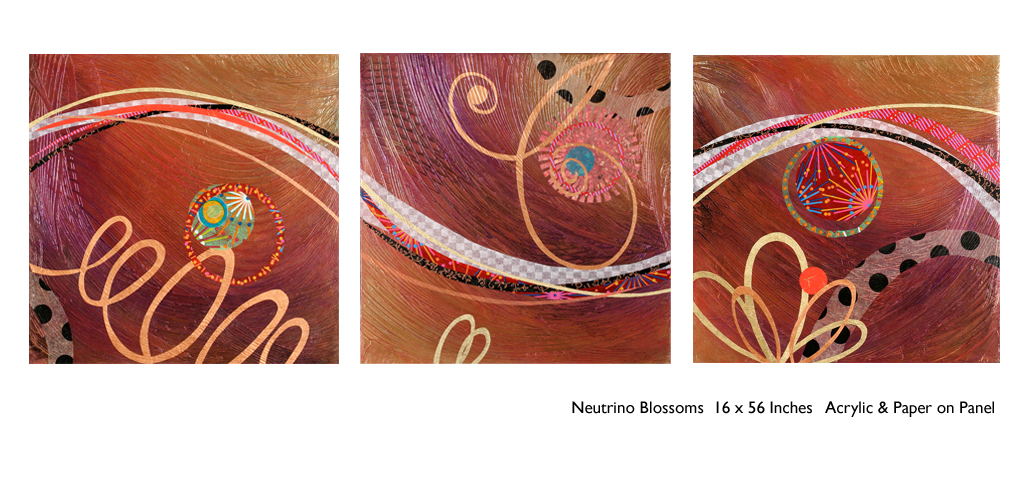
Here I took inspiration from a single panel that Forbes had constructed and requested a series of 9 panels grouped in a grid to make a larger statement on the wall. The interest created from a grid of images adds movement and dimension to this series already complex with sculpted texture and applied layers.
Color, texture, size, style, subject (or not) all are aspects of art that are to be considered for the personal interests of both artist and patron. If the patron has selected an artist to approach about a commission it is as a result of experiencing their work and appreciating it. The artist, in response, is to accept the parameters of the request and enjoy the challenge and process of creating the intended/desired finished product.
The intensity of this rich red wall was decided early in the design process. As we built layers of existing elements and introduced new pieces, the desire for a custom installation became apparent. This Urban Elements series was a collaborative effort between Forbes and me to provide a bit of an edgy, industrial vibe to this eclectic urban loft. Note too that the end table and coffee table were locally crafted for the project by Kirt Kirkpatrick
Forbes’ creativity is rooted in pattern, color and texture.
Primarily non-objective, her pieces are compositions of movement and dimension.
Working with a layering technique, she builds her action with a collage of
papers and fibers, paint and stain. Action is key when describing Forbes’ artwork.
She creates for herself, but when called upon to collaborate
on a project, her eager curiosity for what might result is enthusiastic and
ever-promising. About her style and self-expression she states “When I
have created a joyfulness and vibrancy in the work, I know I ahve created an
experience I wish to share.”
When asked…
1. How/when/why did you start your abstract technique of
layering colors and textures?
Forbes has always been drawn to color as a means of her personal expression, once she “experimented with acrylic materials that would hold a texture and started playing with those using combs and rubber spatulas and sticks to mark in the materials” she was hooked. “Metallic and interference paints call to me — so I began to combine the over the textured backgrounds, and then discovered that with acrylic one could imbed paper. It was really experimentation and discovery of what these amazing materials could do…”
2. What is the most satisfying aspect of your art for you personally?
The
element of surprise is what gets Forbes excited! “When something comes
together almost unexpectedly and I wonder how I did that — it’s always a search
for the right combination of elements, colors, textures, feelings.”
When they all come together she experiences great satisfaction. “It’s
like turning over pieces to see what fits. Sometimes I have to turn over a lot
of pieces to get the right combination — sometimes wondering whether to
continue. Seems like it is always worth continuing the work to a happy
conclusion.”
3. Why do you enjoy commissions to create specific pieces
for interiors/patrons?
Forbes
expresses genuine gratitude for her patrons. “I feel honored and
appreciated when someone likes and appreciates my work and invites me to do
something special for their home or office space.”
4. What pleases/satisfies you about this custom commission process?
The
process of working together with her
patrons is positive creative challenge. “I enjoy the collaborative aspect
and going through the process with a client or designer and receiving their
feedback as the work progresses.”
The
satisfaction for a designer in partnering with an artist is designing and realizing
a vision to complete a space. Bringing visions to reality. I often say that my team provides tremendous
support in making my dreams come true. From artists and craftspeople to seamstresses
and all manner of contractors, it is truly a team effort to achieve great
results!
Time to remodel the kitchen!! This charming little bungalow had already experienced its share of remodeling – well, not so much structural – although, many interior design transformations had occurred over the decades. In the mix, the well-used and enjoyed kitchen was feeling a quite tired and dated.
You might remember I have used this now completed project, in the last few months, during its transformation process to identify certain features and design practices. Here is the as-promised unveiling of the before and after photos for further discussion about the design process, intent and results.
We loved the mottled color and organic character of the existing slate floors and opposing green-grey beams with spanning boards of a caramel stain. These were the two elements that went well together as though intentionally planned. Yet in between, the pale, peachy pickled oak cabinets with their radius detailing and red-rose/black matrix of the tiled granite counter-tops, didn’t seem to speak at all well with the ceiling treatment and slate floor’s greens, rusts and charcoal tones. It was a dark, confused space.
When observing and “listening to” the house, it was evident that the current kitchen, in addition to being poorly coordinated, had absolutely nothing to do with the original architectural intent. The new owners had brought a few very fine antique pieces into the home. The mid-century circa 1964 age of the house accepted them on its original hardwood floors also adorned with their fine antique rugs…but something was missing. There was no cohesive thread running through the house. Over the years finishes and decorative elements had been selected and installed without any consideration for original materials or an attempt to introduce compatible and harmonious materials for the good of the home’s overall theme.
In all fairness, had the entire interior been gutted and a
contemporary interior been uniformly installed into the framework/shell of the structure,
I might have considered it a success. However, this multiple decade decor was a
mix of disparate trends and preferences that had no commonality.
To begin the process of bringing this home into a cohesive
design last year, we had redesigned the living room. There we introduced a classic
blue and white color scheme derived from the Persian rug in the adjacent dining
room.
To the corner kiva fireplace, we added a sandstone hearth and
mantle with just enough blue and white Talavera tile trim at the base of the
hearth to subtly coordinate with the new scheme. The Talavera was an
appropriate material for this New Mexican bungalow.
The original fireplace had a dark, broken brick quarry tile hearth and no cap on the mantle.The face-lift replaced the hearth material with broken-edged sandstone slab and matching mantle cap with Talavera detailing at the bottom.
With this living room having been so successfully re-designed, the obvious thought came into the discussion to continue the vernacular of the blue and white Talavera into the kitchen. As a bit of a purist when it comes to application and termination of materials, I was not content for a mere back-splash. No, if the tile were to be effective and commandeer the stage, it had to be used wall-to-wall as though an entire wall treatment.
Treating the Talavera tile as wall-covering, it continues from the kitchen, into the adjacent pocket-space housing a desk and laundry machines.
But wait! The addition of an earthy aqua handmade tile from
Spain offered an appealing and unexpected accent woven intermittently through
the Talavera. It created a coordinating thread from the colors found in the mottled
slate floors and ceiling beams.
Pre-grout shot shows the individually cut 1″ pieces inserted as mosaics into the random field of Talavera
The cabinets were in excellent condition, but the doors were
sadly dated and in no way spoke to the home’s other cabinets, doors and finish
carpentry.
The confused interior finishes we in need of a transformation!
With the white raised panel theme throughout the home’s original appointments, we elected to salvage the cabinet boxes and replace the doors and drawer fronts with a similar raised panel detail. The same red oak was used and, with a glossy white paint applied, the grain “read-through” with a very intentional yet subtle moiré-like pattern. The new raised panel white doors and drawers, with crowning top molding provided a crisp, timeless motif. The random patterned Talavera used as an entire wall-covering was very effective. The kitchen was quite gussied-up!!
The transformation was dramatically successful!
The existing slate floor was beautifully organic and I felt, from a design standpoint, was a must to salvage. Making it look like an intentional selection – part of the new scheme – was imperative. Therefore, selecting a counter-top that communed with the tones in the floor resulted in a selection of concrete-like engineered Italian quartz material – balancing the floor with the next horizontal plane and ultimately with the stained and green-grey boards of the existing ceiling treatment.
The new concrete-like Italian quartz counter-tops coordinate well with the other materials.
Another asset was the connection to the outdoors, however the existing window over the sink was high and small.
The window over the sink was high and small…
By bucking the warranty of the Pella people, we had a new double-hung window made to close down onto the new counter-top that passed through from inside to out. They would not fabricate the window to do what we intended, so we had the contractor remove the bottom of the new window frame, thus rendering the warranty null and void, in order to have a completely open, uninterrupted pass-through when raised.
Amusing and interesting…existing family pieces of blue and white ceramics are being discovered and used as decorative accessories in the new kitchen!
We also captured the opportunity to open the opposing wall into the hallway adding pass-through light and dimension to the space. This exponentially expanded the space and made the encapsulated kitchen feel much less confined.
Before, the kitchen felt small and dark…Opening the wall into the hallway brought in additional light and dimension.
To add drama to the newly created dimension, we discussed having a painting commissioned to pop an accent of yellow into the blue and white scheme on the far hallway wall. Lemons, a perfect citrus for the kitchen, was decided for the theme.
A miniature oil painting by Federico Leon de la Vega was used to Photoshop into the scene to inspire and convey the design intent.
The additional POP of yellow is a dramatically effective contribution to the overall composition. After consideration, the owners selected a local artist to paint the full-scale painting.
A local Albuquerque artist, Thomas Tomlinson rendered the lemons in acrylic with blue and white tile details.
In summary…keeping the original slate floor, existing cabinet boxes (replacing door and drawer-fronts only), with a bling of new chrome cabinet pulls, switching out the stained glass pendants, replacing the island’s surface with a handsome solid walnut top and a new coordinating concrete-like counter-tops on the periphery, with the decorative embellishment of the Talavera tile continued from the subtle introduction at the living room’s kiva fireplace, the transformation of the kitchen is stunning – not trendy – and was truly, uniquely designed for the architecture and forward, on-going contextual design conversation of the home.
Uniquely designed…
Look around and listen to the environment for and in which
you are designing. What makes the best sense for the design direction
considering the function and context of your project?
With all the New Year buzz about the new color forecasts…I started taking notice of the seeming non-color, white. It is often considered the absence of color when in fact it is a very complex color of many shades and values. Just try to select a white and you will know what I mean.
When you look at white paint samples, you will notice the nuances. There are pink whites and blue white, grey whites and yellow whites. Each white is off-set and contrasting to another. You see the differences by comparison and by context. You think you have just the right white until you place it against another sample and see that it is grey or cream and then second guess yourself again…and again…How do you know which white is right?
Dunn Edwards groups their whites and pastels in a separate section of their fan deck as do other paint companies. What is interesting here is that the background is a sheet of white copy paper. Notice how is reads against the colors in the samples…it seems to be a purple blue color. This shot was taken under a full-spectrum LED lamp. The colors should be true. The range of “white” is amazing.
To intentionally design with white is bold. To have the confidence, to decide that white IS the color and that white IS the scheme, is challenging. To effectively design with white, you not only have to select the right white(s), but you have to know just how much of anything else might be effective yet not detract.
Le Leche in Puerto Vallarta is a fabulous example of designing exclusively with white. Only with minimal punctuation with black lettering on the wall of containers and also by allowing shadows is the white interrupted. But the blacks’ minor interruptions gives depth and fine detail.
White design can be cold or warm. Depending upon the desired effect, mood or function of the space, the whites need to be carefully selected. This is true with lighting as well. Warm whites or cool whites…what gives you the desired result?
Popular white string lights add festivity and a warm glow to an evening scene.See how many lighting colors you can identify in this scene…Starting on the left, a cool pocket glows through the underbrush. The walkway has a warm pink-ish light. The very cool blues of the pool area give a dramatic read. A bold yellow accent peeks from the far left and also over on the right. The palm trees are wrapped in a warm white tube lights while the far right side illuminates the entry to the dining palapa with a cool white light source. The foam of the surf on the beach is captured with a cool white spotlight that maintains its naturally expected white color.
Knowing when to add color to a white scene to achieve an intentional POP is an art. The color itself, the amount and placement is all part of the success of a good design result. From the fine black detailing in the previous shot of La Leche to this still-life composition of a tropical cocktail that I propped the other day, the minimal punctuation of color is key.
White mosaic shards of tile in the background of this composition featuring a peeled coconut and the POP of a pretty pink party umbrella result in a white-on white scene. Yes, this shot says PARTY with a perky smile!
The bench which served as the backdrop for the coconut cocktail is a dramatic serpentine sculpture of site furniture that plays with the white-on-white of the tile and grout.
Contrasting against the organic wood decking, this white monolithic bench snakes around the periphery of this outdoor lounge area. The sunset is casting a soft pink wash over the all white glazed tile.
Beach settings using white materials compliment the white sand and greenery of the tropical plants. From wood frame platform cabanas to the sprinkling of umbrellas, white is a wonderful, fresh color for a crisp clean scene.
Whites on whites…creamy sand colors to crisp white terrycloth, the white-on-white scheme is soft, inviting and clean.Greenery compliments the white umbrellas and sunning beds on the lawn by the beach.Palm trunks and other fruit trees are often painted white to protect against insects and what insects insist on climbing the surface are easily spotted by birds who appreciate the help to capture a snack! In this case, they contribute to the white design theme.
The soft creamy off-white folds of fabric offer a soft, inviting scene.
Shadows in the creases and depths of the folds add the dimension to the luxurious feel of the cotton damask fabric.White stucco is dappled by shadows and greenery while given a warm, strong base by the brick pavers. White as an architectural finish is only successful if the context compliments it. This is true in all design.
Architectural color and texture of surfaces is a moving target. A recent discussion about a white building with black detailing would not have proved right for this particular use of white. The hard, commercial read would have been too severe for the intended effect. Yet that same project, with a warm white and an ochre accent, will be just the right combination to achieve the desired result. Watch for this project to be featured in a few months.
Architectural surfaces incorporating tones and textures of white provide interesting opportunities
Block and crumbled edge accent bands on the facade of an exterior wall.
White in design is an exciting selection. Knowing how, when and why to use it is a test of your creativity. Picking the right white is the challenge.
The limitless colors of white found in a pile of gravel…..
So the next time you think white, think a lot about it. Study the context and what you are trying to accomplish. Feel freed by the fact that white is a color to express and enjoy.