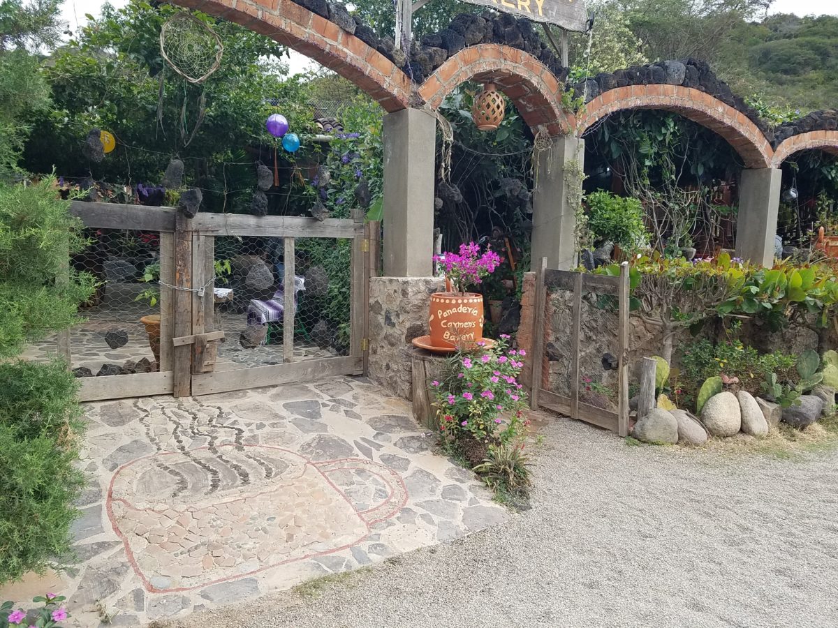
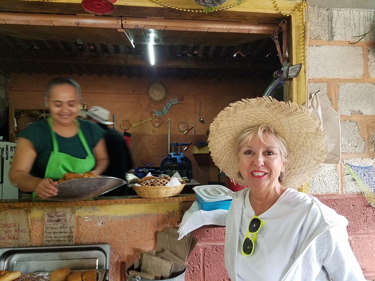
After experiencing and pondering the value of incorporating nature’s elements into architectural planning in the previous blog, I find myself winding into the countryside from sea level to a mile high into jungles and ultimately pine forests, across vast expanses of rivers and towering bridges spanning grand abysses…and stopping at a modest panaderia (bakery) on the side of the road.
You can’t tell a book by its cover as this simple little rural structure – standing alone – looked curiously intriguing and quaint enough, with an unpaved parking area transitioning to well-tended pea-gravel. Traffic cruised by, on the way across the bridge.
Those that knew, turned in. We pulled off the road and were told that this couple had a wonderful bakery and were promised an exceptional treat! Fresh empanadas that would bring remarkably satisfying mid-morning joy.
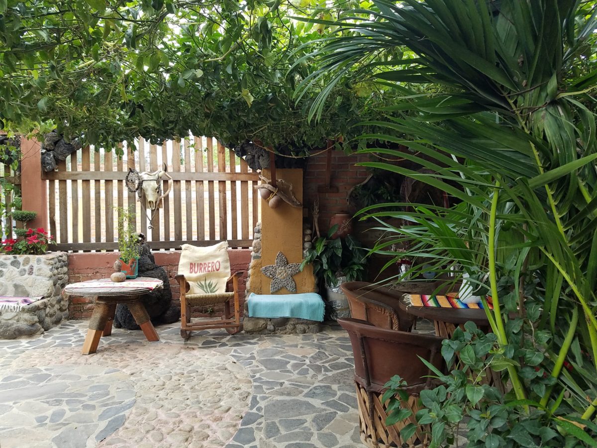
Very tidy and thoughtfully eclectic, this little destination bakery is a precious find.
Oh, were we in for a surprise! At the entry, I stopped to shoot the whimsical cup of coffee mosaic set in a field of stone and concrete. I thought – what a fun design element to greet arrivals and set the stage. But I had no idea to what extent I was about to be elated. What unfolded so exceeded my expectations that I wanted to stay all day!!!
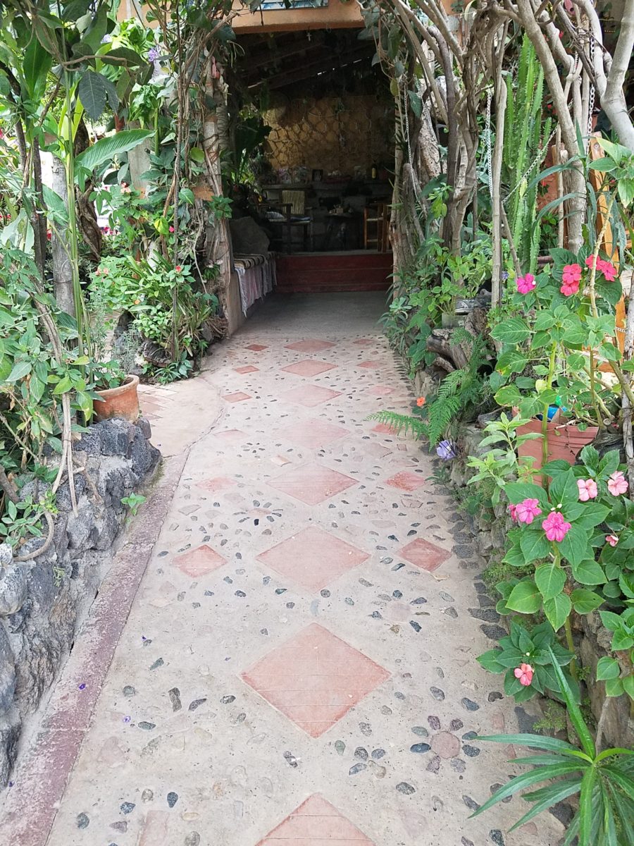
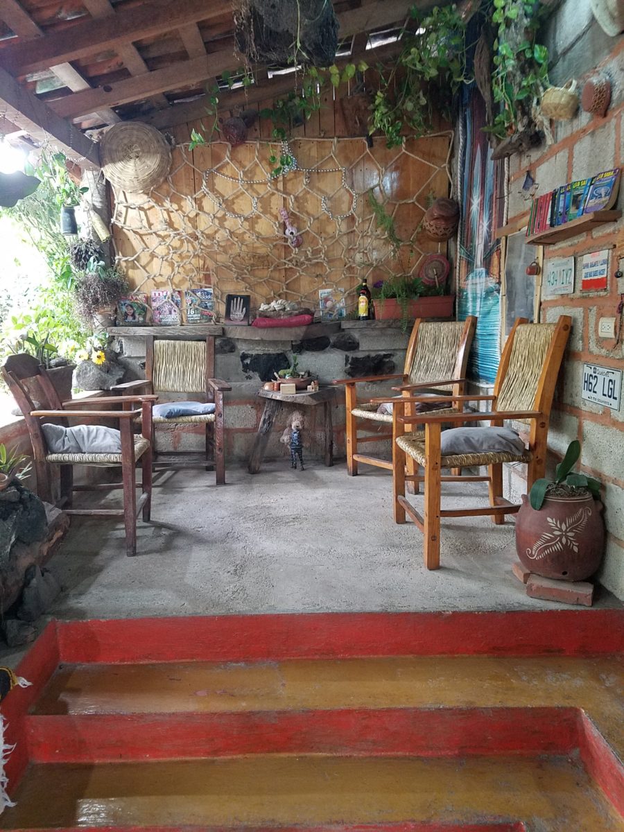
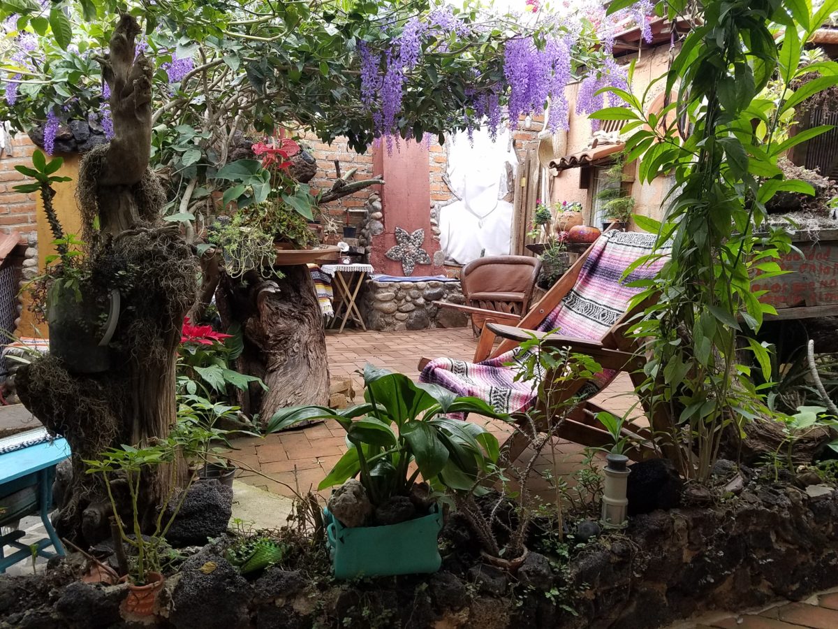
Happy stone and tile-work adorned the pathways. From the textures of stone and brick, tile and wood – it was an organic fantasy – an unexpected design experience.
Simple, yet spectacular – simply spectacular!!!!!
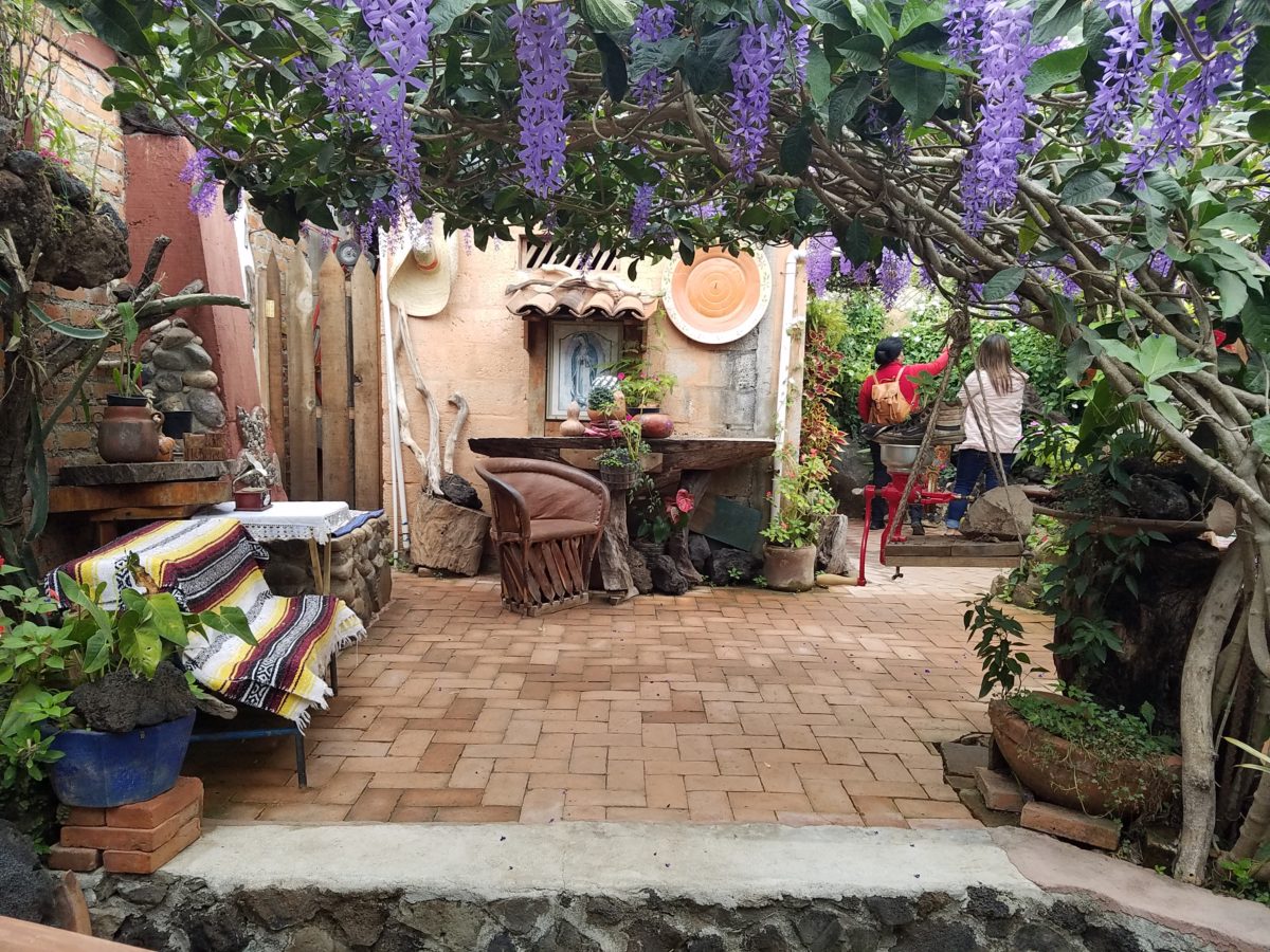
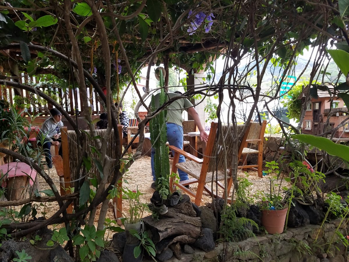
Ceilings of colorful floral blooms – perhaps wisteria – suspended from their vines and other plantings intertwined with the structure.
Spotless and meticulous the eclectic elements were a harmonious creation.Stone walls, wooden slats, vines and adobe all worked together to define the spaces.
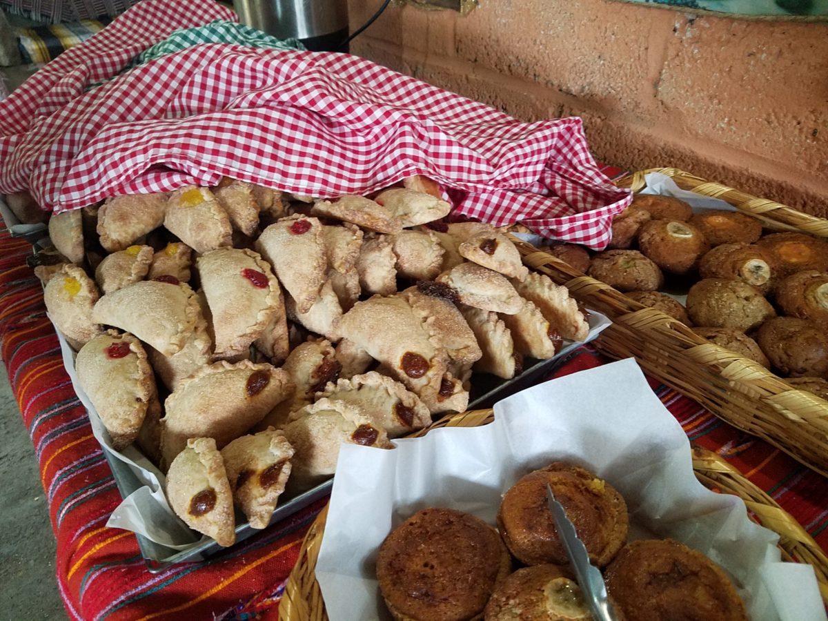
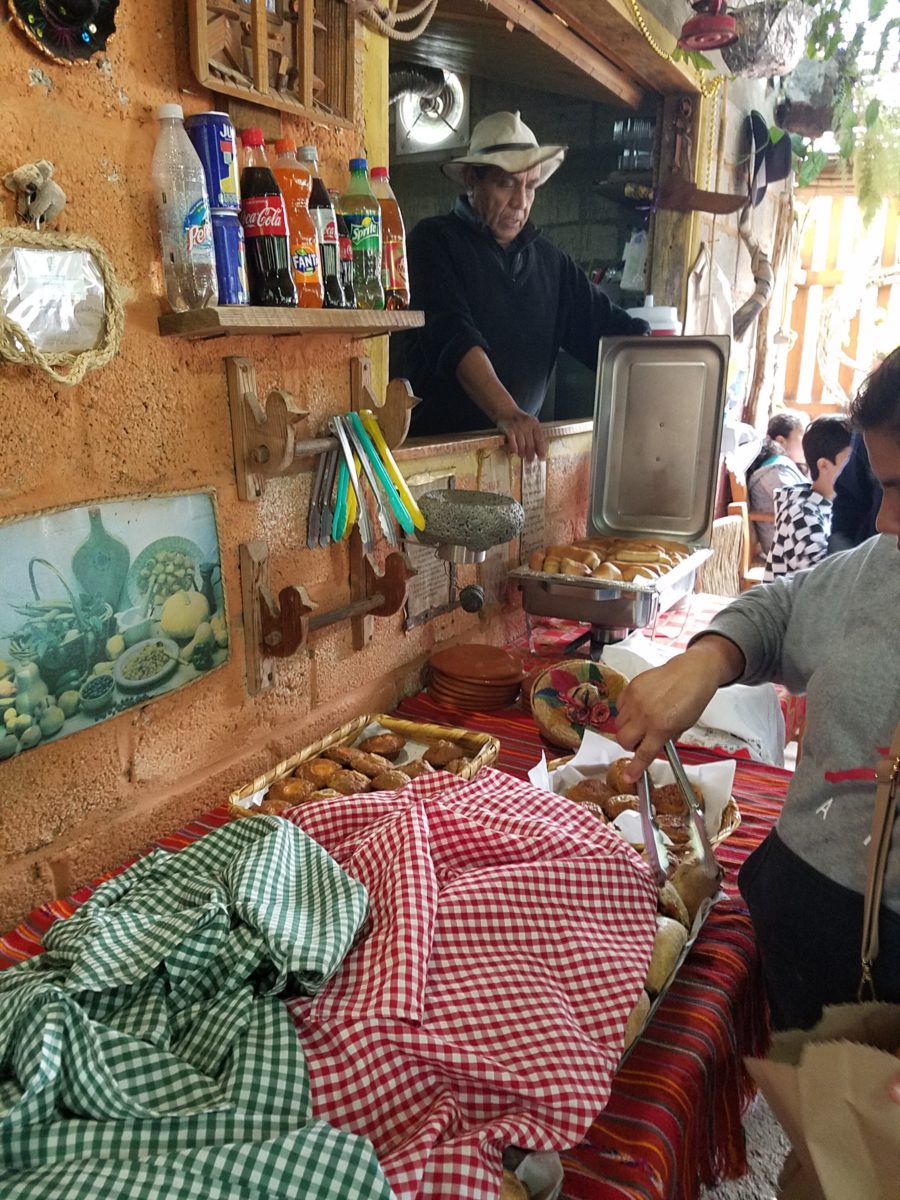
The wafting aroma of fresh baked goods – it was more than delightful. From warm savory clouds with mushroom filling and another with chile-laced sausages – and an array of sweet strawberry, cream and pineapple empanadas to corn muffins, banana muffins and more! All nestled beneath colorfully woven cotton tablecloths.
Light and delicious – the best empanadas ever!! With a tiny sprinkles of granulated sugar, for a sweet crunch, before sinking into the fabulous fillings! Muffins challenged any others and savory treats were so satisfyingly delectable. Little buttons of banana slices on top denoted which were the banana muffins!!
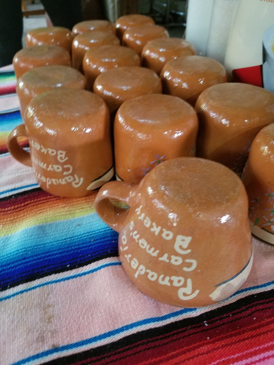
Rich Mexican coffee with a touch of freshly ground cinnamon and luscious hot chocolate were served in custom-glazed “barro ware” complimenting the fresh-from-the-oven confections.
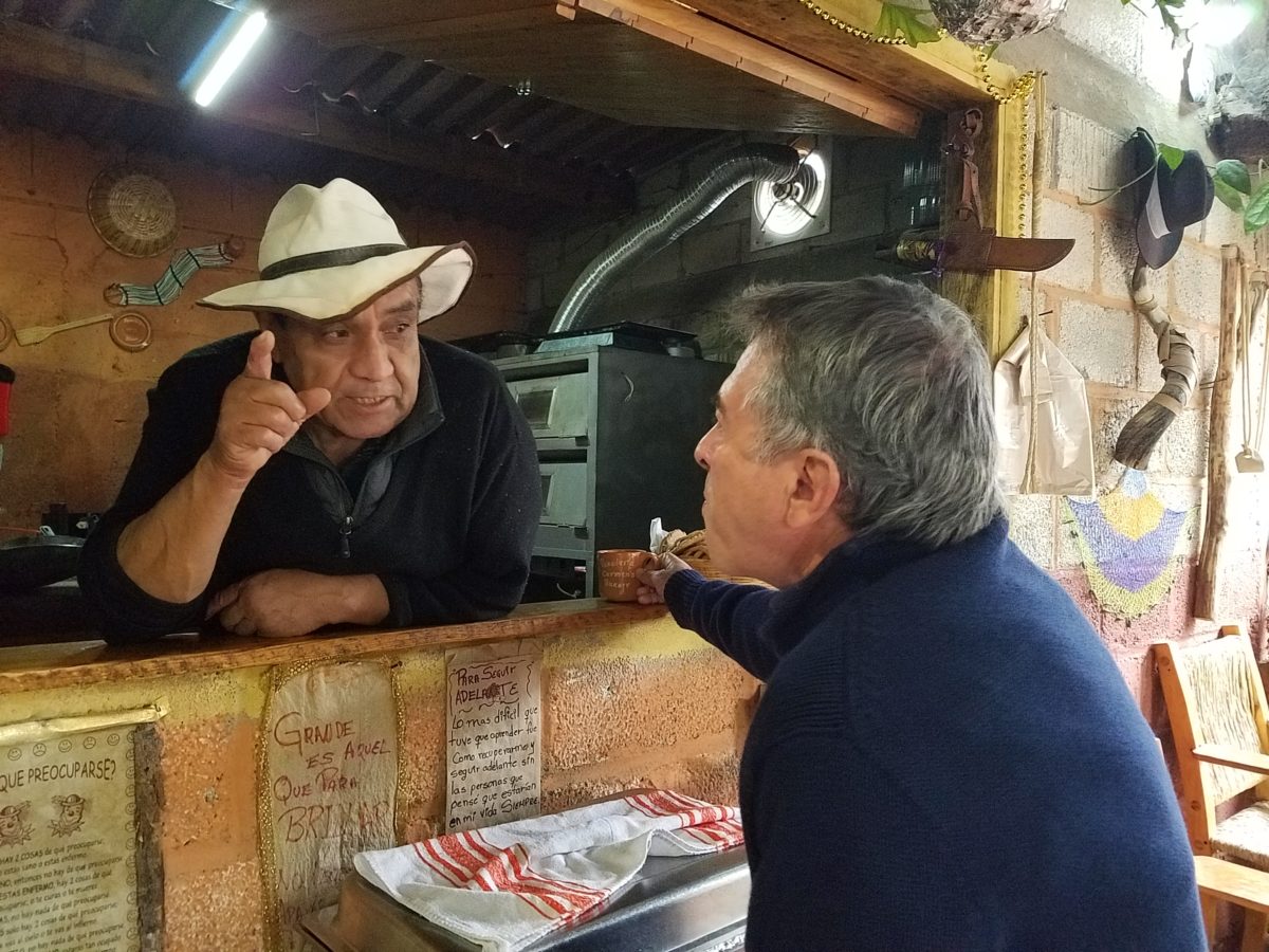
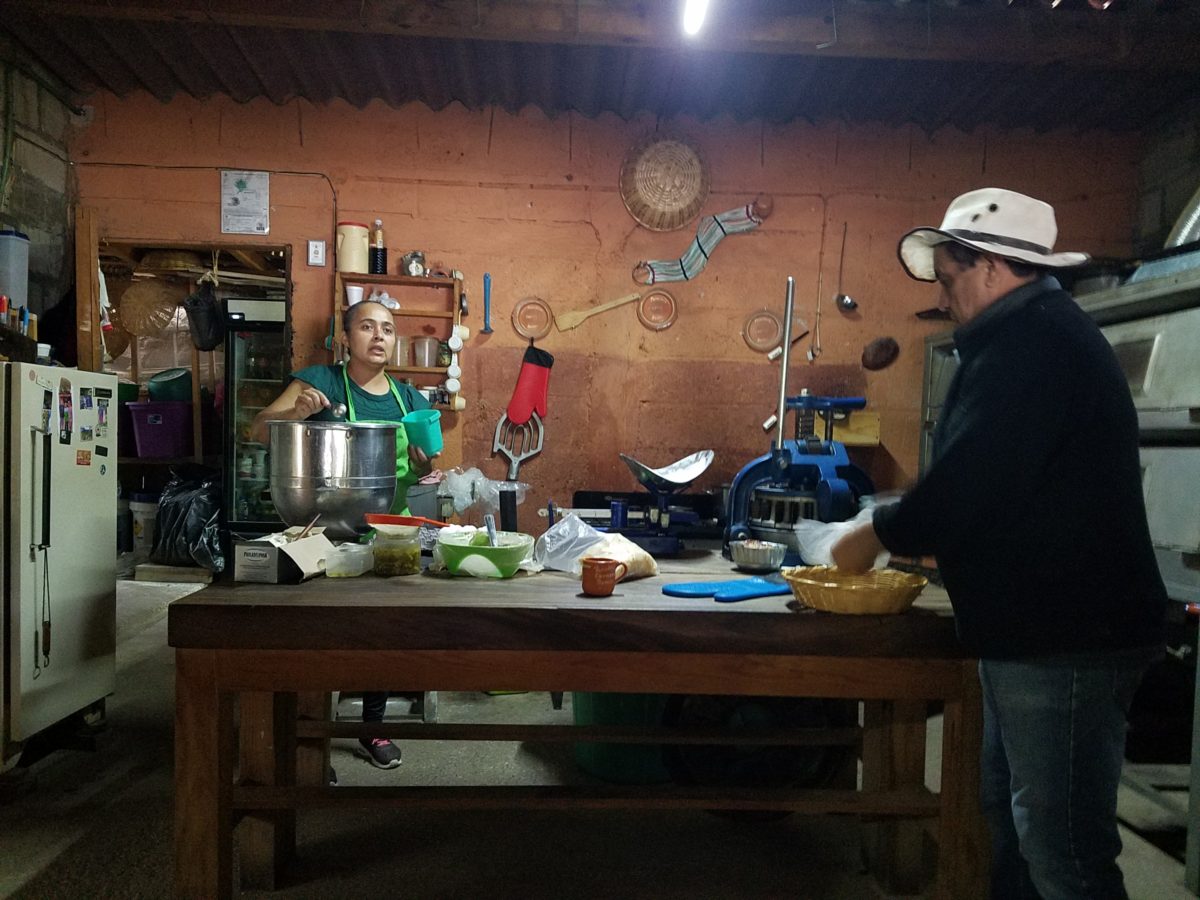
The exhibition baking kitchen overlooked the serving line. The buffet of pastries thoughtfully explained by our gracious and welcoming host, Jesus!
Carmen presents fresh strawberry tarts just from the oven!!! A combination of old and new – tradition and technology meet in this cozy kitchen.
Fragmented spaces open, yet enclosed, offered intimate pockets in which to pause and enjoy.
Color-pops insert themselves effectively around the interior and exterior spaces.Inviting seating areas semi-concealed offer private repose. Tucked away – more areas to enjoy…
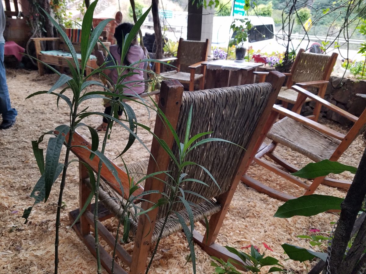
Clever use of clean blond wood shavings on the floor of the main covered patio created a wall-to-wall carpet of fresh aromatics complimenting the inviting aromas emitted from the ovens. Rocking chairs and rigid sturdy versions, with a fun little rope swing, all surrounded by tropical plantings made a cozy area to gather.
Soft underfoot and subtly fragrant – the wood chips make a great shag carpet!!!
As I meandered around exploring all the interesting spaces, textures, colors and plantings, I marveled at the sensitivity with which this had all been crafted and assembled. It was artful interior design with an exterior feel – open air and charming, with a decidedly handcrafted, Mexican sense of place.
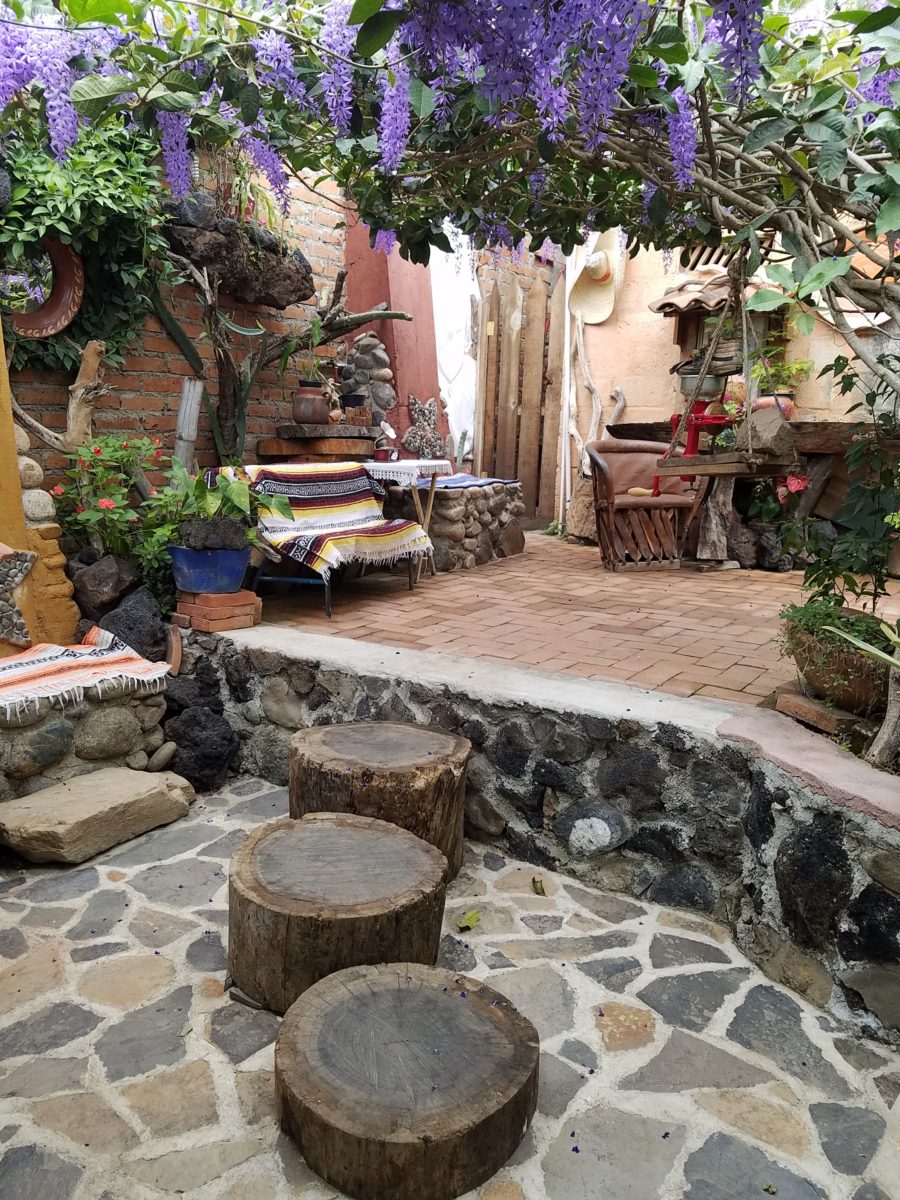
Slices of handsome tree trunks make perfect stepping “stones” with graduated heights.
It was an eclectic collage of furniture, structure and organics – living and static – that was welcoming and artful, delightful and so pleasing, that it was a treat for all the senses.
The cool morning air of the mountains mingled, with the comforting fragrances, creating an atmosphere inviting gentle conversations of people gathered around good food and artfully relaxed surroundings.
Peek in places and through doorways to find worlds of design
waiting to be discovered!!!
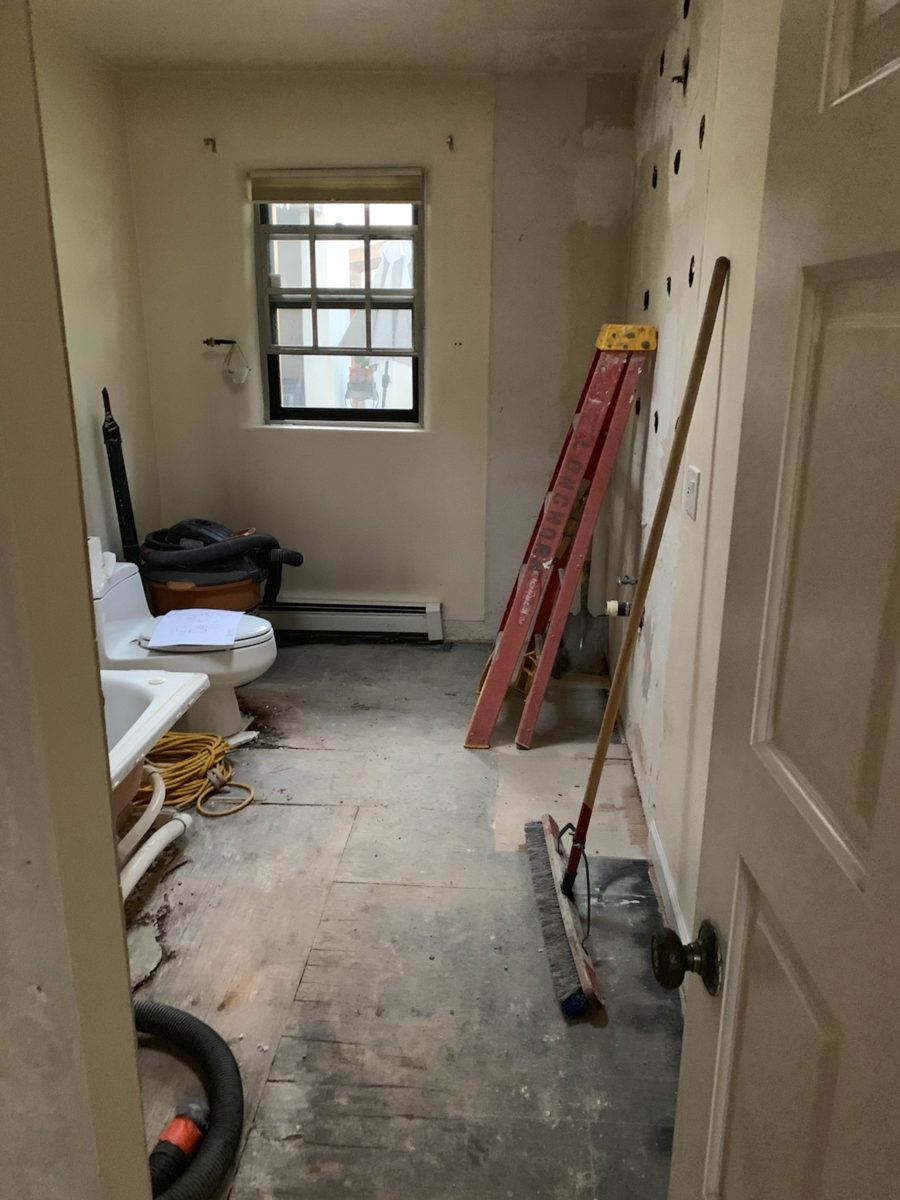
Everyone loves before and after shots – they are so telling, dramatic and fun to compare. How about during? This week, we are nearing completion of a project that has been in the works for the past few months. Not quite finished, here is a little story about the stages of the design process…
Are YOU planning a remodel…a room an entire house?
Once a project is identified, the options are studied. Usually each party involve has their preconceived notions…images and ideas come to mind. The mind is that arena from which it is tough to articulate images and especially between people. The design process requires that ideas need to be expressed, defined and argued – pros and cons.
This room was dated and fussy. The finishes were tired and needed refreshing. The project was described as a complete makeover to compliment other recent updates in the home.
The scope of work was to remove the tub, replace the cabinets, add a second sink and create an opening into the guest room. At that point, the “what ifs” began.
Healthy arguing ensues – meaning sharing ideas back and forth, explaining the approach and concepts. More like presenting than arguing. It’s actually a fun, creative process – full of choices, ideas and seemingly limitless opportunities. It’s the “What if…” stage. Sketches are used, arm-waving and samples, photos and words all contribute to the compilation of the ultimate design. Each person contributes to the process until a common plan is adopted.
Whether formal plans are needed depends upon the code requirements, if applicable (“cosmetic only” changes requiring no modifications to structure, electrical or HVAC – for example – might not need formal drawings). Therefore, the development of documents is dependent upon the requirements of the municipality and/or methods of the contractors. Regardless, sketches begin the process.
If code requirements necessitate permitting, the process
must proceed through that stage prior to commencing the work. So after weeks of
ideas being tossed about, a plan was conceived, client approved drawings were
made and the process moved forward.
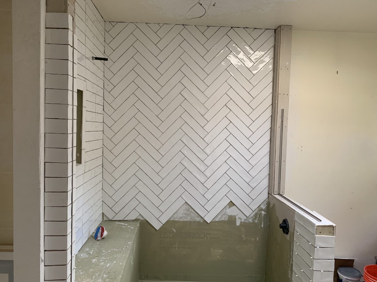
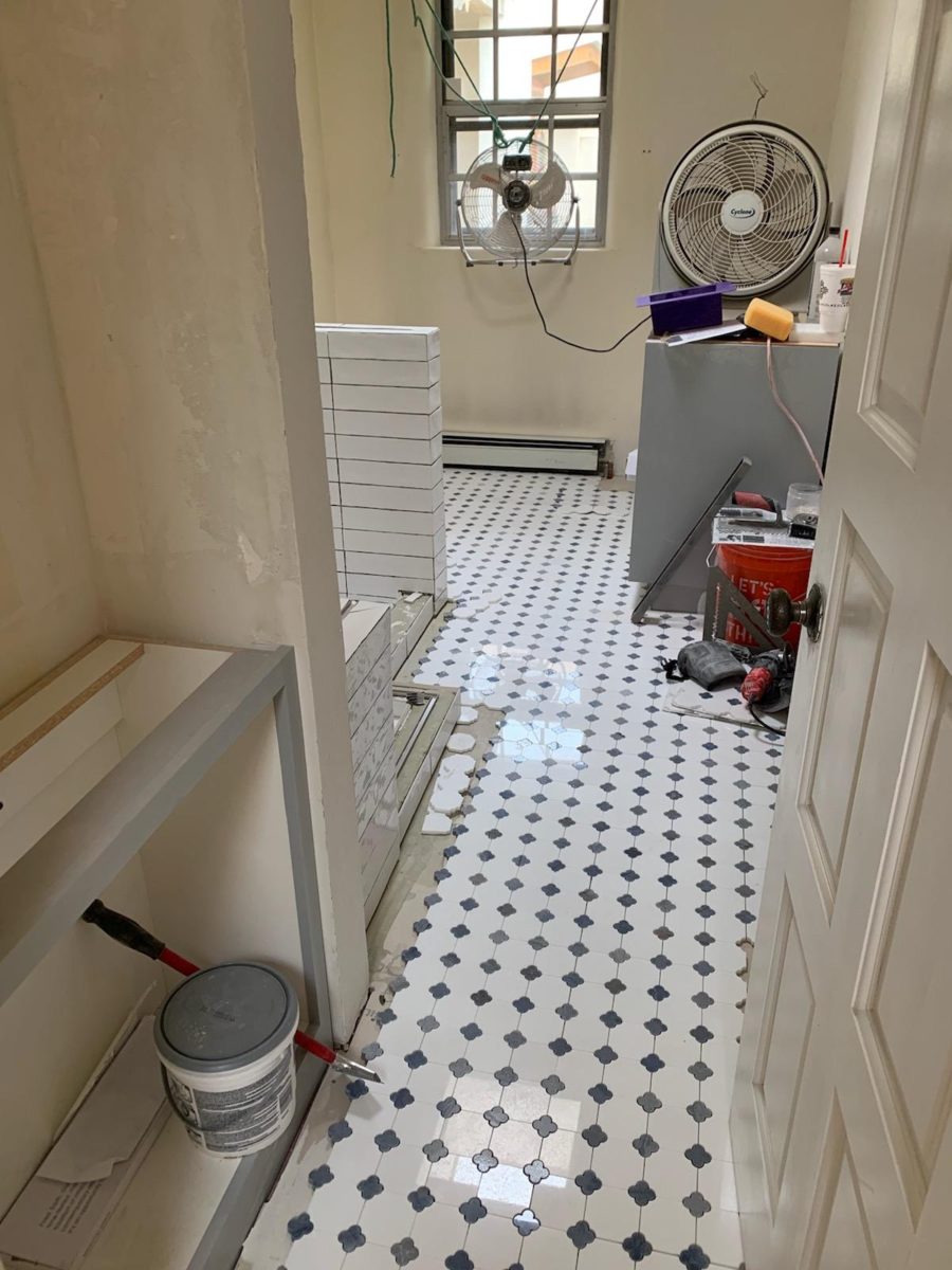
The scheme was set with the first materials selected – glossy glazed imperfect wall tiles for an interesting and textural herringbone pattern with a stone mosaic for the floor.
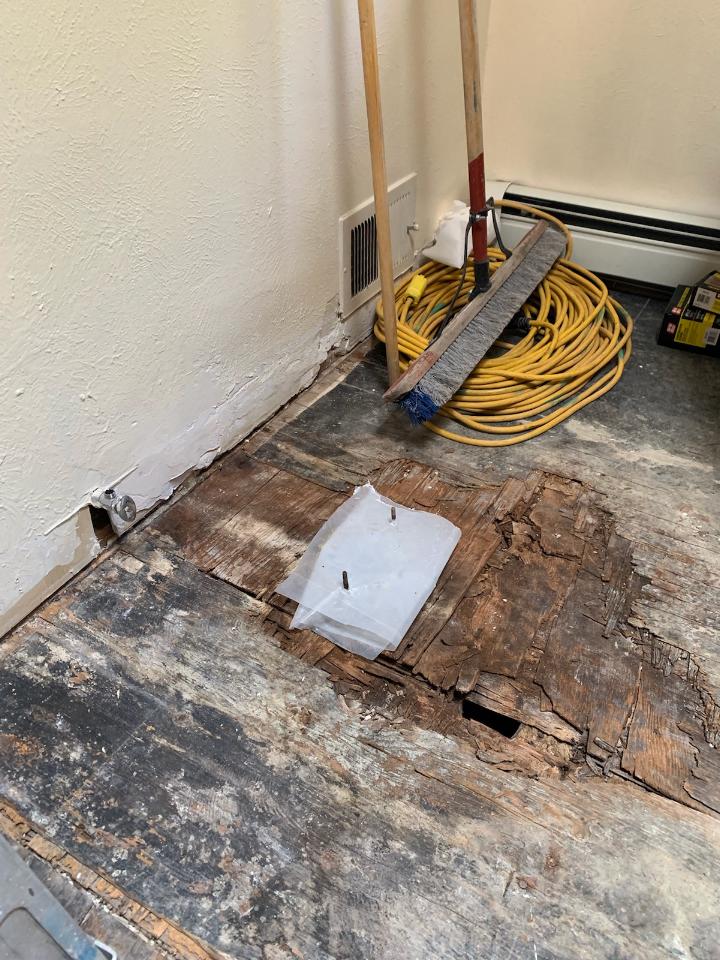
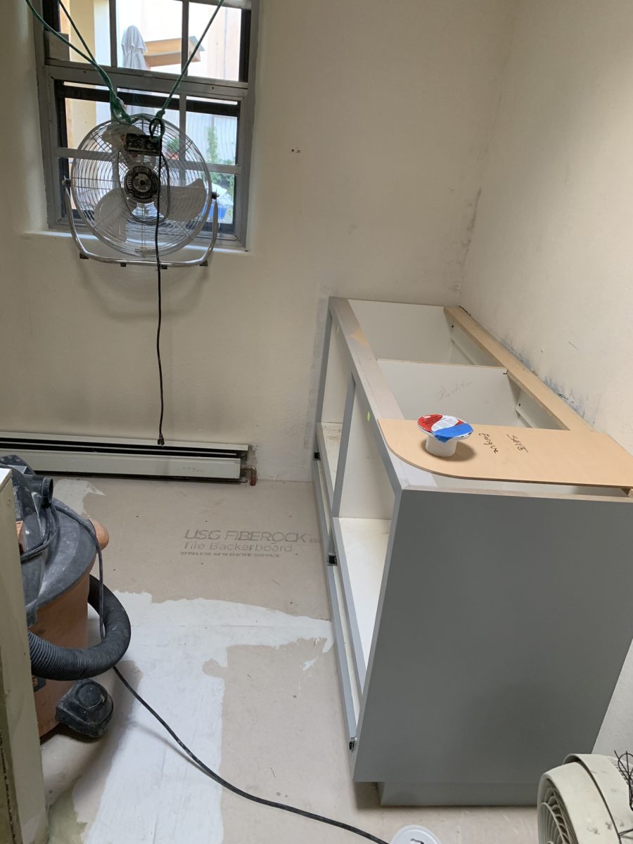
The demolition – always a shock – but “you have to break and egg to make an omelet!” Unbeknownst to anyone, the floor was rotted beneath the toilet and required repair. Mirror, glass block, tile and much sheet-rock was removed.
Old cabinets were removed and after all the dust had settled, the bare bones exposed and a clean slate presented, the new work began.
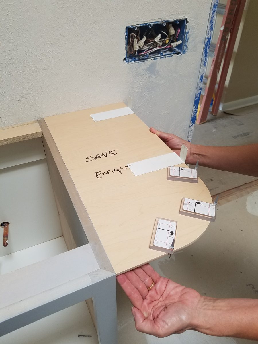
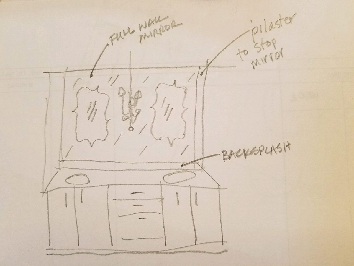
The new cabinets were to accommodate a second sink and slightly longer counter-top. To make sure access between the shower and counter-top was not too restricted, I designed a radius to ease the squeeze. Enrique made a template of the radius that would be represent his end shelving and counter-top. When Rocky Mountain Stone arrived to shoot their lasers to measure for their templates, the radius template Enrique had made was very helpful.
The end of this cabinet will have radius shelves with counter-top following the radius. Until then, Enrique made a template of the shape so that the counter-top could be measured in advance of end piece being completed and installed.The laser process to template the counter-top begins…with the help of the mock-up of the radius!
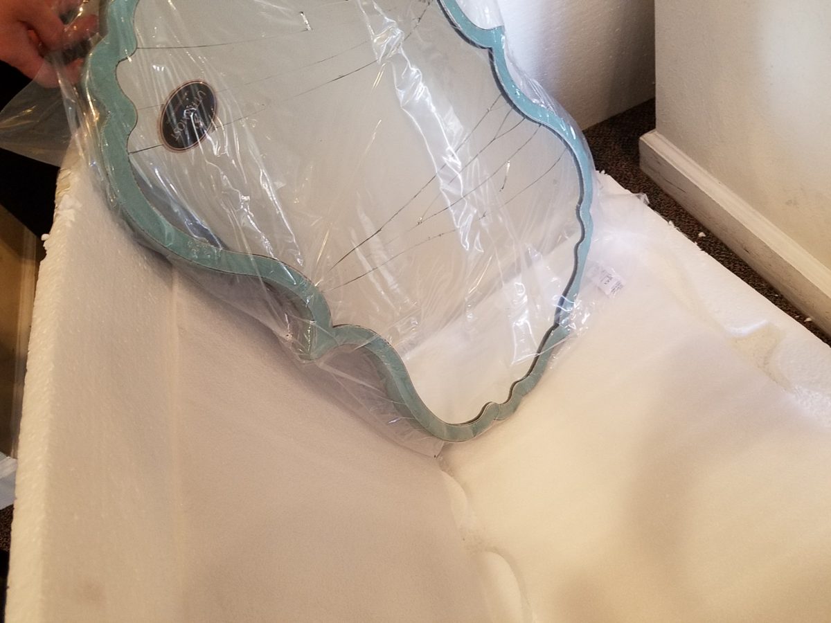
Decisions regarding lighting had not been finalized, with the completion of the plans. Having eliminated the desire to have recessed fixtures, whether to use a center sconce, two flanking sconces or a single pendant in the center between the sinks was still up in the air. Love the pun! Debating a full height panel of mirror versus two wall hung framed pieces, was also undecided.
But here’s an “oops” when we discovered the power for the light fixture off-center for a center-hung pendant.
Taking the risk to be disappointed, but with little investment
to do so, our client elected to buy the
two curvy framed mirrors that almost promised to be too small. Upon arrival one
of the two mirrors were broken. Bummer.
The inevitable, unexpected happens on every project…we had decided not too use these so rather than have the one of the pair replaced, we requested a refund. However, upon further study, we modified the design to accommodate both mirrors – we are re-ordering the second mirror.
But in an effort to determine if we wanted to have the
broken mirror replaced or refunded. We held it up on the wall, as we feared, it
was confirmed that they could not carry the space. We asked that the company
not replace the broken mirror, but refund the cost.
We really loved the
whimsical quality of the curvy framed mirrors and their distressed turquoise finish
was a great addition to the otherwise blue and white scheme. So, a week later,
after pondering the dilemma of the mirrors…I offered what seemed to be a radical
suggestion (but not really), and that was to install a full-panel wall mirror –
backsplash to ceiling – and then mount (over it) the two mirrors. To do so, our
very able and talented glass master, Robert, would have to cut (prior to installing) holes
in the mirror panel located behind where the framed mirrors were prepared for hanging. The result would be the
pair of mirrors hanging on top of the full panel creating a floating, multi
dimensional effect. Watch for “afters” in a couple weeks, of this
completed installation.
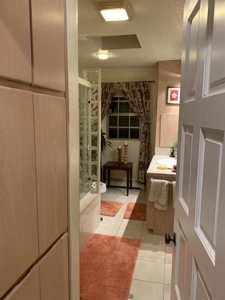
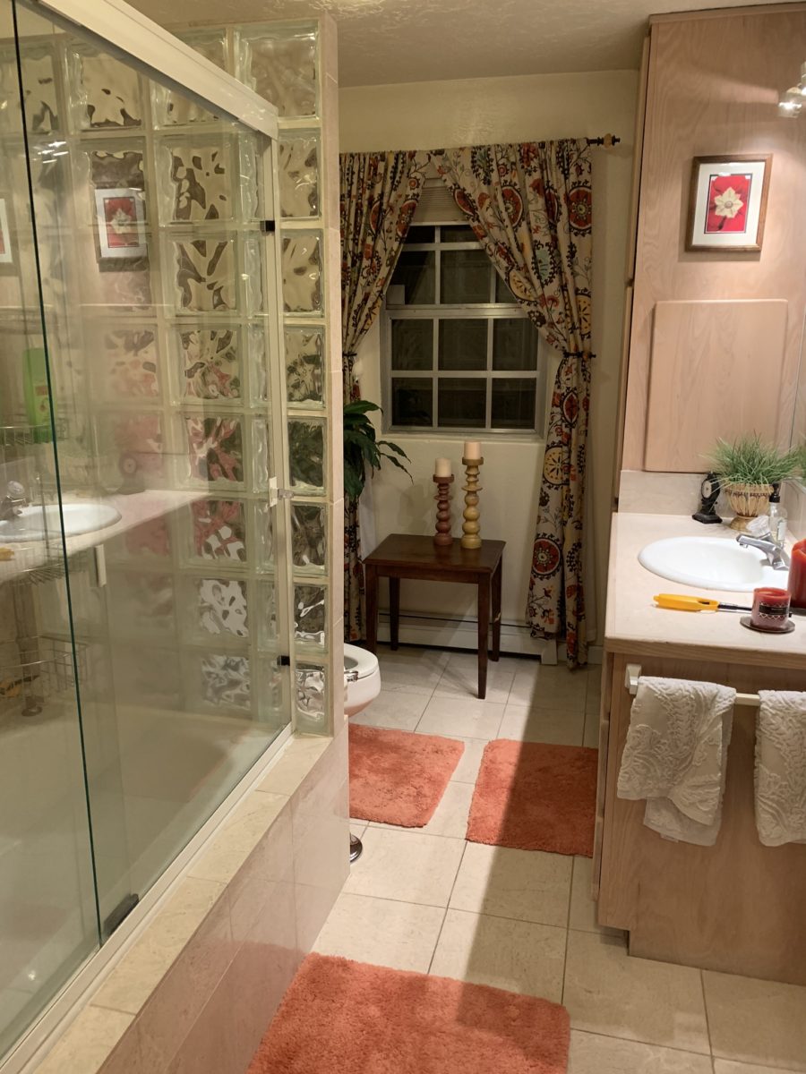
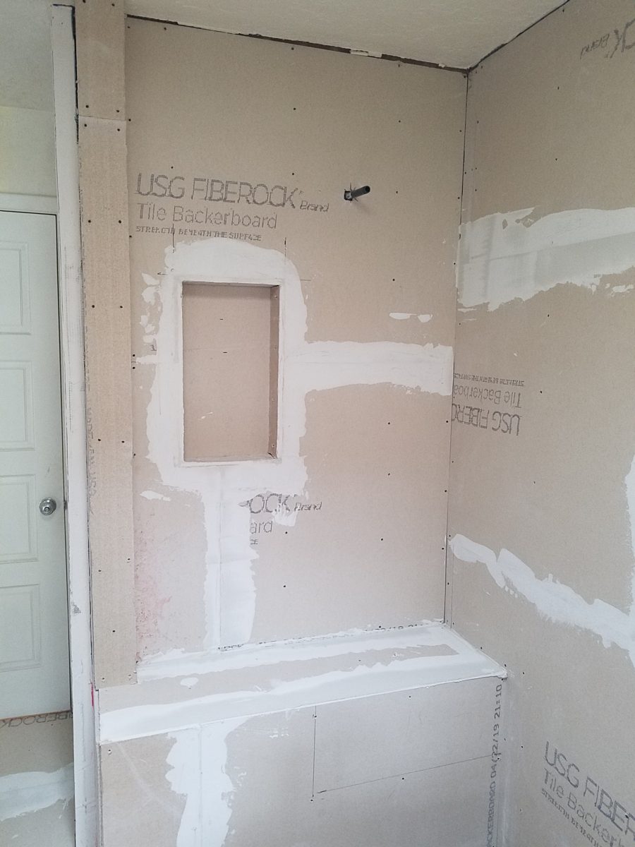
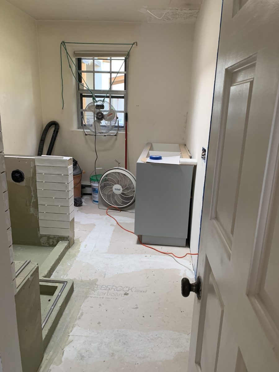
As the project proceeds, the flooring is nearly completed and all but the finishing touches remain.
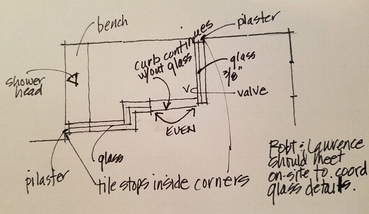
Pilasters were added at each end to stop the tile on an inside corner, rather than having it quit flush on the wall. The shower will not have a door, but nearly encapsulated with frame-less clear glass to give an illusion of a more spacious room.
Best to stop here and reserve the finale for the finished “after” shots as promised.
Time to remodel the kitchen!! This charming little bungalow had already experienced its share of remodeling – well, not so much structural – although, many interior design transformations had occurred over the decades. In the mix, the well-used and enjoyed kitchen was feeling a quite tired and dated.
You might remember I have used this now completed project, in the last few months, during its transformation process to identify certain features and design practices. Here is the as-promised unveiling of the before and after photos for further discussion about the design process, intent and results.
We loved the mottled color and organic character of the existing slate floors and opposing green-grey beams with spanning boards of a caramel stain. These were the two elements that went well together as though intentionally planned. Yet in between, the pale, peachy pickled oak cabinets with their radius detailing and red-rose/black matrix of the tiled granite counter-tops, didn’t seem to speak at all well with the ceiling treatment and slate floor’s greens, rusts and charcoal tones. It was a dark, confused space.
When observing and “listening to” the house, it was evident that the current kitchen, in addition to being poorly coordinated, had absolutely nothing to do with the original architectural intent. The new owners had brought a few very fine antique pieces into the home. The mid-century circa 1964 age of the house accepted them on its original hardwood floors also adorned with their fine antique rugs…but something was missing. There was no cohesive thread running through the house. Over the years finishes and decorative elements had been selected and installed without any consideration for original materials or an attempt to introduce compatible and harmonious materials for the good of the home’s overall theme.
In all fairness, had the entire interior been gutted and a
contemporary interior been uniformly installed into the framework/shell of the structure,
I might have considered it a success. However, this multiple decade decor was a
mix of disparate trends and preferences that had no commonality.
To begin the process of bringing this home into a cohesive
design last year, we had redesigned the living room. There we introduced a classic
blue and white color scheme derived from the Persian rug in the adjacent dining
room.
To the corner kiva fireplace, we added a sandstone hearth and
mantle with just enough blue and white Talavera tile trim at the base of the
hearth to subtly coordinate with the new scheme. The Talavera was an
appropriate material for this New Mexican bungalow.
The original fireplace had a dark, broken brick quarry tile hearth and no cap on the mantle.The face-lift replaced the hearth material with broken-edged sandstone slab and matching mantle cap with Talavera detailing at the bottom.
With this living room having been so successfully re-designed, the obvious thought came into the discussion to continue the vernacular of the blue and white Talavera into the kitchen. As a bit of a purist when it comes to application and termination of materials, I was not content for a mere back-splash. No, if the tile were to be effective and commandeer the stage, it had to be used wall-to-wall as though an entire wall treatment.
Treating the Talavera tile as wall-covering, it continues from the kitchen, into the adjacent pocket-space housing a desk and laundry machines.
But wait! The addition of an earthy aqua handmade tile from
Spain offered an appealing and unexpected accent woven intermittently through
the Talavera. It created a coordinating thread from the colors found in the mottled
slate floors and ceiling beams.
Pre-grout shot shows the individually cut 1″ pieces inserted as mosaics into the random field of Talavera
The cabinets were in excellent condition, but the doors were
sadly dated and in no way spoke to the home’s other cabinets, doors and finish
carpentry.
The confused interior finishes we in need of a transformation!
With the white raised panel theme throughout the home’s original appointments, we elected to salvage the cabinet boxes and replace the doors and drawer fronts with a similar raised panel detail. The same red oak was used and, with a glossy white paint applied, the grain “read-through” with a very intentional yet subtle moiré-like pattern. The new raised panel white doors and drawers, with crowning top molding provided a crisp, timeless motif. The random patterned Talavera used as an entire wall-covering was very effective. The kitchen was quite gussied-up!!
The transformation was dramatically successful!
The existing slate floor was beautifully organic and I felt, from a design standpoint, was a must to salvage. Making it look like an intentional selection – part of the new scheme – was imperative. Therefore, selecting a counter-top that communed with the tones in the floor resulted in a selection of concrete-like engineered Italian quartz material – balancing the floor with the next horizontal plane and ultimately with the stained and green-grey boards of the existing ceiling treatment.
The new concrete-like Italian quartz counter-tops coordinate well with the other materials.
Another asset was the connection to the outdoors, however the existing window over the sink was high and small.
The window over the sink was high and small…
By bucking the warranty of the Pella people, we had a new double-hung window made to close down onto the new counter-top that passed through from inside to out. They would not fabricate the window to do what we intended, so we had the contractor remove the bottom of the new window frame, thus rendering the warranty null and void, in order to have a completely open, uninterrupted pass-through when raised.
Amusing and interesting…existing family pieces of blue and white ceramics are being discovered and used as decorative accessories in the new kitchen!
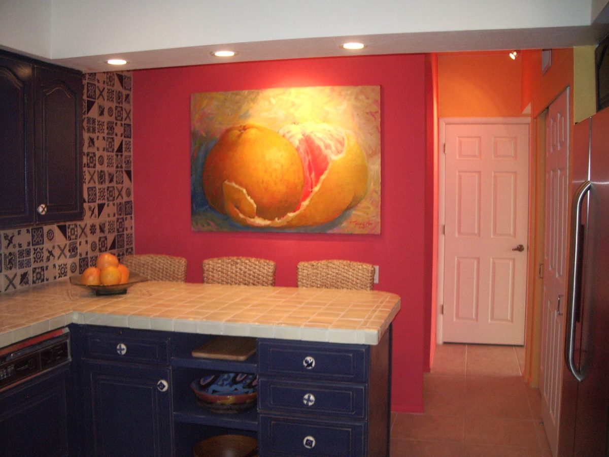
We also captured the opportunity to open the opposing wall into the hallway adding pass-through light and dimension to the space. This exponentially expanded the space and made the encapsulated kitchen feel much less confined.
Before, the kitchen felt small and dark…Opening the wall into the hallway brought in additional light and dimension.
To add drama to the newly created dimension, we discussed having a painting commissioned to pop an accent of yellow into the blue and white scheme on the far hallway wall. Lemons, a perfect citrus for the kitchen, was decided for the theme.
A miniature oil painting by Federico Leon de la Vega was used to Photoshop into the scene to inspire and convey the design intent.
The additional POP of yellow is a dramatically effective contribution to the overall composition. After consideration, the owners selected a local artist to paint the full-scale painting.
A local Albuquerque artist, Thomas Tomlinson rendered the lemons in acrylic with blue and white tile details.
In summary…keeping the original slate floor, existing cabinet boxes (replacing door and drawer-fronts only), with a bling of new chrome cabinet pulls, switching out the stained glass pendants, replacing the island’s surface with a handsome solid walnut top and a new coordinating concrete-like counter-tops on the periphery, with the decorative embellishment of the Talavera tile continued from the subtle introduction at the living room’s kiva fireplace, the transformation of the kitchen is stunning – not trendy – and was truly, uniquely designed for the architecture and forward, on-going contextual design conversation of the home.
Uniquely designed…
Look around and listen to the environment for and in which
you are designing. What makes the best sense for the design direction
considering the function and context of your project?
With all the New Year buzz about the new color forecasts…I started taking notice of the seeming non-color, white. It is often considered the absence of color when in fact it is a very complex color of many shades and values. Just try to select a white and you will know what I mean.
When you look at white paint samples, you will notice the nuances. There are pink whites and blue white, grey whites and yellow whites. Each white is off-set and contrasting to another. You see the differences by comparison and by context. You think you have just the right white until you place it against another sample and see that it is grey or cream and then second guess yourself again…and again…How do you know which white is right?
Dunn Edwards groups their whites and pastels in a separate section of their fan deck as do other paint companies. What is interesting here is that the background is a sheet of white copy paper. Notice how is reads against the colors in the samples…it seems to be a purple blue color. This shot was taken under a full-spectrum LED lamp. The colors should be true. The range of “white” is amazing.
To intentionally design with white is bold. To have the confidence, to decide that white IS the color and that white IS the scheme, is challenging. To effectively design with white, you not only have to select the right white(s), but you have to know just how much of anything else might be effective yet not detract.
Le Leche in Puerto Vallarta is a fabulous example of designing exclusively with white. Only with minimal punctuation with black lettering on the wall of containers and also by allowing shadows is the white interrupted. But the blacks’ minor interruptions gives depth and fine detail.
White design can be cold or warm. Depending upon the desired effect, mood or function of the space, the whites need to be carefully selected. This is true with lighting as well. Warm whites or cool whites…what gives you the desired result?
Popular white string lights add festivity and a warm glow to an evening scene.See how many lighting colors you can identify in this scene…Starting on the left, a cool pocket glows through the underbrush. The walkway has a warm pink-ish light. The very cool blues of the pool area give a dramatic read. A bold yellow accent peeks from the far left and also over on the right. The palm trees are wrapped in a warm white tube lights while the far right side illuminates the entry to the dining palapa with a cool white light source. The foam of the surf on the beach is captured with a cool white spotlight that maintains its naturally expected white color.
Knowing when to add color to a white scene to achieve an intentional POP is an art. The color itself, the amount and placement is all part of the success of a good design result. From the fine black detailing in the previous shot of La Leche to this still-life composition of a tropical cocktail that I propped the other day, the minimal punctuation of color is key.
White mosaic shards of tile in the background of this composition featuring a peeled coconut and the POP of a pretty pink party umbrella result in a white-on white scene. Yes, this shot says PARTY with a perky smile!
The bench which served as the backdrop for the coconut cocktail is a dramatic serpentine sculpture of site furniture that plays with the white-on-white of the tile and grout.
Contrasting against the organic wood decking, this white monolithic bench snakes around the periphery of this outdoor lounge area. The sunset is casting a soft pink wash over the all white glazed tile.
Beach settings using white materials compliment the white sand and greenery of the tropical plants. From wood frame platform cabanas to the sprinkling of umbrellas, white is a wonderful, fresh color for a crisp clean scene.
Whites on whites…creamy sand colors to crisp white terrycloth, the white-on-white scheme is soft, inviting and clean.Greenery compliments the white umbrellas and sunning beds on the lawn by the beach.Palm trunks and other fruit trees are often painted white to protect against insects and what insects insist on climbing the surface are easily spotted by birds who appreciate the help to capture a snack! In this case, they contribute to the white design theme.
The soft creamy off-white folds of fabric offer a soft, inviting scene.
Shadows in the creases and depths of the folds add the dimension to the luxurious feel of the cotton damask fabric.White stucco is dappled by shadows and greenery while given a warm, strong base by the brick pavers. White as an architectural finish is only successful if the context compliments it. This is true in all design.
Architectural color and texture of surfaces is a moving target. A recent discussion about a white building with black detailing would not have proved right for this particular use of white. The hard, commercial read would have been too severe for the intended effect. Yet that same project, with a warm white and an ochre accent, will be just the right combination to achieve the desired result. Watch for this project to be featured in a few months.
Architectural surfaces incorporating tones and textures of white provide interesting opportunities
Block and crumbled edge accent bands on the facade of an exterior wall.
White in design is an exciting selection. Knowing how, when and why to use it is a test of your creativity. Picking the right white is the challenge.
The limitless colors of white found in a pile of gravel…..
So the next time you think white, think a lot about it. Study the context and what you are trying to accomplish. Feel freed by the fact that white is a color to express and enjoy.
Color. Fashion and trends. Pantone’s annual pick and announcement – this year, based upon observation of the field of design scenes namely Airbnb and Apple, really? I find that amusing. Described by Pantone as “an animated life-affirming shade of orange, with golden undertones.” If orange had golden undertones, it would be more yellow-orange – a golden orange – NOT the pinky-orange suggested by their swatch of Living Coral and myriad examples that are being set forth. However, a few months ago I noticed and saved (because I liked the colors), a Smith’s Food Store envelope featuring peaches that illustrated the cozy combination of the rosy-orange coral tones with the golden yellows – a perfect pairing.
This pinky coral – a hot, but smooth, orange-ish color – has been one of my favorites for years! In 2004 I referenced it as “lipstick” that wonderful color between red, orange and pink! A hard-to-find lipstick shade sought by many!!! It melds fabulously with citrus colors and is cooled and contrasted by blues. A wall of colors depicts this perfectly.
We painted the wall, took a photo of it and emailed it to Federico Leon de la Vega in Mexico to commission him to do this grapefruit painting with its luscious, pink center and coral shades, wrapped in a yellow peel and surrounded by cool, bold, brushstrokes of whites and brilliant blues.
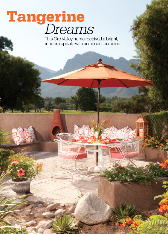
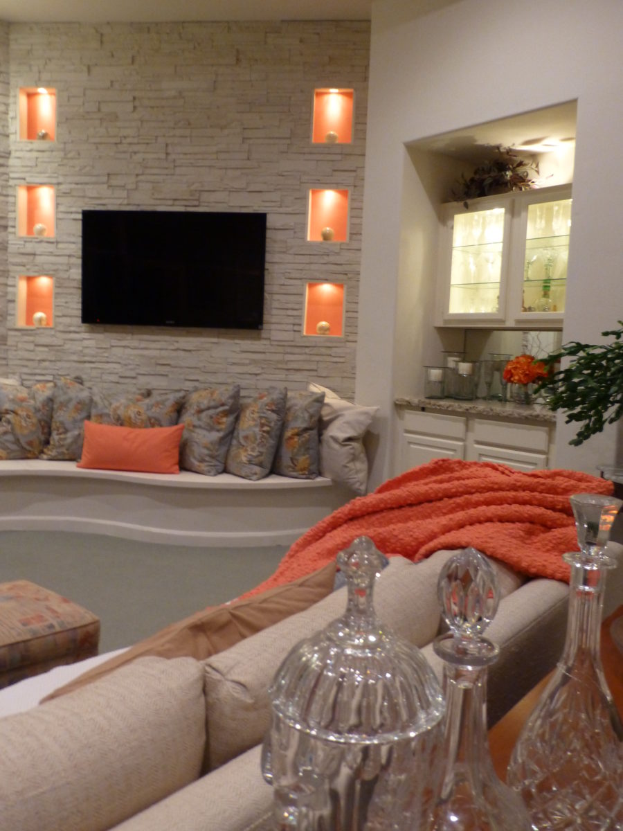
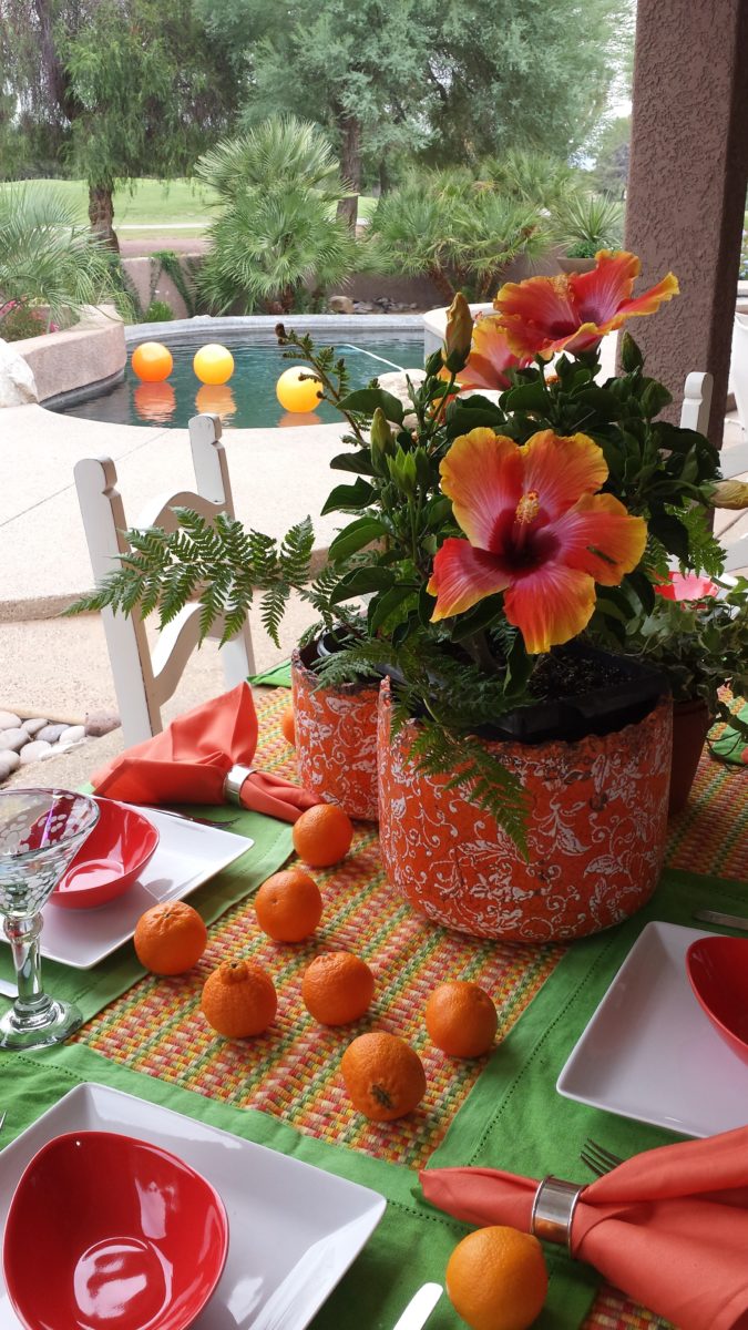
A few years later we devoted an entire project to the fresh, citrus, color tangerine – which because of my personal preference leaned toward the coral shade of orange rather than the pure, natural tangerine. But art is about taking liberties and when developing an orange accented color scheme, all versions are allowed. Right?
This project was punctuated with orange tones from tangerine (for which it was named), and deep warm coral-pink shades. The hue and its many vibrant values!
However, to photo these nuances of color is tough. I walked around the Tangerine project a couple of days ago. It has stood the test of time by beating trends by a few years and not adopting any particular design elements that would have given it away today.
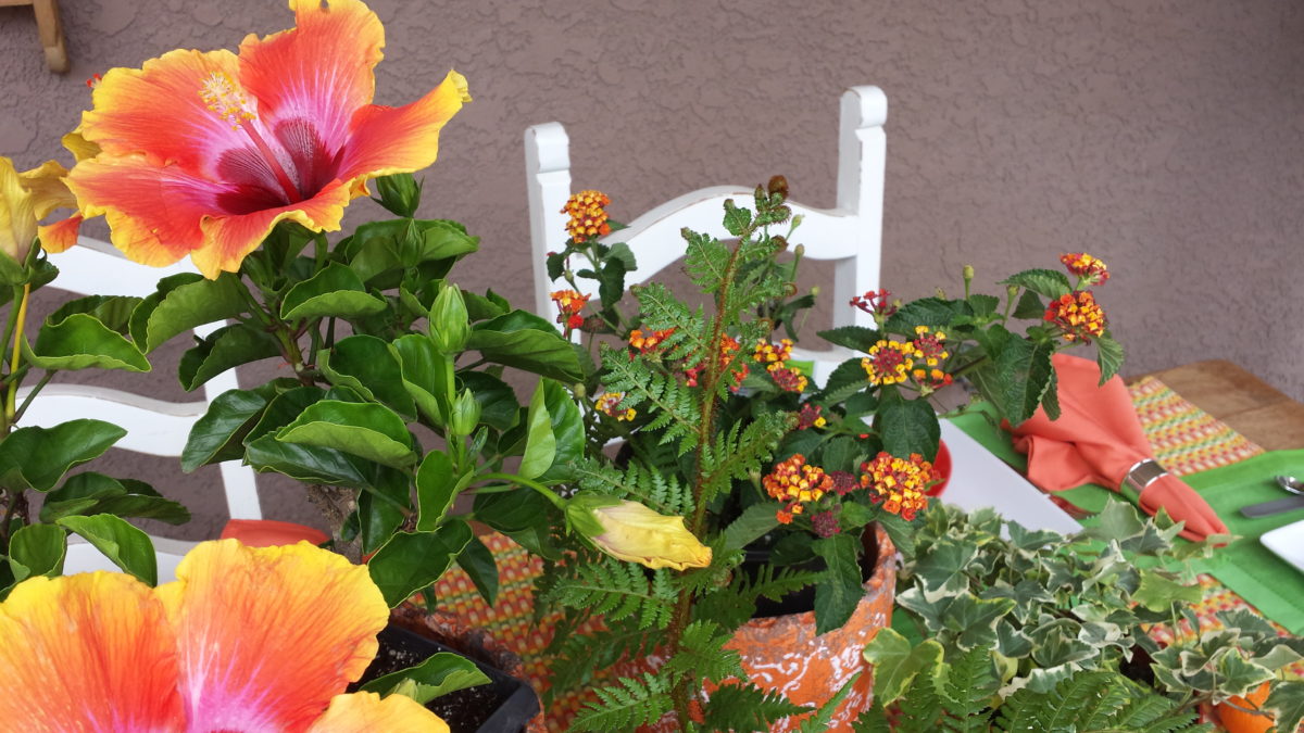
Look at how much nature played a part in the staging of these coral infused scenes!
My advice is to pick the colors that you like – the colors that make you feel
good. Once determined, develop design based upon when to use that/those colors
and when to contrast them or perhaps neutralize them.
Coral is bold and warm. It can read hot and energized –
although is softer than red and less harsh than orange.
Nature is abundant with coral – not just the living sea
coral – but flowers and the rare fabulous accent fur of Vietnamese monkey the
red-shanked douc!
Vietnam’s red-shanked douc- brilliant coral accents in his coat!
The thought of warm saltwater and fresh sea air at this time
of year is tantalizing. Living coral
doesn’t just say – coral, (of which there are many colors) it evokes that shade that we snap to when
mentioned. Hot, soft pinky coral – a color of seduction. It is featured in
jewelry and art renderings, architecture and interiors.
My advice is to pick the colors that you like – the colors that make you feel good. Once determined, develop design based upon when, where and how to use that/those colors and when to contrast them or perhaps neutralize them.
A little whimsy to celebrate this bold exciting color of the year!!!
Have fun with color – any color- all colors! Welcome Pantone’s Living Coral, into the conversation and design elements, for this New Year!!!
We are excited to have the opportunity to bring a design installation(s) into a new project that will serve to support the brand with a twist. A nearly completed new smokehouse is coming to Albuquerque. This home-grown eatery blends family history and southern roots with southwestern barbecue flavors including indigenous wood and iconic chile blends. But this is not about their cooking profile. It is about how we have arrived at a design theme that will define and further the identity in this new, specialized smokehouse department of this larger local brand.
To accomplish this task, we examined the concept the owner had to remodel an existing facility that had been a popular gathering post serving this community for decades. The fringe barrio location was of a demographic primarily comprised of Mexican/Americans. Decades past it was home to a heavily black community. The fabric of these cultural combinations suggested a mosaic of color and vibrant heritages.
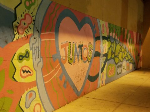
The spark of cultural references lead to discussion of the popular artistic expression of urban mural painting.
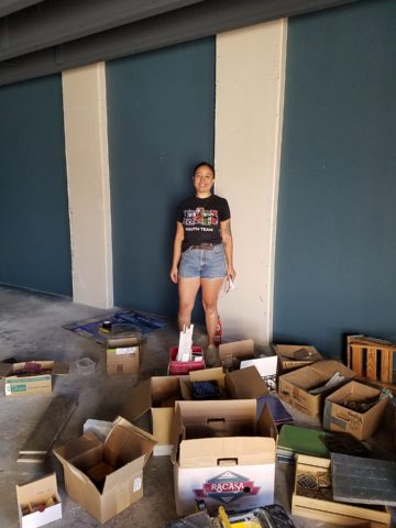
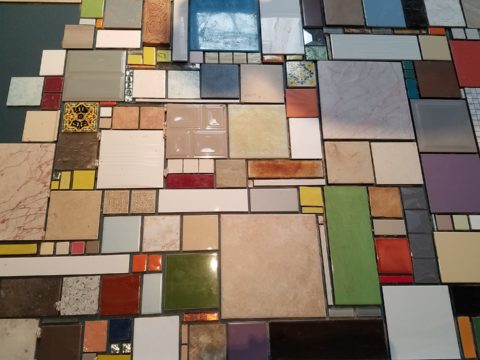
When we began the dialogue, the decision to have a mural painted by local neighborhood kids, with a mentor to design and supervise the work, seemed to be the direction we were headed. After subject matter debate and development, I veered off on another tangent that might take a less subjective approach, be weather-proof and more durable for a patio location – mosaic.
This new more impervious and durable medium still offered the opportunity to engage the community, but with less focus on a specific subject and more about geometric color and texture. We discussed the details of installation so as to keep it simple for kids to participate using whole tiles – minimize cutting, if any, for starters.
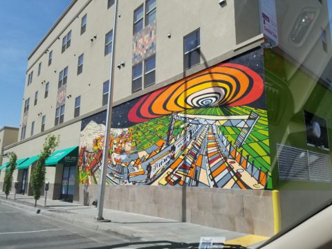
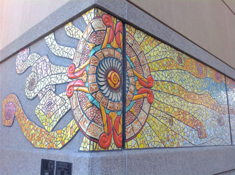
Inspiration came from several other installations such as the Albuquerque Convention Center’s on-going mosaic mural project wrapping many sections of the buildings with intricate scenes of New Mexican lifestyle and cultural diversity. The colorful mosaic is an elegant and sophisticated contribution to our city’s cultural aesthetic.
Helen Atkins, manager of consignment art at PATRICIAN DESIGN’s downtown boutique gallery and the lead on their current restaurant mural project, has worked on several phases of the Convention Center’s mural project.
We have incorporated mosaic into several of our own design projects such as last week’s blog https://patriciandesign.com/trust-and-custom-designs/about a residential kitchen installation.
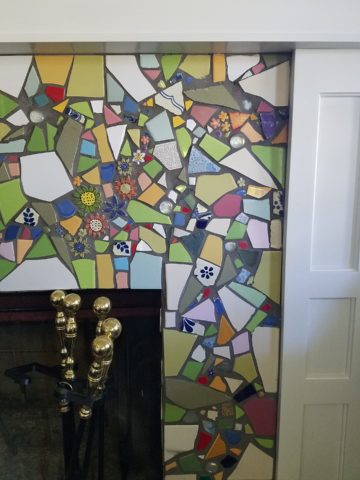
Here, in another installation, a fireplace surround of mosaic adds movement, color and textural interest to the room.
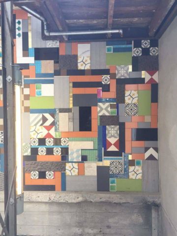
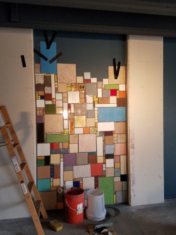
Ultimately, one of Helen Atkin’s personal photographs cemented the approach. It was decided that a geometry of different sizes and disparate glazes and designs of tiles pieced together in a colorful, textural panel would be our design theme.
Helen Atkins, a recognized artist in many media, captured this in passing while visiting New Zealand. It’s crisp, yet irregular composition was intriguing and pleasing. It became the springboard for the concept for a geometric mosaic panel to anchor the theme of this new New Mexico eating establishment.
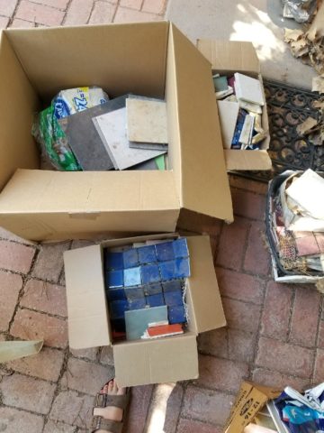
The idea became more exciting as we began gathering material from local tile distributors and our own personal inventories of favorite treasures saved for a special project. Here it was. It seemed such a strong design element and therefore offered a new direction for the actual brand of this establishment. We embraced the idea and brought it into the interior and distributed murals throughout the space.
Still under construction, we will not divulge the identity or locations of this project just yet. But suffice it to say, the murals are an exciting part of this interior design scheme.
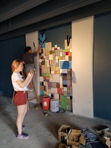
As we further discussed the plans to implement this project, school started and the ease of coordinating the assistance of neighborhood kids became more difficult. Helen lead the project as primary installer, coordinator and supervisor. She enlisted the assistance of a couple of people – one experienced and the other not at all.
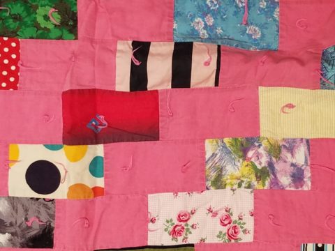
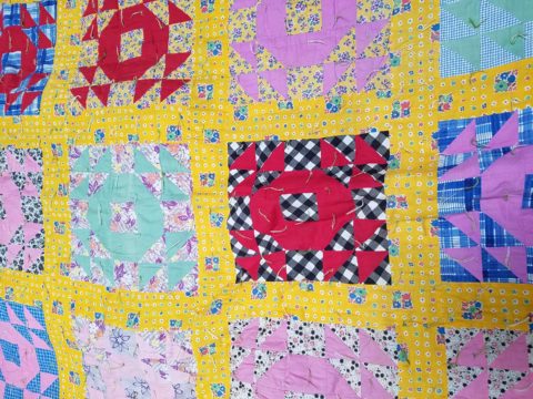
We have named this series, Urban Pieced Work – an artistic narrative. Here we are interpreting generations old sewing patchwork using ceramic, glass and pottery pieces rather than the traditional fabric patches. The original folk art needlework has been in the American vernacular for ages. In these installations, this up-cycled use of discarded or discontinued tiles is similar to patchwork fabrics, re-purposed to make clothing, wall decor, window treatments and bed dressing when times were tough – often referred to as “pieced work.”
My paternal grandmother in New Mexico made this twin quilt for my bed when I was a child in Virginia.
My same grandmother made this and was given to me by my cousin, her only other granddaughter.
Mosaic is often, like fabric patchwork, a practical art form that puts scrap, shards and fragments to good use in an artistic fashion. Note though that more sophisticated mosaics have been designed more intentionally for centuries not merely as salvaged material. These masterpieces both in contemporary work and antiquities represent many periods in history and movements in artistic expression.
This mosaic version connects with the history of the restaurant’s roots and southern heritage. The panels’ mural nature speaks to the urban murals found throughout the community.
Located strategically throughout the interior, these murals have become a strong design element and anchor for this facet of the brand.
Another shot of the spectacular cultural story murals at the Albuquerque Convention Center.
We have woven a meaningful artistic statement throughout the interior and also on the exterior of the building. In addition, we will be inserting a graphic version into the signage and logo design.
Urban Pieced Work – an artistic narrative, of a New Mexican Smokehouse, will provide pleasing design visuals throughout this new interior, provoke conversation and interaction, weave an element of history and context with the southern roots of this exciting new eatery!
Join the conversation and watch for the first succulent flavors to come out of the smokers later this year.
When you think about finishing a wall, you probably think about paint colors…you might think about a wallcovering – wallpaper, or even a mirror – I’ve previously noted how mirroring an entire wall can exponentially expand a room – a dimensional effect/illusion that suggests the room extends well beyond its actual size. But another wall treatment, with which I LOVE to play, is tile!
All over the world, the art of designing and creating decorative finishes with tile has been evolving for centuries. All cultures have utilized mud and clay, glazes and fire to bake beautiful patterns and colors onto geometric slabs. Shapes of rectangular, square, octagonal, dots or diamonds – the geometric shapes are many and the designs are limitless.
As is true with other wall treatments, I prefer not to stop on an outside corner. I believe that the color or material should suggest a built mass – part of the architecture. To stop on an outside corner suggests a veneer. It proves that the finish on the element is not a structural/integral part of a built mass. When you paint into an inside corner and stop, it allows the mass the read as though solid and not merely superficially treated. The same is true with tile. Don’t stop it until you get to an inside corner – if possible. There are situations that force a finished edge on the flat plain of a wall – but avoid outside corners at all cost!!
This entire shower is tiled floor to ceiling, around the pony wall, bench…no door…it reads like a built environment of stone tile.
Think of the surface as an architectural element. Tile from floor to ceiling, inside corner to inside corner – wrapping corners, if needed, along the way.
Take a backsplash…customarily used to do just that – catch splashes at the back wall of a wet area (sink) countertop…bathrooms and kitchens, behind sinks and between upper and lower cabinets – but why stop there?
The entire back wall of this kitchen is mosaic marble tiles in a herringbone pattern.
Think of it as a true wallcovering – wallpaper. Commit to the entire surface. Here are more effective examples…
The backsplash and entire adjacent wall were covered in glass mosaic tiles. It “reads” like wallpaper.
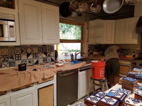
here again, the classic blue and white Talavera tile backsplash is continued along the entire wall from floor to ceiling.
We are currently working on a couple of kitchen projects that will soon be completed. They both use tile liberally. Each quite different from the other. Stay tuned for the finished products!
In bathrooms, the area around a mirror can be more than merely the backsplash. Embed the mirror into the tile surround or tile the entire wall and hang a mirror on top of the tile surface.
This mirror is flush with the surrounding tile, suggesting that it is embedded into a tile wall.
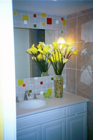
Planning this transformation, the mosaic vase was the inspiration. Then loose tiles were scattered on the countertop and the concept began. Note, the existing mirror was attached to wall with light fixture mounted above it and a medicine cabinet off to the side.
The transformation involved removing the medicine cabinet, taking the floor tile up the wall and wrapping it floor to ceiling. It was also cut into smaller squares to use behind the sink as a “full-wall backsplash.” Then punctuated with glass and glazed tiles to create an updated design. Relocating electrical to flanking the mirror for a pair of new sconces and a new countertop, faucet and sink with existing cabinets painted resulted in a cost-effective design.
Here a mirror is mounted on top of the fully tiled wall. Inside and outside of the shower enclosure the tile is a true wall treatment.
I recently received this advertisement in my email. It was such a spectacular collection that it caught my eye and I share here one of the patterns and context shots as the backdrop to a range.
Mosaic assemblages can be fun! Here is a fireplace surround.
The addition of three-dimensional pieces adds interest.
This exterior fireplace surround tolerates the elements – an all-season installation.
Here is a mosaic mural of a dynamic geometric abstraction discovered in New Zealand. We are using this inspiration to establish a theme in a current restaurant project. An interpretation of this in the form of geometric tiles of various sizes, colors and patterns will be used to create a cohesive repeated design element through various areas of the restaurant – both inside and out. Watch for this completed project in coming months.
Commercial restrooms can benefit from full-wall tile treatments too. Not only does it look complete, but it is an ease of maintenance consideration.
Three dimensional tiles add interest to this cactus motif!
Fun with color and texture, tile are also easy too keep clean – terrific for public restrooms.
Murals are also terrific ways to use tile as art in your interior/exterior designs!
This is embedded into the stucco for an integral installation.
When using outside though, remember to consider the range of temperature and moisture to which it will be exposed. Porcelain is the most durable in areas where the temperatures get to and below freezing. Freezing and thawing can destroy tile. Many murals are made from clay that is not suitable in cold climates!
Inset into the tile wall treatment is this stunning glass mosaic abstract mural.
Tile – it’s a nearly limitless medium. So consider the possibilities for your next project! As a piece of art, an accent wall or an entire installation – full-wall treatments make a statement! Have fun with tile!
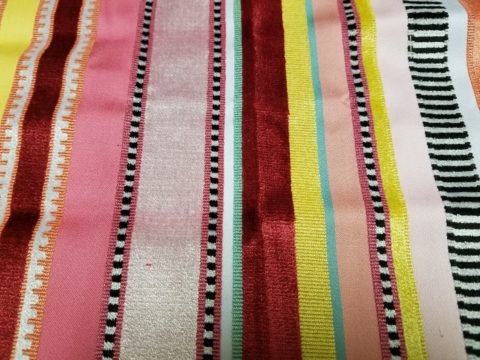
Fabulous fabrics are NOT common – that’s what they have in common!! After paint, fabrics are the most malleable design element that can make dramatic transformations in an interior. New pieces, reupholstering existing pieces, treasure-hunting to cover vintage pieces, salvaging family heirlooms, plastering or padding walls and ceilings, draping and accenting – doesn’t it sound exhilarating? Imagine the possibilities!
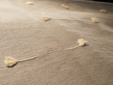
Metal studs to trim things…wrap a lampshade, border draperies, trim a sofa, adorn a pillow…so many things…and the stormy cloud printed velvet in the background of this trim – is blustery and powerful.
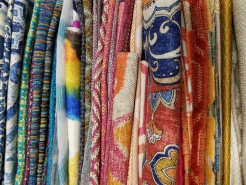
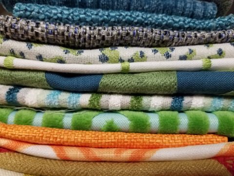
One of the most fun-filled events in our design studio are the road-trip visits by our fabulous sales reps that bring the world to our conference table!! In larger cities, the design resource centers, markets and their showrooms offer myriad marvelous samples of furniture, decorative accessories, art, lighting, fixtures, finishes and fabrics. Exciting new design trends are presented each season.
But when you live, in isolation from the major centers, as we do here in the high desert – we are treated to personal presentations that are intimate, relaxing, inspiring and educational. Here is an exclusive collection that was presented just last week. Sit back and watch the fabrics unfurl and float – one after another – in layers of color, texture and incredibly inspirational style.
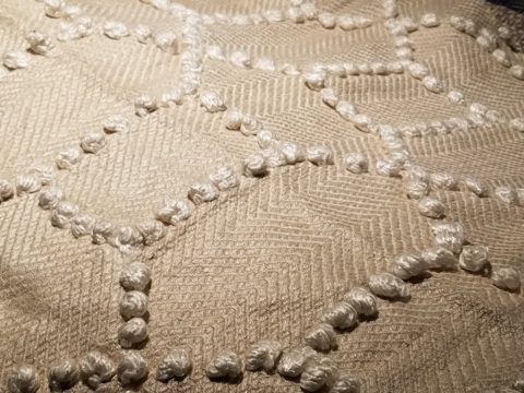
Weighty over-stitching or “top-stitching” adds detail-either high-contrast, color-on-color subtlety or the median slightly contrasting grey with white. Trending – touchable textures! Here presented for interior fashion, but you can bet that clothing fashion designers would love to play with these textiles for wearable art too!!!
Sure, throughout the year we travel to source hubs, surf the net, call our reps, request samples, compile materials and gather what we need across the miles. It is challenging. Like living on an island and bringing the amphibious containers of supplies over the sea and up onto the beach! But inasmuch as we don’t have a design center handy to do a lot of “one-stop-shopping,” we do curate our own very extensive source library of fabrics and architectural materials. With that at our fingertips, without leaving the studio, it’s a time-saver, a stimulating place to to engage clients and we are easily spoiled!
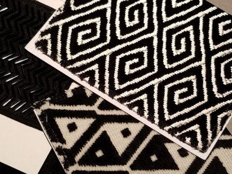
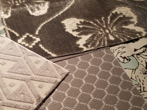
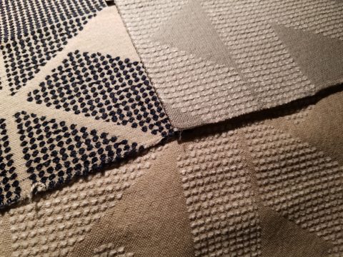
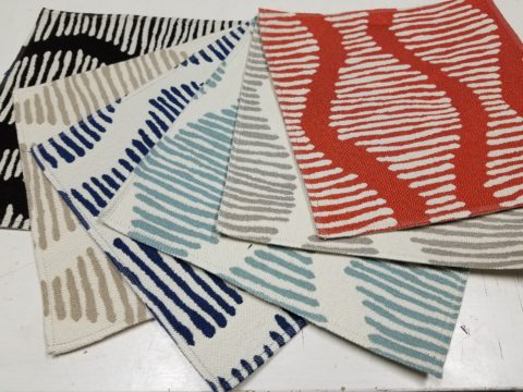
Fine weaves make terrific grounds for bold prints – here in three different color-ways – what a POP! Retro to new concepts – patterns add pizzazz!!
This recent textile presentation brought refined and rugged landscapes of intriguing textures and patterns that stimulated our design juices.
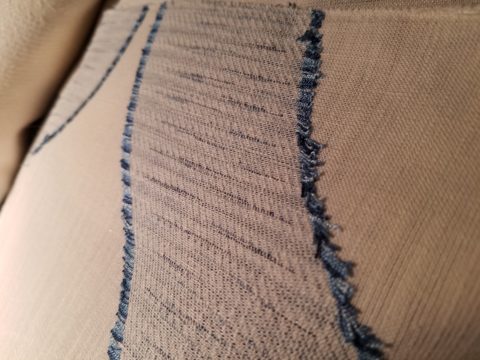
Intentionally cut after the weaving process provides extra texture and pattern interest.
Often the “backside” of these fabrics are as interesting (if not more so) than the fronts – but be mindful of floating threads and other weaving details/methods that interfere with practical use.
Bold “geometrics” are not only vivid with high contrast threads, the texture is what cannot be accurately replicated or conveyed via digital images on a screen. Despite the fact that I got up close and personal with these samples to photo, nothing beats touching and feeling the fibers and textures.
Complex weaves dazzle with design creativity. Bringing an artist’s concepts to fruition, with a mill to fabricate the dreams, is enchanting.
Traditions of weaving artisans are found in countries around the world. Sadly, not many fine fabrics are woven here in the States, partially due to the cost of fabrication and also due to the generations of crafts people who are experienced in the art of weaving more cultivated in other cultures. Whether organic, engineered, by hand or efficient, fast-paced mechanization – art and technology continue to push the envelope of fantastic creation and production in the fabric industry.
Here’s a great tip – if for only a pillow cover – if only ONE side of a pillow cover, having unique fabrics is having art. Living with functional art. Appreciating the designs, textures, craftsmanship and unique qualities of fine fabrics and wall-coverings is most satisfying.
Paints hand applied to the surface of fine woven fabrics is gilding the lily.
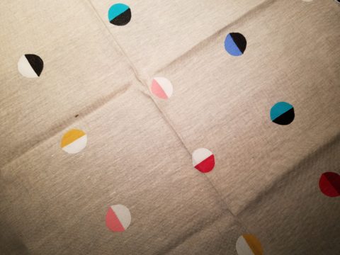
Who doesn’t love these colorfully, whimsical dot halves hand-applied to the surface of this nubby neutral??!!
Silk-screening also is an art-form that enhances the quality and appreciation of fine fabrics and papers.
Some of this collection are vintage art-pieces resurrected with new colors on the screen prints. The caliber of a fine, timeless, resource is about quality of both design and construction. A collection that continuously offers – classic and new, bold and subtle – answers to so many opportunities, is a resource that is to be celebrated!!
We investigate the most extraordinary fabrics, in the world, so that we can compile and create the perfect combinations for your exclusive lifestyle.
As we know, kitchens and bathrooms lead the features that often make or break a house sale. Investing in such improvements can not only enhance your living experience, but also serve you well when it comes time to sell. There are a few basic tips to follow as you embark on this could-be, (but need-not be) daunting project. Here are some important things to consider for all facets of the experience!
To begin, note what things about your kitchen you would like to improve – both functional and aesthetic.
Gather inspirations – make a hard-copy file or at least collect in a folder in your computer things that inspire you in your quest for your improved kitchen. Use kitchen design magazines, Pinterest posts or remodeled kitchen ideas that you Google-search. These ideas are a great springboard to narrowing your design direction and conveying your concept to your design professional.
Based upon your “inspirations” what is your color scheme? This direction will impact options and decisions for finish materials such as flooring, cabinets, countertops, back-splashes, wall finish and window treatments.
Is it merely a facelift? New cabinet doors and drawer fronts? Perhaps new countertops and back-splash. Or is it a complete gut and replace?
New appliances – replacements or additional components?
Sketch the layout of your new kitchen, if applicable. Make sure the available space accomplishes what you are imagining.
Imagine the finished product. Illustrations of the “after” design are the best way to accomplish this.
When in this process should you consult with a design professional? Perhaps after number 3 once you have gathered examples of your preferences…I let the list continue beyond number 3 to give you an idea of where in the process you might feel the need to have some qualified assistance!! An experienced designer will see things you don’t, know things you might not have considered and ideally maximize your budget by avoiding costly mistakes or missed opportunities.
For example, don’t miss opportunities for additional storage – this is a critically creative design detail that results, in great benefit, to the finished product.
In fairness to you and your contractor, try to establish a budget. Do a little homework. Gather rough costs for lineal feet of cabinets, appliances, design consultation and construction costs (a good resource are the home-improvement stores). Give yourself some latitude as this cannot be a finite budget at this early stage of the planning.
With your design pro, discuss contractors that fit the bill to what you are trying to accomplish. If you are only tackling cosmetic improvements, a general contractor might not be needed. For example, new wall finish, countertops and appliances or new cabinet fronts, a new light fixture…these are individual sub-contractor projects. But as soon as you get into moving plumbing and electric, adding or removing walls, puncturing the envelope with windows or skylights – you had better hire a general contractor to take responsibility for the scheduling, coordination, licensing and permitting of the work.
Once your scope of work is determined, you might need to get familiar with great carry-out in your neighborhood!!! That and a few great restaurants too, as you might be without your kitchen during a portion, if not all, of the process once the work begins!!!
Here are a few projects that we have documented with pretty effective “before and afters” to help you consider some of the above referenced tips.
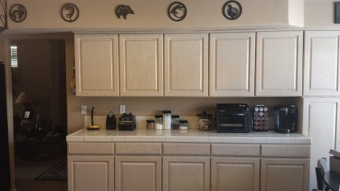
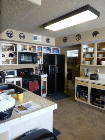
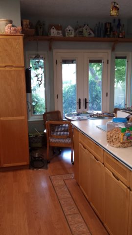
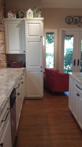
These peachy pickled white-washed red-oak cabinets had classic lines and were in excellent shape after 30 years! The original owners were ready for an update.
Purely cosmetic (except for replacing the lighting) we saved the cabinets in their entirety, painted the boxes, doors and drawers. By shooting the fronts remotely, quality control was insured and caused less imposition at the residence.
Black accent pieces were already in play. The new black finish was a dramatic transformation. Using a special tinted varnish, proper prep and several coats results in a very strong new finish. All other finishes were replaced with a conscientious effort to coordinate with the existing flooring. The result “reads” as though it was all done at the same time. The floor tile looks good as new!
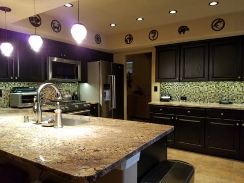
Similarly, we saved the cabinet boxes, but differently from the previous project, we added a few updated cabinet features and replaced the door and drawer fronts to a more classic raised panel detail.
Again the transformation was exciting, but by saving the perfectly good cabinets, we had far less disruption to the home-owners. Enhanced cabinet details for improved drawer glides, additional storage, new counter-tops, new lighting, and as is true with all of these projects “cabinet jewelry,” in the way of new door and drawer pulls and handles, adds the finishing touches.
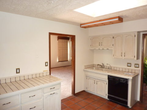
This very dated kitchen from the early 70s, had a new owner – a single man – and he definitely didn’t want this provincial look!
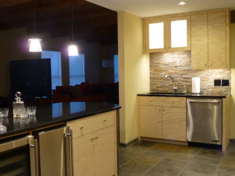
In this case, a general contractor was in order. We opened walls, re-designed all the lighting, replaced all cabinets with new custom cabinets, appliances, flooring, counter-tops and back-splashes. The transformation is astonishing!
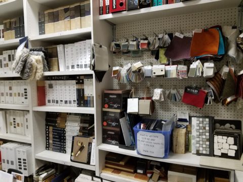
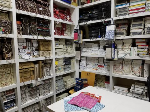
I am so all appreciative of texture and color and sheen and lack thereof…that I KNOW that it is impossible to make any decision about fabrics or any other textile for that matter, rugs, weavings…via a monitor or screen. We are all becoming so dependent upon the instantaneous access of information through the internet – finding sources on-line and virtually ALL of our purchases – that we are forgetting the tactile necessity of determining value, applicability, and certainly true visual appeal with tangible samples.
Yes, we can order memo samples and those of us in practice for the past few decades KNOW that we have to order samples every now and again – that is IF we have our own source library or a number of showrooms close at hand to do the instant gratification portion of the search.
Most clients LOVE to come to the library and see the many options, play with the samples and participate in the design of their project. It is a one-stop experience that sets the stage. We then have all the many distributors and showrooms, mills and factories from which we can order additional materials. But the resource library of tactile samples of fabrics, flooring, wall-coverings, flooring, rugs is exciting.
There are those who prefer fewer choices – just show me a couple of options and I’ll be fine. Quite the opposite of the one who wants you to prepare a dozen scenarios for their consideration. Yes, they pay for that luxury, but the ones who appreciate the hunt -who appreciate the searching through samples to compile their favorites – THEY are the ones who really get into the Creative Process ( see recent post on this very subject).
Living on an island – as we often feel we are – we HAVE to compile a significant source library in order to have the samples available for on-sight instant compilation for a project. Yet having all the resources close at hand, as in the showrooms of larger cities, we still have to drive there to do the work. I must say, I am spoiled with such a comprehensive source library at my studio where I go any time of day and do research to gather myriad samples to satisfy a project’s needs.
It’s taken decades to evolve. It takes a lot of concentration to keep it in order and up-to-date. That is invaluable. This isn’t to say that after spending several hours searching, culling, sorting and weighing possibilities against for-sure options, that I don’t have to occasionally call the many mills and distributors and ask for special pieces that have eluded me on my search. I might have gathered several coordinating/contrasting and fabulous samples, but lack that one blue and white striped pattern that I have visualized since the inception. It is then that I reach out and say – “I can’t find the right blue and white stripe – please send me what you have for upholstery weight.” And the samples begin to arrive and usually the missing link in the design puzzle will be found – sooner or later. IT is out there.
But the value of the well-organized and well stocked library is an invaluable tool. Yes, it is a tool – THE primary tool for a designer after their own imagination’s creativity. It fills the blanks of that creativity with actual materials that complete the design. And having a resource library on-site in our own studio saves much time and offers a plethora of options, materials, finishes, inspiration and those priceless tangible sample at our fingertips that MAKE an interior design.


 But the value of the well-organized and well stocked library is an invaluable tool. Yes, it is a tool – THE primary tool for a designer after their own imagination’s creativity. It fills the blanks of that creativity with actual materials that complete the design. And having a resource library on-site in our own studio saves much time and offers a plethora of options, materials, finishes, inspiration and those priceless tangible sample at our fingertips that MAKE an interior design.