Back to School: 10 Pro-tips for Setting Up a Dorm Room

It’s that time again…the end of summer and getting kids back to school…exciting, hectic, a bit stressful and today, very nostalgic. I (who saves everything) still have my little black and white Sony TV, embroidered fiber art that hung on my wall, floral twin bed sheets and bath towels! I remember the white chenille bedspreads that I got – giving one to my bestie/roommate so we’d match – even though she was a red accent person and I chose blues and greens!! We picked each other, our college and designed our neat and tidy package.

Earlier this weekend, as Victoria navigated this information highway that is the lead-up to getting her dorm room assignment, roommate and all the related details, she texted her yet-to-meet roomie and asked what her color scheme was going to be. Victoria, having established her pink (dusty rose) and grey scheme last fall upon entering her freshman year elsewhere, was hoping that she was not going to have to share her intimate space with a shocking orange scheme or similarly discordant color. All of a sudden, from the back seat came a exclamation – “NO Way!” To what, we asked  – “What?”  And she said “Guess what her color scheme is? Pink and Grey!!! YAY!!! What were the chances?”

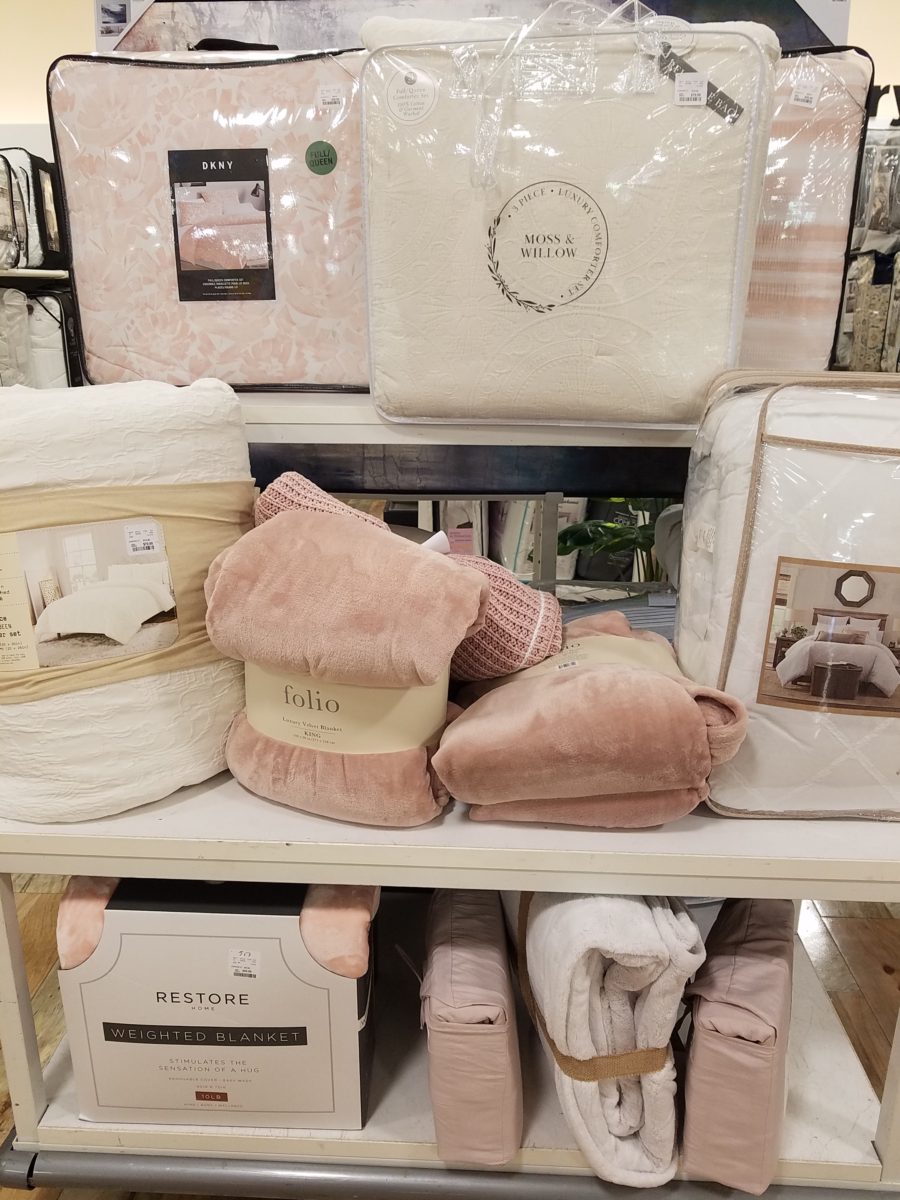
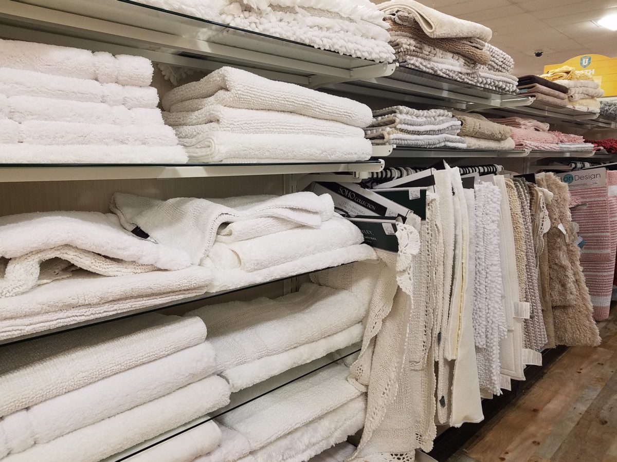
Well, strolling through the stores with their piles of offerings displayed in tempting color-coordinated arrangements, pink and grey still carries over from last fall in a big way – so the chances, it seems, were not all that far-fetched!! LOL.

With the prominent pink and grey,  popular turquoise and grey and for the boys (if we are being color/gender-esque) black and grey – seems grey is the common denominator facilitating merchandising and keeping everyone in color-trend order.

Pro-tip #1 Make a list of what you’ll need prior to hitting the stores with their limitless temptations for dorm decor! It can be daunting if you go shopping – cold. It can be daunting anyway – but best to attempt to be prepared! As I looked around all the displays leading these trends…leading these kids…I wondered how many – if any – might veer off course and pick an orange and lime green  theme or brilliant cherry red…and what does it say about one if they buck the established trends?  Some might be oblivious to the trends – despite being bombarded in every store by the “must have” selections. Those independent thinkers who like what they like – if it matches or not.  The eclectic ones who are driven by memories, personal expression and acquisitions gathered and honed over the years that were not guided by trending decor influencers.

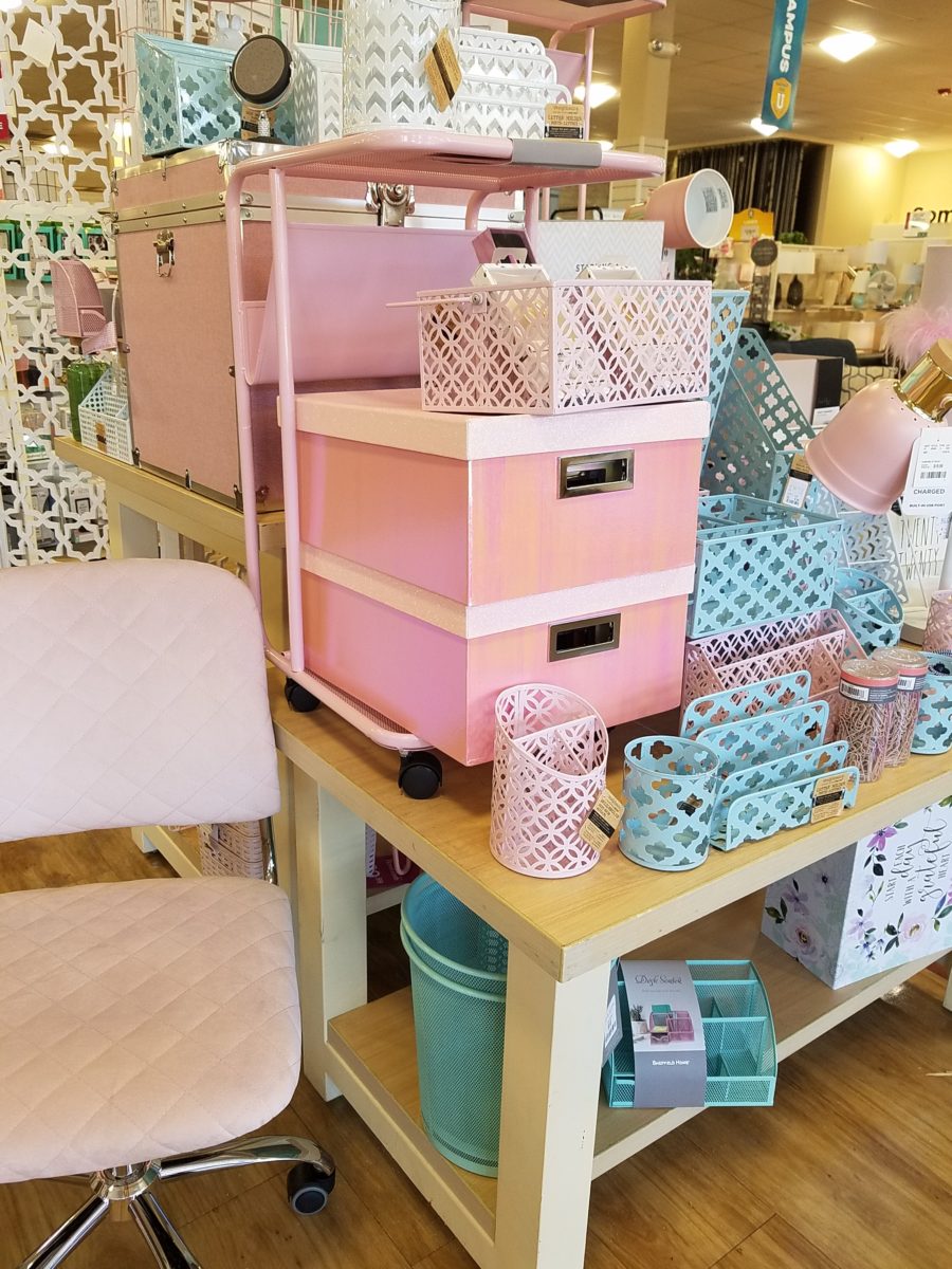
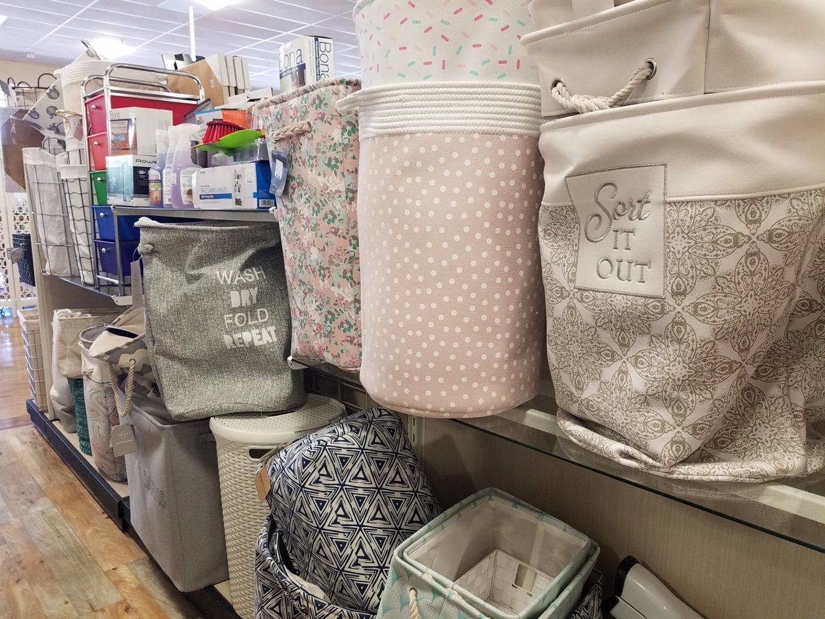
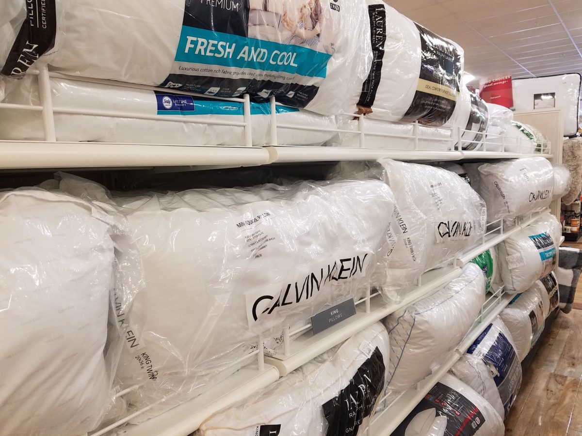
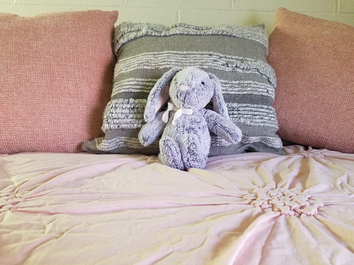
However, it is entirely possible to genuinely LOVE the trends and invest in the colors for more than the first semester of eager dorm room decor! We were living it! What was purchased last fall was saved and expanded upon, with new-found knowledge of the tips learned from the pros! There are boxes, bins, rugs, lamps, staplers, desk organizers, linens, bulletin boards, throw pillows, blankets and throws – all color coordinated making the job relatively easy and swift.  

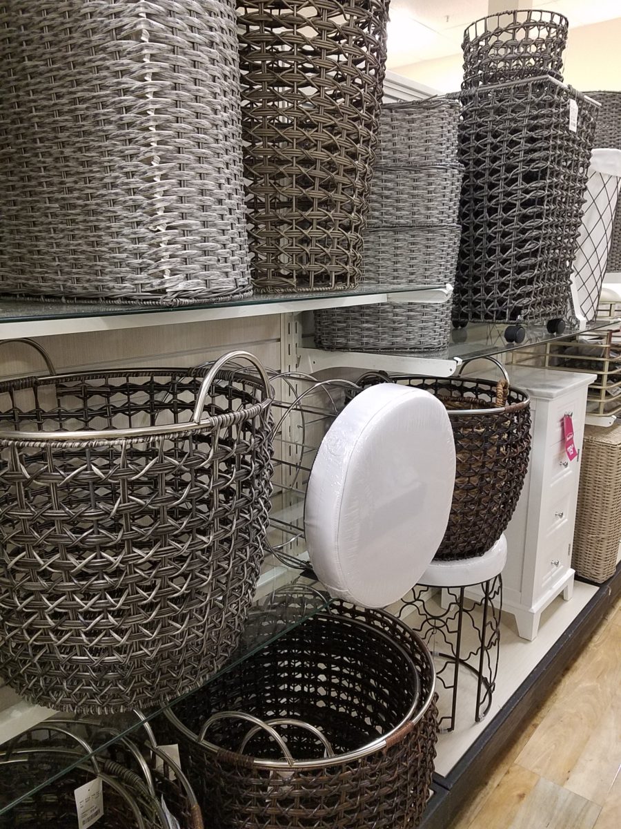
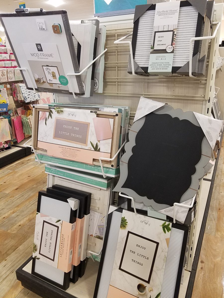
The stores are prepared. Welcoming students – their signs are out and their shelves are stocked! Rows of pillows, mattress covers, foam pads, artsy accessories and accents galore…all to enhance the otherwise bare rooms that will soon come to life!

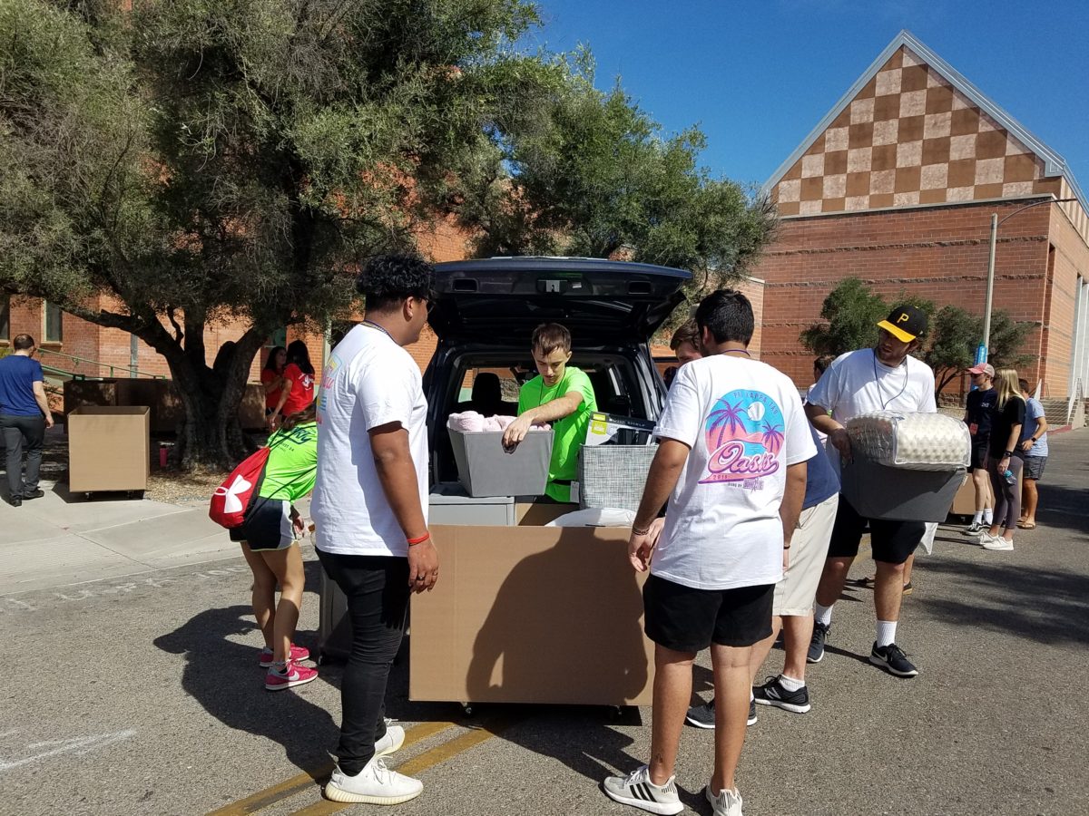
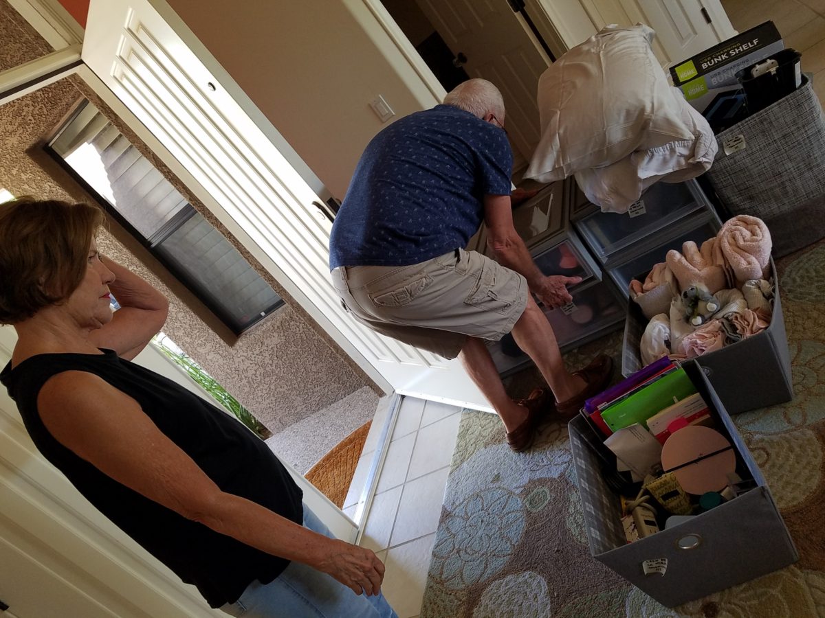
The morning of the move, they staggered the move-in time to insure an orderly point of arrival and processing to the rooms. We were assigned 9:30 and met curbside by a handsome posse of volunteer boys who were armed with rolling cartons cleverly created using carpet-wrapped moving dollies upon which were mounted large, sturdy cardboard cartons. These rolling bins were piled high with contents from the cars and wheeled into the dorm rooms with efficiency. Co-eds in red t-shirts identified them as the RA staff – the ones with the answers to all of your questions.

Being organized is key. Victoria had benefit of a previous semester where she watched the pros and got their tips! Pro-tip #2  Be organized!

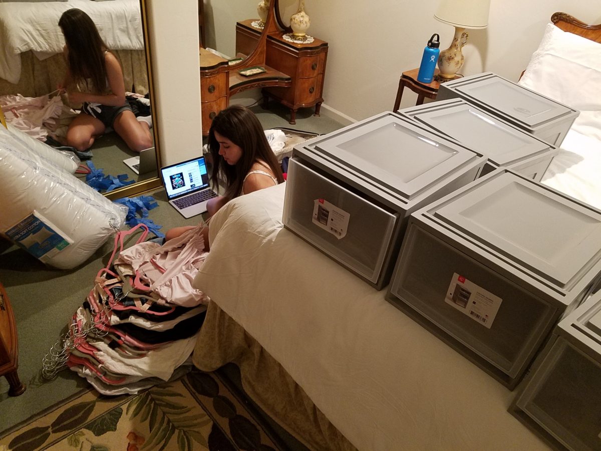
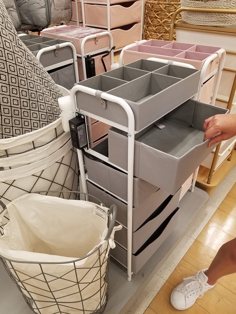
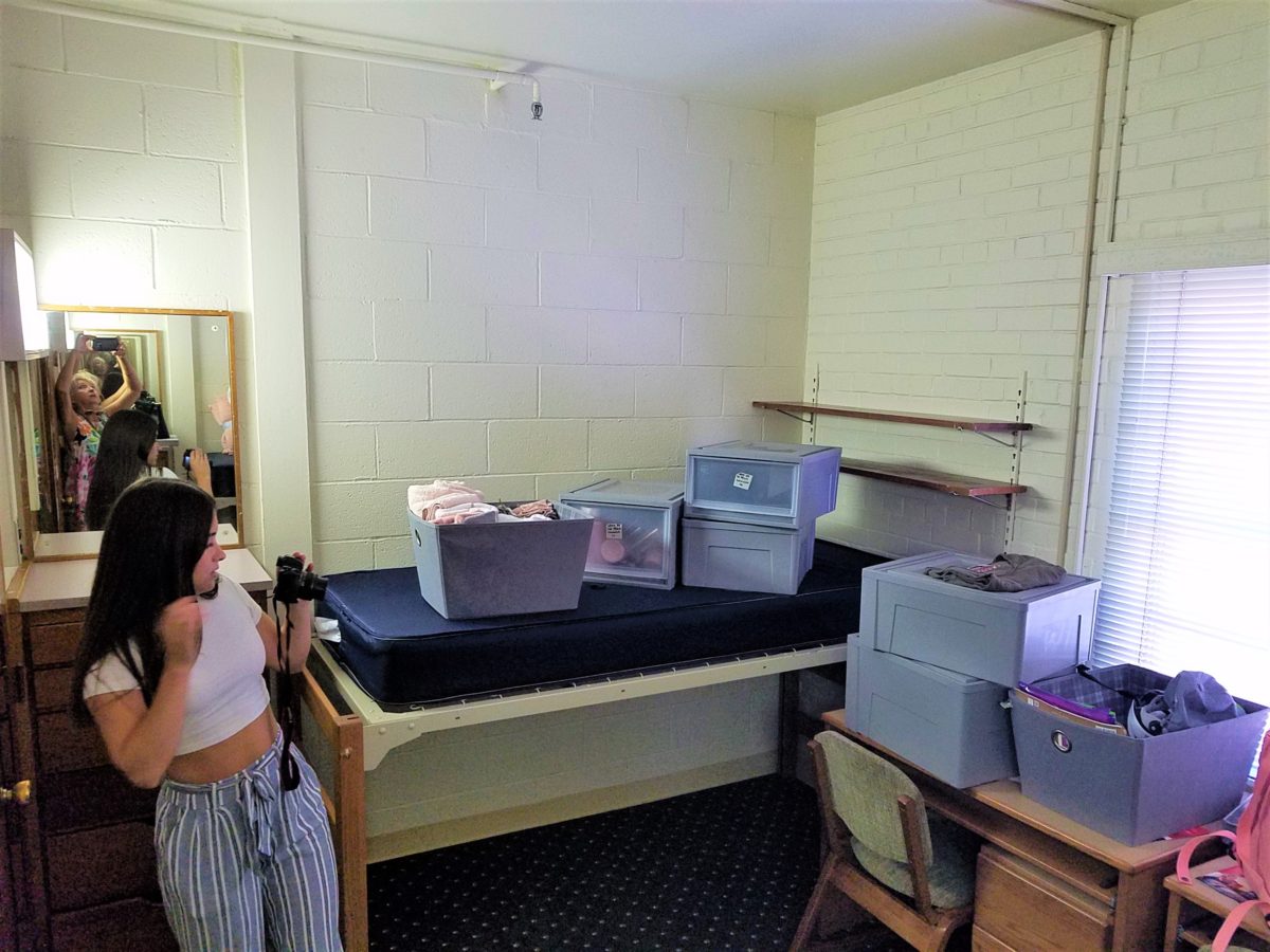
To that end, utilize your limited space to the max! Capture all available real estate! Pro-tip #3  Bed risers. The beds are high – high enough to stack storage drawers/bins beneath them. They can be raised even higher with risers. Pro-tip #4 The plastic stacking drawers are cool because they make easy access to contents just like added dresser storage space.

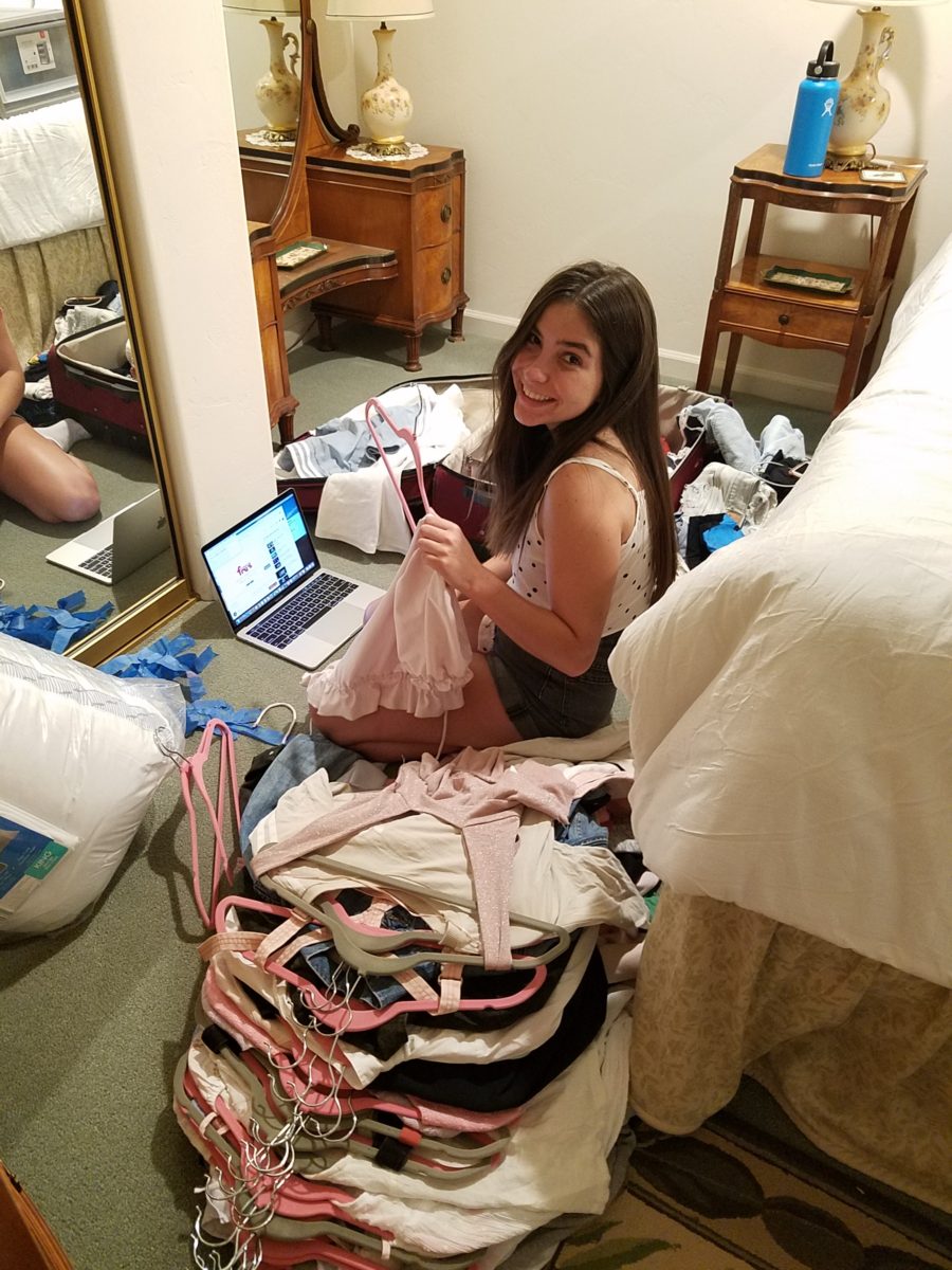
Victoria had it all figured out. Pro-tip #5 To consolidate luggage, she packed a lot of her clothes in the bins – all in very specific order and folded making it easy to transfer once in the room.

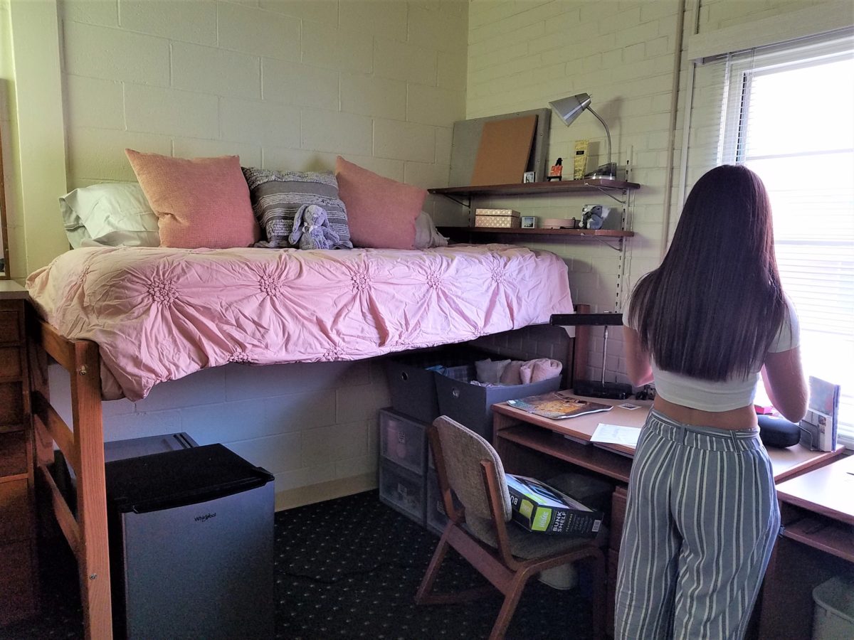
Once in the room, she raised the bed even higher on 4 cone-shaped plastic riser units that she had purchased. She then placed her new mini frig (Pro-tip #6 Get a mini frig) and bins beneath the bed in an organized fashion. She emptied the bins one-by-one into the chest of drawers thereby freeing the bins for other supplies such as snacks, kitchen supplies and miscellaneous other necessities.

Having a mini frig in the room keeps personal perishables under control and handy instead of having to label things in the shared frig down the hall.

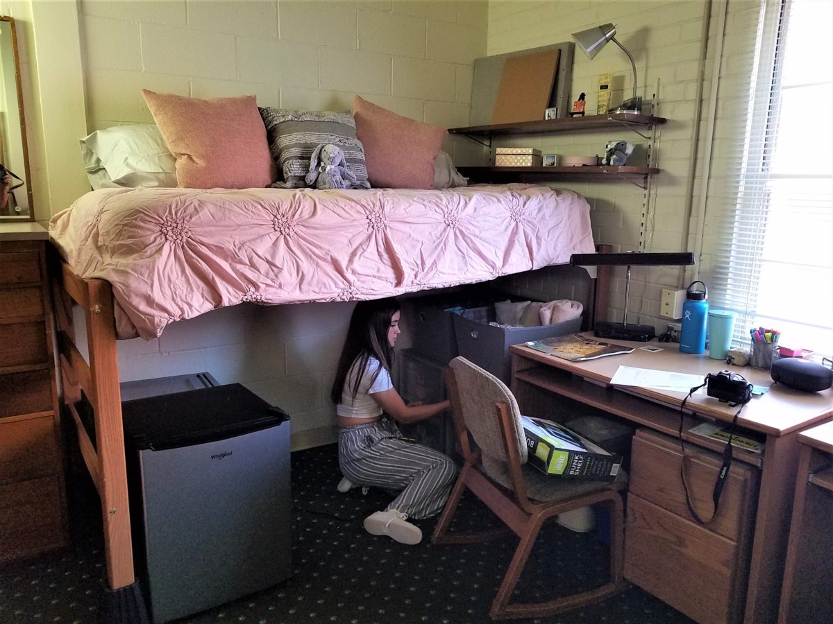
Pro-tip #7 Take extension cords and multi-plug surge protectors. This was handy for the reading lamp waaaaay up high above the now super high bed and also to run power to the mini frig. You can never have enough power sources and another bonus was that one of the set of four bed-riser units had power outlets and a short cord!

Pro-tip #8 Get a collapsible shoe rack/shelf (for ease of storage and transport). They have nifty wooden ones – but we took ours back as the closet had a tidy set of built-in shelves perfect for shoes.

Once the power was all connected and the bins organized clothes put away, it was time to make the bed and add the finishing touches.

It was beginning to look like a home-away-from-home! Pro-tip #9 With hanging implements that will not harm the wall like Command Strips, the walls will gradually come to life with strings of photos clipped with clothes pins, twinkly lights, bulletin boards and other imagery.

 Pro-tip #10 Take photos – the memories are priceless!!!!!!

Still crazy after all these years…..

Thanks Sam, for the memories!!!!!

Designing a Cool Theme for a Vacay Rental Property

When designing for a vacation rental property, the first order of business is to select things that are durable and easy to maintain. This means finishes to furnishings. I know this from practical life experiences and also working with commercial/hospitality interiors. To do so, one needs time to place and receive the orders with enough contingency for mishap. It is also dependent upon the housekeeping arrangements planned for on-going maintenance.

In this recent project, the work began 12 months out – plenty of time you think…but it was all about the physical remodel. We began with the drawings for floor plan re-configuration and specifications for new lighting, cabinets and finishes throughout. The decision to furnish was not made until nearly 10 months later with a deadline to complete in less than 7 weeks. The delay was partially due to an indecision over how many of the 4 units (all on one floor) were to be short-term or long-term rentals. Then a new city ordinance imposed a moratorium, of sorts, on short-term rentals and while that was tossed about over several weeks…more indecision ensued.

It’s a riot to see overnight design projects transform interiors in 24 hours. That’s due to a free-reign for design decisions, a team(s) and vehicles to pick-up/deliver, all trades on deck, a single director calling the shots and an organized chaos that results in a magical finished project – yes, like magic. Open your eyes, be stricken with awe, cry a little and exclaim repeatedly that you “just can’t believe it!!!!”

Real life is generally not like that. Real life has in-put by owners, limited schedule openings by the various trades, little spontaneous decision-making and fleeting time riddled with unwanted surprises and delays. Real life, in this case, was a theme provided by the owner, a preconceived “look” developed in the mind’s eye and scratch paper of the designer during the selection of finishes and floor plan modifications and vacillation for several reasons, of what units to furnish and when. Over the course of a year, leading up to less than the last 30 days, the project was to be fully furnished and finished – ready to rent!

The good news is that with controlled frenzy, changing availability of products, focused efforts and teamwork, we are pleased to present the Lobster! Completed all but hanging the TVs by the requested July 1st deadline, it is beautifully appointed and offers a colorful and a bit whimsical, spacious, clean and did I mention  enviable location- 2 blocks from Pacific Beach in San Diego?

This entire project, except the move-in this last week, was done long-distance with the owner in Maine, her management company SHORE on-site in California and we the design team in New Mexico. This is not at all unusual, but Maine prompted the owner’s desire to name the unit Lobster. Not your spiny lobster from the local waters, but the New England version from the Atlantic with the classic recognizable form that accompanies the imagined crustacean – including the brilliant reds of the often appreciated steamed version!!

With fond memories of her childhood helping her elders maintain this property, the owner wanted to commemorate the building with an entry plaque visible from the street on the new redwood gate (soon to be completed). In addition, we suggested an individual name/theme for each of the 4 apartments which were all initially designated as fully-furnished short-term rentals – hence the bold identity for each!   I designed the new name plaques and had them fabricated by Artistic Bronze in Florida. The backing was built by our talented Enrique Jimenez, in New Mexico, and all shipped to California. Bronze was selected for its timeless presentation, handsome durability and commanding respect. Parisienne was the font I selected which may now be used to identify the property as though a logo to tie-in with the on-site signage. Subliminal cues that are recognized even slightly are effective reminders and triggers for recognition. The idea was intended to offer a fun, but lasting, introduction and identification which was to be reflected in the interiors. The Lobster was the largest unit with 2 bedrooms. It was ultimately chosen to the be one fully-furnished unit and owner’s second home when visiting the area.

For budget and availability, we sacrificed certain durable features that would have been better long-term investments, resulting in some knock-down furniture that was never intended for much abuse. Fragile painted table surfaces – for example – better in laminate, wood or stone…but time will tell.

The look is clean and fun, colorful and beachy – with a slightly up-scaled twist. Cool aquas accent a few walls in the otherwise crisp white interior. Red punctuates effectively in lobster accent pillows, decorative accessories and the full-wall mosaic glass tile treatment in the kitchen. Yes, once again, we like to treat tile on the walls as not mere back-splashes, but wall-covering full height and width!

Weathered grey toned LVT (Luxury Vinyl Tile) in the way of interlocking planks were an easy to maintain and durable floor finish. The faux wood adds warmth and is softer underfoot than other hard surfaces. Perfectly matched with all trim pieces, this flooring is fabulous!!

Lighting is key and here we added recessed directional lights to spot the walls and related artwork. Switching was also an important detail to have options for the lighted areas and accents.

The owner found a novel lobster rug with a great textural, tufted, yarn system that brings fun and great color and warmth to the bunk-bed room! Busy, colorful bed dressings intentionally selected (over the hospitality white that is still trending) contrast against the bright white bed frames stacked for space optimization and a little kid fun!

A cool find in the way of the glass vessel lamp…where usually the stem with electrical cord feeds down through the center of the base and of the back, this one feeds from the socket stem with a cork top that removes allowing the vessel to be filled with treasures – in this case southern California beach shells and fragments! And for a little more animation, I found a carved wooden shark to insert cruising above the shells to make the lamp even more interesting!!!

A pair of vintage photographs of a lobster shack and fishing boat contributed by a friend in Albuquerque – taken by him in Maine in 1962 – were enhanced with bright red mats in their original polished silver metal frames along with a large painting on canvas of a Maine lobster/fishing boat sent by the owner in Maine provide interest to further perpetuate the lobster theme.

The master bedroom is a comfortable retreat with another lobster pillow for punch! To give the room the best approach and make it feel as large as it can be, placing the bed in front of the windows was the solution. Beds facing the entrance to the room are always preferable to arriving into the side of them – for visual space and a more inviting orientation.

The original bathroom layout was all one space with tiny appointments jammed together…so we removed the tall storage cabinets and sink vanity allowing more room for the commode beside the tub/shower and added a privacy door. Then the new cabinets and counter have their own space with another privacy door resulting in a two-compartment bathroom area for maximum use and enjoyment. Red mosaic glass tiles were repeated from the kitchen to further coordinate the theme. 

The bold color scheme was thoroughly distributed throughout the unit which is an intentional design emphasis especially effective and novel in a short-term vacation rental – where such a thorough scheme might be too intense for one’s primary place of residence.

Effective design both functionally and visually should be a significant asset in the marketing of rental property. When used consistency in marketing material with logos and repeated features, this and other properties with attention to detail should attract the discriminating guests. Once there, repeated stays are the key to maintaining a strong guest population – of desired visitors.

Please watch for the entire slide show of before and afters of this dramatic transformation in the commercial projects section of our website, in coming weeks, entitled Emerald Green Beach Rentals – Lobster!

Remodeling Process and Presenting the Same Accessories in the New Scheme

It’s true. If you think designer’s projects go more smoothly than the ones they do with and for you, you’re wrong. It’s true – they don’t! It’s about Murphy’s Law and I have been remodeling our master bath for months. Starting in November and as recently as this weekend personally installing (DIY) the stone surrounding our mirror, it is still not finished. But it’s close.

The full-wall mirror was re-used. During the removal and transportation to be cut-down, the edge cracked and had to be cut down…we lost an inch or so – no big deal EXCEPT that it then affected the dimensions of the new stone surround that had already been determined. Oh well…we now will have to cut the tile – had intended not to have to do that. One of the many little surprises and delays. We had to order more stone and will now engage the installer to cut the ones that would not fit the new and slightly non-parallel conditions .

It’s actually fun to tile…until you have to cut it. It is like frosting a cookie and then pressing it onto the wall. It goes quickly and gives instant gratification. But when things are not perfectly parallel, something has to give. That’s when we cut. (Or call someone to cut!!!)

The effect, of having almost all of the mirror surround finished, gets us that much closer. The effect is great and is beginning to feel like the intended design.

The shower before and after is providing the open expansive look that our little shower enclosure didn’t provide. Despite the facts that the footprint is nearly the same and the old enclosure was all clear glass – albeit framed in gold finished aluminum – this new single panel of 1/2″ clear glass and white-on-white floor and walls looks clean and open. Not a snail design – but, no door. Prepared to add a white shower curtain on a custom curved aluminum ceiling track once winter returns – but for now we’re enjoying the refreshing and comfortable atmosphere.

We elected to use stacked stone on the rear wall of the shower as our house sits at the base of the majestic Sandia Mountain and selecting stone seemed more grounded and contextual than other decorative options – of which there are a million from printed concrete, glass mosaic, embossed porcelains…the list goes on…

Decorative elements are beginning to “read” against the new finishes. The same Portuguese ceramic footed rectangular container holds a bouquet of white washcloths. Yes, I think that the rolled terry towels look like rosebuds and I have always enjoyed the softening effect they provide amidst all the other hard surfaces. Plus they are handy on the countertop for clean replacements.

Footed Italian porcelain has had wash cloths in it for years and stays on the new counter top in a slightly different location.

Behind the terry rosettes, notice the pair of Heisey open and lidded pair of stemmed glass vessels that I use for make-up brushes and cotton balls respectively.

The same crystal wide-mouth vase holds and dispenses the facial tissues. I love the effect of the white-on-white coiled folds of the tissues. They are soft and read interestingly through the cut crystal.

I’m a LEO and find myself discovering and enjoying subtle references to lions. Our front door knocker and this cache pot that I’ve had for over 20 years as examples.

Nothing in this new scene is new. These accessories are all the exact items that were scattered on the countertop previously! Funny how the exact same decorative accessories work so well in this new interior!

A silly little collection of found things in a family inherited vintage pressed glass bowl including a glass marble, square frosted glass coke-bottle-colored mosaic tile, various sea shells and fragments, a squashed bottle Coca Cola bottle cap from Mexico, a hemp cord DIY necklace with a shell pendant…

Another glass tray that was also on the previous countertop presents my fragrances, a few products, a bobble-head turtle, my Waterford ring stand stacked with costume glass rings, my tragic, yet miraculous jade bracelet (save for another story), a fossilized bone – in – stone I found as a child, my  white framed sunglasses which might seem selected for the new color scheme – when, in fact, they are a result of my love for white framed glasses and these that I bought even though I didn’t like the would-be “reader” small lenses – I kept. I don’t like the way they look on – so have relegated them to the master bath for emergency dashes to the outdoors, on the upstairs deck when my other sunglasses are downstairs!

Still to complete…the stone mirror surround, hang the glass shade for the new pendant light fixture, install the towel/robe plugs, install the polished chrome drawer bar handles to match the new square door and drawer pulls, clear all the remaining stone pieces, thin-set and grout bags and boxes from the tub deck, install the new window sills…

Re-evaluate your existing accessories (and/or furniture) before feeling the need to change everything when you remodel. Watch for the completed before and after shots of this remodel soon to come. Well, relatively soon!!

BEFORE AND AFTER for Busy Young Couple Making First House a HOME

Busy lives in a new town, he in his residency and she working in a busy OR, they bought a house – their first house – and asked for help making it theirs.

They have traveled the world and collected art along the way, a disparate inventory of things that caught their eye, spoke of their experiences and reminded them of people, places and things to savor once home.

Home, that was the task. Create HOME in this new, old house. Built mid-century, it was simple, clean with some patchy remodeling from previous owners reflecting rather common decisions, with limited funds. We needed to discuss priorities and budget, evaluate what should stay and what needed to be changed.

They both had a love of Guatemala. Their travels there left them with dreams of color and pattern, handmade functional art and an exotic sense of place. Having these elements ingrained in their longing, they expressed a desire to have that sense, but with a bit of a modern twist.

Assembling the colors and materials…

We salvaged the existing natural granite slab countertop and unfortunate surface-mounted sink. The granite was a practical save and the sink came along for the ride. In order to integrate the granite as though intentional,  I selected a multi-colored Talavera tile that specifically had a dollop of mustard glaze in the design picking up that Dijon field color in the speckled granite. As is my usual preferred mode of installation, we took it wall-to-wall as a complete wall-covering.

We also saved the cabinet boxes and doors, but needed to give them a lift from their median caramel stain on oak. Deconstructing the colors in the design of the Talavera,  we knew we wanted blue cabinets – so the paint shades were fanned and the color pinned-down. To give the cabinets that wabi-sabi look of loving wear, we sanded the edges after the painting was finished. We also added cabinets over the stove for additional storage space and utilization of that blank wall.

We removed all the doors and drawer fronts, filled the holes from the old pulls/knobs and painted them off-site. We painted the boxes in the field. Granite was salvaged along with the sink.
New paint, Saltillo flooring, Talavera tile and cabinet pulls along with new appliances gave an updated look to the scene.

In real life, when  practicality rules, certain things have to give way for the good of the whole. The whole being the pocketbook and other elements that take precedence at the time. So we live with the radiant heaters, keep the chandelier for now, until they have one fabricated to their specifications, use a machined rug instead of a handcrafted piece and know that over the years they will massage this starting place and truly make it their home.

Continuing to dissect the colors from the new wall tile, our colorful young couple wanted more color…we chose individual values of bold paint colors –  smoky turquoise, slightly burnt orange and brilliant golden yellow to intersect the planes throughout the space.

Typical mahogany doors common to that era of home interiors, the decision to match the white trim would have been easy, but we labored over the existing natural, tropical wood and decided to keep it in the mix.

Although the nearly immaculate, original hardwood oak floors were revealed after removing the wall-to-wall carpeting, the kitchen floor throughout the rear vestibule and laundry room was an inexpensive and uninspired sheet vinyl.  Saltillo clay tiles were the answer to furthering the Guatemalan feel. More commonly associated with Mexico, these clay tiles are historically the plebian choice. Taking many forms, some artful enough to be the cornerstone of patrician interiors in fine mosaic installations and other patterns and designs, clay tiles – glazed and unglazed always add an artful, soulful human element. Speaking to that, we inserted 2″x2″ glazed Talavera accent tiles into the floor’s  new Saltillo field in the vestibule creating an almost area-rug-like definition.

The dated floor-plan enclosed the kitchen separating it from the rest of the living area. The very first comment made by our clients was questioning if we could open that wall – connecting with the living room and large picture window beyond.

The mottled cobalt blue light fixtures add another punctuation of color over the bar along with the parrot green barstools that our home-owners spontaneously nailed in an irresistible lust for even more color!!

Rather than trying to continue the existing “Dijon” granite, white Talavera tiles were used on the new pass-through bar counters – both high and low on the new cabinets.

The first phase of this colorful project has set the stage for an enjoyable work-in-progress for years to come as they now have a basis for design, more collectibles to come, and all they enjoy from places near and far. The upcoming annual trip to Guatemala, in April, will reinforce the joy and appreciation for this special place “home base” in their lives.

The dogs look in eagerly, but are limited to their expansive backyard, their vestibule and full run of the master suite.

Although they selected a durable denim twill fabric to reupholster their sofa and loveseat that they were gifted from a friendly neighbor, the primary living area is – for the most part – “off-limits,” but that seems to work for everyone in the family!!!

The Blue and Yellow Buzz…

What’s all the buzz about bees this week?? Seems it has been studied and determined that they can discern between blue and yellow in order to prove they can perform remarkable arithmetic.

Last fall while hiking in Boulder, I spied this little fellow on a cornflower.

Yes, it’s official – they can distinguish colors – blue and yellow – in order to prove their math skills! Want to know more? You can immerse yourself in the study here:

http://advances.sciencemag.org/content/5/2/eaav0961

In our source library at PATRICIAN DESIGN, we have hundreds of fabric samples from designers all over the world…these little iron bees were irresistible for our purposes today!!

Blue and yellow as a color palette is classic. I never tire of it. I find myself encountering it often. Blue and white…often punctuated with yellow. It transcends styles.  

Color schemes are the basis for so many design related exercises.  Finding your color preferences for your lifestyle from clothing fashions to interior appointments – it’s about personality, temperature, lighting…

Here’s a great link to get you thinking about color palettes or finding one that suits your personality.

https://colorpalettes.net/tag/blue-and-yellow/

Undecided? Change schemes from one room to the next – have a little fun!

Focus on an Artist, Patricia Forbes and the Art of Custom Design.

Collecting art, investing in art, loving art, designing with art…one aspect or all of the above, art in interior design has many facets. I have written previously about and presented a workshop about “I want a piece of art to go with my red sofa,” a kind of raspberry in the face of curators, collectors, critics and appraisers who would never take or condone that approach. But the desire and need exists and as a interior designer it is wonderful to work with artists who can and want to respond to cues, take on commissions and create for specific parameters.

Contrary to opinions from the high-brows, this is not to say that these artists lack artistic integrity or meaningful self-expression. Their value is as any other – determined by what the market will bear. The basis for this writing is that we work with many artists who love their work. And creating it (even under direction) brings them and their patrons joy.

Featured here is the up-lifting, colorful and texturally abstract work of Patricia Forbes. We have enjoyed commissioning her for specific interiors over the years and are never disappointed in the quality and creativity of her pieces.

For scale, diminutive Forbes poses by her Vertical Stick series.

With so many mass-produced art offerings at the trendy home decor stores, it is refreshing to encounter new clients who are at the start of their nesting years, establishing their own domains, selecting things that bring them comfort and identity and who’s appreciation lies in acquiring original art.

Designing an interior is about comfort and personal identity. It is about surrounding oneself with things that work – both functionally and aesthetically. Individual’s requirements, in either of those departments, can vary greatly – but suffice it to say, each person or couple or family unit creates a home environment based upon their likes and needs (and budget).

Enter the interior designer. When calling on the assistance of someone outside the intimacy of the home, the client is hoping for and expecting a successful custom-tailoring of their requests based upon the experience of the professional.

When designing an interior, it is exciting to use existing pieces already owned by the client. It is gratifying to arrange and place those items in ways not yet imagined – thereby justifying the investment in design consultation. After an intense session of rearranging furniture, artwork and decorative accessories the “ta-da” moment is one of near instant gratification and satisfaction.

When an interior needs a little something to pull it together, fill a gap, create an accent or establish a focal point, it is great fun to engage the creativity of an artist to custom design a piece to fit the need. Approaching an artist for the express purpose of acquiring a piece of their work to enhance a space is  an exciting venture. It is a personal connection between artist and patron that creates a communion, a bond.

Here I took inspiration from a single panel that Forbes had constructed and requested a series of 9 panels grouped in a grid to make a larger statement on the wall. The interest created from a grid of images adds movement and dimension to this series already complex with sculpted texture and applied layers.

Color, texture, size, style, subject (or not) all are aspects of art that are to be considered for the personal  interests of both artist and patron. If the patron has selected an artist to approach about a commission it is as a result of experiencing their work and appreciating it. The artist, in response, is to accept the parameters of the request and enjoy the challenge and process of creating the intended/desired finished product.

The intensity of this rich red wall was decided early in the design process. As we built layers of existing elements and introduced new pieces, the desire for a custom installation became apparent. This Urban Elements series was a collaborative effort between Forbes and me to provide a bit of an edgy, industrial vibe to this eclectic urban loft. Note too that the end table and coffee table were locally crafted for the project by Kirt Kirkpatrick

Forbes’ creativity is rooted in pattern, color and texture. Primarily non-objective, her pieces are compositions of movement and dimension. Working with a layering technique, she builds her action with a collage of papers and fibers, paint and stain. Action is key when describing Forbes’ artwork.

She creates for herself, but when called upon to collaborate on a project, her eager curiosity for what might result is enthusiastic and ever-promising. About her style and self-expression she states “When I have created a joyfulness and vibrancy in the work, I know I ahve created an experience I wish to share.”

When asked…

1. How/when/why did you start your abstract technique of layering colors and textures?

Forbes has always been drawn to color as a means of her personal expression, once she “experimented with acrylic materials that would hold a texture and  started playing with those using combs and rubber spatulas and sticks to mark in the materials” she was hooked.  “Metallic and interference paints call to me — so I began to combine the over the textured backgrounds, and  then discovered that with acrylic one could imbed paper.  It was really experimentation and discovery of what these amazing materials could do…”

2. What is the most satisfying aspect of your art  for you personally?

The element of surprise is what gets Forbes excited! “When something comes together almost unexpectedly and I wonder how I did that — it’s always a search for the right combination of elements, colors, textures, feelings.”  When they all come together she experiences great satisfaction.  “It’s like turning over pieces to see what fits. Sometimes I have to turn over a lot of pieces to get the right combination — sometimes wondering whether to continue.  Seems like it is always worth continuing the work to a happy conclusion.”

3. Why do you enjoy commissions to create specific pieces for interiors/patrons?

Forbes expresses genuine gratitude for her patrons. “I feel honored and appreciated when someone likes and appreciates my work and invites me to do something special for their home or office space.”  

4. What pleases/satisfies you about this custom commission process?

The process of working together with  her patrons is positive creative challenge. “I enjoy the collaborative aspect and going through the process with a client or designer and receiving their feedback as the work progresses.”

The satisfaction for a designer in partnering with an artist is designing and realizing a vision to complete a space. Bringing visions to reality.  I often say that my team provides tremendous support in making my dreams come true. From artists and craftspeople to seamstresses and all manner of contractors, it is truly a team effort to achieve great results!

Time to Remodel – Finding a Theme

Time to remodel the kitchen!! This charming little bungalow had already experienced its share of remodeling – well, not so much structural – although, many interior design transformations had occurred over the decades. In the mix, the well-used and enjoyed kitchen was feeling a quite tired and dated.

You might remember I have used this now completed project, in the last few months, during its transformation process to identify certain features and design practices. Here is the as-promised unveiling of the before and after photos for further discussion about the design process, intent and results.

We loved the mottled color and organic character of the existing slate floors and opposing green-grey beams with spanning boards of a caramel stain. These were the two elements that went well together as though intentionally planned. Yet in between, the pale, peachy pickled oak cabinets with their radius detailing and red-rose/black matrix of the tiled granite counter-tops, didn’t seem to speak at all well with the ceiling treatment and slate floor’s greens, rusts and charcoal tones. It was a dark, confused space.  

When observing and “listening to” the house, it was evident that the current kitchen, in addition to being poorly coordinated, had absolutely nothing to do with the original architectural intent. The new owners had brought a few very fine antique pieces into the home. The mid-century circa 1964 age of the house accepted them on its original hardwood floors also adorned with their fine antique rugs…but something was missing. There was no cohesive thread running through the house. Over the years finishes and decorative elements had been selected and installed without any consideration for original materials or an attempt to introduce compatible and harmonious materials for the good of the home’s overall theme.

In all fairness, had the entire interior been gutted and a contemporary interior been uniformly installed into the framework/shell of the structure, I might have considered it a success. However, this multiple decade decor was a mix of disparate trends and preferences that had no commonality.

To begin the process of bringing this home into a cohesive design last year, we had redesigned the living room. There we introduced a classic blue and white color scheme derived from the Persian rug in the adjacent dining room.

To the corner kiva fireplace, we added a sandstone hearth and mantle with just enough blue and white Talavera tile trim at the base of the hearth to subtly coordinate with the new scheme. The Talavera was an appropriate material for this New Mexican bungalow.

The original fireplace had a dark, broken brick quarry tile hearth and no cap on the mantle.
The face-lift replaced the hearth material with broken-edged sandstone slab and matching mantle cap with Talavera detailing at the bottom.

With this living room having been so successfully re-designed, the obvious thought came into the discussion to continue the vernacular of the blue and white Talavera into the kitchen. As a bit of a purist when it comes to application and termination of materials, I was not content for a mere back-splash.  No, if the tile were to be effective and commandeer the stage, it had to be used wall-to-wall as though an entire wall treatment.

Treating the Talavera tile as wall-covering, it continues from the kitchen, into the adjacent pocket-space housing a desk and laundry machines.

But wait! The addition of an earthy aqua handmade tile from Spain offered an appealing and unexpected accent woven intermittently through the Talavera. It created a coordinating thread from the colors found in the mottled slate floors and ceiling beams.  

Pre-grout shot shows the individually cut 1″ pieces inserted as mosaics into the random field of Talavera

The cabinets were in excellent condition, but the doors were sadly dated and in no way spoke to the home’s other cabinets, doors and finish carpentry.

The confused interior finishes we in need of a transformation!

With the white raised panel theme throughout the home’s original appointments, we elected to salvage the cabinet boxes and replace the doors and drawer fronts with a similar raised panel detail. The same red oak was used and, with a glossy white paint applied, the grain “read-through” with a very intentional yet subtle moiré-like pattern. The new raised panel white doors and drawers, with crowning top molding provided a crisp, timeless motif. The random patterned Talavera used as an entire wall-covering was very effective. The kitchen was quite gussied-up!!

The transformation was dramatically successful!

The existing slate floor was beautifully organic and I felt, from a design standpoint, was a must to salvage. Making it look like an intentional selection – part of the new scheme – was imperative. Therefore, selecting a counter-top that communed with the tones in the floor resulted in a selection of concrete-like engineered Italian quartz material – balancing the floor with the next horizontal plane and ultimately with the stained and green-grey boards of the existing ceiling treatment.

The new concrete-like Italian quartz counter-tops coordinate well with the other materials.

Another asset was the connection to the outdoors, however the existing window over the sink was high and small.

The window over the sink was high and small…

By bucking the warranty of the Pella people, we had a new double-hung window made to close down onto the new counter-top that passed through from inside to out. They would not fabricate the window to do what we intended, so we had the contractor remove the bottom of the new window frame, thus rendering the warranty null and void, in order to have a completely open, uninterrupted pass-through when raised.

Amusing and interesting…existing family pieces of blue and white ceramics are being discovered and used as decorative accessories in the new kitchen!

We also captured the opportunity to open the opposing wall into the hallway adding pass-through light and dimension to the space. This exponentially expanded the space and made the encapsulated kitchen feel much less confined.

Before, the kitchen felt small and dark…
Opening the wall into the hallway brought in additional light and dimension.

To add drama to the newly created dimension, we discussed having a painting commissioned to pop an accent of yellow into the blue and white scheme on the far hallway wall. Lemons, a perfect citrus for the kitchen, was decided for the theme.  

A miniature oil painting by Federico Leon de la Vega was used to Photoshop into the scene to inspire and convey the design intent.

The additional POP of yellow is a dramatically effective contribution to the overall composition. After consideration, the owners selected a local artist to paint the full-scale painting.

A local Albuquerque artist, Thomas Tomlinson rendered the lemons in acrylic with blue and white tile details.

In summary…keeping the original slate floor, existing cabinet boxes (replacing door and drawer-fronts only), with a bling of new chrome cabinet pulls, switching out the stained glass pendants, replacing the island’s surface with a handsome solid walnut top and a new coordinating concrete-like counter-tops on the periphery, with the decorative embellishment of the Talavera tile continued from the subtle introduction at the living room’s kiva fireplace, the transformation of the kitchen is stunning – not trendy – and was truly, uniquely designed for the architecture and forward, on-going contextual design conversation of the home.

Uniquely designed…

Look around and listen to the environment for and in which you are designing. What makes the best sense for the design direction considering the function and context of your project?

Color. The Spices and Ingredients of Design

Colors for fashion, interiors or a composing a bouquet are like the many ingredients, spices and herbs selected for great food. Creating dishes with fine flavors and visual appeal, by selecting the right combination, is good culinary design. So we see the spices and ingredients of design everywhere!

Assembling the colors, textures and shapes in a bouquet…

The art is in gathering the right combinations, textures, colors, flavors,…ok – maybe edible bouquets…Well, we’re not tasting the interiors – but some are scrumptious! Ooh – good enough to eat! And the fashion – yes, we’ve seen edible fabrics…generally not attempted in draperies – but who knows? The sky is the limit in design!!!


A few years ago, Kingston University Fashion Student, Emily Crane began pioneering a new strain of edible couture created from gelatin and seaweed! Brilliant and beautiful!!

Inasmuch as edible couture and creating fabrics from edible materials is fascinating, I digress…the actual point of my story is to recognize the common denominators between gathering materials for all forms of art – the assemblages result in the creative finished products. In this instance, interiors and their color schemes which bear likenesses to beautiful foods!

Color is the most apparent ingredient of most artistic design endeavors. It is the most obvious and first to catch your eye. Assembling an interior is usually grounded by a desired color. The foundation of a room begins with deciding a direction with color. This might seem to be contrary to the concept that form follows function – but I believe that the designing for the two are often concurrent events. The vision occurs while the function is simultaneously examined. Most people visualize in color.

I often write about color. It is an ongoing fascination to discover who prefers what color(s) and why. It offers the beginning of the visualization of a concept. As the framework is discussed – such as programming a kitchen. Inevitably, in the early stages, colors and materials are discussed. They might change. They might not end up as first imagined, but color aids in the visualization and process of  design.

Look around your world and consider color. Why did you choose your interior colors? When selecting a color for the surfaces, fabrics and finish materials what would you do differently and why. Taking care not to merely react to trends, what colors will bring you joy? Trends often tempt. They are enticing and new, but they move along…It takes thorough examination to determine if a trend is truly applicable or merely a passing temptation. The validation of design is the approval of the occupants or function for whom/which it serves. Not just the feature of a new trend.

So have a little fun seeing these interiors paired with edible color schemes as dishes are correlated to interior schemes.


The spices and ingredients selected to create the flavor bursts might be hot green jalapenos, serranos, tart limes, dried red chiles balanced by the soft and warm yellow of corn tortillas.

What interior might look like a spicy platter of festivity? Perhaps bold wall colors sprinkled with myriad decorative accessories and functional art.

Spicy colors in this festive kitchen.

Imagine creating a creamy white-sauce mushroom pasta with velvety texture and soft finish. The ingredients you would reach for would be the cream, pasta, white pepper and perhaps a touch a sherry. Sautéing the mushrooms in butter for a luscious golden brown.

Invitingly divine.

An interior that captures a similar feel derived from the same palette of colors…


Mimicking the creamy mushroom palette, rich wood, copper and steel tones contrast against the creamy whites in this interior featuring one of our favorite furniture and fabric lines – Duralee/Robert Allen!
Duralee/Robert Allen has many collections providing the perfect fabrics and furnishings for so many deliciously diverse interior projects!

From creamy, soft and warm to cool and refreshing…


Cool sushi plates featuring the pink and orange tones of tender fresh fish, cilantro sprig greens, and so white rice!

An interior possessing similar colors – the perfect ingredients to create a stunning design!


Durlaee encompasses many fine collections. Here the Clarke & Clarke Oriental Garden fabrics are gathered together to present a fresh scene reminiscent of our colorfully fresh sushi plate!

Ready for reds?


A berry lovely dish with creamy whites…Our delectable raspberry tart presented on a lace-embossed white pottery piece accented with finely sliced toasted almonds sets the stage for the next interior color scheme…

Once again we are featuring Duralee’s Clarke & Clarke statement called Zanzibar a brilliant raspberry and red ethnic statement inspired by the exotic and vibrant world of Tanzania, Africa. Discovering the creativity of colors and fabrics in distant places offers a mélange of ingredients with which to create an exciting interior design!

 Mix it up. Gather the ingredients that will bring you joy and result in a deliciously creative interior!!! Come see and feel these fabulous fabrics and furnishings from Duralee/Robert Allen in our comprehensive design resource library at PATRICIAN DESIGN! Call us and we will send samples!

WHITE by Design…

With all the New Year buzz about the new color forecasts…I started taking notice of the seeming non-color, white. It is often considered the absence of color when in fact it is a very complex color of many shades and values. Just try to select a white and you will know what I mean.

When you look at white paint samples, you will notice the nuances. There are pink whites and blue white, grey whites and yellow whites. Each white is off-set and contrasting to another. You see the differences by comparison and by context. You think you have just the right white until you place it against another sample and see that it is grey or cream and then second guess yourself again…and again…How do you know which white is right?

Dunn Edwards groups their whites and pastels in a separate section of their fan deck as do other paint companies. What is interesting here is that the background is a sheet of white copy paper. Notice how is reads against the colors in the samples…it seems to be a purple blue color. This shot was taken under a full-spectrum LED lamp. The colors should be true. The range of “white” is amazing.

To intentionally design with white is bold. To have the confidence, to decide that white IS the color and that white IS the scheme, is challenging. To effectively design with white, you not only have to select the right white(s), but you have to know just how much of anything else might be effective yet not detract.

Le Leche in Puerto Vallarta is a fabulous example of designing exclusively with white. Only with minimal punctuation with black lettering on the wall of containers and also by allowing shadows is the white interrupted. But the blacks’ minor interruptions gives depth and fine detail.

White design can be cold or warm. Depending upon the desired effect, mood or function of the space, the whites need to be carefully selected. This is true with lighting as well. Warm whites or cool whites…what gives you the desired result?

Popular white string lights add festivity and a warm glow to an evening scene.
See how many lighting colors you can identify in this scene…Starting on the left, a cool pocket glows through the underbrush. The walkway has a warm pink-ish light. The very cool blues of the pool area give a dramatic read. A bold yellow accent peeks from the far left and also over on the right. The palm trees are wrapped in a warm white tube lights while the far right side illuminates the entry to the dining palapa with a cool white light source. The foam of the surf on the beach is captured with a cool white spotlight that maintains its naturally expected white color.

Knowing when to add color to a white scene to achieve an intentional POP is an art. The color itself, the amount and placement is all part of the success of a good design result. From the fine black detailing in the previous shot of La Leche to this still-life composition of a tropical cocktail that I propped the other day, the minimal punctuation of color is key.

White mosaic shards of tile in the background of this composition featuring a peeled coconut and the POP of a pretty pink party umbrella result in a white-on white scene. Yes, this shot says PARTY with a perky smile!

The bench which served as the backdrop for the coconut cocktail is a dramatic serpentine sculpture of site furniture that plays with the white-on-white of the tile and grout.

Contrasting against the organic wood decking, this white monolithic bench snakes around the periphery of this outdoor lounge area. The sunset is casting a soft pink wash over the all white glazed tile.

Beach settings using white materials compliment the white sand and greenery of the tropical plants. From wood frame platform cabanas to the sprinkling of umbrellas, white is a wonderful, fresh color for a crisp clean scene.

Whites on whites…creamy sand colors to crisp white terrycloth, the white-on-white scheme is soft, inviting and clean.
Greenery compliments the white umbrellas and sunning beds on the lawn by the beach.
Palm trunks and other fruit trees are often painted white to protect against insects and what insects insist on climbing the surface are easily spotted by birds who appreciate the help to capture a snack! In this case, they contribute to the white design theme.

The soft creamy off-white folds of fabric offer a soft, inviting scene.

Shadows in the creases and depths of the folds add the dimension to the luxurious feel of the cotton damask fabric.
White stucco is dappled by shadows and greenery while given a warm, strong base by the brick pavers. White as an architectural finish is only successful if the context compliments it. This is true in all design.

Architectural color and texture of surfaces is a moving target. A recent discussion about a white building with black detailing would not have proved right for this particular use of white. The hard, commercial read would have been too severe for the intended effect. Yet that same project, with a warm white and an ochre accent, will be just the right combination to achieve the desired result. Watch for this project to be featured in a few months.

Architectural surfaces incorporating tones and textures of white provide interesting opportunities

Block and crumbled edge accent bands on the facade of an exterior wall.

White in design is an exciting selection. Knowing how, when and why to use it is a test of your creativity. Picking the right white is the challenge.

The limitless colors of white found in a pile of gravel…..

So the next time you think white, think a lot about it. Study the context and what you are trying to accomplish. Feel freed by the fact that white is a color to express and enjoy.

“COLOR IT FABULOUS” – A Color Game to Play and Learn!

After last week’s Color of the Year observations, I furthered the subject regarding the importance, influence and value of colors.

I don’t know the science behind how individual’s eyes perceive and translate color… rods and cones and the anatomy of the eye as it speaks to the brain…but what I do know is that COLOR and the context of COLOR MATTERS even if it is not perceived exactly the same by everyone. 

My parents were coincidentally both apt to notice, remark about and describe color specifically.  To them, and ultimately to me, colors were something to regard and absorb, for better or for worse, and all colors deserved acknowledgement and specification. 

I distinctly remember their descriptions, “Parrot Green, Sapphire Blue, Lemon Yellow, Fire Engine Red and Brown as a berry” – a compliment which indicated that you had tanned sufficiently! I think it was a result of our island home-away-from-home that prompted many of these titles. We, for sure, had no parrots making their presence known in Virginia! But for some reason, colors in the islands prompted unusual appreciation and scrutiny. This parrot green was like grass green but a bit more intense – saturated – not a dark green and certainly not a spring green – just a brilliant, clear, secondary green! The result of true, primary blue and yellow mated to make GREEN!

Color is a communication tool to convey – color. But what color? What type of color? What specific color? Is your version of a color the same as mine? Do we “read” color the same way? Do we express the description of color the same way? How might you explain a color to a person who is blind?

I’m writing this today from the tropics and it seems worthy to note that colors are abundant here in brilliant evidence through all seasons. Whereas in a decidedly changing seasonal and climate, colors come alive in spring, progress through changes and pretty much crash for the dormant winter months. Contrarily, the topics meld their rainbow of blooming floribunda, bounty of fruits and palette of these brilliant colors year round. 

Maybe it is because we straddled both worlds. The lush, verdant, colorfully blooming and always reliable tropics countered by the decidedly and distinctly changing seasons through dormancy in the northern climes. There must be an appreciation for the change. The lovely, yet possibly monotonous climates that produce blooming color all year round might dull the senses to the seasonal reemergence and staggering beauty of new growth and blooming abundance and mute the verbal expression and appreciation thereof. 

For example, my color antenna is always up and running. As I struggled with my pair of carry-on luggage monstrosities clearly in excess of 75 pounds (good thing there is only a size and not a weight limit!!), I came upon 2 art pieces in the Houston Hobby airport. The colors beckoned me. Although I had noticed them in swift passing, I couldn’t help wanting to see more. So I stopped and dashed back, disassembled my cumbersome haul and quickly took photos of these two paintings on exhibit, in the concourse, in order that I could enjoy them a bit later. Initially attracted by the color, they arrested me allowing and inviting an opportunity for  further examination of their subject matter and detail later, when I had the luxury of time. 


The wildly organic plant life, featuring an animated orchid that tangled and writhed on the painting’s surface in a variety of verdant green’s set against a perfectly selected fiery orange table surface, was brilliantly alluring and seemed to set the stage as a  precursor to my soon-to-be-destination in tropical Mexico.  ARTIST: Lucas Johnson Still Life with Schomburgkia

A bit further down the corridor of the concourse another piece caught my attention. Similarly with its colorful invitation, but with entirely  different subject matter which upon closer inspection was quite intriguing, a patchwork quilt of batik fabrics and collage with applied letters beckoning the viewer to wonder what might be beneath was magic. The woman or child and beloved pet in the center of the action nestled under a cozy and colorful quilt, wrapped in a cloak of starry darkness which might suggest clinging to each other against the foreboding imaginings of the night.


The intense collection of the brilliant colors contrasting against black was dramatic, mystic and inescapable in this powerful piece, It Helps to Think We’re Sleeping Underneath the Same Big Sky by artist Joo Young Choi.

Watercolor artist extraordinaire, Susan Weeks,  captured this crate of mangos at an exotic market somewhere very south of here. Peru? Ecuador? I don’t remember. Susan gets around. And, Susan sees color and detail and renders it with remarkably exacting precision. 

As I greet the day, I’m taking my stash of mangoes out onto the balcony to be seen and photographed in context.  Reminded of how Susan rendered this succulent sweet fruit, with the delightfully “hairy pit” (nods to Tricia), I celebrate this colorful collection of nature in a sensational setting! These gorgeous tones of warm golden yellow, baby iguana green and yes, 2019’s rosy warm coral (Pantone’s “Living Coral”) are nature’s color scheme. The orbs are sensuous and the colors are excitingly bright and luscious. 

Mango colors of rosy coral and warm, golden yellow are paired in this arched interior entry.

Here a similar scheme featuring one of our favorite Company C rugs illustrates the bold, effective power of color selection.

Try this exercise with color. I have no idea what your eyes see and your brain translates, but walk around and look at things in your world. Notice color. Notice individual items…book bindings to fresh fruit. Evaluate each color’s effect. Does it evoke any emotion…good or bad? If you wanted a painter to paint a wall that color and you didn’t have the paint selected, how would you describe that color in an attempt to get it on the wall as you desired?

In a more thorough test, you might be prepared with actual paint – like tubes of acrylic from the craft store. Get a print-out of a color wheel to illustrate the primary, secondary and tertiary colors. https://bit.ly/2SVKUMg Buy red, blue, yellow and white and use them to attempt to create the color being described. This could be a party game – but you would need to also have paint chips from the home improvement store or paint store to use as the prompts that would have to be described and used to match the success or failure of the person attempting to create the color.

Noticing color brings appreciation to the details and nuances of our color-filled world.  The little exercise/game, to try to convey a color to another person based upon similar life experiences and references, is interesting.  Please share your thoughts and experiences, dilemmas and frustrations with this project through the blog’s email.

I hope this encourages you to go forth with a new-found appreciation of color and how it adds layers of depth and interest to all that you see. Examine the natural world, or man-made creations in film, set-design, architecture, graphic advertisements, fashion design or interior design. See why color matters!