When designing for a vacation rental property, the first order of business is to select things that are durable and easy to maintain. This means finishes to furnishings. I know this from practical life experiences and also working with commercial/hospitality interiors. To do so, one needs time to place and receive the orders with enough contingency for mishap. It is also dependent upon the housekeeping arrangements planned for on-going maintenance.
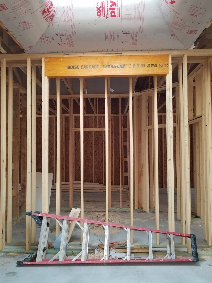
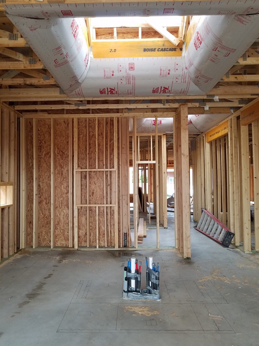
In this recent project, the work began 12 months out – plenty of time you think…but it was all about the physical remodel. We began with the drawings for floor plan re-configuration and specifications for new lighting, cabinets and finishes throughout. The decision to furnish was not made until nearly 10 months later with a deadline to complete in less than 7 weeks. The delay was partially due to an indecision over how many of the 4 units (all on one floor) were to be short-term or long-term rentals. Then a new city ordinance imposed a moratorium, of sorts, on short-term rentals and while that was tossed about over several weeks…more indecision ensued.
It’s a riot to see overnight design projects transform interiors in 24 hours. That’s due to a free-reign for design decisions, a team(s) and vehicles to pick-up/deliver, all trades on deck, a single director calling the shots and an organized chaos that results in a magical finished project – yes, like magic. Open your eyes, be stricken with awe, cry a little and exclaim repeatedly that you “just can’t believe it!!!!”
Real life is generally not like that. Real life has in-put by owners, limited schedule openings by the various trades, little spontaneous decision-making and fleeting time riddled with unwanted surprises and delays. Real life, in this case, was a theme provided by the owner, a preconceived “look” developed in the mind’s eye and scratch paper of the designer during the selection of finishes and floor plan modifications and vacillation for several reasons, of what units to furnish and when. Over the course of a year, leading up to less than the last 30 days, the project was to be fully furnished and finished – ready to rent!

The good news is that with controlled frenzy, changing availability of products, focused efforts and teamwork, we are pleased to present the Lobster! Completed all but hanging the TVs by the requested July 1st deadline, it is beautifully appointed and offers a colorful and a bit whimsical, spacious, clean and did I mention enviable location- 2 blocks from Pacific Beach in San Diego?
This entire project, except the move-in this last week, was done long-distance with the owner in Maine, her management company SHORE on-site in California and we the design team in New Mexico. This is not at all unusual, but Maine prompted the owner’s desire to name the unit Lobster. Not your spiny lobster from the local waters, but the New England version from the Atlantic with the classic recognizable form that accompanies the imagined crustacean – including the brilliant reds of the often appreciated steamed version!!

With fond memories of her childhood helping her elders maintain this property, the owner wanted to commemorate the building with an entry plaque visible from the street on the new redwood gate (soon to be completed). In addition, we suggested an individual name/theme for each of the 4 apartments which were all initially designated as fully-furnished short-term rentals – hence the bold identity for each! I designed the new name plaques and had them fabricated by Artistic Bronze in Florida. The backing was built by our talented Enrique Jimenez, in New Mexico, and all shipped to California. Bronze was selected for its timeless presentation, handsome durability and commanding respect. Parisienne was the font I selected which may now be used to identify the property as though a logo to tie-in with the on-site signage. Subliminal cues that are recognized even slightly are effective reminders and triggers for recognition. The idea was intended to offer a fun, but lasting, introduction and identification which was to be reflected in the interiors. The Lobster was the largest unit with 2 bedrooms. It was ultimately chosen to the be one fully-furnished unit and owner’s second home when visiting the area.

For budget and availability, we sacrificed certain durable features that would have been better long-term investments, resulting in some knock-down furniture that was never intended for much abuse. Fragile painted table surfaces – for example – better in laminate, wood or stone…but time will tell.

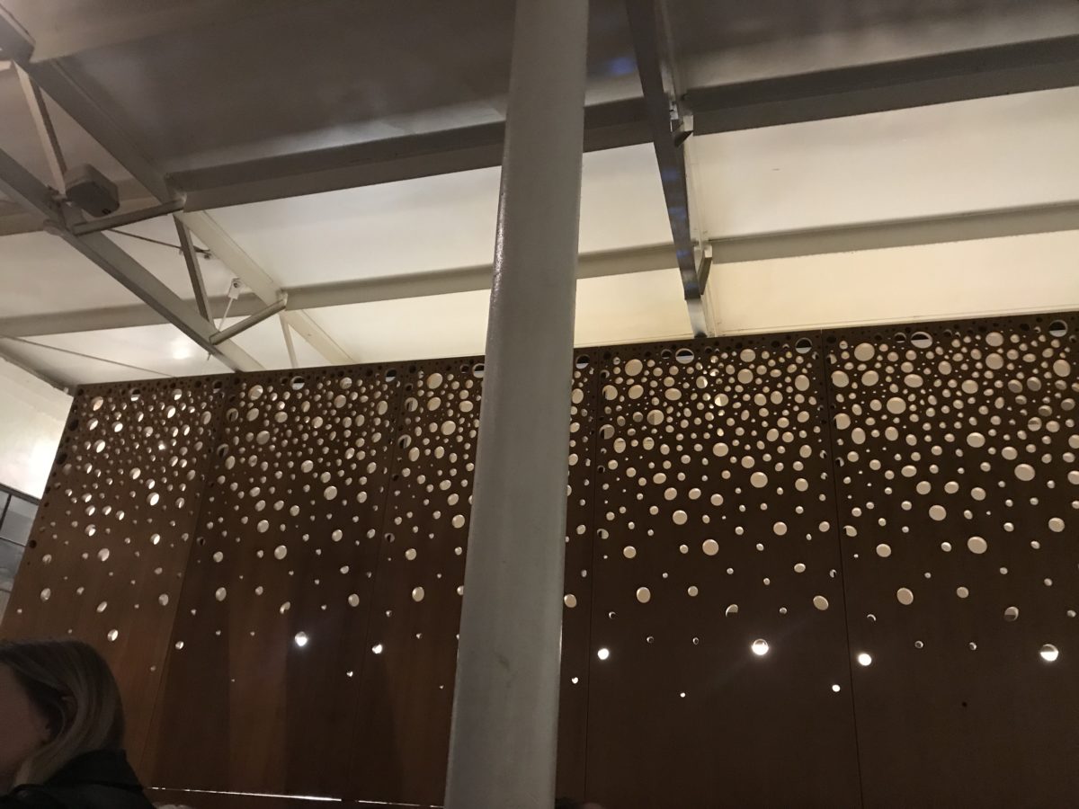
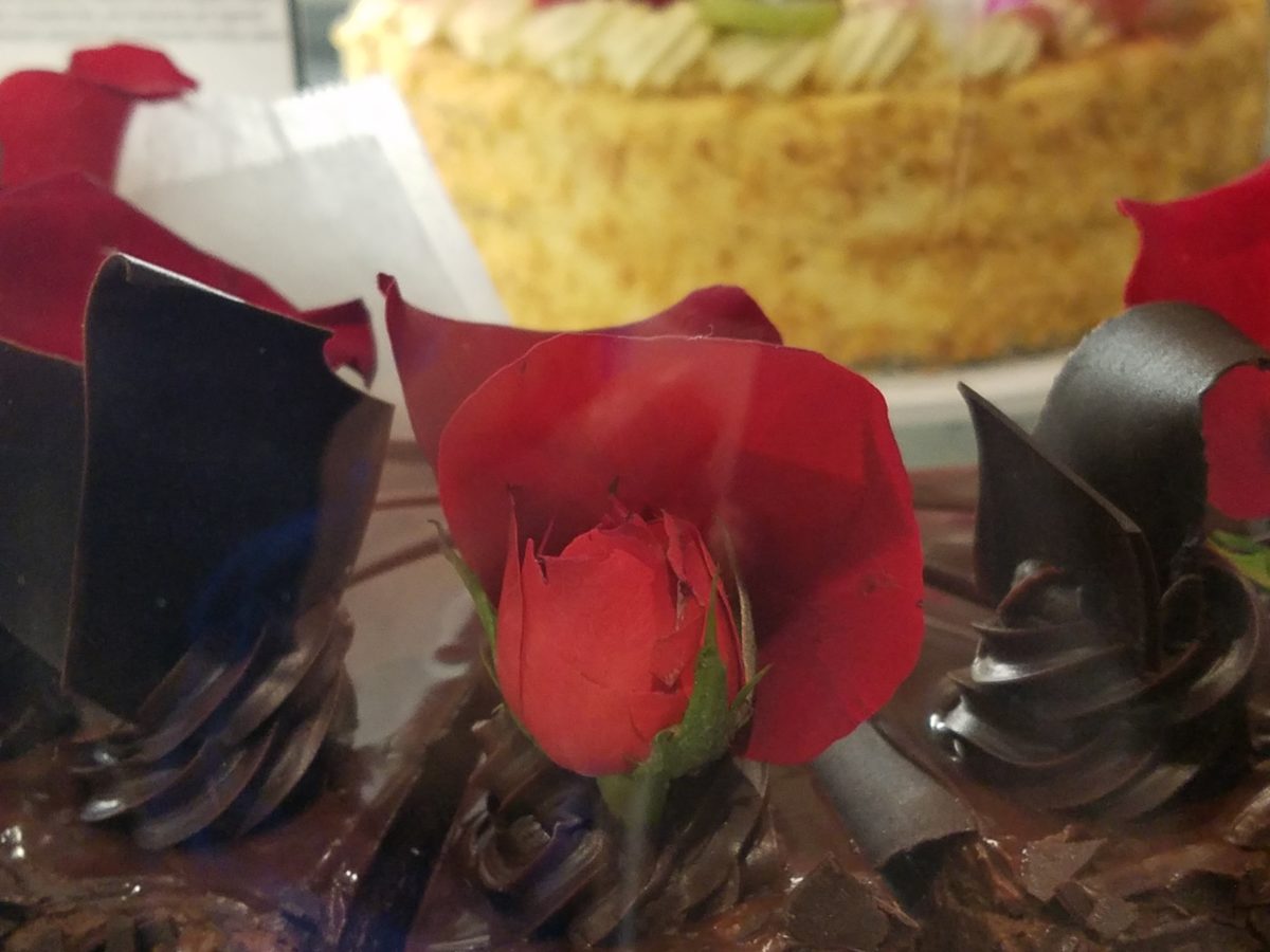
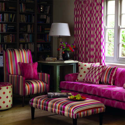
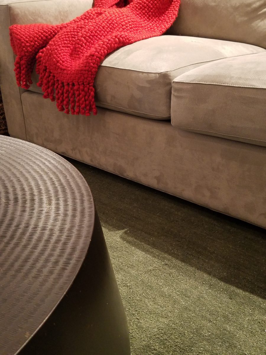
The look is clean and fun, colorful and beachy – with a slightly up-scaled twist. Cool aquas accent a few walls in the otherwise crisp white interior. Red punctuates effectively in lobster accent pillows, decorative accessories and the full-wall mosaic glass tile treatment in the kitchen. Yes, once again, we like to treat tile on the walls as not mere back-splashes, but wall-covering full height and width!
Weathered grey toned LVT (Luxury Vinyl Tile) in the way of interlocking planks were an easy to maintain and durable floor finish. The faux wood adds warmth and is softer underfoot than other hard surfaces. Perfectly matched with all trim pieces, this flooring is fabulous!!
Lighting is key and here we added recessed directional lights to spot the walls and related artwork. Switching was also an important detail to have options for the lighted areas and accents.
The owner found a novel lobster rug with a great textural, tufted, yarn system that brings fun and great color and warmth to the bunk-bed room! Busy, colorful bed dressings intentionally selected (over the hospitality white that is still trending) contrast against the bright white bed frames stacked for space optimization and a little kid fun!

A cool find in the way of the glass vessel lamp…where usually the stem with electrical cord feeds down through the center of the base and of the back, this one feeds from the socket stem with a cork top that removes allowing the vessel to be filled with treasures – in this case southern California beach shells and fragments! And for a little more animation, I found a carved wooden shark to insert cruising above the shells to make the lamp even more interesting!!!

A pair of vintage photographs of a lobster shack and fishing boat contributed by a friend in Albuquerque – taken by him in Maine in 1962 – were enhanced with bright red mats in their original polished silver metal frames along with a large painting on canvas of a Maine lobster/fishing boat sent by the owner in Maine provide interest to further perpetuate the lobster theme.

The master bedroom is a comfortable retreat with another lobster pillow for punch! To give the room the best approach and make it feel as large as it can be, placing the bed in front of the windows was the solution. Beds facing the entrance to the room are always preferable to arriving into the side of them – for visual space and a more inviting orientation.

The original bathroom layout was all one space with tiny appointments jammed together…so we removed the tall storage cabinets and sink vanity allowing more room for the commode beside the tub/shower and added a privacy door. Then the new cabinets and counter have their own space with another privacy door resulting in a two-compartment bathroom area for maximum use and enjoyment. Red mosaic glass tiles were repeated from the kitchen to further coordinate the theme.

The bold color scheme was thoroughly distributed throughout the unit which is an intentional design emphasis especially effective and novel in a short-term vacation rental – where such a thorough scheme might be too intense for one’s primary place of residence.

Effective design both functionally and visually should be a significant asset in the marketing of rental property. When used consistency in marketing material with logos and repeated features, this and other properties with attention to detail should attract the discriminating guests. Once there, repeated stays are the key to maintaining a strong guest population – of desired visitors.
Please watch for the entire slide show of before and afters of this dramatic transformation in the commercial projects section of our website, in coming weeks, entitled Emerald Green Beach Rentals – Lobster!